


Your website’s navigation sets the tone for visitors. People use the navigation bar as a way to acclimate to the site and figure out where different features exist. Creating better menus starts with looking at website navigation examples from brands doing it right and figuring out what applies to your brand.
Have you ever landed on a page and had a hard time figuring out what to do next? Chances are the site’s navigational hierarchy was subpar. Avoid similar mistakes by studying website navigation examples from your competitors and even outside your niche. The more options you have, the better choices you’ll make in your designs.
Clutch surveyed 612 people to get a feel for which user experience (UX) features mattered most. The results showed 94% of consumers want easy navigation on the sites they visit. Your site’s navigational hierarchy should be intuitive and predictable.
Here at Designerly, we believe one of the best ways to learn is by studying other designers’ work. We scoured the internet for some excellent website navigation examples and found some favorites. We’ll explain why we chose them and what you can learn from each.
1. Raphael Bourdin

One of our first website navigation examples takes a look at the artistic side of web design. Raphael Bourdin places his menu in the upper right corner of his page. It’s very unobtrusive, but appears in the same location no matter which page visitors move to. The navigation sets the tone of the entire site, allowing plenty of white space around each tab.
One thing we really like about the menu is the way it expands and contracts. To indicate which page the user is currently on, a line goes through the title of the page on the menu. The menu is well-suited for a creative type such as a creator.
2. Kinsta

Kinsta offers a traditional navigation bar that goes horizontally across the top of the page. The nav bar is the first thing people see when they land on any page on the site, giving them a point of reference to refer to as they go to different pages.
Note how the bar is simple and doesn’t distract from the content on the page. A logo appears on the left and then letters with drop down options across. Most menus appear across the top of the page. One thing to be aware of when designing your site is how mobile responsive your design is. If you choose a horizontal navigational structure, you’ll want to move to a hamburger menu or other style for smaller screens or you risk tabs running across multiple lines and taking over the page.
3. Oscar

Web designers looking for website navigation examples should turn to Oscar. Cut the clutter and focus only on your menu. If you have a lot of features on your page, ask what you can do away with and not lose the function of the site.
Look at each item on your menu and see which ones can be combined. You should remove anything not useful to your visitors. It’s easy to collect extra pages over time. Get rid of what doesn’t point users to the next phase of the buyer’s journey.
4. Atterley

Atterley limits the number of navigation options. You can choose from Men’s or Women’s styles. They have two images in the header. One features some of the styles on sale for women and the other for men.
They also add a search feature, which is a great way to limit the number of navigational categories, while still giving users access to anything on your site they might specifically need to find.
5. Mike Kelly
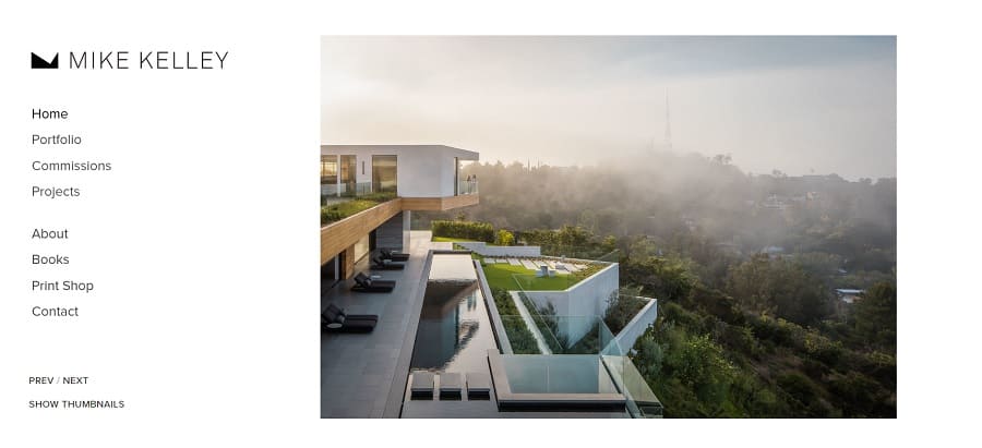
Mike Kelly is a photographer in the Los Angeles area. His website features a side menu navigation, which leaves a lot of negative space to put the focus on his photos. The menu follows the same standards as other excellent designs, including positioning at the top of the page, limited number of categories and great contrast.
Animations are subtle, with a bold effect to indicate which page the user is on. A previous and next button lets people browse through the photos without ever leaving the navigation bar. We also love how wide the menu is on this page, making it one of our favorite website navigation examples for artists.
6. Whole Foods
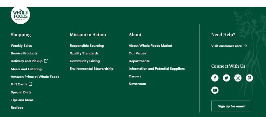
Let’s take a look at Whole Foods’ footer, where they share their website navigation for users. They have four columns. One lists information on shopping there, sharing weekly sales, information on delivery and pickup and ideas for meals and catering.
The next column talks about how they source, give back to the community and strive to protect the environment. An “About” column shares info on their values, careers and current news. The final column gives users access to customer support and ways to connect with the brand via social media or their newsletter.
Pay Attention to Your Favorite Sites
Spend a bit of time on your favorite websites and see what they offer in the way of website navigation examples. You can learn a lot from other companies in your industry or from completely unrelated businesses.
Which features do you like best in a nav bar? How can you try the same techniques on your website? Try different things, do some split testing to see how users respond and tweak until you have the best navigation experience imaginable.


Leave a Comment