


In This Article
In an age of picture-perfect digital marketing that’s made easy with tools like Canva or through traditional ad-making in Adobe, anti-design is making graphic designers question their costly subscriptions. It captures attention by rejecting visual harmony. Here’s how the do-it-yourself aesthetic is drawing more eyes than flawless ads.
The Origins of Anti-Design
Despite its fresh and youthful feel, anti-design isn’t new. Here’s a quick history of the trend that’s once again regaining traction.
Italian Roots
Its roots trace back to post-war Italy in the 1960s and ’70s during the Radical Design movement. It was born as a reaction against modernism’s principles that “good design” must be functional to be appealing to consumers.
Designers rejected the notion that all elements must serve a purpose. They argued that objects could exist for their own sake. Avant-garde groups like Archizoom and Superstudio used irony, kitsch, exaggerated shapes, and conceptual, often non-functional works to critique society. Pieces like the Sofa Superonda, a red, wave-like form that defies traditional seating, or the Safari Sofa, flower-shaped with seats facing inward like a conversation pit, embodied this approach. Through such designs, the discipline shifted from practical production into a vehicle for political commentary.

International Spread
This ethos carried into the 1980s with the Memphis Group, founded by Ettore Sottsass in 1981. Memphis brought anti-design into the global spotlight through playful forms and clashing colors. Imagine a futuristic living room as if drawn by a child, rejecting all traces of minimalism. Visual impact prevailed. You get a robot-looking shelf with slanted columns and sofas with various shapes, where a usual square and rectangle would be.
Though short-lived, it provoked people to question what design is and legitimized expressive, unconventional aesthetics. Creativity doesn’t have to be standard. It can be fun, rebellious, and participatory.
Punk and Grunge Influences
In the 1990s, anti-design resurfaced in graphic design and early digital media, led by David Carson. His chaotic composition and illegible typography, most notably in Ray Gun magazine, prioritized expression. Forget following the “only two fonts at best” rule. His work resembled a collage, with pieces of letters and photos cut and pasted from other magazine pages. This reflected punk and grunge culture and redefined communication as emotional rather than purely functional. Early websites echoed this experimental approach with distorted layouts and jarring visuals.

Worldwide Web Adoption
By the 2010s, a new wave emerged through “Brutalist” web design, reacting against polished, template-driven aesthetics. Think fire orange and neon green elements contrasting against white, cream, and gray backgrounds. It embraced raw HTML and minimal styling to emphasize honesty and resist the cohesiveness of commercialization.
Modern Anti-Design
Today, the trickles of these foundational anti-design ideas inform the movement. It retains the rejection of tradition, especially in the age of artificial intelligence (AI), which makes images easier to generate in a second and to achieve perfection without effort. Instead, it focuses on human touch. It leans toward intentionally broken layouts and mismatched colors over digital cleanliness.
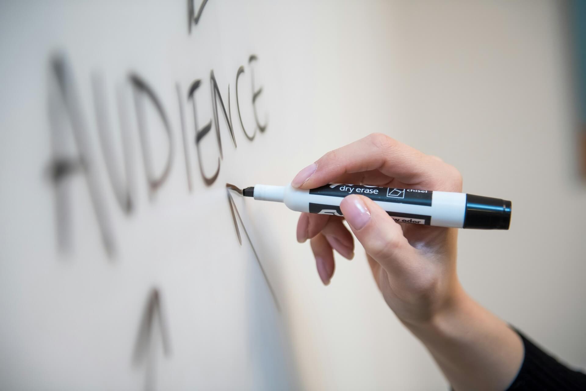
Hence, the popular “graphic design is my passion” (GDIMP) typographies appear in Comic Sans, Papyrus, mixed fonts, or simply drawn with a pen tool. For the untrained eye, it can look like bad style, when in reality it uses the same tools used for refinement to achieve expression rather than conform to function.
Characteristics of Anti-Design
Anti-design is identifiable by certain visual traits. While the exact application can change from one project to another, or even from one era to another, these similarities inform the overall aesthetic and deviation.
- Distorted typography: Fonts are chopped, skewed, layered, or stretched to challenge legibility.
- Asymmetrical layouts: Images and text are positioned unpredictably, outright rejecting grid systems.
- Collage look: Elements overlap, textures clash, and visuals feel improvised.
- Brutalistic elements: Harsh colors, raw HTML-inspired looks, and non-traditional user experience conventions.
- Imagery distortion: Crumpled, displaced, or glitched effects break up the elements.
- Meme-like aesthetic: The appearance mimics youth culture and social media posts, often using “messy” humor or low-fi looks.
Why Anti-Design Works Today
A few factors fuel anti-design’s resurgence. First, AI tools make perfection easy. Anyone can generate precisely aligned graphics or curated social media posts with minimal effort. With 88% of companies already leveraging AI, it’s no surprise that many ads people encounter are AI-generated or created with its help.
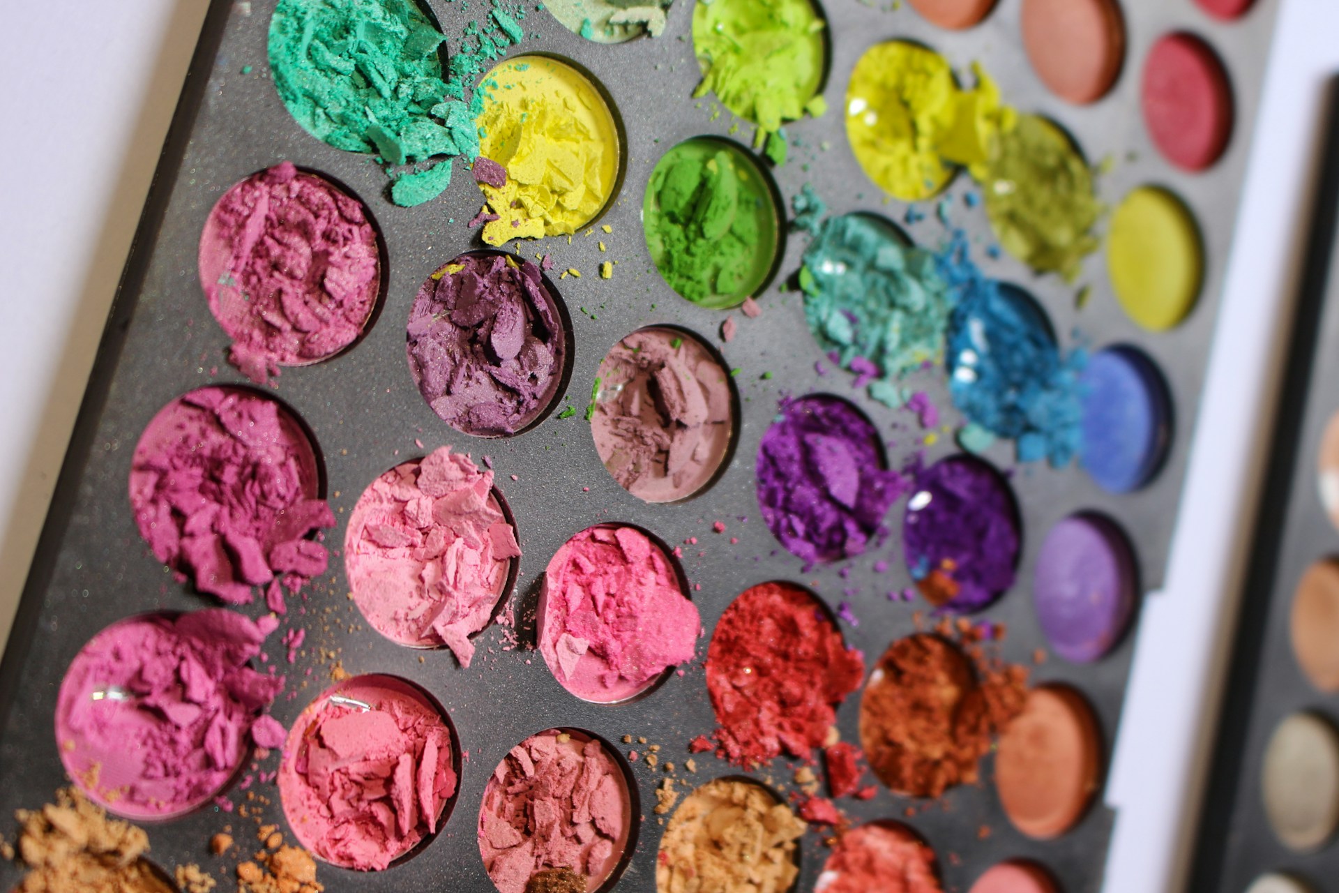
This perfection, however, feels mechanical and creates oversaturation. When audiences see similar ads over and over, they crave novelty. This deliberate flaws signal human creativity rather than algorithmic output. Campaigns that use intentionally messy visuals, like the yellow-green palette of Charli XCX’s Brat album or meme-inspired ad edits, feel relatable.
Second, today’s consumers is perhaps the most flooded with ads daily. Surveys reveal that up to 74% of users are tired of seeing ads on social media, where saturation is highest. When people become cognitively and emotionally tired of seeing similar ads, they develop banner blindness and simply scroll past skillfully styled images.
Anti-design allows brands to communicate without triggering that automatic “ignore” response. A meme-style graphic is processed as user content rather than advertising. As a result, people are more likely to pause, explore, and engage.
Third, anti-design is versatile for branding and engagement. Companies seeking to appear bold, disruptive, or culturally relevant can use it to stand out. Editorial projects, art-focused media, and niche product launches benefit most. Adidas, for example, employed the approach in the Yung-1 Alpine Sneakers promotional page, using disorganized layouts and layered imagery to capture attention.

This is why modern campaigns often mimic the look of a teenager creating content on a phone using images, text, and colors that seem randomly thrown together, which perfectly encapsulate the G.D.I.M.P. philosophy. Yet beneath that chaos is careful intention. It takes real skill to make something look deliberately “bad” while still being effective.
Should Brands Jump on the Anti-Design Bandwagon?
If big-name enterprises are benefiting from anti-design by breaking tradition, does that mean all brands should follow suit?
Not exactly. While anti-design can offer a strategic edge, it doesn’t mean every brand should do the same. Your existing branding still matters. You cannot simply adopt random elements and expect your audience to understand your message immediately. Jumping on the trend without a clear purpose risks confusion rather than engagement.
Before asking your team to create an anti-design strategy, remember — visuals should surprise and captivate, not alienate. For example, if the World Health Organization adopted it for its branding, it would likely confuse people because the style doesn’t align with its identity or mission.
An anti-design strategy needs to be intentional and serve your business goals, especially since more than 80% of consumers view a brand’s authenticity as the key driver of their loyalty. Here are a few things to consider first:
- Brand fit: Does a raw, chaotic aesthetic align with your brand identity and values, or will it feel forced and inauthentic?
- Audience expectations: Will your target market appreciate experimentation, or do they expect clarity, trust, and professionalism?
- Purpose of use: Is this for a campaign, content piece, or full branding? Anti-design works best in controlled, intentional contexts.
- Message clarity: Even if the elements are disorganized, the core message should still be understandable.
- Platform context: What works on social media may not work on websites, e-commerce, or formal channels.
- Accessibility: Ensure readability, contrast, and usability aren’t completely sacrificed for style.
- Execution quality: “Bad” design still requires skill. Poor execution can look like you hired a bad designer and hurt your engagement.
- Risk tolerance: The visual style can alienate as much as it attracts. Be prepared for mixed reactions.
Break the Rules and Leave a Mark With Anti-Design
Anti-design is more than visual chaos. It is a strategic, intentional approach to design that rejects the ideal, embraces authenticity, and challenges expectations.
For SMB owners, designers, and marketers, anti-design offers opportunities to engage audiences in new ways. It provides a way to stand out, signal originality, and create memorable experiences. As consumers continue seeking originality in a social media stream of polished content, it will remain a valuable tool for those willing to embrace its energy and craft it thoughtfully.
Leave a Comment