

Spring breezes in with soft colors and warmer days. Pastel greens, pinks and yellows are in a hurry to bounce back to life after their long winter sleep. The same energy is in the true spring color palette. Picture hues that are warm‚ clear and alive․
For designers‚ color is much more than just a seasonal trend․ As brands move away from cold minimalism‚ color is being put back on the agenda and used to connect‚ evoke and engage․
Why Use a True Spring Color Palette?
Retail sales continued to rise in early 2025, according to the U.S. Census Bureau, which is typical of a seasonal uptick in consumer spending as spring arrives. Color decisions match the mood of the audience. With a spring mood, fresh colors become relevant again.
Color has a significant impact on user perception. Research shows that up to 90% of users’ first impressions of a website are based on its color‚ showing the importance of color palette selection in modern design․
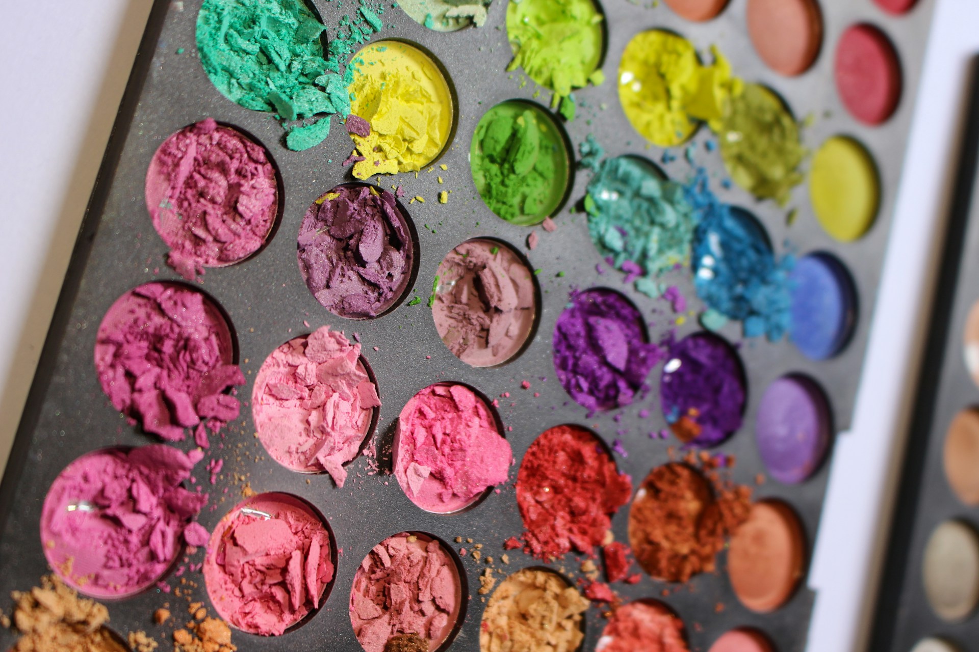
Designers typically describe a true spring color palette as including corals, peaches, yellows, earthy browns, warm blues, greens and hazels. However, you can pair any number of colors with these main selections to create something bolder or more understated. Ask three different designers what colors are in the palette, and you’ll get three different answers. The color palettes here are Designerly’s personal take on bringing the selections to life.
If you’re looking for a fresh take for the season, try these renewed color combinations.
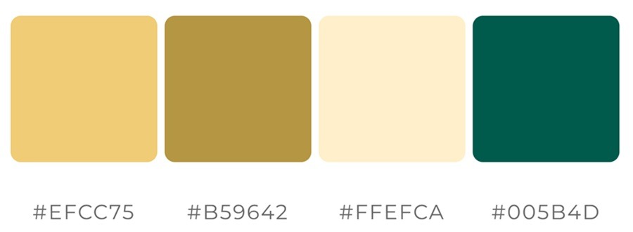
1․ Golden Apricot
Hex codes: #EFCC75, #B59642, #FFEFA, #005B4D
Golden apricot is the anchor of the true spring palette‚ bringing warmth without being too overpowering‚ which makes it a great choice for hero sections and background colors or areas with softer call-to-action styles․ Companies featuring clothing and other fashion items often adopt a similar tone in seasonal campaigns‚ creating a friendly‚ human-centered experience․
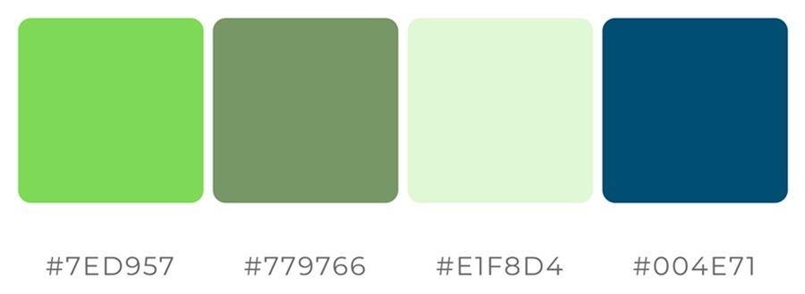
2․ Fresh Leaf Green
Hex codes: #7ED957‚ #779766, #E1F8D4, #004E71
In contrast with dark greens‚ fresh leaf green is energizing and optimistic․ It works well in dashboards‚ wellness brands‚ sustainability design and anywhere a growth or forward-looking mentality is desired․ Duolingo’s signature green‚ also referred to as Duolingo Green‚ is bright and friendly․
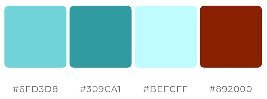
3․ Sky-Touched Aqua
Hex codes: #6FD3D8‚ #309CA1, #BEFCFF, #892000
In the true spring color palette, aqua is softer than its usual icy appearance, offering some relief to the stronger red and teal shades while remaining light and airy. Sites catering to families may enjoy using these brighter, cheerier tones.
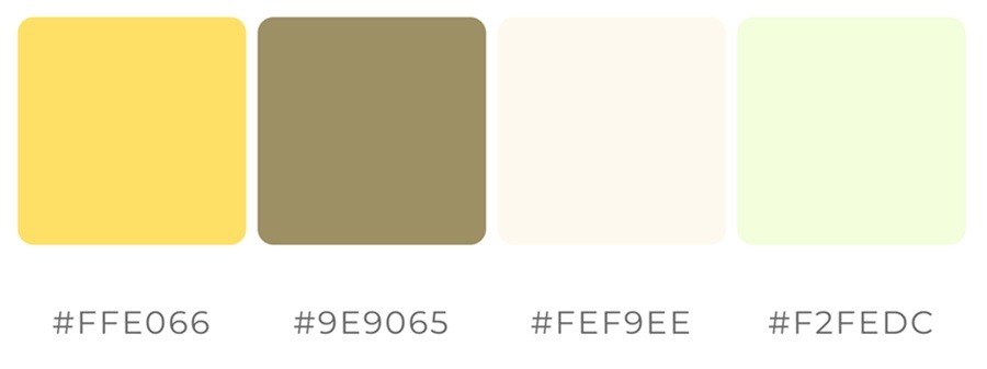
4․ Butter Yellow
Hex codes: #FFE066‚ #9E9065, #FEF9EE, #F2FEDC
Butter yellow tends to add illumination without being harsh, making it a good choice for highlights and icons, though it’s also useful in other places. Pairing the cheerful yellow with earth tones creates a soft palette that works well for service-based businesses. Mailchimp is an example of a company that employs a bold and approachable shade of yellow with warm undertones․
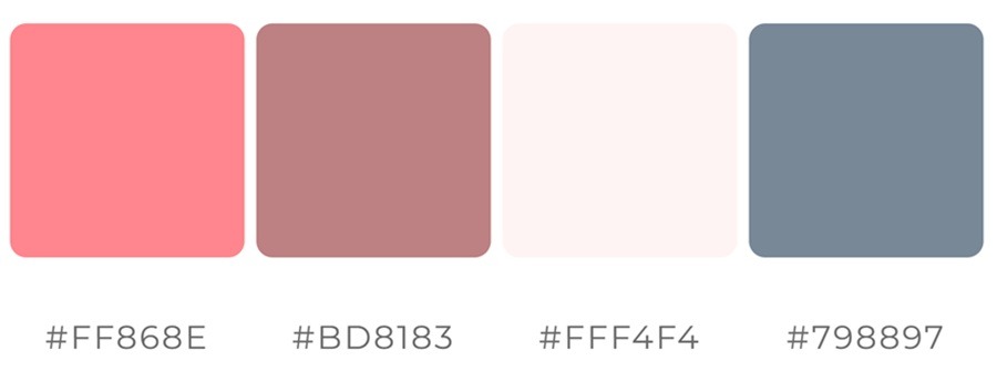
5․ Coral Bloom
Hex codes: #FF868E, #BD8183, #FFF4F4, #798897
Coral bloom is pinkish-orange․ It is considered to be one of the most versatile colors in the true spring color palette․ It is a common choice for buttons‚ accents and focal points․ If you’re looking for a burst of color with some muted complementary tones, this palette gives any design a grown-dup look that stands out.
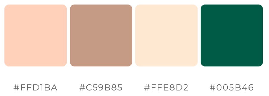
6․ Peach Blossom
Hex codes: #FFD1BA‚ #C59B85, #FFE8D2, #005B46
Its softness gives peach blossom a versatile quality for backgrounds, cards and layered UI elements, providing visual interest without overwhelming heaviness. Beauty brands often use soft colors like the palette pictured above. The deep, emerald green hints at the deep greens of summer, which is just around the corner.
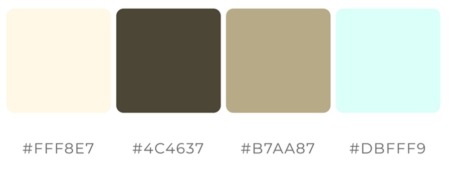
7․ Warm Ivory
Hex codes: #FFF8E7‚ #4C4637, #B7AA87, #DBFFF9
True Spring neutrals avoid pure white‚ instead opting for a warm ivory base so as not to create high contrast․ Many platforms favor warm neutrals‚ retaining elegance while minimizing visual fatigue․ Pair the warm ivory with a soft blue and earth tone for a gentler design. The deep brown hints at the earth and fits perfectly with the overall palette’s ambience.
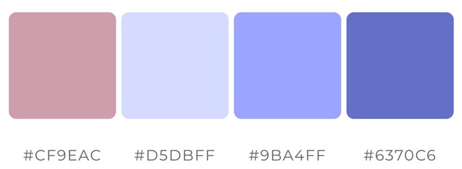
8․ Gentle Pink
Hex codes: #CF9EAC, #D5DBFF, #9BA4FF, #6370C6
Soft versions of muted pink from the true spring hues can energize without overstimulating. Pops of purple can heighten awareness and should be used for alerts and calls to action. When using bright blues and purples, use them sparingly so as not to strain users’ eyes.
Using The True Spring Color Palette Effectively
When using a true spring color palette‚ balance and hierarchy are key․ Some key points to remember are:
- Main colors: Avoid anything too jarring, since you’ll be using your main color for most of your design. For example, you might use your main color for headings or your logo.
- Secondary color: You can add a pop of color for your secondary color choice. Use this alongside the main color in a logo or to create text hierarchy.
- Neutral base: Consider the negative space in your design and which color it needs to fill.
- Accent color: Even though you’re selecting a true spring color palette, you can go a bit bolder for your accent. Use this as an arrow to underline some text or for a call to action button.
To contrast the intensity of these colors‚ you can use lighter tones․ Shades of peach‚ apricot and coral can lend depth without weighing it down․
Just as importantly‚ avoid oversaturation․ True spring likes to be clean‚ so if every color in your palette is demanding attention‚ you will have lost your wow factor․
Why the True Spring Color Palette Is Trending
In design‚ warmth and approachability are coming back, and brands are rediscovering the emotional power of color after years of cool minimalism․ The true spring color palette works best to create:
- Warmth without heaviness
- Brightness without neon intensity
- Clarity without sterility
The true spring color palette creates a space that feels far less alienating‚ something that is common among users․
Let Your Designs Bloom With the True Spring Color Palette
True spring color palettes‚ also called true spring‚ can enliven a computer screen or brighten and warm up otherwise cold and sterile spaces such as offices․ It is the palette for designers eager to create color that feels human again without having to recreate the wheel․ Let it do what spring does‚ and wake everything up․
Leave a Comment