
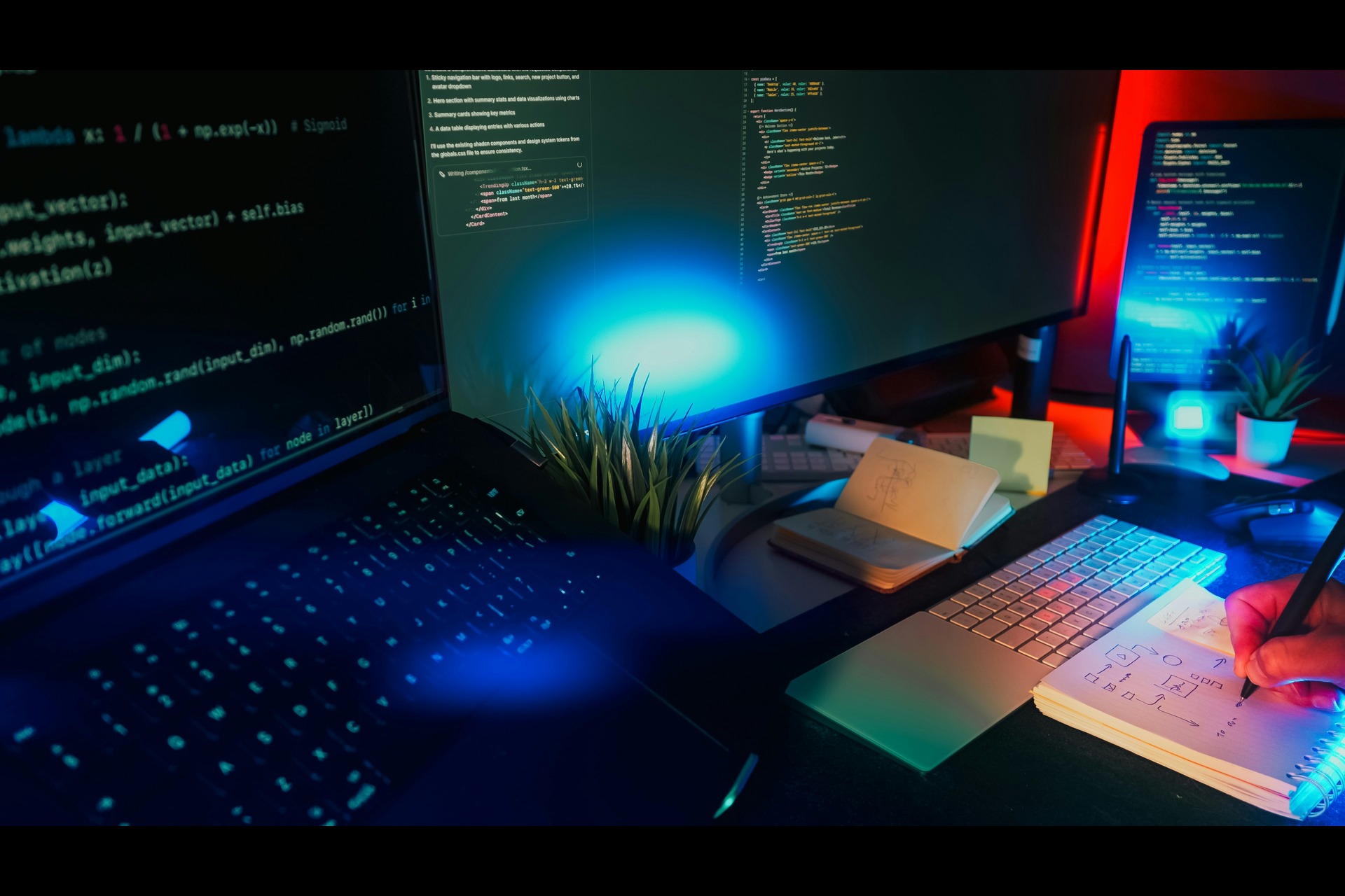
Many web design trends are constantly in flux. Annual stylistic trends arise and draw inspiration from tech movements — like mobile browsing continuing to rise and web browsers increasing in technical sophistication.
In 2018, those who browse the web can expect to see emerging trends in web design, some appealing to the evolving user experience and others seeking to stand out and take advantage of technological growth. Some of the hottest web design trends to anticipate in 2018 include:
Custom, Unique Illustrations and Animations

Stock photos remain beneficial in blog posts and written content. However, web design for a landing page requires a higher standard to call attention. A website using a stock photo in a pivotal location on their landing page or homepage is vulnerable to an uncreative perception if the person visiting the website has seen the stock photo elsewhere.
As a result, websites are embracing custom illustrations to help stand out and enforce their unique brand. Plus, custom illustrations can easily align with a site’s pre-existing color scheme to fit in cohesively. Whereas it will be difficult to find a stock photo that fits within the color scheme. Although custom illustrations require the work of a graphic designer, the time and cost put into creating a unique custom illustration is worth it. Take into consideration the illustration will be a pivotal aspect of a website catering to thousands or even millions of visitors.
The thematic congruence and uniqueness of custom illustrations and animations make them a trend to expect in 2018.
Asymmetric and “Broken” Layouts
There are still a variety of websites today, especially in the corporate sphere, that continue to resemble a sharp-edged notecard in their appearance. This makes for a flat and lifeless appearance. In 2018 a variety of more unconventional and asymmetrical websites enter the fold, helping make reading content more fun. For example, sites that incorporate copy into floating boxes within a “broken grid” provide a reminiscent feel of modern art. Although some businesses may remain better off exuding the more corporate nature of a sharp-edged notecard appearance, those in design and artistic fields can use box-laden copy and an asymmetrical design to show their ideas are truly outside of the box.
An All-Encompassing Atmosphere
Especially with technological advances in monitors and screened-devices combined with browsers handling more resources than ever, web designers embrace aesthetic and atmosphere in their web designs more than ever. For example, a website can combine lush background music with gentle tones of blue to craft a relaxing atmosphere, putting viewers at ease.
Websites can now successfully integrate most elements of sense. They appeal to one’s audible and visual sensibilities, in alignment with their approach and aesthetic. An ocean wildlife fund can explore the aforementioned lush music and blue tones. While a heavy metal band’s website can incorporate dark tones and intense fonts over their heavy music.
In 2018, anticipate seeing websites value their atmosphere as a whole, rather than just the visual aspects. Intuitive navigation and an alignment of background music with appropriate color schemes are a priority as well.
Scroll Trigger Animations
Recently starting to take off, scroll trigger animations have slowly increased in prominence the past few years. Websites utilize scroll trigger animations to captivate viewers as they scroll down, increasing conversions by piquing their interest. Rather than expecting what’s to come, browsers are likelier to ask “What’s next?” These animations help clean a website’s appearance up as well, by hiding information until the visitor scrolls down to its appropriate placement. By cleaning up a site’s visual content and conveying an immersive, interactive experience, web designers will likely embrace scroll triggered animations in the years ahead.
Dynamic Gradients
Gradients provide a great departure from the potential dullness of a single color theme adorning a website. Gradients in the prior years of web design may have come across as clunky. But browser advancements have made their presence more responsive with dynamic capabilities. Specifically, users can explore a variety of gradients as they travel from page to page or section to section. This helps immerse them while providing something new with each page.
Designers also opt to place gradient filters over photos. This helps provide an extra oomph to standard photograph. It makes them look intriguing and thematically congruent with the site’s color theme. Cohesiveness in the gradients remains necessary, as switching abruptly from a purple/pink gradient to a bolder approach may not appeal. Although, gradual evolution in the gradients is an interesting approach that can be successful. Designers will continue to look for ways to stand out and engage users in 2018 and beyond.
Web design in 2018 looks to embrace uniqueness in both the user interface and the way viewers perceive the site. Custom illustrations and asymmetric layouts help stand out from the generic nature of stock photos and sharp-edged note card layouts. Increasing browser capabilities, on the other hand, have made creating an entire atmosphere within a website more possible than ever. Additionally, effects like scroll trigger animations and dynamic gradients provide an extra creative flair to websites, helping elevate content through fun to navigate placement.
Plus, all these web design trends can help with content organization making the content visible only when those browsing the website are ready to read the content. 2018 has exciting trends in store for web design.

Leave a Comment