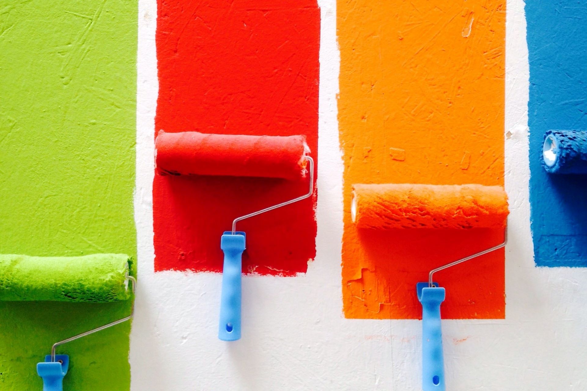
The internet is like a super highway, rife with billboards and pop-ups advertising something new and flashy. In this highly competitive landscape, web designers need to effectively catch their reader’s attention in an instant. One way to accomplish this is through striking and dazzling colors. Explore how chromatic color palettes capture the vibrant personality of a site below.
What Are Chromatic Colors?
Many people may recognize the terms “monochromatic” or “complementary colors” from their grade school art classes, but chromatic colors are usually less well-known. In its most basic definition, chromatic colors hinge on the intensity of saturation.
Saturation is the vividness of a color. Think of a bright, neon orange versus a burnt sienna. The neon orange has a higher saturation. If a color has no saturation, then it is achromatic.
There must also be a dominant hue in the color. Black, whites and grey are shades and tints, not colors. They cannot be saturated and are thus achromatic. Instead, think of blues, reds, yellows, greens and all colors on the wheel.
Why Is Color Crucial for Web Design?
Why differentiate between achromatic and chromatic colors for web design when the distinction is fairly simple? Many businesses and brands stick with the tried and true greyscale for a professional glean to their site. They might also opt for a monochromatic look. This means they use only one hue with varying shades.
These are both fine options, but they do not offer much in the way of eye-catching qualities or personalities. First and foremost, using color draws attention.
Chromatic colors can also enhance the aesthetics of your website. They draw attention to a certain message or call to action with their font or background color. Using contrasting schemes places clear distinctions between pages or text blocks, making it easier for a reader to digest.
Additionally, colors all mean something different. Oranges and red are energetic and warm, possibly inviting a reader to complete an action. Blues and greens are cooler and associated with calmness or sophistication. Tailoring chromatic colors to a unique website personality or message can enhance the meaning tenfold by drawing on unconscious color associations.
Using greyscales and whites can be professional and clean, but using chromatic color palettes adds a whole new dimension of vibrancy to any website.
Chromatic Color Palettes
The possibilities for an exciting, colorful color palette are nearly unlimited. Using chromatic colors does not mean that they cannot be accented by black, white and grey achromatic colors, though.
Sometimes, using too much color can make text difficult to read or abrasive to the eyes. Use these palettes with a healthy balance of neutral, grounding colors. Your best source of an excellent combination is your designer’s eye. Take a step back and look at the overall balance and see if anything needs adjusted. You can keep the same shades and adjust their vibrancy a bit for more or less contrast.
Here are just a few of the schemes that promote strong emotional associations with viewers. Experiment and explore new shades to achieve the full potential of the website.
1. Nature Scapes Palette

This nature scapes palette ranges from deep, olive greens to light shades of tan. With both deeper and pale hues, this palette is perfect for a mix of background and text selections. Remember that a dark background paired with light text, and vice versa, is the best option for reading eyes.
Greens and browns are also ideal for business and self-care websites. These are the colors of nature and new life, so they unconsciously remind the viewer of growth. Many interior designers particularly desire shades of green for offices and libraries as they encourage these feelings of motivation.
Consider palettes like nature scapes to foster a mindset of development and peace.
2. Pleasant Peaches Palette
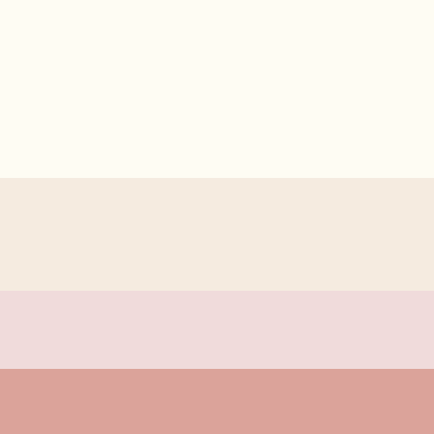
For a soft, feminine look to a website, try out palettes like pleasant peaches. With a mix of peach, baby pink and cream, the palette offers a sense of warmth and encouragement. Pinks are usually more of a warmer color and are traditionally associated with femininity. Brands with large female audiences may want to draw off this cultural standard for their site.
Because these pinks and peaches are so pale, they also evoke lightness and airiness. This website is relaxed, yet clean and sophisticated. Self-care, mindfulness, skincare and fashion all may benefit from these unconscious associations.
3. Cool Complementaries Palette

This palette is a dynamic option as it blends two complementary colors of blue and orange. Complementary colors are two shades that are opposite one another on the color wheel. Though they seem to be total opposites, their differences make them energetic pairings.
The light shades of teal and cool blue offer a sense of serenity and sophistication, while the bright pop of orange introduces some intensity to the situation. That orange shade can be used to offset a call to action or point toward pertinent information.
4. Starry Night Palette

This palette definitely leans towards the darker shades of the color wheel with deep navy and a heavy yellow shade. Dark blues paired with yellow almost always evoke a sense of the night sky, so there are many directions that this website could lean into.
A starry night makes viewers think of dreaming or wishing on a star. The website could lean into that dream-like quality as its selling point. This could also be used to underline a point, like a 24-hour store. They will maintain a feeling of nighttime and blue serenity, while also adding that pop of a yellow moon to point toward their incredible hours.
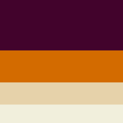
5. Scarlet Skies Palette

This option is striking for its vibrancy of deep navy and maroon. Websites that wish to cast a feeling of comfort or familiarity may find luck with this warm color palette. The pairings may remind them of beautiful summer sunsets or the warmth of Valentine’s day. Blues and reds are always great for creating a mixture of coolness and warmth in a dynamic way.
6. Spring Fields Palette

Staring at lush pinks and pastel greens immediately reminds viewers of the nourishing growth of spring. They are delicate and kind colors and would be great for a website dedicated to these values. Pinks and greens are perhaps an unusual option for a professional business, but there are niches where they would be appreciated, such as toy stores, gardening tools and spas.
Being unique and vibrant offers the best chance to draw-in users.
8. Peanut Butter and Jelly Palette
With a humorous name, this palette utilizes the fun of combining deep purple and oranges with light brown. There is also a vintage quality to their union. Purple is an interesting color as it combines the warmth of red with the coolness of blue. Here, a deep purple is sophisticated and regal and paired with the charming energy of the orange.
Again, this palette brings a feeling of unconventionality and energy to any webpage.
9. Autumnal Air Palette

Teals, oranges and dark reds are quintessential autumnal shades, but they also reflect a vintage feeling. Any visitor will note the unconventional shades and take this energy into any calls to action or articles they traverse.
10. Twilight Zones Palette

Blues and purples are always a perfect match. This set is definitely on the colder side and evokes feelings of winter chill. As always, blue calls for professionalism, and purple adds regality and warmth to the mix. This is not just a greyscale or monochrome set of blues, but a punctuation of rich purple.
Examples of Websites Using Chromatic Color Palettes
One of the best ways to learn how to use a color scheme is to see it in action. We’ve gathered a few examples of some beautiful chromatic color palettes in use on websites. See if these give you any inspiration for your designs.
Rock Paper Plant

Rock Paper Plant taps into the power of a chromatic color scheme to create a bright, fun pops of color that draw the user in. A medium-toned pink fills the background. Leaves and flowers grace the edges of the design in bright blue, green, purple and orange. They use an achromatic white for the call to action button.
The design proves you shouldn’t be afraid to combine multiple colors. For sites using many different hues, the key is to balance a main background color with splashes of other shades.
You must also know your audience and how different combinations might impact their decision to buy or convert into subscribers.
Hardscapes Etc.

Hardscapes Etc. uses blue and shades of brown but then pulls in some achromatic colors here and there for a more professional look. Many of the materials they use to create their landscaping feats involve natural colors, so it makes sense to rely on those same hues for their website design.
Note how brown is the dominant color in this design and chromatic blue and yellow make up very little of the overall design. As the user scrolls down the page, they see beautiful images in a gallery of work. Those colors repeat what you see in the overall color palette.
The Web Showcase With Google
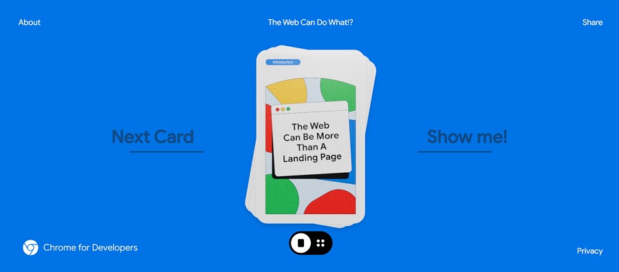
The Web Showcase With Google features an achromatic color scheme and a nod to the popular game of Uno. As the user flips through the cards, each has bright, chromatic colors of yellow, green, blue and red. A bit of black, white and gray appears throughout the design to break up some of the combinations and keep it from being too jarring on the eyes. The background is a vivid blue.
One could gain inspiration from this design by turning to vivid color combinations and fun icons that might draw users in. Web Showcase is an informational site meant to educate users, but you could easily create a navigation wheel using chromatic colors.
Fifth Third Bank

Fifth Third Bank uses a chromatic color scheme with three main colors of blue, yellow and green. Complementary color schemes and triadic color schemes can also be chromatic. You don’t have to use every color on the wheel to make it chromatic. Color saturation is the key for effect.
You can go with lighter hues, brighter hues and anything in between to get the tone you want for your web design.
Verde Market
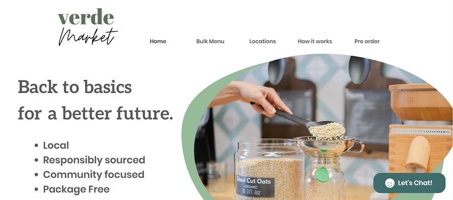
Verde Market offers basic food supplies with a zero waste concept that is package free. People invest in glass canisters or any type of reusable container, which they bring and refill when needed. The food is locally sourced whenever possible and responsibly sourced otherwise.
The chain currently has locations in Miami and Fort Lauderdale. The list the more than 300 items available in their stores, including:
- Detergents and Cleaners
- Beans, Seeds & Grains
- Personal Products
- Body Lotion
- Oils & Vinegars
- Beauty Products
- Super Foods–Acai Powder, Bee Pollen and Nutritional Yeast
- Nuts & Dried Fruits
- Beverages
- Pasta
- Flours
- Nut Butters
The site design relies on nature-based chromatic colors such as greens and browns with some achromatic additions for a soft look.
The Perfect Chromatic Color For You
Choosing the best chromatic color palette is all down to personality. Cool blues may work best for websites, while ecstatic oranges may be the answer for others. Explore your page from the mindset of a new visitor and figure out what colors pair best with your energy and emotional message. Then you can travel across the color wheel to create the color webpage of your dreams.


Leave a Comment