

Disabled buttons are a frequent sight in web design, but their impact on user experience and accessibility is often underestimated. Buttons are essential interactive elements, guiding users through actions like submitting forms, completing purchases or navigating between pages. They are the touchpoints of digital interaction, making them critical to a smooth user journey.
However, when buttons are disabled — often appearing grayed out and unclickable — they can lead to confusion and frustration. Users may not understand why an action is unavailable or how to proceed. And for individuals with disabilities, these buttons can create significant barriers. Ensuring interactive elements like buttons are accessible and intuitive isn’t just good design — it’s necessary for an inclusive web experience.
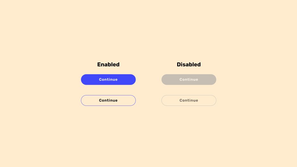
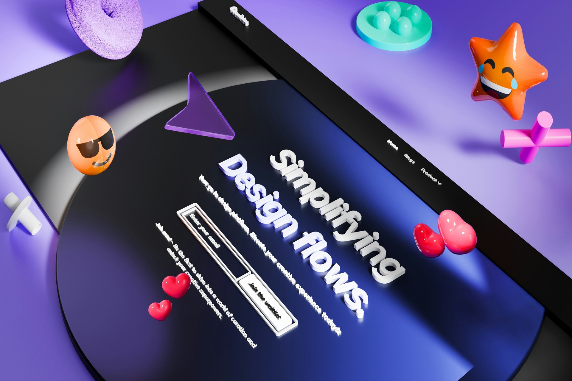
Image from Think 260 Studio
The Accessibility Challenges of Disabled Buttons
Disabled buttons may seem like a harmless design choice, but they can create significant barriers for users with disabilities. From visual impairments to navigation challenges, these seemingly simple elements can make websites less accessible and inclusive.
Screen Readers
Disabled buttons can be a significant source of frustration for users relying on screen readers. They often fail to provide clear feedback about why the button is inactive or how to make it functional. A recent survey revealed that over 88% of individuals with disabilities use screen readers to navigate digital content, highlighting how critical accessible designs is for this audience.
Without proper descriptions or ARIA labels, these buttons can leave users guessing, disrupting their experience and making it harder to complete essential tasks. For designers, this underscores the importance of ensuring buttons look accessible and communicate effectively with assistive technologies.
Cognitive Barriers
When disabled buttons fail to provide clear feedback, they can leave users feeling confused and stuck — especially those with cognitive disabilities. Users may feel overwhelmed or frustrated without clearly explaining why a button is inactive or what actions are needed to enable it.
This lack of clarity increases cognitive load, forcing users to guess their next steps or abandon the task altogether. By offering clear, concise feedback, designers can create a smoother, more inclusive experience that keeps users engaged and on track.
Visual Issues
Disabled buttons often fall short of color contrast guidelines, making them difficult for users with visual impairments to see and interact with. This is incredibly challenging for the 8% of the male population who are colorblind, a significant number when you consider that nearly half of the U.S.’s 300 million people are male.
Millions of users can struggle to identify or understand these elements when designers rely on subtle visual cues like graying out a button. By ensuring that these buttons meet proper contrast requirements, designers can improve visibility and create a more inclusive experience for everyone.
Disabled buttons often disrupt the navigation flow for users who rely on keyboards, creating a frustrating experience for those with mobility impairments or who prefer not to use a mouse. Keyboard navigation depends on a smooth, logical sequence, allowing users to tab through interactive elements quickly.
However, when a disabled button is part of this flow, it can either be skipped without explanation or offer no feedback. This confuses users about their progress or next steps, potentially derailing their journey. Designers can avoid this issue by ensuring disabled buttons are either removed from the tab order or provide meaningful feedback to maintain a seamless experience.
The UX Problems of Disabled Buttons
Disabled buttons often confuse users because they don’t provide feedback about why they are inactive or how to make them functional. Users might not realize they must complete certain actions — like filling out all fields in a form — to activate the button. Without clear indicators or explanations, these buttons leave users guessing, which interrupts their engagement and creates frustration. For many, this lack of guidance hinders further interaction, leading to higher drop-off rates.
The root of this issue lies in a typical design misstep — prioritizing aesthetics over functionality. Disabled buttons are often styled to blend seamlessly with sleek, minimal interfaces. Still, this approach neglects the user’s need for clarity and direction. While these buttons may look polished, they fail to communicate crucial information that could keep users on track. By focusing on functionality and providing actionable feedback, designers can improve usability and the overall user experience, ensuring users feel guided rather than lost.
Alternatives to Disabled Buttons
While disabled buttons are a standard design choice, they often create more problems than they solve for accessibility and user experience. Fortunately, there are more imaginative alternatives that provide clarity, maintain user engagement and ensure inclusivity without compromising functionality or design.
Provide Clear Feedback
One effective alternative to disabled buttons is using tooltips or text below the button to explain why an action is unavailable. These small but informative cues provide users with clear guidance, helping them understand what steps to take to activate the button.
For instance, a tooltip might display a message like, “Please complete all required fields to proceed,” ensuring users know what’s missing. Offering this type of immediate feedback can eliminate confusion and keep users engaged while maintaining an accessible and user-friendly interface.
Prioritize Accessibility
ARIA roles offer a practical solution for making disabled buttons more accessible, especially for users relying on screen readers. Attributes like aria-disabled communicate why a button isn’t functional and guide what the user needs to do next, ensuring everyone gets the context they need. It also enables keyboard interaction and focus management for elements that aren’t usually interactive, making navigation smoother for those who depend on keyboards.
In addition to using ARIA roles, designers should prioritize sufficient color contrast for disabled buttons, ensuring they remain visible even when deactivated. This combination of accessibility tools and thoughtful design ensures disabled buttons are functional and inclusive for all users.
Use Conditional Activation
Another alternative to disabled buttons is keeping them interactive while providing real-time feedback when clicked. Instead of rendering a button inactive, designers can allow users to click on it and display a popup or message explaining what’s missing. For example, if a user doesn’t fully complete the form, the button could trigger a notification like, “Please fill out all required fields before submitting.”
This approach keeps users engaged by providing actionable insights, reducing frustration and helping them resolve issues. Interactive buttons with real-time feedback guide users effectively without breaking their workflow or navigation.
Guide the User
Inline guidance is another excellent alternative to disabled buttons. It offers users clear, real-time feedback by highlighting errors or missing fields that require attention. This approach ensures the content presents instructions precisely where needed, making them easier to read and act upon. For instance, if a user skips a required field, the form can display an error message directly beneath the field or outline it in red, clearly indicating the problem.
Unlike popups or overlays, inline guidance doesn’t interrupt or obscure the content experience, allowing users to stay focused while receiving relevant, actionable information. This seamless integration improves usability and keeps the user journey smooth and frustration-free.
Creating Seamless and Inclusive Web Experiences
Inclusive design should be a priority in every web project, ensuring digital experiences are accessible to all users, regardless of their abilities. Adopting user-first alternatives to disabled buttons can create seamless, frustration-free interactions that promote engagement and inclusivity.
Leave a Comment