
Each month, we look at a different category to find a site worthy of the Designerly Web Design Award. We have looked at travel, government, education, small business and many other categories. We haven’t spent much time on the healthcare industry, but when we came across the Glucose Goddess website, with the French biochemist Jessie Inchauspé, we knew we had to share this gorgeous design.
The purpose of the award is to show an example of what other business owners can do to highlight their brands. While we normally start by choosing a category, in this instance the excellent design jumped out and fell into a particular category we’ve not covered before. The mix of social media influencer, scientist and author that Jessie Inchauspé is tweaked our interest.
According to the Bureau of Labor Statistics, there are approximately 35,700 biochemists in the United States alone. The field is growing by around 9% each year, which is much faster than average job growth rates. Average pay for biochemists hovers around $51.66 per hour. We poked around some other sites to see if any compared but our first choice still stood out as the stellar one.
Winner: Glucose Goddess
Jessie Inchauspé, aka the Glucose Goddess, is a familiar name to anyone who has searched for hacks to lose weight. If you read any of her books, you’ll quickly realize her focus is on treating the whole body and not worrying about weight loss. However, she also shares that following her principles usually does result in people losing pounds because their glucose levels are stabilized.
She offers 10 hacks people can follow that are fairly easy to implement. Jessie shares these hacks freely with anyone who will listen in an effort to change the unhealthy habits many people follow. Some of her ideas are similar to what you’ll hear other keto and low carb doctors and specialists tout. However, she claims you don’t have to give up any type of food at all to be healthier. You just have to eat in the right order and implement some other principles.
She recommends:
- Eat a savory breakfast – no bread or sugar. Have something like eggs or meat.
- Add vegetables to the front of a meal so you eat the fiber first and it’s more filling.
- Take a tablespoon of vinegar in a full glass of water–to protect your teeth–10 minutes before your heaviest carb meal.
- Take a 10-minute walk after one of your meals
She doesn’t tell you not to snack but does say snacks should be savory. The changes she touts are simple and something nearly anyone can incorporate into their daily life.
Why We Chose Glucose Goddess as Our Winner
Normally, we would identify an industry, such as health and start narrowing the choices. This winner jumped out at us when we stumbled across the website and realized how helpful, well laid out and on target it was for users. Here are the things we loved about Glucose Goddess that made us choose the site for this month’s award:
Minimalist Logo
The logo is a simple wordmark that states what the site is without overwhelming. It has a modern look, using a sans serif font. The blue is a color that evokes trust and shows the creator knows her topic and is seen as an expert in the biochemistry field.
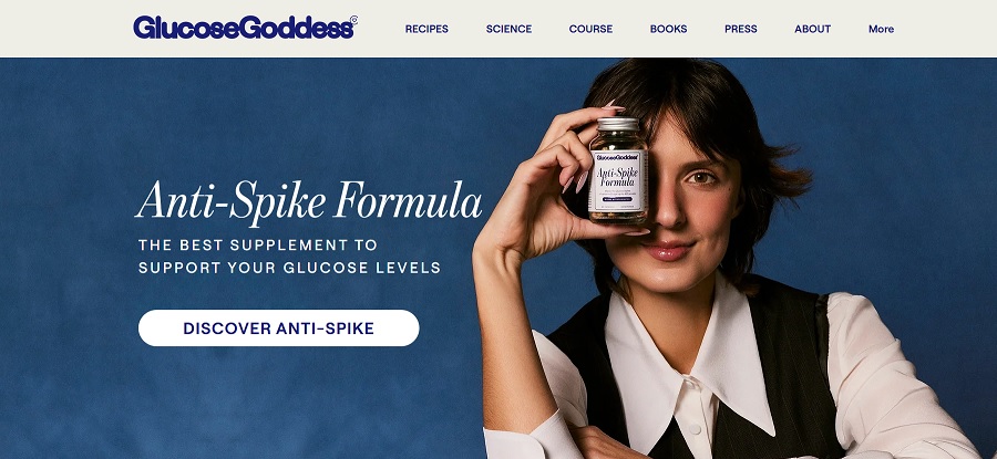
Excellent Hero Image
Take a look at the hero image at Glucose Goddess. It features the biochemist herself holding up one of her popular products to grab attention. Jessie is a beautiful woman and her bright eyes, cute hairstyle and friendly personality shine through the image. The background repeats the blue color palette.
You’ve heard us mention keeping navigation intuitive before. Less is more when it comes to your main categories. Try to keep the number as small as possible. You’ll notice that Glucose Goddess has only seven options in the nav bar. There is a “more” link to expand the menu, but the top choices are what users see first.
Typographic Hierarchy
Another thing we loved about Jessie’s Glucose Goddess website was the typographical elements. There is a hierarchy that points site visitors to the most crucial elements on the page. For example, the headline on the hero image is “Anti-Spike Formula. Those letters are in a serif font, slightly slanted and larger and bolder than the rest of the text. The tagline under is in a sans serif font and smaller and a bit less bold.
Strong Calls to Action (CTAs)
The CTAs on this page were the element that made it a clear winner. Not only are they placed perfectly to grab user attention but the language moves the customer to the next stage of the buyer’s journey.
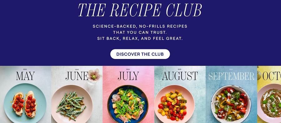
The first CTA is above the fold and imposed in a capsule button on top of the hero image. It reads simply, “Discover Anti-Spike.” Scroll down a bit and you’ll see another section that lays out some delicious looking menu options for each month of the year by showcasing an image. The section scrolls so you can see the entire year of suggestions. Just above the image calendar is an invitation to “Discover the Club,” referring to Jessie’s recipe club.
Testimonials
People are used to so-called experts trying to sell them another diet plan. They may feel reluctant to believe anything they hear from the industry. However, the Glucose Goddess website combats that challenge by sharing multiple testimonials from those who’ve tried the hacks.
Something kind of interesting the designer did was to underline key phrases within the testimonials. For example, a pink underline appears under phrases such as:
- “No more sugar cravings!”
- “My skin and my hair look better.”
- “For the first time in my life, I’m really motivated.”
- “I honestly feel that my cravings are not there anymore.”
The design even includes a “Load More” button so the user can see additional reviews of the program.
Mobile Responsiveness
We always test mobile responsiveness before recommending a site for the Designerly Award. Glucose Goddess doesn’t disappoint, loading equally well and at lightning-fast pace on an iPhone device and a tablet. The images adjust a bit and everything grows longer and narrower but the look is quite similar to the desktop version.
No Pop Ups
The site doesn’t use a bunch of pesky popups to get you to subscribe to something, which is refreshing. You will find a newsletter link with the traditional signup form if you want to be part of ongoing news. However, it is your choice to navigate to the page and a simple form to fill out and get signed up quickly.
What We Would Do Different
Glucose Goddess is one of those rare sites we wouldn’t change much about. We would probably move some of the videos up and make them align to the right or left of other text so users who prefer video over text could more easily absorb the information in their format of choice. However, the site does an excellent job of moving users through the buyer’s journey smoothly and successfully.


Leave a Comment