

When Cracker Barrel quietly pared its old, folksy sign down to a spare wordmark, people on social feeds reacted fast. Some found it quite comical, while others mourned the loss of a familiar face. The logo simplification created tension between fans who saw a character vanish and brand teams that called it modernization. It was not the reaction that Cracker Barrel had expected, so the restaurant chain was forced to revert to its old ways after an entire rebrand.
Cracker Barrel is not the only company turning to logo simplification — it is a common occurrence among many household names. Companies are swapping intricate marks for geometric, sans-serif logos, which designers call “blanding.” It solves real business problems, but it can also scrub away the personality that makes a brand memorable, creating several reputational risks. Why do logos look the same now?
Why Simpler Is Seemingly Better
Why are brand logos getting simpler? It could be due to the following reasons.
A Psychological Appeal
Human brains crave shortcuts. Clean, geometric marks reduce visual clutter and make a logo easier to recognize and remember, especially when people are skimming feeds. A pared-back shape or single, strong wordmark lowers cognitive load and makes the brand feel quicker to understand. A simplistic design can also improve consumers’ decision-making by reducing choice overload and making the most important brand cue faster to process.
Versatile and Adaptable
Logo simplification also leads to versatility. A minimalist logo scales predictably across contexts, whether on a giant roadside sign or a postage stamp. Additionally, it is more cost-effective and efficient to reproduce across various packaging and marketing materials. One tidy asset working in dozens of places makes it easy for busy marketing teams to scale it across practically anything in a short amount of time.
Seamless Look on Every Device
Design choices follow where attention goes. With most people accessing brands first on handheld devices, legibility at thumb size is nonnegotiable. Industry forecasts now project the global number of smartphone users could rise to 7.52 billion within the next five years, which helps explain why mobile-friendly marks top brand teams’ priority lists.
One commenter in a r/Design Reddit thread even explains that the digital world has forced brandmarks to be “legible at scale on mobile,” so many companies now favor streamlined looks that read clearly at smaller sizes.
Global Ambitions and Modern Aesthetics
Finally, there is a cultural logic. Minimal, sans-serif designs convey a modern and globally neutral aesthetic. They strip local or literal imagery that may confuse international audiences and instead promise a timelessness and broad appeal. That is attractive to companies chasing scale, but it is also why every logo looks the same now. After a wave of redesigns, many brands begin to look uncomfortably similar.
Simplification Can Erase Personality
A minimalist aesthetic can provide several gains for brands. However, when a company has had the same logo for years and then drastically scales back its distinctiveness, it can erase decades of visual familiarity and nostalgia in a single refresh. That loss feels personal to customers who grew up with the same look since their childhoods, which often spills into public anger.
Loyal customers do not always see a redesign as “modernization” — many read it as erasure. Social feeds fill with screengrabs and viral think pieces, and brands can face sustained negative press that undercuts the intended benefit of the update. Poor reactions can weaken trust and slow adoption of the new identity.
What is even worse is that these trends can erode competitor differentiation. If countless companies adopt the same look, distinctiveness becomes the casualty. It can be harder for a brand to stand out and even more challenging for consumers to remember which product belongs to which company.
Before and After Examples in Simplification
Simplifying a logo can lead to a win-or-lose situation, depending on the tactic used in a rebrand. Below are a few examples that show what real brands gained and lost.
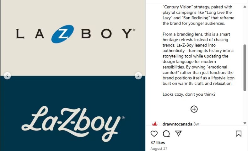
La-Z-Boy’s Win With Heritage Refresh
La-Z-Boy’s refresh is a good example of a heritage brand that has simplified without seeming to discard its past. Rather than strip the company of its personality, the design team leaned into the brand’s emotional core of comfort, craft and nostalgia. It then translated those cues into a cleaner visual language and storytelling platform.
That approach was evident in press coverage and social media posts. For instance, design-minded Instagram threads praised the work as a “heritage refresh” that reframes the brand for younger audiences. Additionally, outlets like The Drum described the effort as a rare legacy update that feels tasteful rather than dated.
Source: https://www.instagram.com/p/DN3lQHX4lwd/?img_index=2
What made the relaunch land well was the pairing of visual changes with a clear narrative and playful campaign work. Slogans reframed reclining as a cozy lifestyle rather than as “the chair dad used to fall asleep in during a football game.”
Today, the new identity pays homage to the brand’s original 1927 wordmark, which represents the curves and cushions of recliners while adapting to the modern age of interiors and younger consumer lifestyles.
Cracker Barrel’s Redesign Nightmare
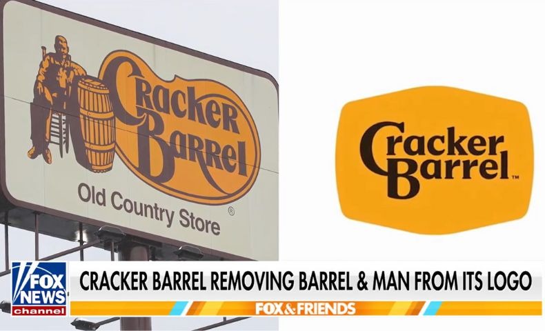
When Cracker Barrel unveiled its refresh, the most obvious change was the removal of the longtime illustrated “old-timer,” which was a seated man leaning on a barrel that had anchored the brand since the 1970s. The missing illustration and a far simpler wordmark stripped away a literal piece of the chain’s “old country store” persona. They left behind a flatter, more modern look that many customers read as emotionless.
Source: https://www.tiktok.com/@cnbc/video/7541395177504607502
People reacted swiftly to the brand redesign on social media. On TikTok, one loyal customer summed up the mood for many — “If it ain’t broke, don’t fix it.” She added that she did not like the change and would most likely not return because of it. The news media further amplified the controversy, making it a national story. Within days, the company reversed course and pledged to keep its familiar look in prominent uses while rethinking the rollout.
Should a Brand Simplify Its Logo?
Some brands may need a simpler mark, while others could do without one, as it is unnecessary. Think of simplification this way — it can be useful for specific problems, but risky if used because it is fashionable. Before greenlighting a redesign, run through the following checklist:
- Define the problem and goal: What is the company trying to solve? Is it for legibility on small screens, a repositioning toward younger buyers or a cost-production complexity? If the redesign can solve a clear problem, then move forward.
- Honor the story and values: If an identity carries heritage equity, plan how to preserve or translate key cues so longtime customers will still recognize themselves in the brand.
- Audit the competition: How will the new mark sit beside direct competitors? Aim for functional simplicity without sacrificing true differentiation.
- Test performance across real contexts: Mock it up across a favicon, app icon, merchandise and packaging. Does it stay legible and on-brand everywhere? Technical checks at tiny sizes catch most surprises.
- Validate with customer feedback: Do quick qualitative tests with focus groups, social listening and short surveys. Early signal checks reduce the chance of an expensive public backlash.
As a key takeaway, know that simplification is a strategy and not mandatory. It should be done for the right reasons rather than for trends alone. Otherwise, a brand can risk erasing the very things customers love.
Balancing Modernity With Identity
Logo simplification can solve actual customer problems, but it can also erase the character that makes a brand feel human. Before undertaking a redesign, weigh the benefits against the cultural costs. If it makes sense to change, conduct thorough research and strategize to minimize risk. When simplification is tactical, it can sharpen a brand’s identity without losing what people love.


Leave a Comment