
As America’s pastime, baseball has remained in the public eye for over a century. That long legacy in the spotlight means professional baseball teams have had to learn a thing or two about adapting their public image. As such, MLB logos can be an excellent lesson in graphic design.
You can find inspiration in any sports organization, but the MLB is the oldest in America, so its logos are some of the most enduring. Here are 10 iconic MLB logos and what you can learn from them about graphic design.
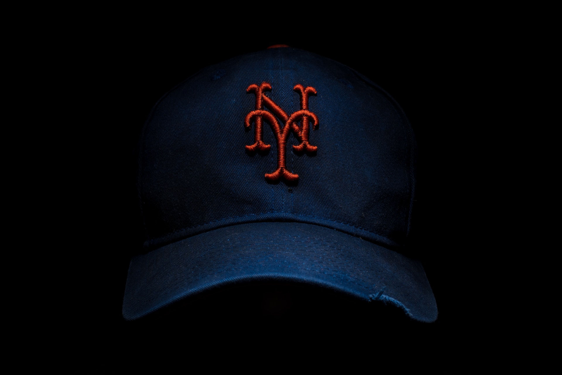
1. New York Yankees
The New York Yankees are one of the most recognizable names in baseball, and their cap logo is equally iconic. Even people who aren’t fans of baseball proudly wear clothes emblazoned with the “NY” design, and it’s easy to see why. The logo encapsulates all four crucial elements of graphic design — simplicity, memorability, adaptability and timelessness.
The “Y” in the logo could stand for “Yankees” as easily as it stands for “York.” Confining the logo to just two letters has also helped cement its iconic status. It doesn’t scream baseball but offers a memorable representation of the city. As such, it’s become synonymous with New York City as a whole, not just the team, propelling it into popularity.
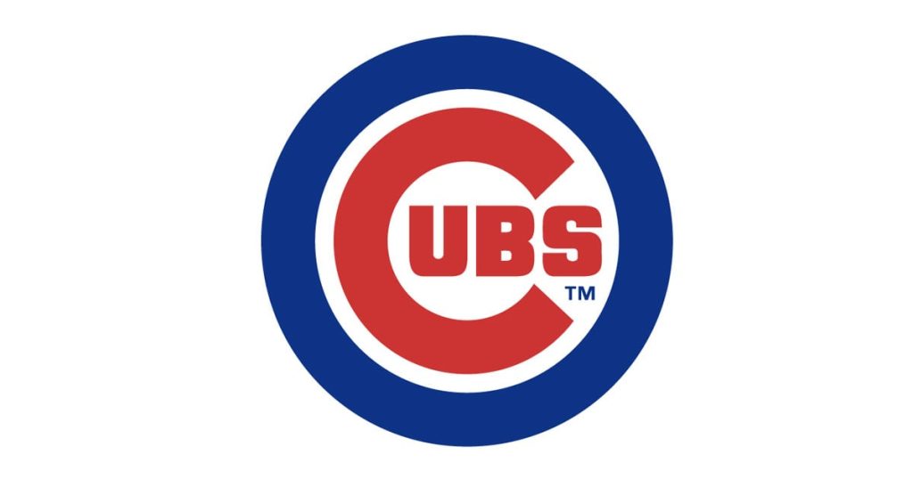
2. Chicago Cubs
While the Yankees’ logo has remained virtually unchanged for over 100 years, the Cubs’ has undergone several redesigns. Its current version is its most stripped-back, but it’s still impactful in its simplicity.
The most striking feature of this MLB logo is its color scheme. The bold red, white and blue provide eye-catching contrast while ensuring the team’s identity — much like baseball itself — remains quintessentially American.
The Cubs’ logo used to feature their animal namesake, but removing it makes the emblem less busy and easier to interpret. As a bonus, the encircled “C” design emulates a copyright symbol — which all logos need — though this similarity doesn’t have any legal effect.
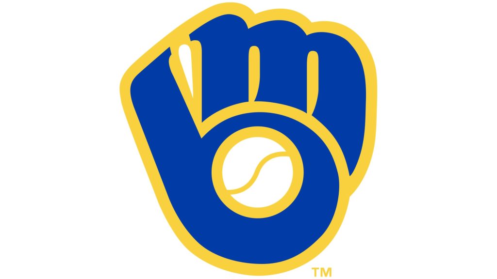
3. Milwaukee Brewers
The Brewers may not be as famous a team as the Yankees or Cubs, but their logo is a masterclass in hidden complexity. At first glance, it appears relatively straightforward — it’s a baseball mitt catching a ball. If you look closely, however, you’ll notice it bears the team’s initials.
The fingers of the mitt form an “M,” while the thumb and ball create a “B.” By removing serifs and other complicated typography, the letters don’t distract from the easily recognizable glove image. At the same time, the bold yellow lines provide enough separation to reveal the letters to anyone who looks twice.
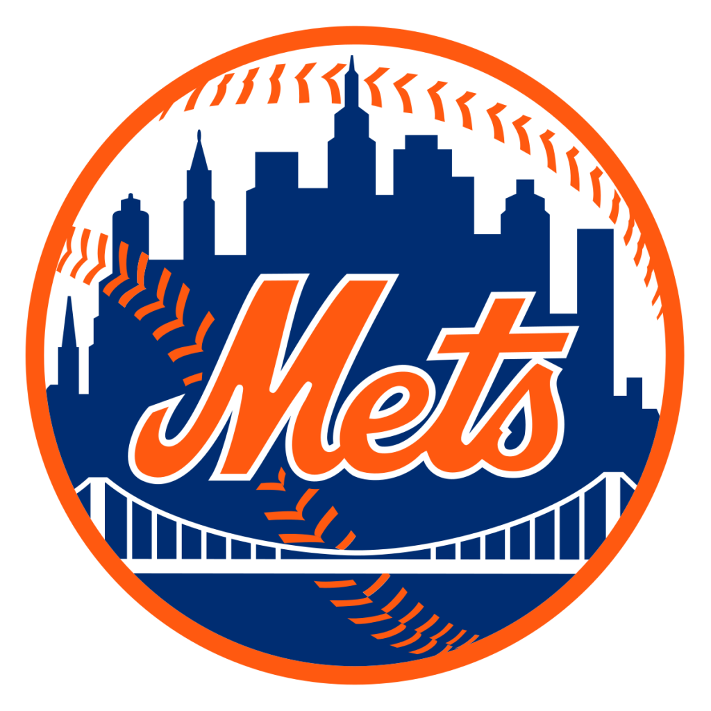
4. New York Mets
While the Brewers’ logo utilizes a deceptively simple design, the Mets’ manages to be detailed without being busy. The key to that balance lies in silhouetting and color contrast.
Because the New York City skyline in the logo is a silhouette, it frames the team name without making it difficult to read. Contrasting colors boost this effect. The skyline also rises and falls with the peaks of the letters themselves, helping it blend in further.
The Mets’ logo also featured a small “NY” until 1999, when they adopted the emblem we know today. This change created more negative space to amplify the color contrast and prevent the logo from being hard to read. It also allows more attention to the skyline, cementing the connection to New York City even without the initials.
5. Toronto Blue Jays
Another of the best MLB logos to combine simplicity and detail is that of the Toronto Blue Jays. The logo’s silhouette is one of the most unique in baseball, forgoing the classic circular emblem design many teams favor. At the same time, the blue jay itself consists of just four shapes and no words.
Despite lacking any lettering, the logo depicts everything that sets the Blue Jays apart. The bird’s head shape is easily recognizable as the team’s namesake, and a simple maple leaf makes it undeniably Canadian — fitting for the only non-U.S. team in the league.
6. St. Louis Cardinals
St. Louis has another excellent bird-themed logo. Compared to the Blue Jays, though, the Cardinals have a much more complex design. It forgoes minimalistic line art in favor of a complete and relatively detailed drawing of a cardinal sitting on a bat above the team’s name.
If the Blue Jays’ logo is a study in modern, sleek design, the Cardinals’ represents nostalgic marketing. The more realistic drawing and cursive lettering harken back to an older time. That’s not a mistake, either, as the current design takes inspiration from the team’s 1920s logo.
It’s also worth noting that despite the logo’s relative complexity, it’s still easy to read. That’s because the lettering doesn’t intersect much with the illustration, and bold lines separate individual elements.
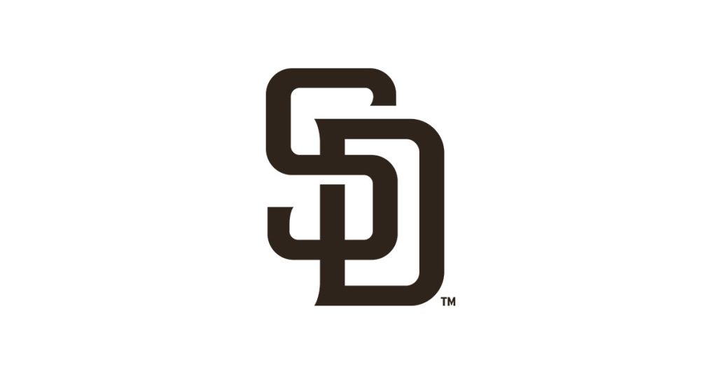
7. San Diego Padres
On the opposite side of the spectrum is the Padres. San Diego’s logo used to be far more complex but, like many social media logos, got progressively simpler over time. Like the Yankees’, the Padres’ design simply combines two letters, but a second glance reveals it’s more unique than it initially seems.
The intersection between the “S” and “D” for “San Diego” forms a subtle “P” for “Padres.” This clever illusion sets an otherwise run-of-the-mill logo apart from the other teams in the league. Another unique consideration is that the Padres opted for brown instead of a more eye-catching hue to represent the team’s uncommon uniform colors.
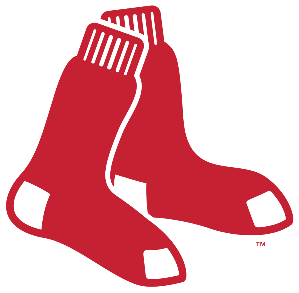
8. Boston Red Sox
Another MLB logo that excels in simplicity is the Red Sox’s letter-less design. Whereas San Diego relied on initials to represent their team, Boston took the other route and relied solely on illustration. No words are necessary because the image depicts the team name exactly — it’s a pair of red socks.
Using negative space to outline one sock where it crosses over the other lets the logo use a single color. As a result, it can stand out no matter what background you put behind it. Like the Blue Jays, the Red Sox also chose to remove the traditional circle from around their logo, bringing more emphasis to its unique shape.
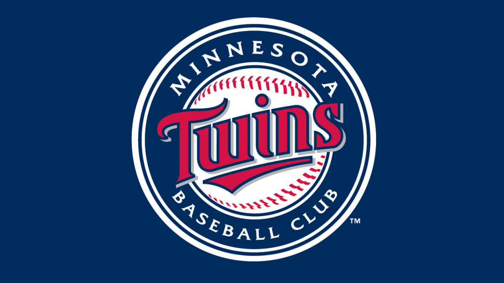
9. Minnesota Twins
Minnesota’s logo is busier but still impactful. Despite being more complex, contrasting colors and the use of deeper shades instead of two equally vibrant hues ensure its readability. More notable, though, is the hidden message in its team name.
The underline in “Twins” doesn’t span the whole word. Instead, it highlights the “win.” The baseball design in the background also ends around this word within a word, further emphasizing it. It’s subtle but leaves a lasting impression once you notice it.
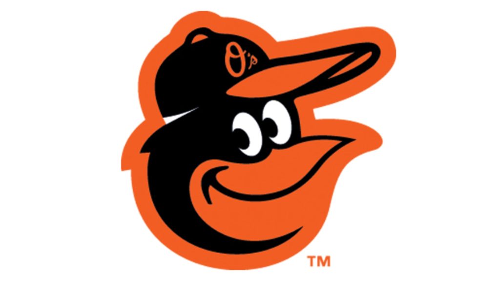
10. Baltimore Orioles
The final spot on this list of the most iconic MLB logos is perhaps the most unique. While most teams in the league use some form of lettering, circular emblems or line art, Baltimore embraces the cartoony. It’s not the only team to depict a bird, but it is the only one with a big smile and googly eyes.
Some may argue the Orioles’ logo is silly, but it’s undeniably memorable. Helping it stand out is the fact that it’s open to some interpretation. The lack of a hard line at the bottom of the oriole’s beak can open debate as to whether its mouth is open or closed. Generating discussion around a logo brings more attention to it, making this ambiguity a clever design trick.
Learn From These MLB Logos
There are 30 teams in major league baseball, but these 10 MLB logos are among the best from a graphic design perspective. Any designer can learn a lot from the different approaches these emblems showcase. Whether your organization wants to embrace the simple, the complex or the unusual, there’s a way to stand out no matter your specific goals.


Leave a Comment