

In This Article
Broadway has been the epicenter of live theater for quite some time. The best of the best take the stage every night. While it’s worth experiencing a Broadway show, tickets are always expensive and hard to acquire.
So how do Broadway shows entice people to see their performance?
Look around Times Square. You’ll see billboard after billboard advertising Broadway’s best productions. Each billboard is stamped with the show’s logo. The logo has to communicate the story and tone of the show to New Yorkers as they walk by (usually yelling at taxi drivers).
Show logos are important to the success of a Broadway show — and here are the top Broadway show logos:
Jump to: Hamilton | The Lion King | The Book of Mormon | Cats | Kinky Boots | The Phantom of the Opera | Wicked | Hairspray | West Side Story | Chicago | Les Miserables | Mean Girls | Beauty and the Beast | Grease | Disney’s Frozen | King Kong | Freestyle Love Supreme | Waitress | Come From Away | School of Rock | Pretty Woman | The Play that Goes Wrong | Aladdin
Hamilton

Very few musicals have become a cultural phenomenon like Hamilton. The musical is the story of a bastard orphan whose determination leads him to become a war hero, Founding Father and creator of America’s financial system.
How do you fit all of this into a logo? Well, the graphic designer definitely didn’t throw away his shot.

(I didn’t have enough time to make a Hamilton costume for Halloween this year…. I guess painting my pumpkin will suffice.)
Since Hamilton is a historical musical, everyone knows it’s going to end with the duel between Alexander Hamilton and Aaron Burr. Now think back to the time you skimmed through your history textbook. You may recall that the duel ended with Burr shooting Hamilton after Hamilton fired at the sky.
Hamilton’s point to the sky comes into play many times over the course of the musical. At first it represents his ambition to rise to the top. Then Hamilton, who is a changed man by the end of the show, raises his gun to the sky because killing Burr is the one shot he isn’t willing to take — a key story element that showcases Hamilton’s story arc. The image used in the show’s logo tells you everything you need to know about the story before you walk into the theater.
The Lion King

The musical based on the popular Disney movie has been on Broadway for quite some time. The Broadway production had to separate itself from the film, while keeping the same tragedy, character relationships, emotions and triumph that everyone loved.
To The Lion King’s graphic designer, I say this–Hakuna Matata, my friend.
The Lion King’s logo gives the play a completely different vibe, but at the same time it feels recognizable. Other than the Disney logo at the top, everything else is different. The font and cave-painting-esque lion somehow feels familiar. The logo seems like it could be pulled directly from the movie, yet it sets a different tone that can only be utilized for the Broadway show.
The Book of Mormon

Hello! My name is Elder Price, and I would like share with you the most amazing logo.
Written by the minds of South Park, The Book of Mormon has become well known as one of Broadway’s funniest shows of all-time. The musical opens with a comical take on Mormon’s door-to-door marketing mission, which is what most non-Mormons know about the religion. The doorbell acting as a letter in the logo is brilliant.

The doorbell reflects what everyone knows about Mormons. The story delves into the religion—with a more comical take that may not accurately reflect the Mormon religion. Either way, it lets the audience into the story before they even buy a ticket.
Cats

Mystique, dance and fur balls—they all come to mind when you think of Andrew Lloyd Webber’s musical Cats. The same words (well, maybe minus the fur balls) come to mind when you see the logo for Cats.
Cats are mysterious creatures, which is why the Broadway production is a mysterious show. Cats’ eyes always stand out. Whether they’re sitting in the dark or strutting around in broad daylight, you notice their eyes.
The black background and yellow eyes is an incredibly appropriate design for the show’s logo. Also, the pupils in the eyes are the characters dancing. The logo captures the essence of the characters and aura of the show.
Kinky Boots

Kinky Boots is a musical about a shoe factory owner who teams up with a drag queen to produce a line of high-heeled boots in an effort to save the company.
Another fun fact about Kinky Boots: its logo is perfect for the show.
The most obvious aspect of this logo is the K, formed from two high-heeled boots. The product, of course, is the main feature of the show—and spoiler alert: It’s what will save the factory from going out of business. It’s an important element of the story, and it should be showcased in the logo.
The font—bright red—and sparkles fit the show very well. It’s loud and stands out and a true representation of the show.
The Phantom of the Opera

The iconic mask. The shattered typography. What else could you need?
The phantom’s mask is the embodiment of his character. It’s the first thing people think about when they see the words, The Phantom of the Opera. The shattered font is a nod to the memorable chandelier scene.

Every element of the logo summarizes the story of the musical without giving anything away. It also gives off a sense of mystery, which adds to the suspense throughout the musical. Remember to keep the story of your musical, movie or business in mind when you’re designing an entertainment logo.
Wicked

When you think of Wicked, the color green comes to mind.
It’s the trait that separates The Wicked Witch of the West from every other character. The separation leads to Elphaba developing feelings and motives that drive the story. The color green is also used as a lighting effect throughout the play. It’s synonymous with her character in The Wizard of Oz, and that’s why the graphic designer put it on display.
Hairspray

Hairspray offers social commentary on a very serious topic: equality and race relations. However, its out-of-place protagonist leads the audience through the topic in a light-hearted and comical way.
The logo for Hairspray focuses on the enthusiastic aspect of the show. The font is light and fun. It looks like a logo for a sitcom, which works well because a television show is an important part of the story.
When creating a logo, try to encapsulate the essence and tone of the story. Hairspray does this by bringing out the light tone that makes the show so appealing.
West Side Story

How do you create a logo for a musical that follows a love story and two rival gangs? A bold stencil design will do.

The strong stencil design looks like street art you’d find in a city. The red color also foreshadows the violence that’s to come. Notice the white splotches in the design, which could represent blood that’s bound to be spilled in a story about rival gangs. The strong logo also aids the story of the musical.
Chicago

Bright lights and a strong culture, the logo for the musical Chicago reflects all that jazz.
The musical is about a crime that takes place in Chicago. Suddenly the bright lights have a different meaning when the musical tells the story of a trial. The logo surprises the audience by bringing them to a story they weren’t expecting.
Les Miserables
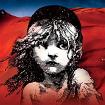
Originally a French historical novel set during the French Revolution, the Broadway production is a musical form of Victor Hugo’s novel. Nicknamed Les Mis, the production first premiered in 1980. Since 1985, Les Mis has run continuously in London, making it the longest-running musical there and the second longest-running musical in the world.
The story is about pain, love, loss and war and follows the life of Jean Valjean, a French peasant imprisoned for stealing bread for a starving family member and set out to redeem himself and change his identity. His daughter becomes involved with a young man trying to overthrow the government.
How do you show the many layers of the musical in a single logo? You use the image of a waif-like child and keep the colors dark and mysterious. The background colors, while dark, are made up of the French flag’s colors of red, white and blue.
Mean Girls
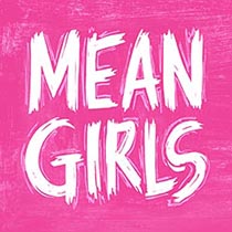
Based on the hit movie originally starring Lindsay Lohan, Mean Girls for broadway sums up the entire show with a broken pink background and letters written as though in an angry scrawl. In the storyline, the mean girls at Cady’s new school keep a burn book, where they scrawl all types of rumors and lies, especially when someone angers them.
The choice of the scrawling print with almost a graffiti look meshes perfectly with the underlying tones and culture of high school mean girls.
Beauty and the Beast

The fairy tale of a beautiful girl who falls in love with a hideous beast is a “tale as old as time.” The musical is based on the Disney version of the story and highlights all the original songs in the animated film as well as one that didn’t make it into the film. It’s among one of the highest grossing musicals of all time, with total revenue of $429,158,458 earned over the 13 years the show ran.
One of the key elements in the storyline is the beast being given a rose by a beautiful enchantress who cursed him. If he doesn’t learn to love another and gain her love in return before the last petal falls, he’ll remain a beast. The logo for the show reflects this part of the storyline. The background is black, and the beast is outlined in white, a rose in his paws with the petals falling off the stem.
Grease

What list of Broadway musicals would be complete without a mention of Grease? One thing about this long-running musical turned into a popular movie is that the length of the show’s popularity means the logo has gone through some changes over the years. Grease hit Chicago in 1971 with the 1950s storyline, which follows the romance of Danny and Sandy at Rydell High School.
The original show had references to Chicago and quite a bit of profanity. The musical’s poster was a black and white rendering of the cast as a whole.

The film based on the musical was released in 1978 and starred John Travolta and Olivia Newton-John as the two love-struck teens. Note how the letters for Grease are still similar, and now the poster features the couple in a close embrace, putting the focus on the romance part of the story.

Today’s Broadway poster is a departure from past renderings, with the focus on Danny. His back is to the audience, and the letters have a new look with a lowercase “G.” What do you think? Do the graffiti letters on the original poster and the movie poster work better, or does this new version? The latest version looks very Broadway, indicating that this rendition is the musical on stage as opposed to the film.
Disney’s Frozen

Disney’s popularity shows in the number of hit Broadway shows based on their animated films. Frozen currently runs on Broadway and makes this list for the interesting logo that explains the basic premise of the storyline. In this tale, Princess Elsa has a special power where she shoots out ice and freezes things, but she doesn’t know how to control the power, and it creates problems for her family and between Elsa and her little sister, Anna.
Note the icy look of the logo and how the letters freeze in a swoop of motion. The tail on the letter “R” is particularly noticeable, and the letter “O” looks as though Elsa started to draw the letter in the air and it froze. The font itself looks like ice.
King Kong
The story of a gargantuan ape captured, brought to the big city and wreaking havoc on people has been retold numerous times for stage and film. The focus of the story is a 20-foot-tall ape found on a mysterious island. He falls in love with an actress and in the end sacrifices his life for her. Note how the logo from 2013 features the ape’s silhouette outlined in front of the letter “O” as though Kong stands in front of a full moon.

The current production features robotics, puppetry and music. The logo again features Kong outlined in front of a full moon, but the image is black and white. The space between his front arms uses a trick of the eye between positive and negative space to create the outline of a woman in the white space.
Freestyle Love Supreme

Lin-Manuel Miranda’s hip-hop troupe is an improvisational show where the cast members take suggestions from the audience and add it to freestyle rapping. The creator of Hamilton started the show off-Broadway, but now it’s on the big stage.
The logo taps into current trends of metallic fonts, using gold, three-dimensional lettering. The script is so fancy that it takes one a minute to realize the letters spell out the initials of the show, FSL. The twirl at the end leads to a gold microphone with sound coming out in bursts.
The logo has a modern look that is also reminiscent of graffiti.
Waitress

Based on a 2007 film, Waitress touches on some troubling subjects, such as domestic violence. Much of the story is set in the diner where Jenna, the main character, works. The logo reflects the neon lights of a diner sign but also gives a nod to the female lead by using pink with a touch of blue.
The design is retro and brings to mind the 50s, making it look timeless. At the same time, it creates a distinctive style that makes it clear where the majority of the play is set.
Come From Away

Come From Away is a Canadian musical based on the events of September 11, 2001. The music and lyrics were created by Irene Sankoff and David Hein. The story is set in Gander, Canada and tells the true tale of 7,000 passengers from grounded planes and how the small town housed and fed everyone while comforting them through a difficult time.
The logo uses fat, chalky looking yellow letters, which puts the main focus on the blue globe used in place of the letter “O.” The globe likely represents that we’re all part of a bigger community, that it’s important to remember our humanity and show kindness to one another.
The design on the website also includes an emblem to show that the play is a Critic’s Pick from the Times. Other lettering indicates the musical is based on a true story.
School of Rock

The music in this play, based on a 2003 film starring Jack Black, was created by Andrew Lloyd Webber with lyrics added by Glenn Slater. Open since 2015, the logo has gone through a few changes in the last four years but maintained a thick, stenciled look with red letters throughout.
Some renditions of the logo feature a serpent to the left of the letter “S,” and a private school emblem. The current logo on the website features silver rather than a white outline, and a banner signifying the play is a musical.
Pretty Woman

The logo for Pretty Woman looks more like a website header than a Broadway logo. Thick, red letters for the title with a slight shadow gives it some depth. The title is in upper case, as are the words “the musical,” turned on its side between “pretty” and “woman.”
Across the top are words that play on a famous line from the show, and appear to be handwritten by Vivian — the main character.
The Play that Goes Wrong

The Play that Goes Wrong won a Best New Comedy Award in 2015. As a nod to the title of the play, and the crazy antics of the characters, the logo takes the word “wrong” and sets it askew from the other letters.
The type is a simple serif font with straight, traditional lines and tall, thin letters. The look is reminiscent of styles such as Ransahoff font. The letters are black until you get to the word “wrong.” Then the design shifts to a red.
The very last letter of the word seems as though it’s falling off the page, showing the viewer that all isn’t well.
Aladdin

This Disney production offers a lot of things reminiscent of the animated and live-action movies with the same name. The logo looks like a book cover and utilizes the brand name to indicate it’s sponsored by the entertainment giant.
Set in the town of Agrabah, it only makes sense the logo would feature letters with a distinct Middle Eastern look. There’s also a bottle with a golden genie rising out of the spout.
Tell a Story
Broadway show logos are a part of the production’s story. Tell a story in your designs, and make sure your logo is representative of the product.


Leave a Comment