


What are the top website navigation best practices currently? The world has shifted in the last few years, with more people online and shopping digitally. How can you ensure you’re meeting user expectations in a new world?
When people land on your website, one of the first things they do is look for your navigation bar to acclimate themselves to your site. Ideally, the nav bar is in the same spot on every page. What is the magic formula that makes one website’s navigation stand out from another’s? Why are some pages so intuitive and user friendly while others fall flat? Website navigation best practices make your design stellar instead of stale.
Recent research from Nielsen Norman Group shows websites with many different categories do better when vertical menus allow for expansion and quick scanning. Don’t be so tied into the way you’ve always done navigation that you don’t seek other options. Website navigation best practices take time to implement effectively, so try things and test them to see how your audience responds.
Good navigation isn’t one type or style. Excellent examples vary widely. However, they all have a few things in common you can apply to your own navigation design.
1. Limit Categories
One of the top website navigation best practices involves reducing the number of categories to a handful. Too many options confuses the user. Cut out any clutter and look for patterns so you can combine two areas into one.
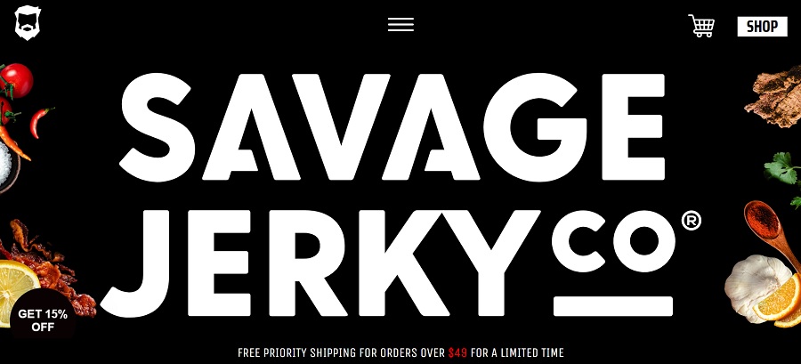
Source: https://savagejerky.com
Savage Jerky Co. reduces the options down a simple hamburger menu at the top of the page. When the user clicks on the icon, the menu expands into three simple options: Home, Jerky or Extras. Everything on the site fits within one of the three tabs.
2. Go Responsive
Mobile traffic is now at 54.4% of all website traffic, surpassing those browsing on their desktops. Another website navigation best practice is to test for mobile devices. Just because navigation looks great on a desktop doesn’t mean it translates well to a smaller screen. Also, keep in mind how people tap buttons and text on their smartphones. Is the placement conducive to easy access?
3. Create Interactivity
You’re competing with millions of other things to capture user attention. Not only must you grab their interest away from competitors, but they may bounce away to social media, listen to music, chat with a friend or check email rather than staying on your site.
Look for ways to make your menu interactive. The more engaged the user is, the more likely they’ll click on something and move forward on the buyer’s journey.
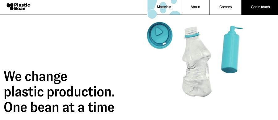
Source: https://www.plasticbean.com
Plastic Bean adds a blue dot for a cursor. When the user moves it around the screen, it morphs over the navigation menu. The effect is almost like a retro lava lamp. The color grabs attention on an otherwise mostly white page with black text and a blue bottle.
4. Stick With What Works
Even though it’s okay to add in some new elements to keep up with the changing times, you also should stick to the tried and true. When people land on a website, they know to look toward the top for navigation and possibly a repeat of some of the categories in the footer.
Website navigation best practices insist the menu be above the fold. You can play around with center, left or right but make sure it’s one of the first things users see when they land on your page.
Your navigation bar should also be a slightly different color so it draws attention. You want to set your menu apart from the rest of the page.
When planning out your site’s navigation, think about the way people naturally move through your site. Are there some areas that are main categories and others that are sub categories? You can utilize heat maps to see what pages are most popular or study website analytics.
Decide how you’ll show main categories and subcategories for easy movement through your site. Consider what you might add over time and how it fits into your plan.
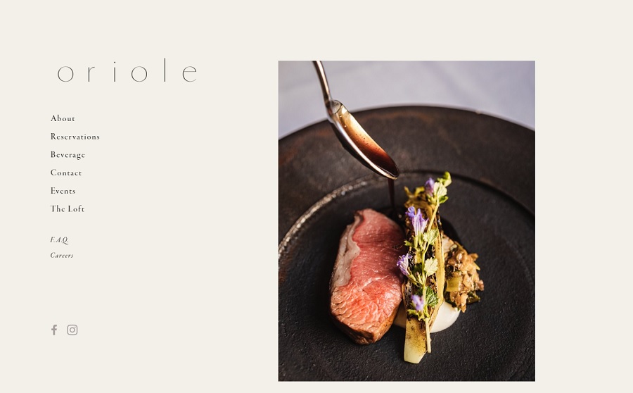
Source: https://www.oriolechicago.com
Oriole places their menu to the left side of the landing page. Note how the hierarchy shows in the font used. The main categories are in a serif font without italics. The lesser-visited areas are in italics.
Another option is to have a dropdown menu with subcategories listed under each main category. As the site grows, consider a mega menu to expand on subcategories with sub-subcategories.
6. Add Separation
Set your navigation a little apart from the rest of the page by adding some white space before you start on the body of your design. For example, if you’re using a hero image near the top of the page, you might place the navigation just above but leave a few lines of space between the two so users know they are two separate entities.
If website navigation best practices include anything it should be a clear view of what the menu does. If anything isn’t obvious to users, change the wording or categorization until it is. Survey your top customers and ask them how well the current menu works to suit their needs. Do they visit a particular page and have to take several steps to get to it? Perhaps a login within the menu would be beneficial.
Look for ways to improve website navigation best practices until your site stands out from every competitor you have. With a little time and effort, you can create a site that is user friendly and highly intuitive.


Leave a Comment