

How attractive is your sales funnel? The buyer journey makes or breaks your conversion rates on your website. If your sales funnel is bulky, hard to navigate, confusing or just visually displeasing, you may lose out on sales you could secure.
At least 50% of your prospects aren’t a good match for what you sell. Instead, you should funnel those who are a good match on to the next wrung in the sales funnel to eventually convert them into buyers. Clearly label everything and drive people to action. You have mere seconds to make an impression on the qualified leads who land on your page.
Need help converting prospects into buyers? Here are seven ways to make your sales funnel more visually appealing to encourage prospective customers to move through the buyer’s journey.
1. Add Images
The human brain processes images must faster than the written word. You can use this knowledge to drive your users through the sales process. Offer rich images highly relevant to what you’re selling. Show people taking the action you’d like your site visitors to take or using your product or service. The more you personalize the images to your brand, the more impact they’ll have on your users.
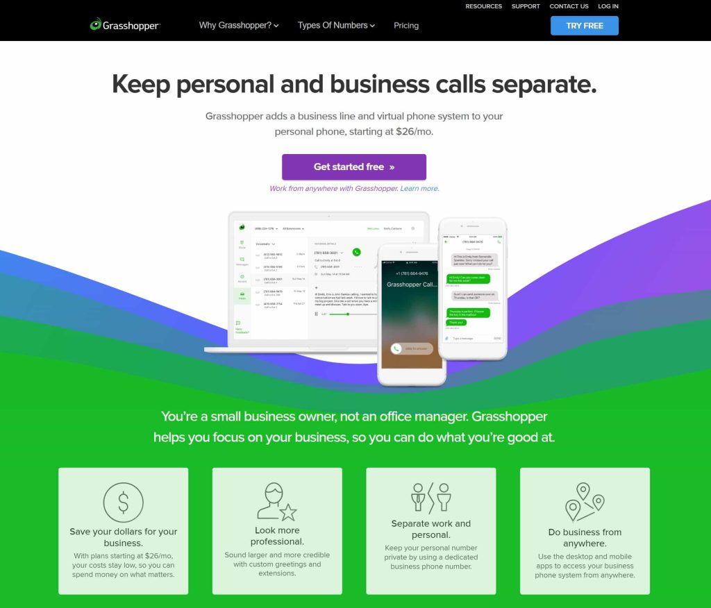
Grasshopper invites visitors to get started for free. They use an image of their business phone solutions through a screen that lists business calls, how they come in and how customers can respond. The user moves from the awareness phase into the interest phase by clicking on the call to action. Then, the brand offers some more detailed shots of both a desktop screen and a smartphone screen along with text that details the product’s features.
2. Keep the Design Simple
Over time, your landing page and the pages that take the user through the different stages of the sales funnel can become cluttered.
Look at each page the buyer goes through on their journey toward converting into a loyal customer. Is everything on the page necessary? What can you cut without losing meaning? Experiment by cutting one thing at a time and conducting some split testing to see how the removal impacts conversions.
3. Reach Multiple Audiences
If your business services several types of buyers, you’ll want to create a clear path to different funnels. For example, if you run both a business to business (B2B) and business to consumer (B2C) model, you’d need two distinct funnels.
The more you personalize each person’s trip, the more likely they’ll buy from you. Figure out who your buyer personas are, and develop a separate sales funnel where it makes sense.
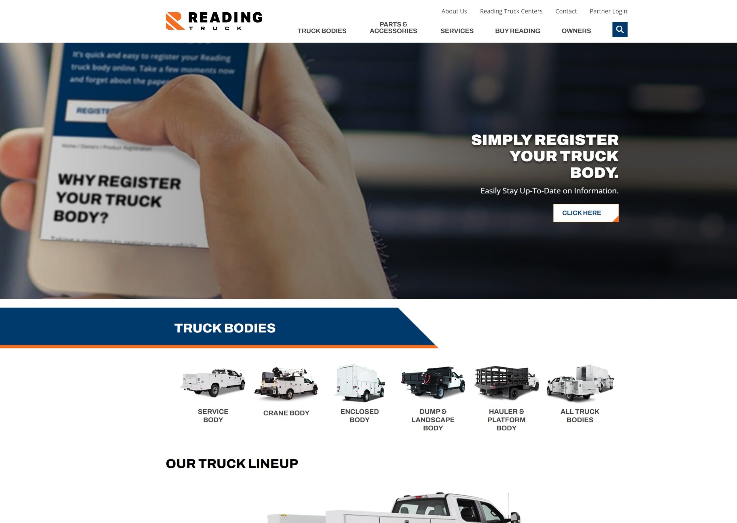
Reading Truck Body does an excellent job of segmenting their awareness page of the funnel into distinct buyer persona types. The company understands various kinds of buyers invest in their products, and they include a link for dealers and businesses with fleets of vehicles. They also offer the opportunity to learn more about becoming a distributor of their products. Separating these distinct buyer types allows them to provide a more personalized experience.
4. Design for the Process
Consider the stage the buyer is in throughout the journey. For example, cover basic information about your product and its functions on the landing page, where you want to develop initial awareness. Focus on the customer’s pain points and how you can solve them.
As the buyer proceeds through the stages, what information would most likely move them on to the next level of the funnel? Design according to the action you want the user to take on that page, and remove anything that doesn’t achieve that goal.
5. Ramp Up Calls to Action
Your calls to action need to stand out from anything else on the page and guide the buyer through each step of the process. In a study of more than 330,000 CTAs, researchers found personalized CTAs convert 202% better.
A CTA is about more than the words on a button, though. The icon’s color must contrast sharply with the other elements on the page so that the buyer finds it easily. An influential CTA button also stands out by being larger or slightly beveled on the edges. Try different techniques for your CTAs until you find the perfect mix.
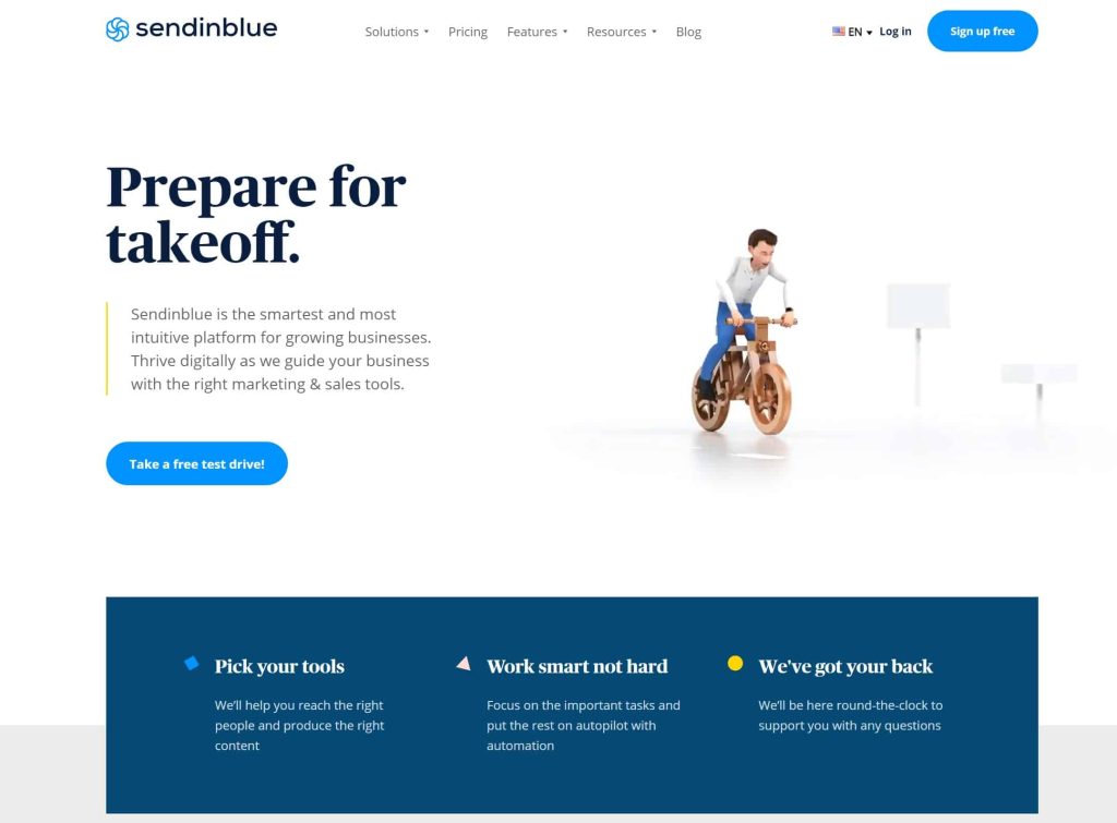
Sendinblue offers the perfect awareness stage page for their sales funnel. Its strong CTA draws the user in and invites them to try out their free service.
An animation and the invitation to “Prepare for Takeoff” appears above the fold. The company then uses a bright blue CTA button to draw user attention and take a “free” test drive — grabbing interest in the initial phase. The second phase gathers some information and offers additional details about what they have to offer with another CTA that invites the user to “Get Started.”
6. Choose Accessible Fonts
Your pages’ fonts should be accessible no matter what browser or device the person uses. Google offers many free fonts that adapt well. Stay away from fancy scripts for body text — save them only for a logo or your site’s main header to avoid readability issues on a smaller screen. It’s much easier to move the buyer to the next stage of the campaign when they can read your content easily.
7. Focus on Contrast
Your website pages’ different elements should contrast with one another. For example, if your background is dark, your text and CTAs should be lighter.
Whenever possible, add contrast. Go with a slightly lighter hue, or add an overlay for additional vibrancy. Step back from your computer screen to see how the design looks from a distance. Do important elements still pop and grab attention? Also, view the site up close and on a smaller screen to gain an objective view of your site’s appearance on different screens.
From Interest to Desire
The moment a user lands on your page, you must grab them and draw them into the buyer’s journey. Pay attention not just to your initial landing page but every page the user goes through on their adventure toward becoming your customer. If you pay attention to the small details, you’ll quickly see higher conversions and better return on your investment. The extra effort is worth the investment.

Leave a Comment