
During COVID and immediately following, the hospitality industry took big hits. Fortunately, they’re now poised for a strong comeback. This is an excellent time to upgrade your online presence to prepare for future bookings. Finding hotel website design ideas takes time and determination.
Lucky for you, we’ve done the grunt work and tracked down what we think are the best designs out there. We have a few criteria we use for all the WordPress themes we choose to highlight. The design must have been updated in the last few months to keep up with current PHP and WordPress versions. We also look for themes with a free component, even if some features are paid. Finally, we take an overall look at the features.
All other things being equal, we choose the most functional and aesthetically pleasing themes we can find.
What to Include in Your Hotel Website Design
In 2022, the hotel industry was forecast to hit $258.1 billion dollars, reaching and overtaking pre-pandemic numbers. Experts predicted the industry would reach $1.21 trillion in 2023. The growth path tracks steadily upward as of the first quarter of 2024.
Upgrading your website to attract modern post-pandemic world visitors requires some attention to detail. Some key features to include in your website are:
- Photos and description of the key features of your hotel–people want an experience
- Easy reservation call to action button
- Explanation of how to cancel in case of emergency or the visitor changes their mind–transparency is key
- Reviews from past guests
- Highlights about staff and owners to give the site a personal touch
Navigation should be intuitive. The goal of hotel website design is getting users to reserve a stay. The more questions you answer upfront, the less customer service you’ll need to pay for to walk them through the process.
Learn From These Stunning Hotel Websites
We sorted through a ton of hotel websites to find the ones with the best designs. These are the ones that inspired us. We’ll look at each site, what makes it work and what elements you can use in your own hotel website designs.
1. Kimpton Hotels & Restaurants
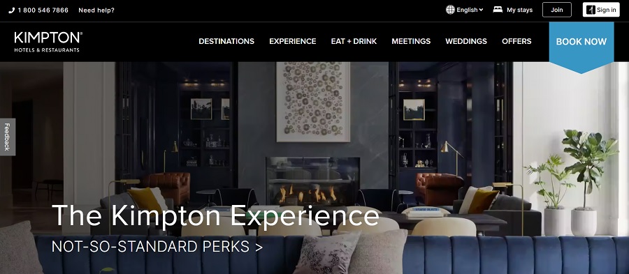
Kimpton Hotels & Restaurants are part of the IHG hospitality network of brands. Because they have big bucks behind them, you can be certain their hotel website design is top-notch. We like the dark blue and black theme of the design. It features a regal look but has enough white space and neutral colors within the photographs to break up the darkness and grab user attention.
Note the bold “Book Now” call to action (CTA) on the far right. It stands out from the rest of the design because of the brighter blue. They list a toll-free number at the top so potential visitors can get in touch.
2. One & Only Cape Town, Africa
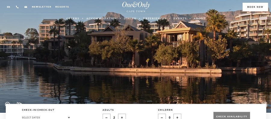
One & Only resorts showcases their luxurious Cape Town, Africa location with a video hero header. The images shuffle through a woman looking out at an amazing view, shots from the water to the bay, a woman running happily and aerial views. You even get a glimpse of the chefs and the restaurant.
Utilizing a video allows you to show more than a single static image and develop a feel for the location you don’t get without moving photos. Videos add a new level of engagement and draw visitors into the scene. They can increase conversions and get you more bookings.
3. Belmond Hotels
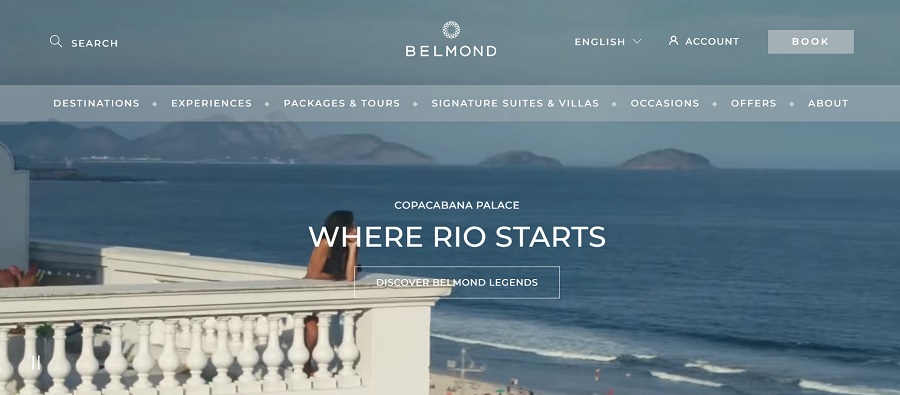
Belmond chain of hotels has a gorgeous main website featuring beautiful views and elegant hotels. The navigational structure works particularly well in its limited but on-point options. You can choose from “Destinations,” “Packages & Tours” and “Offers.” As you scroll down, you can see the latest news from the brand.
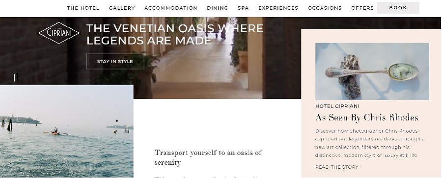
Select a specific hotel, such as the Hotel Cipriani in Venice, Italy, and you get video and views of that particular location. The “Book” button on the navigation bar has a background where the others don’t, to point the user to action. The images are all specific to that hotel. One thing to love if you have multiple locations is that each website is similar in the layout and design but unique in the videos, detailing and images.
4. Galt House, Louisville, Kentucky, United States
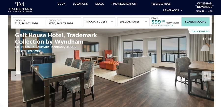
The Galt House in Louisville, Kentucky has a rich history and is known for its grandeur. Part of Wyndham hotels, it takes on the same look as other hotels in this chain. However, one thing we really liked about this design was that the search rooms feature is right at the top of the page. Visitors don’t even have to scroll to get to the booking area. It pops up right there for them.
Adding a booking feature near the top is user-friendly for repeat visitors who already know they want to stay at your location.
5. Kakslauttanen Arctic Resort
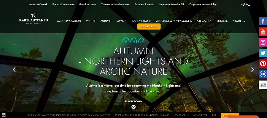
Have you ever wanted to view the northern lights, see an arctic fox or hang out in a glass igloo with a view of stars that reaches to space and beyond? Kakslauttanen Arctic Resort is a unique option for travelers and their website reflects this through slider images showcasing sights you won’t see anywhere else.
Hotel Website Design Should Focus on the User
The best hotel website design tips focus on usability. Site visitors should book easily and get the information they need without having to dig. If unsure about a feature, run some A/B tests to see what customers respond best to. Studying other sites is a good way to figure out what might work for your site, but ultimately your clients may different slightly from another hotel’s patrons. Trust your gut and keep tweaking the design until it’s perfect.


Leave a Comment