What Is Material Design? An Introduction to Google’s Framework

Posted on June 26, 2025 | Updated on June 26, 2025
If you have ever used a Google app and thought about how easy it feels to use, you have experienced the power of Material Design. In 2014, Google introduced this design system to bring consistency and usability to digital platforms.
Material Design has enabled designers to create interfaces that feel familiar and functional, shaping much of the web and mobile experience today. Learning the basics can be a great way to get started if you are ready to use it.
What Is Material Design?
Material Design is Google’s design system, encompassing guidelines, components and tools that help teams build user-friendly digital experiences. It is essentially a blueprint for creating apps and websites that work smoothly across devices.
Material Design is based on the idea of using digital “materials” that behave in the same way as real-world objects. These elements respond to touch, move purposefully, and create depth using shadows and elevation. The goal is to mimic reality just enough to make interactions feel more intuitive. The purpose behind this idea is to reduce cognitive load for users.
Material design helps designers achieve this by offering basic style guides. By providing rules for everything from layout to color — and with accessibility and consistency in mind — it helps you create something that feels familiar and responsive from the first click.
The Key Principles of Material Design
Material Design incorporates a handful of core principles that guide how digital experiences should look, feel and respond. These ideas are rooted in creating intuitive, user-first interfaces.
1. Material as a Metaphor
At the center of Material Design lies the idea of treating user interface (UI) elements like physical objects. Buttons, cards and menus behave like they have weight and dimension, responding to touch and movement in ways that mimic real-life materials. This approach helps users instinctively understand what they can tap, drag or swipe, even if they have never used the app before.
2. Bold, Graphic and Intentional
Material Design encourages the use of color, clean typography and purposeful whitespace, but designers must do so in a meaningful way. Every design choice they make should be intentional, from a pop of color to the size of a heading. This guiding principle ensures you guide user attention to what matters most.
3. Motion as a Thoughtful Element
Motion is more than for flair — it has a purpose. Animations make design intentional by helping users understand transitions, interactions and spatial relationships. This could be through something as simple as a button ripple or a smooth page slide. Either way, the goal is to create a more fluid experience to make usability as easy as possible.
This focus on adaptability is crucial, especially in today’s multi-device world. Recent surveys show that 83% of developers said desktop browsers were “very important” to the sites they work, while 71% stated the same for mobile devices. Material Design’s principles make it easier to build interfaces that look and feel right for users, whether they are on a laptop or scrolling from a smartphone.
Core Components of Material Design
Google’s design language has a full set of building blocks to ensure you bring its visual philosophy to life. These main components provide structure and consistency while still offering room for creativity.
Layout and Structure
Material Design uses a flexible grid system to help you organize content clearly and responsively. It defines everything from margins and spacing to alignment and breakpoints, making creating layouts that adapt beautifully across screens easier.
Color System
Color is central to creating personality and communicating specific messages. Material Design offers dynamic theming tools that allow you to define primary, secondary and surface colors. You can then adjust them based on user interactions, system themes or branding needs.
Typography
Typography in Material Design is all about readability. Google recommends fonts like Roboto and Noto and provides guidelines on how to scale type for different screen sizes and content types. It encourages you to use size, weight and line heights to seamlessly guide the user’s eye.
Components
From buttons and sliders to cards and dialogues, Material Design offers a library of reusable UI elements that behave consistently across platforms. These components facilitate accessibility, responsiveness and ease of use, saving teams time while ensuring a polished result.
Elevation and Shadow
Material Design uses shadows and elevation to suggest hierarchy and interactivity. These visual cues help users understand which elements are interactive, layered or foregrounded.
Examples of Material Design
Material Design work is present across various projects, including in the following applications.
1. Google Calendar Gets a Makeover
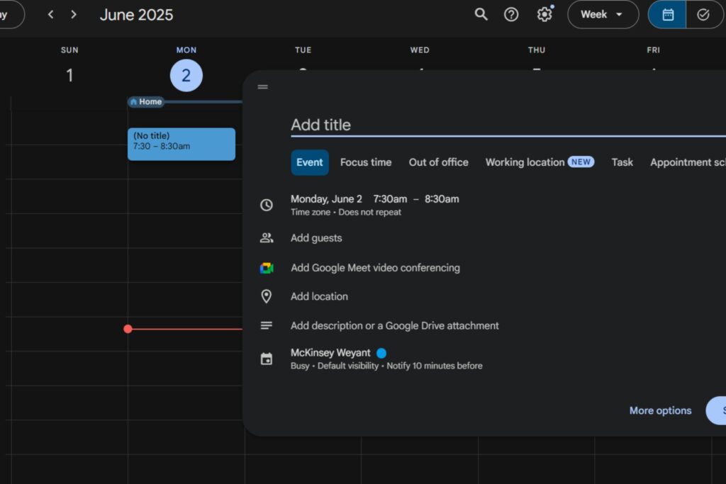
In late 2024, Google Calendar received a redesign integrating Material Design 3 principles. The update introduced a more modern and accessible interface featuring new:
- Typography
- Iconography
- Light and dark mode themes
The purpose of this visual refresh is to improve user experience and reduce visual fatigue, which began rolling out last October to Google Workspace users.
2. Gmail’s Material Design 3 Update on iOS
This year, Gmail for iOS had an update made to align with Material Design 3. The redesign included a pill-shaped search bar and buttons, enhancing the app’s visual consistency with its Android and web counterparts.
Additionally, the update introduced a more flexible interface for Android tablet and foldable device users, allowing for adjustable lists and conversation panes.
3. Android 16’s Introduction of Material 3 Expressive
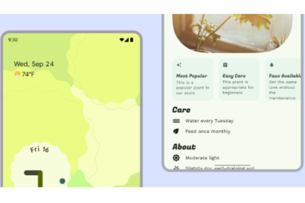
At Google I/O 2025, the company featured its new Android 16 design language, Material 3 Expressive. This addition to Material Design increases the use of animation, vibrant colors and blur effects more fluidly.
The purpose of this update is to meet the growing trend in user preferences, as Google’s research found that Gen Z prefers maximalist interfaces 87% of the time. Material 3 Expressive is scheduled to be released in 2025, making the design system more progressive.
Tools and Resources for Using Material Design
A huge advantage of Material Design is the support it offers for design and development workflows. There are numerous tools to bring Material Design to life, so it is easy to keep your work consistent. Some helpful tools and resources available include:
- Material design guidelines: Google has an official site for documentation, visual assets and best practices. It covers everything from color systems to motion and accessibility.
- Angular Material: If you are working in the Angular framework, this library gives you pre-built UI components that follow Material Design principles out of the box. It is great for quickly spinning up apps that look clean and perform well.
- Material theme builder: A handy tool to create custom themes based on brand colors. It automatically generates tokens and previous your UI in different states and modes.
- Figma UI kits: For design teams, the Material UI Kit in Figma makes it easy to mock up screens, test themes and create interactive prototypes. This feature helps you stay true to the system’s rules.
- Jetpack Compose + Material 3: Android developers can use Jetpack Compose’s built-in Material 3 components to streamline mobile UI development and ensure everything aligns with the latest design updates.
Is Google’s Material Design Right for Your Project?
Material Design offers a strong foundation for creating clean and user-friendly interfaces. Its guidelines take a lot of the guesswork out of design, making aligning teams and maintaining quality easier.
That said, the framework does come with its own visual principles. If your project demands more customization or unconventional UI, you may be bending the rules or stripping them back. The good news is that Material Design is flexible, so you can combine it with other systems if you consider it for your next project.


About The Author

Cooper Adwin is the Assistant Editor of Designerly Magazine. With several years of experience as a social media manager for a design company, Cooper particularly enjoys focusing on social and design news and topics that help brands create a seamless social media presence. Outside of Designerly, you can find Cooper playing D&D with friends or curled up with his cat and a good book.