


Designers need to show off their talent in ways that get noticed, and what better way to do that than with an animated portfolio? They know they have the skills, but all of that does not matter unless they have a platform to show them.
An animated portfolio tells a story, reveals the process and keeps potential clients or employers engaged. To bring it to life, designers must use the right strategy and tools to make a lasting impression.
The Role of Animation in a Portfolio
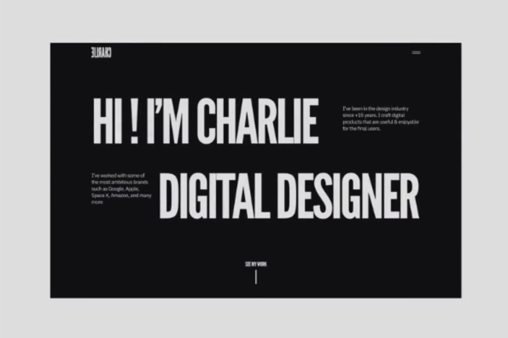
Image here: https://dribbble.com/shots/17884526-CHARLIE-Portfolio-Website-Hero-Animation
Animation is a communication tool. In a sea of static sites and templated portfolios, movement can help a creative’s work stand out by telling more. It could be something as simple as a hover effect or as dynamic as an introduction reel. Animation adds energy and depth to a presentation.
In creative fields like UX, motion design and branding, animation can offer a deeper understanding of user experience and design thinking. Seamless transitions, hover states or animated case study walkthroughs help show the process. It is a way to let their personality shine while demonstrating their technical abilities.
As clients and employers increasingly expect interactivity and storytelling in digital experiences, an animated portfolio signals that the designer is keeping up with the times and knows how to make work that moves.
1. Start With a Strong Narrative Structure
A successful animated portfolio should provide a curated experience. Without a clear narrative, the visuals can feel all over the place. Animation offers a chance to guide viewers through the story more intentionally by cohesively leading them from one project to the next.
Get started by mapping the flow of the portfolio. Designers can achieve this in various ways, including:
- Taking a chronological approach
- Highlighting key projects by category
- Building it like a case study journey from problem to solution
Once chosen, the next decision is to know where to use the animation to support that flow. For instance, this could include a simple fading in of project descriptions or sliding in visuals at the right time. These movements can create a rhythm that keeps viewers engaged. By pairing a strong structure with animation, creatives make it easier for others to understand their work and the story behind it.
2. Use Microinteractions and Subtle Motion for Polish
Sometimes, the smallest details make a huge difference, such as microinteractions. These animations respond to user actions and can elevate a portfolio by refining it. Think button transitions, loading animations or scroll-triggered elements.
These tiny cues improve usability while reinforcing the owner’s attention to design detail. In fact, a survey asked how users feel about microinteractions. Approximately 69% of respondents said they are much more engaged, and their overall experience improved. Meanwhile, 70% of respondents cited that they bring more clarity and usability to a website.
Microinteraction serves aesthetic and functional purposes. They can guide the viewer’s eye, provide feedback and create a sense of flow as someone navigates through. When done well, they add interactivity that feels natural to the user.
Remember, the goal is not to animate everything. That would be too overwhelming to the viewer. Instead, aim for a smooth experience with the substance of professionalism and design sensibility.
3. Optimize for Performance and Responsiveness
A beautifully animated portfolio will make the right impression if it loads fast enough or displays correctly on mobile. Performance responsiveness is as important as design. When showcasing work to potential clients or employers, the platform that designers host it on must work smoothly. Otherwise, a nonresponsive site creates a negative experience, creating the wrong impression.
Large animation files, unoptimized images and poorly coded motion can slow down a site and create a frustrating user experience. To keep things smooth, most site owners will compress assets where possible and use file formats like SVG or Lottie JSON. They will also avoid overloading their homepage with autoplay videos or heavy transitions to keep things simple.
It is also essential to test it across multiple devices. Over 60% of the world’s website traffic comes from mobile devices. Responsive design ensures the animation scales properly and remains accessible for those users.
4. Choose the Right Tools and Platforms
The tools used to build an animated portfolio can make or break how the final product feels.
Below are the platforms that can cater to different skill levels and goals:
- Webflow: Great for designers who want to build custom, responsive sites without writing code. Includes built-in animation and interaction tools.
- Framer: Ideal for interactive, high-fidelity prototypes and portfolios with real-time animations. Offers an intuitive interface and smooth transitions.
- Adobe After Effects Rive: Perfect for detailed motion graphics. After Effects handles the animation, while Rive can convert it into lightweight, web-ready assets.
- Figma’s Smart Animate: Allows for prototyping and showcasing simple animations, especially when using Figma for UI design.
- Wix Studio: A no-code website builder that now includes advanced animation tools and full design flexibility.
- Semplice: A WordPress-based portfolio system created for designers by designers, with custom animation support.
The right platform will depend on the creator’s comfort level with code, the desired level of customization and the type of animation needed to showcase. Whatever the goal, the key is to balance the visual impact and ease of use for the site owner and the audience.
5. Showcase Process Before Outcomes
A strong portfolio may show the designer’s creation while displaying how they got there. Animation provides a different way to walk viewers through the process by helping them understand the thinking and problem-solving approach.
Instead of presenting a polished mock-up alone, consider using motion to:
- Animate wireframes to final designs for before-and-after comparisons.
- Create interactive flows that highlight design decisions in context.
- Use scroll-triggered animations to break down each project phase.
- Show iterations or user testing feedback visually.
Remember, presenting the workflow is the best way to build trust. It shows how a designer solves problems, giving insight into their thought processes and collaborative style, which can be as important as the finished product.
6. Keep Accessibility and Usability in Mind
It is easy to get caught up in the creative aspects of animation, but it is important to keep every person in mind when trying to impress. An accessible or user-friendly site should enhance the experience, so it is important to start with the basics. This means making sure all text remains legible against moving backgrounds, maintaining strong color contrast and avoiding flashing or overly fast animations.
Also, consider users who prefer reduced motion. Many modern operating systems allow individuals to opt out of motion-heavy interfaces, which is a requirement of the Web Content Accessibility Guidelines (WCAG) and a best practice for those preferences. Using a prefers-reduced-motion CSS media query can tone down or turn off animations accordingly.
7. Get Feedback and Iterate
Designers’ portfolios should evolve as their skills, style and body of work grow. Gathering feedback and making improvements over time keeps the presentation sharp and aligned with industry expectations.
The best way to get feedback is to put it out there. Share it with fellow designers or creative communities on platforms like Dribbble, Reddit’s r/design_critiques or design-focused Facebook groups. Look for input that is constructive of the content and animation flow. They may provide insights into something overlooked, such as whether the transitions are smooth or the storytelling is clear.
Gather this information annually or with every major site update. Then, implement the feedback that makes the most sense. The purpose of constructive criticism is to use it to stay relevant.
Elevating Your Animated Portfolio
An animated portfolio is a live extension of a creative’s voice. When thoughtfully executed, it can enhance storytelling and create an experience that sticks with the audience. However, designers must keep it purposeful. By prioritizing clarity, usability and emotion, this platform can rise to different levels of attention and open doors to new opportunities.


Leave a Comment