


If you’re a millennial, you likely grew up watching Steve Irwin wrestle crocodiles and teach the world about the creatures he loved. Unfortunately, the Crocodile Hunter lost his life while on an underwater filming expedition in the Great Barrier Reef in 2006. During his career, he poured into the Australia Zoo and his family. Today, the surviving family members–his wife and children–run the zoo and continue his legacy of conservation and education. We couldn’t think of a more fitting website to consider for the monthly Designerly Website Design Award and we were beyond thrilled to find it was everything we hoped and more.
How We Selected Our Designerly Award Winner
Zoos and aquariums are a big business, generating approximately $22.67 billion each year. The annual growth rate between 2025 and 2030 will remain at 1.26% until the market volume reaches $24.14 billion in 2030. Zoos play a significant role in wildlife conservation efforts and preventing animal extinction.
There are thousands of zoos and related facilities globally. Rather than try to look at every one to narrow down our options, we looked at the top dozen search results and compared website designs alongside the Australia Zoo.
Factors Considered
| Aesthetics | Color Palette |
| Consistency | Mobile Responsiveness |
| Typography | Navigation |
| Layout | Big, Relevant Photos |
Each time we select a winner we look at the main factors above, but we also include some specifics from the industry. For zoos, we asked if the site covered the basics visitors would need to know to go there for the day. Was information easy to find? What added value might there be that was or wasn’t on the site?
Winner: Australia Zoo
Source: https://australiazoo.com.au
Out of the 13 zoos we considered, Australia Zoo’s design stood out from the rest in the categories above and a few others. We love the family history of the place. Although it wasn’t factored into our decision, including the details works well for a site with a family name to tie to it.
Beerwah Reptile Park was established in 1970 by Steve Irwin’s parents. At that time, the wildlife park was around two acres and included wildlife of snakes, crocodiles, kangaroos and magpie geese. Steve’s mom, Lyn Irwin, made pouches to carry around baby kangaroos as she nursed them back to health. In the 1980s, the park doubled in size and was renamed the Queensland Reptile and Fauna Park.
As Steve Irwin’s television career grew, so did the zoo, eventually being renamed Australia Zoo in the 90s. Today, Steve’s wife, Terri, and his two now-grown children, Bindi and Robert, carry on the legacy of the zoo. It covers around 700 acres and has 500 staff members, focusing on education and conservation. People visit the zoo from all over the world to learn more about Australia’s native wildlife and how they can support the mission.
Why We Chose Australia Zoo as Our Winner
Although the people behind Australia Zoo are filled with passion for wildlife and conservation, that isn’t the reason we chose their website for our design award. Instead, we looked with a neutral eye and compared the site’s features against other zoos around the globe. Here are the design concepts that made AustraliaZoo.com.au stand out as our winner.
Intuitive Layout
The grid-style layout is easy to navigate. The site has a familiar layout that makes it intuitive. Visitors know where to go as they move through the pages and how to find their way back to where they started.
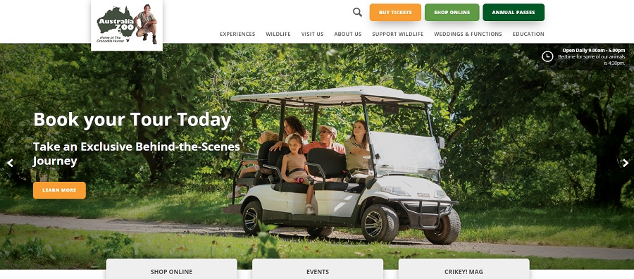
The slider at the top of the home page highlights new additions and important news to get you directly to where you need to go on the site. Under the slider are three boxes highlighting the online shop, upcoming events and the zoo’s magazine. We love all the photos of the Irwin family embedded into the design and showing various animals they have at the zoo.
How well your navigation functions impacts conversion and bounce rates, as well as the user experience (UX). The navigation for Australia Zoo’s website is located at the top of the page, right where users would expect it to be. They limit the categories to seven to keep things simple, and then weave in subcategories for additional details.
Mobile Responsiveness
The mobile version of the zoo’s site is quite similar to the desktop one. The colors and images are the same. Rather than having the boxes three across, they are stacking on top of one another. Everything is sized down for a smaller screen but still readable and actionable. Calls to action (CTAs) are singular rather than several across the screen. The menu becomes a hamburger icon.
The site loads quickly and is easy to navigate and interact with on a smartphone. However, they do limit the length of the home page, so users aren’t endlessing scrolling to find information.
Color Palette
The earthy tones and bright pop of orange works well for this website. Plenty of neutral white gives the design a crisp look. The juxtaposition of orange against dark green adds enough interest to draw users in. The text contrasts nicely against the background, adding excellent UX.
Interesting Content
The site stands out because of the massive amounts of material meant to educate the public about Australian wildlife. The zoo dedicates an entire section of the website to educational materials, including material for schools. You can also learn about how to volunteer or donate to the zoo on this page.
Online Shopping Integration
The online shopping works better than many of the zoo websites we tested. Everything loaded quickly and the shopping cart allowed us to add multiple items easily. You can purchase tickets, annual passes and various specialty products. Note that they do ship to the United States from Australia and shipping wasn’t nearly as pricey as one would think. Your experience may vary if you live in a different part of the world.
Calls to Action
The CTAs work quite well to pull users toward shopping and buying tickets or planning a visit. The varied colors of the CTA buttons separate each possible action the user might take. “Buy Tickets” is in the brightest color of orange and grabs attention first. “Shop Online” and “Annual Passes” are various shades of green.
Throughout the site, other CTAs appear to pull the user into the buyer’s journey, from “Buy Now” commands to “Learn More” invitations, they all work to move the user along a path.
Our Final Thoughts About Australia Zoo
While we normally make a small list of things we’d like to change, it seems disrespectful to the brilliance of The Crocodile Hunter to list them out. In a perfect world, Steve would still be building the notoriety of the zoo and working with the creatures he loved with everything in him. Instead of listing some minor things we’d change, we want to take a moment to reflect on the powerful impact one person who truly cares can have. Whether your passion is website design, conservation or something else entirely, put everything you have in it and you can change the world.


Leave a Comment