

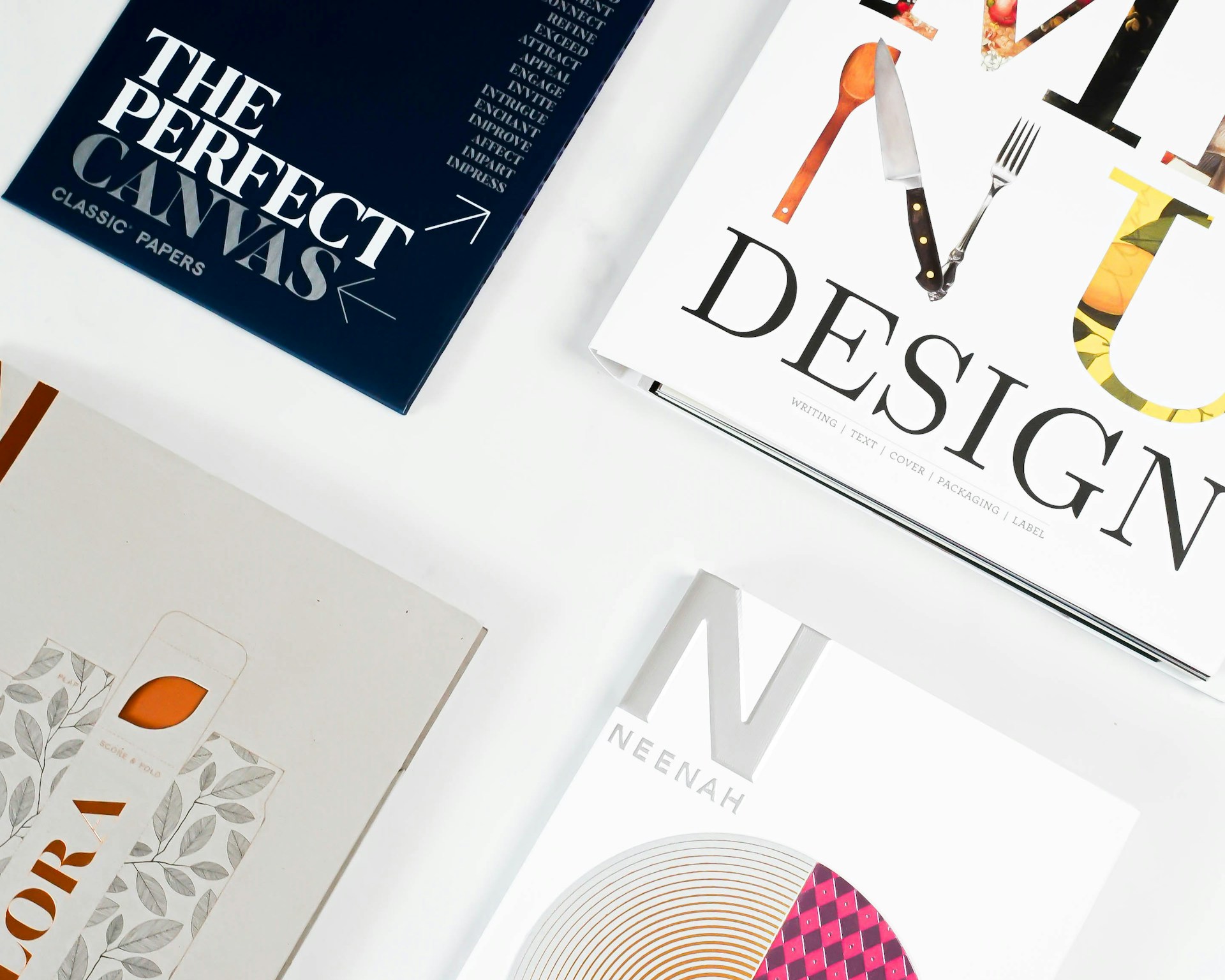
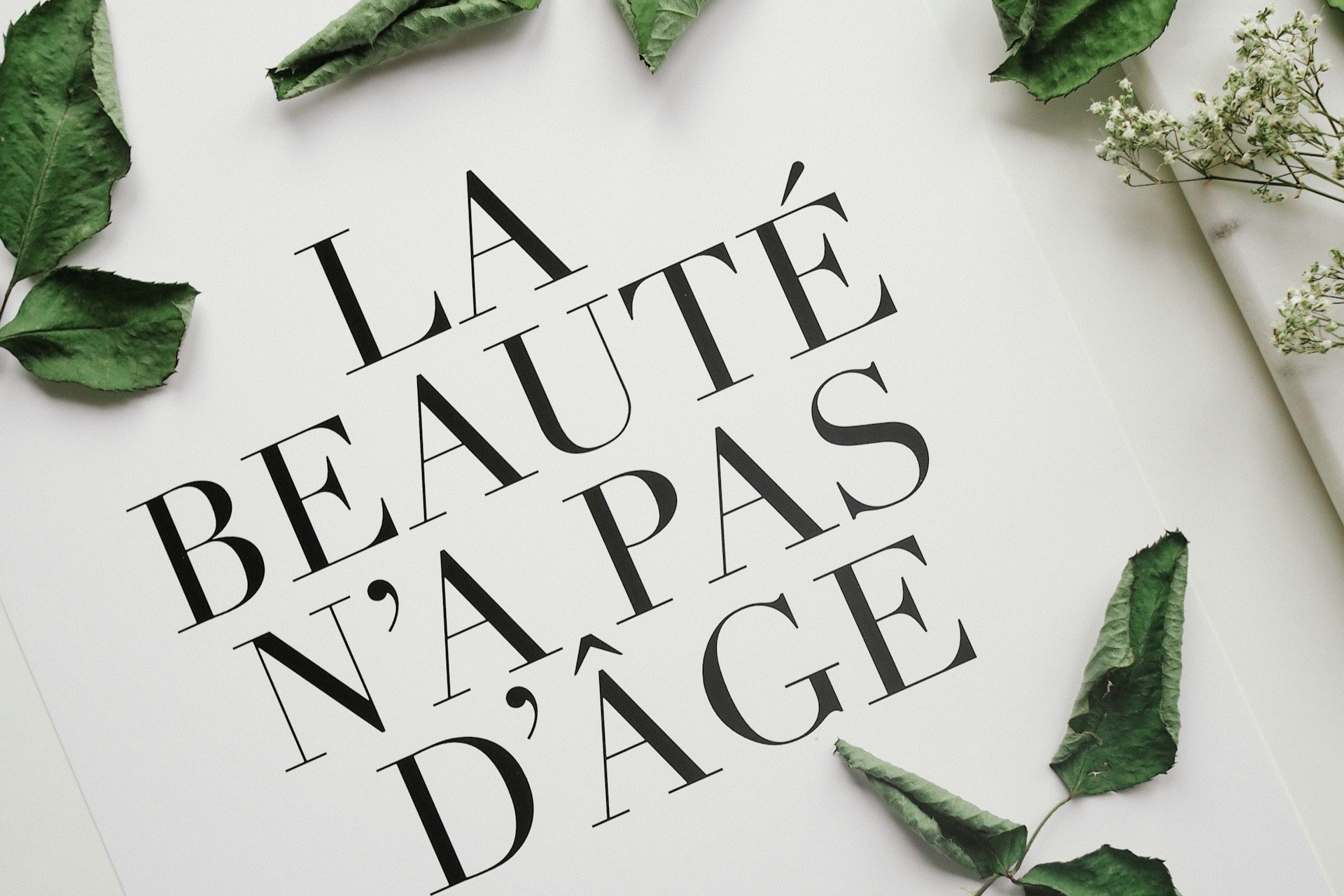
Whenever you open up something with text – whether it’s a fashion magazine, a blog about cooking or a flyer from a local aspiring D.J. – we expect certain aesthetics – or at least judge them. While most people don’t consciously realize it (unless you’re a designer), anything with words makes some kind of impression, and not just the words, but the kind of font those words are presented with. A fashion magazine usually uses some kind of serif font. Flyers often use bold fonts, like Tungsten or Broadway. Some marketing materials combine font for a unique branded message.
Most design advisors – meaning the most prominent design bloggers and/or influential designers online– say there is no right or wrong way to combine fonts and there are no actual rules. I slightly disagree with that. It’s just that there are so many rules and so many exceptions to those rules that it’s basically like having no rules for font design at all. But there are most certainly wrong ways to combine fonts, especially for certain types of media or industries – for example, font combinations for a medical site or a wedding magazine. There are certainly font combinations that just wouldn’t suit either one.
Basic Combo: Serif + Sans Serif
This is one “best practice” that’s consistently advised across the board, whether designers say “anything and everything is possible” or “um, not really, though.” Serif fonts are used in print media like magazines and publications for a reason – serif is easy to read, even in large, uninterrupted blocks of text, and it’s also a timeless font. Combined with sans serif –which is still classic, yet also contemporary – the two fonts create a very complementary font combination. In other words, if you absolutely have no idea where to start, you can’t go wrong when combining a serif with a sans serif – that is, with some other followed guidelines.
Determining Font Combination Compatibility
Letter forms:
There are a few helpful guidelines that can help you to determine the compatibility of two fonts, even when combining a serif and sans serif. The best letters to look at when comparing fonts are “a,” “g” and “e,” because these three letters have the most pronounced differences in their type-face. Take a look at the following fonts:
![]()
Which of the following fonts pairs best with the one above?

The Gills Sans MT font in the first example is the best match – however, the Franklin Gothic font would not necessarily be wrong, either. Notice the difference in the Comic Sans letters from the other sans fonts. The differences in the “a,” the “g” and the “e” are like the nameplate on an office door. You know you’re at the wrong office door if these letters don’t match up.
Combining the Comic Sans and Georgia fonts for most texts would be like wearing a checkered jacket with a paisley shirt – a design disaster. Remember to match your “a’s”, “g’s” and “e’s” to their equal counterparts, and you’ll avoid a font catastrophe… probably. Although, there are exceptions,like this one:

X Height and Proportions
Letter height can also be compared to determine what works in a font combination. Compare the following example of a short subheading and text body. Both fonts are 14pt.

These fonts wouldn’t be a terrible combination if we consider only their style. The reason for the awkwardness is the height difference. The text body overshadows the subheading, which defeats the purpose of a subheading. If this were a newspaper or other print media article, the subheading or title would look like an aside or something parenthesized.
However, it isn’t the actual height of the letters that matters, but the X height. The X height of a font is the space between the invisible bottom borderline the letters sit on and the top of the “x” letter. To illustrate again:

See the difference in their X heights? This is a simple, helpful guideline for distinguishing height in compatible or non-compatible fonts.
Avoiding monospaced fonts for large blocks of texts or text body is generally another good rule of thumb. When information or a message is being passed to a reader, don’t distract the reader with a bad font choice. For the most part, when choosing fonts for text bodies, less is more; go for unexciting and plain. The following example shows a good use of monospace font.

There are plenty of other factors that contribute to determining a good font combination: the medium or media, the layout, the niche or industry and even design and text trends.
While some designers get really into fonts, others put minimal work hours into them. Remember though, your text font can reinforce or help deliver the message, or it can work against it. Combine fonts with care to convey the personality of your document or graphic.
Image: Javier Garcia

Leave a Comment