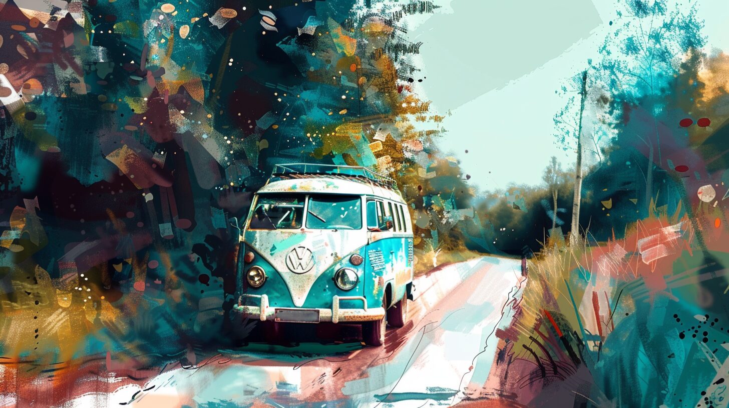


The 1960s was a unique decade. Protests ramped up, people began to experiment with different ways of living that were previously frowned upon and the styles were just as bold. From psychedelic colors to swirling patterns and from A-line dresses to bell bottoms, it’s easy to spot something from the era as having a unique flower child type look. Embrace a 60s font when designing in this style.
People found their satisfaction from music by the Rolling Stones, The Mamas and the Papas and Bob Dylan. At the same time, the early to mid 1960s saw clean, wholesome vibes from groups such as The Beach Boys, The Supremes and The Righteous Brothers. The building tension between the old way of doing things and the new way created a generational gap that is seen in some of the artwork of the time with angry strokes of color.
The love of music and people embracing events such as Woodstock and various protests meant album covers had a big impact on font choices of the times. If you want to give a design a 1960s flare, you need to pay attention to both color and font.
What Colors Signal a 60s Font?
Psychedelic designs utilized colors such as a bright fruit-colored orange, lime green, brilliant yellows, browns and deep pinks. A modern design doesn’t have to embrace every color to give a hint of the 60s. Use a couple of colors to give the feel of a 60s font and then stick with a neutral color palette for a mix between the 60s and today.
We spent some time scouring the web for 60s fonts to find ones we thought would work for various designs. There are dozens of options, but we narrowed the list to some of our favorites.
1. Derania
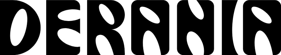
Derania has the thick letters with rounded strokes and straight edges and corners that make up the look of many album covers from the decade. The juxtaposition of the angles and curves makes for a psychedelic look many people who grew up during the Age of Aquarius will recognize.
2. Aprila 400
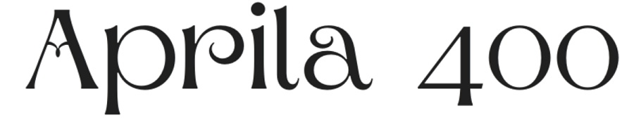
The Aprila Font Family has a unique look that puts one in mind of the flower child vibe the hippies exuded. Note the unique line on the capital letter A. The swirls combined with the straight serifs give the font a unique look unlike any other.
The font comes in a variety of weights, but we like the 400 weight particularly well for a mix between light and medium that would work well for headlines or a logo.
3. Magna
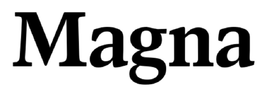
If you’re looking for something a little more traditional, Herbert Thannhaeuser created the Magna font in 1968 for the URW Type Foundry. You can purchase it today from a number of online font repositories. Pay attention to whether it is suitable for commercial usage or what rights you need to buy.
The font has strong, straight serifs that give it a more traditional look. Although the 1960s did have some unique styles, not everything was an eye-jarring color or swoopy lines. This font would work for a more traditional 1960s font look.
Around 80% of websites use one of three traditional looking fonts. They are quite adaptable to different styles. Adding in some 1960s images or colors can take a simple font such as Magna and turn it into a design masterpiece.
4. Lucidity & Extras
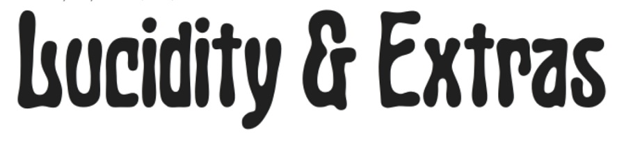
Lucidity font looks a bit askew as the world looked to many during the late 1960s. One thing we really like about Lucidity is the extra symbols available that give the design a flower child flare.
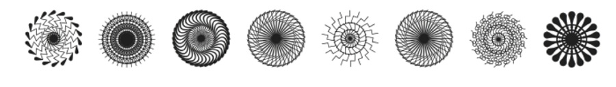
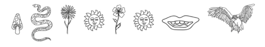
With the add-ons of mushrooms, flowers and psychedelic circles, the font offers a wide range of uses for the modern designer.
5. Peace & Love
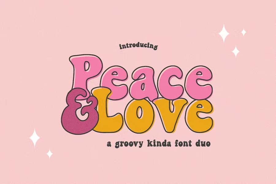
If you’re looking for a Motown vibe and you loved The Brady Bunch when it debuted in 1968, you’ll adore Peace & Love font duo. The package comes with a regular font and an outline font. The image above shows the outline font through the big letters and the regular in the small ones. Together, the font duo gives a solid 1960s font vibe. You can also use each separately for a more subtle effect.
Some colors will give the design a more retro feel than others.
6. Ad Lib Font

Are you more of a Beatles fan? If you love the whole aura the musical group from the UK exuded, you probably recognize Ad Lib as the font used on The Beatles Second Album.
Fonts In Use identifies Ad Lib in all capital letters for the album title. The type first appeared in 1961 and is part of the Venus family of fonts. The original version came in two variations, but the digital files have just one option in different weights. The thick, bold strokes make it the perfect font for titles.
7. Kool Beans
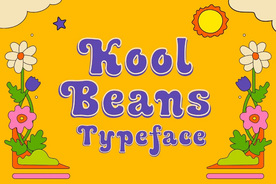
Not only does Kool Beans have the thick strokes and outline that screams 60s font, but we love the name of this one. It is so reminiscent of something a young person might say during the decade in everyday conversation.
The typeface taps into psychedelic design and creates a retro look for logos, advertisements or web designs. Combine it with some vintage looking images and you have a complete vibe.
Going Back to the 1960s
Understanding which font to use in your Age of Aquarius designs requires understanding the decade. Some women were still housewives and enjoyed staying home and caring for their families. Others were going out and seeking careers. Still others wanted to wring every ounce of living they could out of their days. No one attitude was right or wrong. It was just a time when attitudes didn’t align.
Your 1960s designs can reflect the tumultuous times by using a mix of groovy and traditional fonts. You could also embrace flower power and go with fonts that exude freedom and fun. No matter which direction you go, the fonts above will give you a good start as you work on your retro projects.

Leave a Comment