
Mobile devices are constantly advancing. Each year, tech companies seem to feature the next big thing, and how they intend to beat their last breakthrough is a wonder. One of the latest innovations that seemed impossible in the smartphone industry is the folding phone.
Devices with touchscreens you can literally fold in half are on the rise, so designers must figure out how this may impact their processes. While designing for smaller screens is one challenge, creating engaging website experiences on flexible displays takes it to a new level. Yet, once they grasp how exactly foldable phones reshape mobile web design, creative professionals can understand what they can do to upskill their techniques.
The Rise of Folding Phones
Smartphones are so prevalent in everyday life that 85% of Americans now own one. Designers’ jobs include considering how to cater to these users. By delivering user-friendly designs to mobile device users, companies reach a larger audience and achieve their mobile optimization goals for search rankings.
Now that foldable versions are in the picture and are forecast to reach 70 million in global shipments by 2027, designers must adapt their web design practices quickly. This shift is especially important since large manufacturers like Samsung and Motorola are leading in production. These companies are constantly offering models with bigger screens and physical improvements, showing a demand for these new designs.
Surveys have found that over half of smartphone users would consider a foldable as their next device, so designers must start thinking beyond traditional breakpoints and prepare for a more multi-format future.
Why Foldables Change the Rules of Mobile Web Design
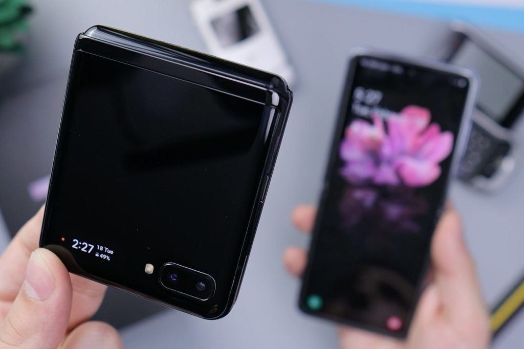
Foldable phones introduce entirely new design considerations. Standard smartphones are different because they have a fixed screen size, but foldable offer two distinct modes:
- A compact cover screen typically ranges from 1.5 to 3.4 inches, so their interfaces are similar to smartwatches, allowing for quick tasks and notifications.
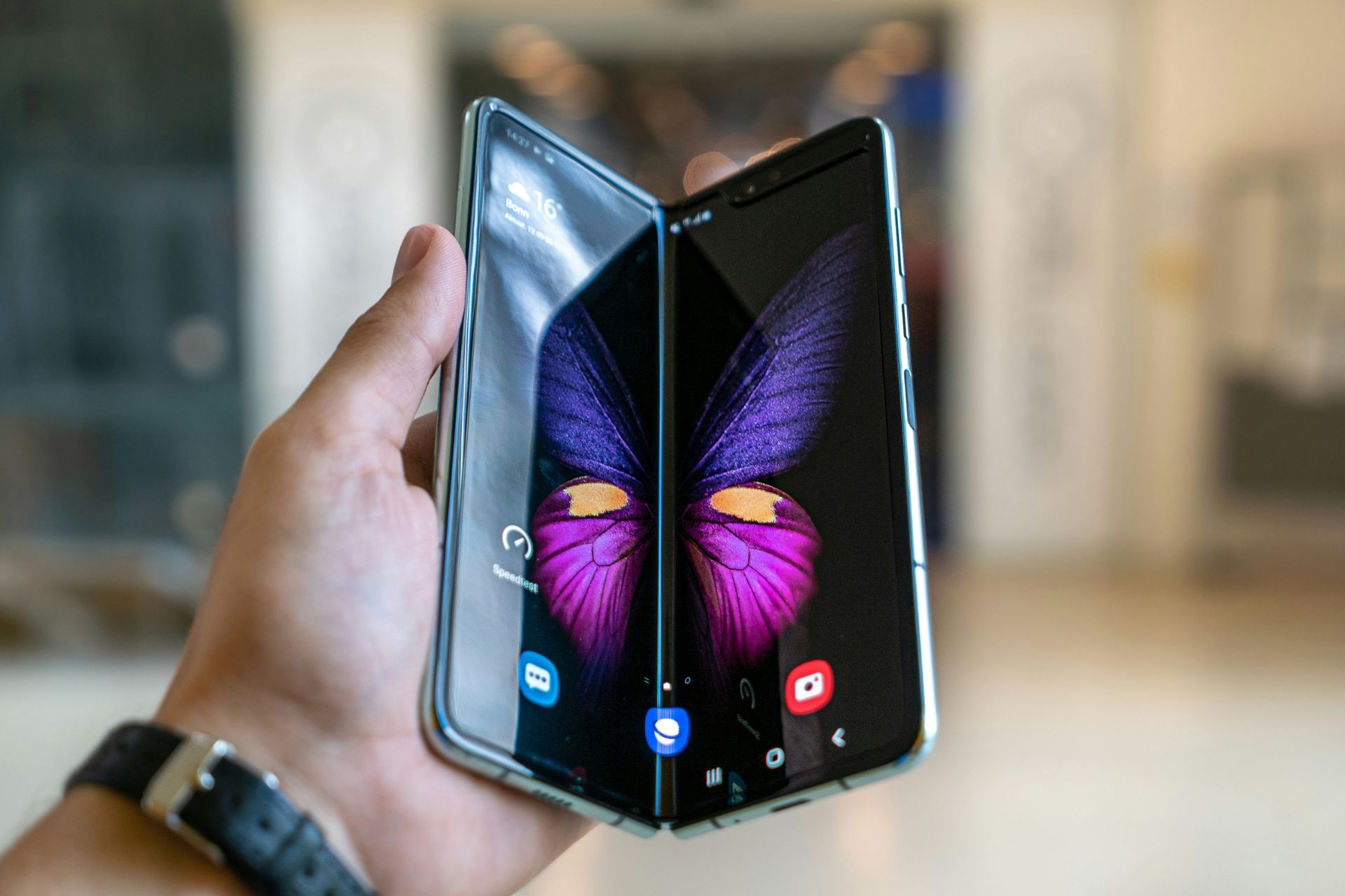
- A larger, unfolded display that functions more like a tablet. It offers a full- and split-screen view, allowing users to open multiple windows simultaneously.
This variation in screen size changes how users interact with websites. For instance, a layout that works seamlessly on a narrow screen may feel awkward on a wide-open fold-out. Designers must consider this size change and start accounting for shifting aspect ratios across different states.
Another aspect to consider is screen continuity and multi-window experiences. Many foldables allow users to run multiple apps side by side or transition a task from the small screen to the larger one without interruption. That means web pages need to be more adaptable so they can offer a fluid response when transitioning to different viewing modes.
This is why it is crucial to consider the new design principles for these devices. With increased screen size and functionality variability, designers must be more thoughtful in how they approach mobile web design.
Core Design Challenges in Folding Phones
Foldable phones open the door to new user experiences but also bring new design headaches. Here are some top challenges designers face and how to tackle them.
1. Inconsistent Viewpoints
Designers who work with one screen size at a time have a smoother process because they can rely on fixed breakpoints or assume how content will flow. Yet, since foldable screens switch between two different screen sizes, designers have to ensure a smooth transition from a standard smartphone display to a tablet-like view.
Take your design a step further by testing on foldable-specific emulators and using CSS container queries. These allow components to adapt their container size instead of only the viewport.
2. Different Aspect Ratios
Foldables have aspect ratios outside standard mobile or tablet norms, like ultra-wide or nearly square displays. This feature can easily cause elements to appear stretched or misaligned.
Therefore, fluid layouts and flexible grids are crucial for keeping content proportionate. Avoid hardcoded widths or heights and rely on percentage-based spacing and max-width constraints to ensure visual harmony across ratios.
3. Layout Reflow and Content Prioritization
When the screen expands, content often jumps or reshuffles in ways that feel disjointed to the user. Headlines might split awkwardly, or buttons may shift to less intuitive locations.
The solution is to design using adaptive user interface (UI) principles. Consider which elements should be rearranged, resized or fixed. Controlling how content behaves as space changes is essential to maintaining flow and hierarchy across folded and unfolded states.
4. Touch Target Placement
Foldables introduce new interaction zones. With conventional smartphones, users often interact with their devices using one hand to navigate across applications. Flexible displays facilitate touch responses that may vary slightly or feel less natural. When users open their phones the whole way, button locations must change for more ergonomic usability.
For example, refrain from incorporating interactive elements into the center crease or fold lines. When a user folds their phone halfway, it may create a more awkward layout when interacting with a button.

5. Performance on Larger Displays
Unfolded screens demand more functionality and performance from a website. A site with poor optimization may feel laggy or sluggish, especially when stretched across a larger resolution.
Optimize images and scripts, lazy-load non-critical elements and minimize heavy animations. Foldables reward speed and responsiveness, so it’s essential to audit performance regularly.
New Opportunities for Designers
Although some design challenges come with folding smartphones, they also present new ways to think outside the box:
- Dual-panel layouts: With more screen real estate, designers can create side-by-side interfaces — like a list view on one side and a detailed view on the other — without sacrificing usability.
- Context-aware interfaces: Folded versus unfolded modes let you create more experiences that align with user context. A folded screen may show a simplified version of a site, while a bigger screen delivers a more immersive view.
- Enhanced visual narratives: A larger canvas allows designers to build richer layouts with visuals and images that can be displayed across the screen.
- Touch-driven interactions: Foldables encourage more natural gestures and split-view usage, so there’s an opportunity to design touch zones and swipe areas more intentionally.
- Better multitasking compatibility: Foldables were made for multitasking. By making sure the site can handle split-screen or multi-window mode, users gain more control and flexibility.
Design Best Practices for Foldable Web Experiences
Basic responsive techniques are critical for foldable web design, but other techniques must be implemented to ensure seamless and functional outcomes.
1. Start With a Solid Responsive Foundation
Responsive design is still the main priority. From flexible grids to scalable units, an interface that fits different screen sizes aligns with modern web design best practices. While foldable adds more complexity, keep in mind that a responsive base creates room to scale up, not start over.
2. Use Adaptive UIs
Foldables demand flexibility. Instead of resizing content, consider how elements may behave differently depending on the screen’s state. For example, when unfolding the device, you might swap a single-column layout for a two-panel view.
3. Design With Mobile Dominance in Mind
Getting caught up in new design challenges is easy, but always remember the big picture. Approximately 69.4% of all online traffic comes from mobile devices. Foldables represent a new chapter in mobile. That means your designs should still prioritize fast load times and clean, tap-friendly navigation, especially for users who interact with the folded cover screen on the go.
4. Test Across Foldable Devices
Testing is a must to determine if there are bugs or awkward experiences. Samsung’s Remote Test Lab and Chrome DevTools’ foldable device simulation allow designers to preview how their creations work in folded and unfolded states.
Designing for the Next Generation of Mobile Devices
Folding phones are here and are changing the rules of design. This introduces more dynamic layouts and changing user behaviors. While these advancements may introduce new challenges, designers still have a chance to shape experiences in a new light. So, as mobile devices continue to take on new shapes and functionality, one key consideration comes to mind — and that is how well professionals can design when the opportunity arises.


Leave a Comment