

Following font trends as a designer may be a huge turn-off, as some may see it as copying someone else’s idea. This is easily understandable since creatives want to follow their own pursuits.
However, typography is brimming with creativity. And while some fonts may be more popular than others, it is always a good idea to see which ones speak louder than ever. Doing so helps you stay inspired when building a brand, keeping your designs relevant and ensuring your creations make sense in today’s day and age.
1. Handwritten and Human-Centered
Regardless of what people think about handwritten or human-centered fonts, they always stand out. These typefaces are rising in popularity because they feel human. In a world consistently filled with corporate aesthetics, these fonts offer refreshments, bringing warmth and a personal touch to designs.
They look like actual handwriting, which creates a more authentic, welcoming atmosphere. They are especially effective in branding, packaging and social media content, where emotional connection is key. Consumers are drawn to designs that feel genuine, and nothing says “real” like a typeface that looks like someone penned it by hand.
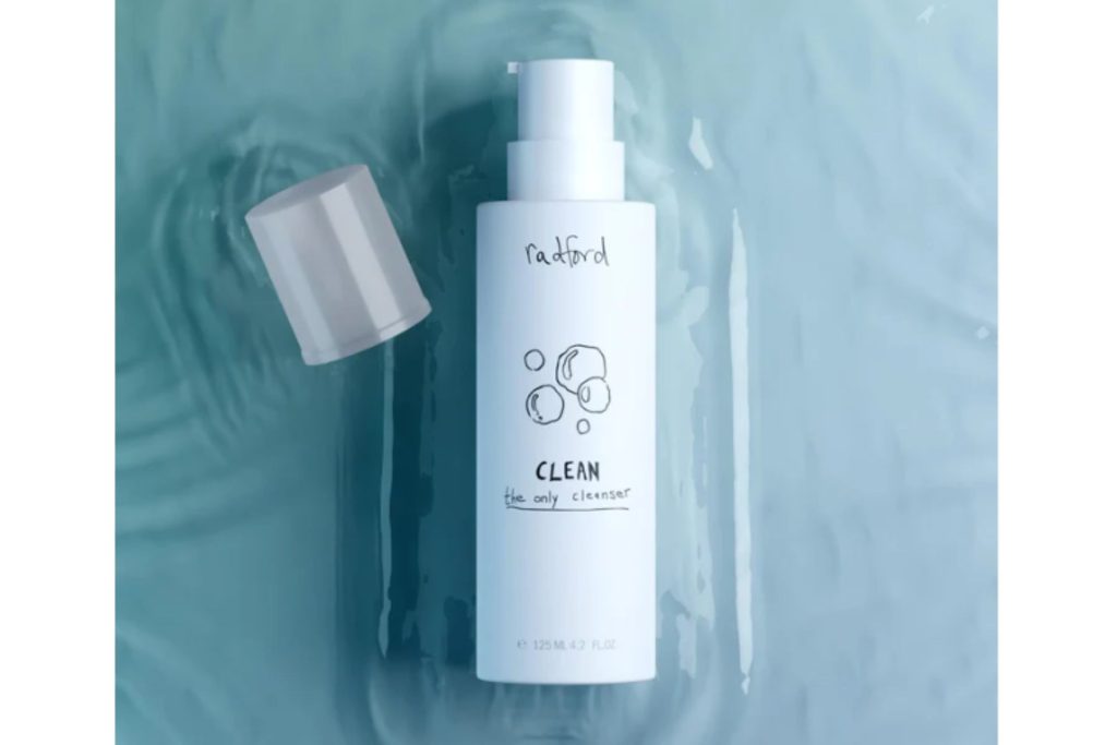
One example is Radford Beauty, a Canadian brand founded by makeup artist Victoria Radford. Its branding incorporates humanlike typography into its packaging and digital media. The handwritten elements often appear on product labels and promotional materials, adding individuality to its message of self-expression and inclusive beauty.
Fonts like the ones Radford Beauty uses feel less polished and more playful, making them ideal for brands looking to invite their audience in and connect with their offerings.
2. Bold and Retro-Inspired
What is old is new again, and fonts that come back in style are bolder than ever. Retro-inspired typography is a nod to the trends of past decades, from the ‘60s to the early 2000s. However, they are returning with a new flair. Some high-contrast, dramatic curves, while others include chunky serifs with bright colors.
Retro fonts are likable to most because they feel authentic and are fun to experiment with while bringing people back to a time period, even if they have not lived through it. For instance, some may want to know what it would have been like to live through the 70s. A groovy aesthetic with a psychedelic funk feeling can immerse consumers in a decade when hippies and music festivals thrived.
Additionally, vintage fonts offer versatility. Because there are multiple decades to choose from, designers have many options to explore. Some of the typefaces to start with today include:
- Cooper Black: A timeless classic with soft, heavy curves that instantly evoke vintage charm.
- Beale: Funky and full of soul, with exaggerated proportions inspired by 70s soul album covers.
- Strawford Rounded: A friendlier take on geometric fonts with a retro undertone and softened edges.
- Balloon: A bubbly display font often used in pop art or playful branding that offers a major energetic personality.
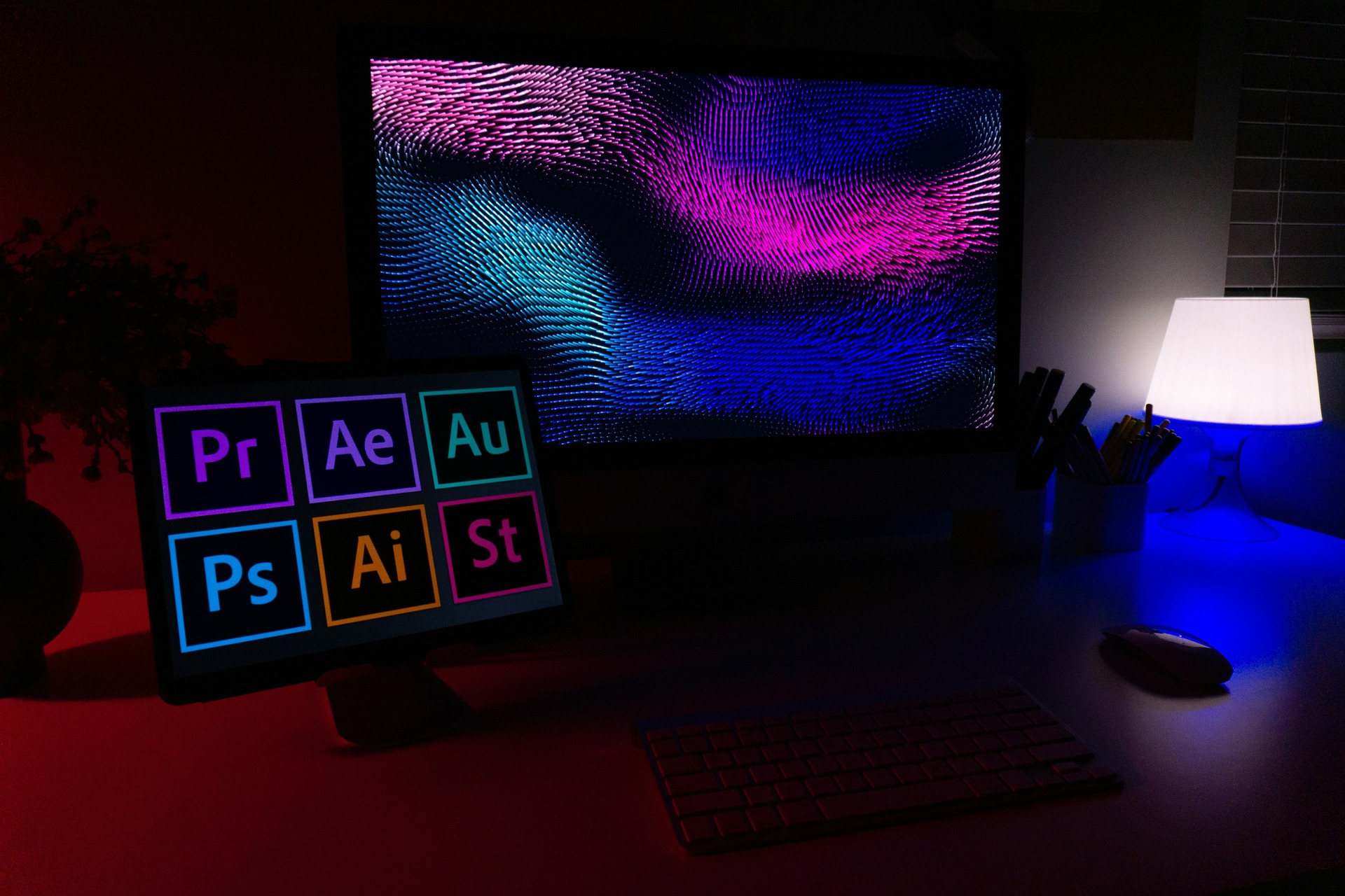
3. Low-Res and Pixelated
Clean lines and sharp precision have long dominated digital typography. Lately, however, designers have been intentionally leaning toward imperfection. Low-res, raw and glitchy fonts are gaining momentum, embracing the quirks of early computing and analog tech.
These typefaces often feature jagged edges, inconsistent stroke weights or pixelation, featuring every flaw. These bitmap-style fonts step away from overly perfect aesthetics, injecting personality into excessively clean environments.
An iconic subset of this trend is the pixel font. This style is reminiscent of 8-bit video games and vintage computer screens. They are made up of tiny squares that mimic the limitations of early displays, creating a blocky structure. Pixel fonts instantly evoke nostalgia — but when used creatively — they can feel surprisingly modern.
Designers are using pixelated fonts to add retro-futuristic flair to websites and tech-forward campaigns. Fonts like Press Start 2P and Pixeboy are a few popular choices for creating this digital vibe. They are especially effective when adding vibrant gradients or glitch animations for further impact.
4. Friendly Serif and Casual Sans
Some think of sans serifs as stiff and cold. In recent years, it has become more common for designers to use typefaces that offer a more casual, conversational tone while maintaining structure and professionalism. This is where friendly serifs and casual sans became popular.
These font trends are approachable by design. They often feature rounded terminals, open counters and soft curves that feel warm and inviting. They are great for brands that want to seem trustworthy yet modern and personal.
Consider Humanist Sans fonts. These typefaces show subtle stroke modulation and the natural rhythm of the human hand. They offer structure without stiffness, giving them a more organic appearance.
Humanist sans-serif typography has deep roots. One of the earliest examples was created for the London Underground in 1916 by Edward Johnston. Later, fonts like Syntax and Frutiger from the late 1960s and early 1970s became benchmarks for the style.
Today, fonts like Zed Text and Tremolo Sans continue that tradition. Zed text offers a family of weights and widths, perfect for creating flexible designs.
5. Experimental Typography
Experimental typography may push the boundaries of legibility and form, but that is its purpose. These fonts intentionally break the rules to create visual intrigue, so they are becoming a favorite among designers and brands. Experimental typography challenges expectations and helps those who use it stand out.
What makes it so compelling is its unpredictability. Viewers will see stretched letterforms, unexpected ligatures, warped baselines, variable weights and kinetic elements. These designs often play with space and motion, using distortion and layering to grab attention in bold, expressive ways.
You will often find this type in editorial publications, websites, branding and social media graphics — anywhere a statement needs to be made. While experimental fonts are not always fitting for body copy or long-form reading, they work well for headers, logos or visual storytelling. When used strategically, they can elevate a design from functional to unforgettable.
6. Inflatable 3D Features
One of the font trends that refuse to go unnoticed is the rise of inflatable 3D fonts. These balloon-like typefaces are puffy and playful and constantly look like they will float off-screen. Think blow-up textures, high-gloss surfaces and soft, rounded edges that give the impression of depth and tactility. It is like a typography that seems like you could squish, poke and pop.
This font is growing in digital-first environments like social media, advertising and experimental web design. Inflatable 3D fonts often come in pastel gradients, chrome finishes or hyper-saturated colors, and they typically go with minimal backdrops so the letters take center stage.

This trend typically appears in fonts that simulate puffed-up forms using 3D modeling and shading. Many designers also create custom inflatable typography using tools or AI-driven rendering platforms.
Inflatable 3D fonts offer fun and escapism, often evoking childhood toys and bubblegum packaging. They are perfect for when your message needs to be loud and impossible to ignore.
Let These Font Trends Speak for Themselves
Typography has always acted as a design element in its own right, capable of shaping tone, emotion and visual identity. Yet, it is only growing more expressive and dynamic than ever. This gives designers more room for choice, letting them experiment further with creativity and depth.
Use these font trends for inspiration and make intentional design decisions for your project’s voice and audience. Staying attuned to new typography styles gives you more ways to communicate, so experiment boldly, choose thoughtfully and let your type make an impression.

Leave a Comment