


When you think of creating a memorable user experience (UX), the first thing that often comes to mind is a sleek design and smooth navigation. However, the smallest details matter, too. Those seemingly insignificant moments — known as microinteractions — can leave the biggest impact on how users feel about your website. Though subtle, they can differentiate between a seamless experience and one that frustrates users.
What Are Microinteractions?
Microinteractions are tiny, single-purpose moments triggered by a user action or system event that provide contextual feedback. These elements may be subtle interactions between users and a website, but they help users accomplish tasks smoothly. For instance, a button may change color once a user clicks on it, or a notification pops up after a form submission.
These microinteractions are everywhere, providing tactile cues to guide a user’s journey. When done right, they become almost invisible, enhancing the overall user experience without distracting from it. Yet, when misused or overlooked, they can leave users confused. That is why mastering microinteractions is key to creating a smooth user experience.
How Microinteractions Benefit UX
Microinteractions may be small, but their impact on UX is significant. Users who interact with a platform expect smooth transitions and clear feedback. Microinteractions help meet these expectations by confirming users’ actions or to show they are on the right track.
One survey found that 69% of respondents felt that microinteractions are engaging and enhance their overall experience. This is because these interactions establish a connection between users and the digital interface by making their actions feel acknowledged and valued. Whether it is a color change or a subtle animation, these small details work together to create a more satisfying experience.
Microinteractions are also critical in improving usability. Approximately 70% of respondents in the same survey agreed that they improve clarity and a platform’s usability. Since they provide guidance for users, they help the audience understand they are getting closer to their goal. They minimize errors, leading to a seamless journey.
UX-Enhancing Microinteractions
When implemented thoughtfully, microinteractions can greatly improve user satisfaction and ease of use. Some examples that show how these small design elements enhance UX include the following.
1. Button Feedback
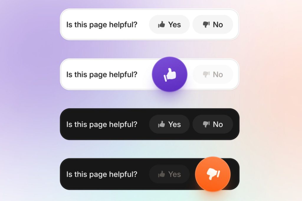
Source: https://dribbble.com/shots/24754074-Ausbildung-de-User-Feedback-Component
Buttons can draw users’ attention to where you want them to click. When users click a button, a visual change validates that the site has registered their action. Button feedback can include changes like color shifts, ripple effects or bounce animation.
Instant responses like these reassure users and eliminate uncertainty. With this feedback — users feel certain that the interface recognized their input — leading to potential frustration.
2. Form Validation
Form validation alerts provide instant feedback when users fill out forms. This could be in the form of a green checkmark that appears when an email has a correct format or a red outline around an invalid field.
This immediate feedback guides users toward successful completion more efficiently, as checking for manual errors can be time-consuming. Therefore, form validation reduces friction and allows users to move through the process more quickly.
3. Scrolling Effects
Source: https://dribbble.com/shots/13961411-Breathtaking
Scrolling effects can change the way users navigate a site and explore content. For example, infinite scrolling allows users to browse through large amounts of content without the interruption of loading new pages.
As users reach the bottom of the page — more content automatically loads — keeping the experience continuous and fluid. Microinteractions like this one allow users to engage freely without clicking through pages.
4. Animated Error Messages
Error messages are inevitable, but how you deliver them makes all the difference. Animated ones — like a shake of a form field or a bounce of a notification — can draw attention without overwhelming the user. These microinteractions allow users to understand what they are doing wrong and how to correct it.
5. Transitions

Source: https://dribbble.com/shots/20284814-Glitch-transitions
Smooth transitions between pages or sections of a website can enhance the navigation experience. Instead of abrupt changes, transitions like fading content in or glitching between sections make the site flow easily and give users’ eyes time to adjust. As such, these microinteractions are less jarring, reducing cognitive load and making navigation feel more natural.
Microinteractions That Can Lead to Negative Outcomes
While microinteractions can be helpful to the user experience, poorly executed ones can create user frustration. Several common examples of microinteractions that can backfire include:
1. Overly Aggressive Animations
Animations are excellent for website engagement, but they can be too much at times when overdone. Long, overly elaborate ones take up too much time. The space they take up can also distract users from their tasks or make your interface feel slow.
For example, an excessively flashy transition between pages may look good at first but can delay the user’s progress and result in frustration. Users appreciate efficiency, and too much animation can slow them down.
2. Unclear Button Feedback
Buttons are crucial for a positive user experience. Yet, when the feedback is too subtle or missing entirely, users may wonder whether their action was successful. A button that avoids offering some visual feedback can cause uncertainty, leading users to click multiple times. This inadequate feedback can lead to task abandonment since it makes your site feel unresponsive.
3. Too Long Loading Indicators
Loading indicators reassure users that a process is underway. However, they can have the opposite effect if they linger too long. A spinning wheel or progress bar that drags on for too many seconds can leave users feeling impatient, especially when they refrain from providing any updates on how long the wait will be.
A long loading interaction breaks the user experience flow and gives the impression that your site could be faster. Therefore, giving a good first impression is important, as many users determine whether it is worth staying within the first few seconds of using a site.
4. Intrusive Notifications
Notifications provide useful information but can be disruptive to the user’s flow if they pop up too frequently. Pop-ups that cover critical content or appear in rapid succession can push users away, especially if they lack clear value.
Many websites use notifications to convert users to sign up for newsletters or promotions. However, these pop-ups can frustrate site visitors if they have zero interest. While they are excellent for capturing user information, they can be disruptive if popping up every few seconds or each time they click on a new page. The key is to ensure the notifications appear at the right time and in an infrequent manner.
5. Unresponsive Interactive Elements
Interactive components like toggles and sliders must respond quickly to user input. Otherwise, it can severely impact the user experience. If users click on a particular element and nothing happens immediately, they may assume the site is broken.
Delayed feedback can cause user frustration and a loss of confidence in your site’s functionality. A speedy, responsive interface keeps users, driving further engagement.
Leveraging the Power of Microinteractions
Microinteractions may seem small, but their impact on user experience is anything but. These tiny design elements can create smooth, engaging user journeys. However, they can drive disengagement when implemented poorly.
That is why testing each one and gaining user feedback is important. Research your audience’s feelings about these components and focus on the details. Doing so will be key to delivering an enjoyable experience that keeps users returning.

Leave a Comment