
Some design concepts repeat every so often, bringing back the look and feel of decades past. People seem to embrace concepts from the ‘50s, ‘60s, ‘70s and ‘80s the most. However, many of the looks of the 1990s are becoming quite popular in 2024 and beyond. Finding the inspiration and right tone for retro style websites takes a bit of practice and more than choosing a few vintage images.
Defining Retro Style Websites
Retro is typically defined as a modern creation based on styles of the past. For example, if someone creates an illustration with chunky text and neon colors, they are giving their design an 80s retro look.
By contrast, vintage means something that actually is from that decade, so while we might use the term vintage to talk about fonts or graphics or designs, unless the thing was created in the time period, it isn’t technically vintage. For the purposes of website design, almost everything that looks like it was from the past is retro.
Antique refers to things 100 years old or more, so nothing on the internet would qualify at this time. So, now that you know all current designs made to look old are retro, what elements do you need to embrace the style?
- Fonts that look like movie posters or old typeface
- Graphics reminiscent of brand logos and magazine ads
- Colors frequently used during the decade
- Syntax of the time, such as something be radical, tubular or kewl
When creating a retro style website, you can add just a few elements from the time or you can create the entire website to look like it fell out of the sky in 19-whatever. Consider the business you’re designing for. Do they want to hint at a certain decade or style? Or, do they want to fully immerse their users? You should also do some split testing with their target audience to ensure you’re hitting the right design notes to impress and still convert.
Retro Website Examples
The best way to learn to incorporate vintage looking elements in your designs is to check out what other people have done to give their sites the look and feel of a particular style. We spent some time hunting down stellar examples of retro design. Here are our favorites and how you can repeat the success of each.
1. Berkshire Hathaway
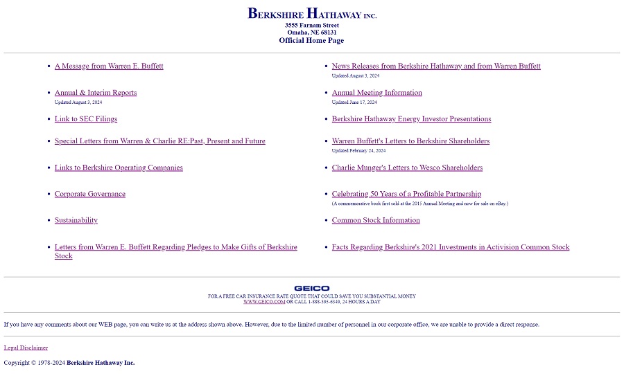
When the internet first began growth and companies started to have a digital page online, the designs were very simple. Text and links or links and text. Images and fancy backgrounds would come later. The Berkshire Hathaway site takes on a retro design reminiscent of the late 1980s or early 1990s.
Designers today can embrace the less is more concept. You don’t have to include all the bells and whistles on a strictly informational page. We do like to see a bit more engagement than this page offers, but it serves a functional purpose with zero distractions.
2. Ling’s Cars
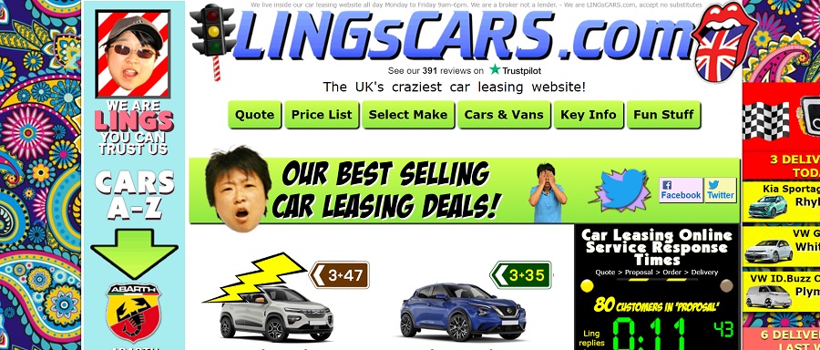
If you’re looking for the complete opposite of minimalistic, Ling’s Cars gives you a retro design that encompasses everything from the ‘70s to the ‘80s and a little bit of the ‘90s. The animated talking head, roughly drawn lighting bolt, florals and arrows may cause you to need eye bleach after viewing the site.
However, we can learn a lot about retro design from Ling. First, the colors are spot on, with vivid lime green and pink. The graphics are rough but draw the eye to specific elements on the page. The site has personality and if retro design should be anything, it should be interesting.
3. Steady
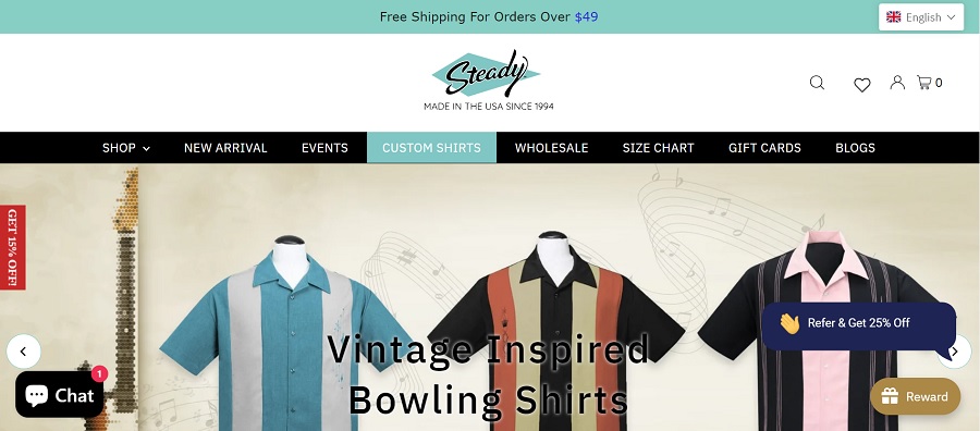
Steady offers vintage inspired clothing. Note the 1950s blue combined with the products of yesteryear fashion. The background has a vellum look that adds to the entire vintage appeal of the page. Although the logo reminds one of a dry cleaner in the mid twentieth century, the site also has some modern elements, such as the calls to action (CTAs) and chatbot feature.
Combining retro elements with modern features gives sites a unique appeal. However, it also shows users that the company has a modern approach to doing business so they don’t have to worry about the customer experience (CX). Figuring out how to take users back in time while still offering modern conveniences is challenging. Focusing on CX is the best way to ensure you accomplish both.
4. Vintage Crust Baking Company

Vintage Crust Baking Company takes on a decidedly vintage look with their retro website design. The logo utilizes fonts that take one back to the 1930s or 1940s. We like how the serif font becomes three dimensional and repeats in the heading layered on top of the hero shot.
By combining vintage looking images with retro fonts, the site screams a bakery that’s been in business for decades. Although the business is a recent one, people landing on the page will feel it is established. The entire design lends itself to trustworthiness.
5. New York Moon
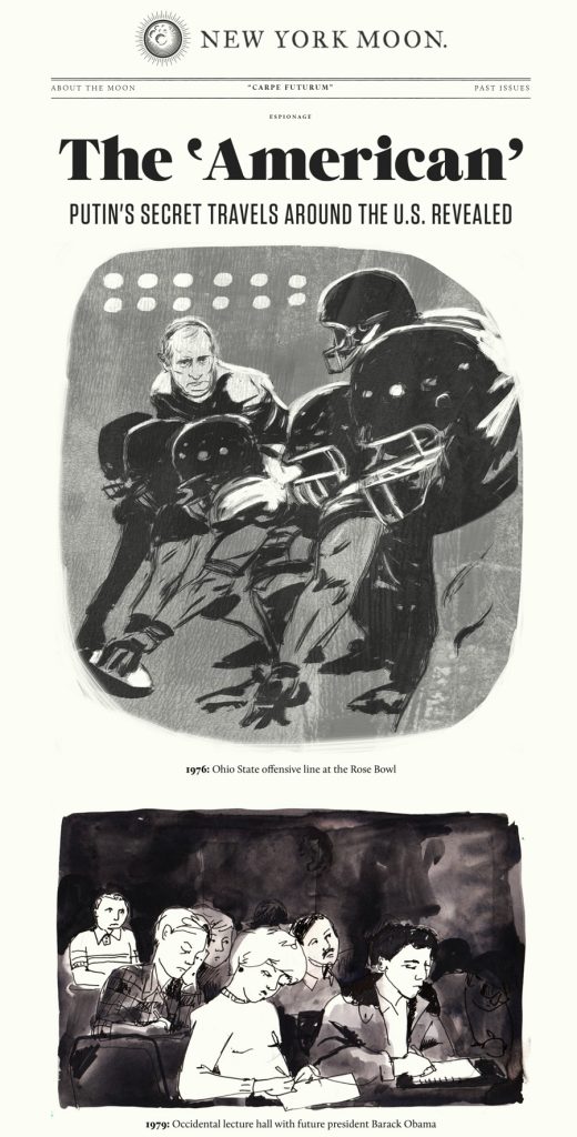
New York Moon fully embraces the retro vibe to make the site look like a newspaper from the past century. As you click through the site, you see photos of past events, such as the aftermath of Hurricane Sandy. The slightly fuzzy focus on images and the simple presentation make you feel as though you’ve stepped back in time.
The design is quite unique and might work well for a blog focused on travel or history. You can repeat the elements by giving your images a graphic look or selecting photos from the time period to sprinkle throughout.
6. Astro Forge
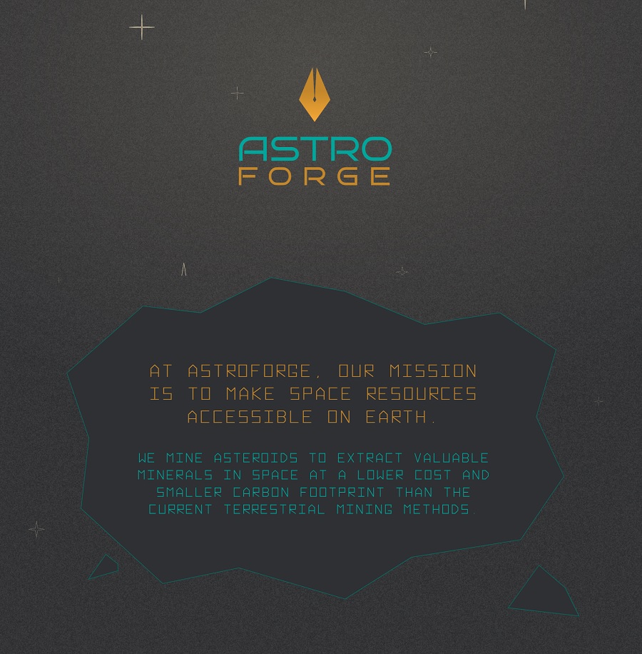
Astro Forge has the distinct look of an original Atari late 1970s or early ‘80s video game. Even the typography gives a nod to the simple san serif text used in many of their highly pixelated original games.
Since the company focuses on harvesting space resources, the entire theming matches their overall vibe. You can go with a theme and make it look like something from the past. Consider what ties into your brand’s mission and brainstorm possibilities.
Advice for Retro Style Websites
Before starting your retro design, consider how much of the site will take on the look of the chosen time period. A few elements can ramp up the effectiveness of the vintage feel. On the other hand, you can embrace a concept like Astro Forge did and invoke a specific game, fashion style or cultural trend of the time. With your imagination, the sky’s the limit–perhaps even beyond.


Leave a Comment