
Rolling Stone Magazine offers a beautiful and highly functional website that draws users in. Each month, Designerly staff looks at some of the top websites around the world, trying to find the best of the best. The idea is to break down award-winning designs and learn from them. We hope you can apply some of the principles to your sites.
We also try to look at various industries, so the award winners offer a nice variety of looks. This month, we decided to take a look at newspaper and magazine websites. The category tends to have a specific layout and functionality you don’t always see in blogs or e-commerce websites.
We sifted through dozens of magazines and newspapers from around the world. Some of the top contenders included The Guardian, The Wall Street Journal and Tokyo-based Popeye. We ruled out The Guardian because of the giant ad at the top of the page that interferes with the flow of the site. “The Wall Street Journal” was a close second because it is easy to navigate and adds a ton of value from stock tickers to scrolling headlines. Popeye has a very aesthetically pleasing design. Ultimately, we felt “Rolling Stone” offered the most straightforward experience with plenty of whitespace to prevent the design from being too busy.
Winner: Rolling Stone Magazine
Source: https://www.rollingstone.com
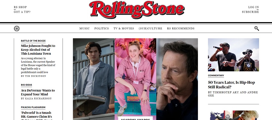
Rolling Stone Magazine offers a straightforward layout with a limited number of categories in the navigation bar. Top stories appear as a single, multiple image, hero section. On the right sidebar is a list of articles the magazine wants you to check out. You’ll also see the latest headlines on the left.
Jann Wenner and Ralph Gleason co-founded Rolling Stone in 1967 to cover rock music and politics. Famous faces graced the cover over the years, such as John Lennon. Over time and with more magazines coming on the scene, the magazine shifted focus to more of an entertainment style publication than politics, although they still covered some high profile pieces. The magazine is under new ownership today and a monthly publication.
The magazine is digital and print. Subscribers get more content with the digital version but can subscribe to the print magazine for $4.99 per month paid annually. The original mission of the magazine wasn’t just to report on music but to look at the world through the focus of whatever music they were covering, be it political, heartfelt or psychedelic.
Why We Chose Rolling Stone as Our Site of the Month
Out of all the magazines and newspapers in the world, why did we go with Rolling Stone? There were many strong contenders but the minimalistic design, combined with a straightforward navigational structure and the bright pop of the company wordmark at the top of the site all drew us in.
Excellent User Experience
When you land on the Rolling Stone Magazine home page, the first thing you see is the title logo and the navigation bar. We like that the subscribe link isn’t in your face or popping up to distract from reading material. It is quite subtle to the right. People can subscribe for more content or order the print version.
They also have some ads near the top of the page, but they blend well with the rest of the design and add rather than detract from it. Embracing multiple streams of revenue in an age when media struggles to thrive is a smart move.
Bold, Bright Logo
The logo is familiar for anyone ever encountering the magazine. The serif font has both square and rounded accents, wide outlines and a silver edge around a bright red letter. The logo also has a three-dimensional look reminiscent of a movie poster.
Simple Navigational Hierarchy
It’s clear the magazine has thought through which material people are most likely to want to access. They have current articles front and center and place five categories across the nav bar.
- Music
- Politics
- TV & Movies
- (SUB) Culture
- RS Recommends
As you scroll down the page, you’ll see links to trending articles in each category. For example, they have sections for “Songs You Need to Know,” “Music Now” and “Rising Stars.”
Three-Column Layout
The three column layout with sidebars on the left and write gives the entire site a nice, magazine-style layout that’s familiar to users. When the user clicks on an article, the format goes to a two-column layout. The article is on the left for easy reading with a thinner sidebar on the right featuring other articles of interest.
Mobile Responsiveness
The mobile website offers all the same great features but sizes down for a smaller screen. The logo moves to the center with the hamburger menu to the left and the subscribe button to the right. One main article pops to the center. Scrolling and navigating the site is simple and intuitive.
Great Contrast and Readability
The white background makes the black text pop and gives the site a newspaper feel that is a welcome respite in a digital world filled with glaring colors sometimes harsh on the human eye. A beautiful serif font fills the body text, making the articles easy to read and digest.
Recognizable Branding
The red and silver logo is easily recognizable and the main component of the design. Instead of adding a ton of different colors and CTA buttons, the site focuses on their being a household name and hones in on red, black and white for their color choices. The result is professional but fun at the same time.
What We Would Do Different
We would lose the ad at the top of the page. While we understand the need for magazines to find multiple ways to bring in revenue and stay afloat, the top of the page creates a big distraction and pushes key information beneath the fold, particularly on mobile devices.
The Designerly staff could go on for weeks about the many things to love about Rolling Stone Magazine’s website. There is always room for improvement. Our idea is to show you what works well in this industry and give you an idea to make your site that little bit better.
If you have a news-based website, you could do far worse than following Rolling Stone’s lead. The site excites us because it proves good design is still out there and doesn’t always mean animated images or fancy cutouts.

Leave a Comment