
One area we haven’t yet looked at for our design awards is the personal coaching sphere. When you think of life coaches, the name that naturally comes to mind is Tony Robbins. With dozens of books, tons of events and movie appearances, his face and name are a brand to be reckoned with. His website just so happens to also be an amazing example of excellent design that pushes a brand image while serving multiple functions.
In October 2023, IBISWorld reported the personal coaching industry brings in around $14 billion per year. You’ll find coaches for health, fitness, career and happiness. Anything that makes one thrive can be turned into a coaching opportunity.
Tony Robbins’ website has a nice grid-based layout that is familiar to most users. The layout, look and spacing all work together to create a stellar presentation we can learn from as designers. Although there aren’t many bright pops of color, the simplicity is still striking.
Winner: Tony Robbins
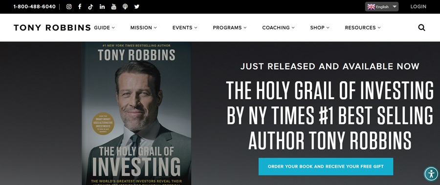
Since Tony Robbins shares a message of personal empowerment, it isn’t surprising that the design uses strong colors of black, charcoal gray and white. Note the single pop of color from the call to action (CTA) button that grabs attention and directs the viewer to the next step.
The navigation bar rests across the top of the page just under the toll-free number and social media icons. The navigational hierarchy is clear from the wider band of white to showcase the seven categories listed. Narrowing the options makes site navigation easier.
Who Is Tony Robbins?
If you haven’t heard of Tony Robbins before, he is a life coach who pushes individual excellence and the power of positive thinking. He’s an author, business consultant and inspirational speaker. Probably most impressive is his work with business owners. He has been named a top 50 business intellectual, top 200 business guru, top six business leader and dubbed the “CEO Whisperer.”
Tony Robbins is a force to be reckoned with. His net worth is $600 million in 2024–made up of seminars, books, coaching and other business ventures.
He’s known for his seminars and his website’s design reflects the many ways he helps people, including upcoming events, training others to do what he does, programs and a shop area for his books. There is also a resources section with a blog, podcasts and videos.
His website is an interesting mix between a portfolio of pursuits and educational features.
Why We Chose Tony Robbins as Our Site of the Month
We love looking at the way people build their businesses. We try to vary the industries covered to give an idea of some of the different trends in each and how they can apply across various types.
Tony Robbins’ name comes up repeatedly on YouTube, on television and social media. His short quips provide inspiration and his website matches. One of the reasons we selected his site to feature this month is because there are a wealth of free resources via the blog and podcasts. While he does sell seminars and coaching sessions, he also provides valuable insight for people on a budget. Here are the things we love about the overall aesthetic of the design.
Wordmark Logo
We like the simplicity of the logo. It puts the focus on the brand name and shows that Tony is the force behind the company. The logo doesn’t distract from the navigation but blends seamlessly with the other text on the page. Still, it is a bit larger than the other letters, so it does stand out.
Black & White Color Palette
We love the elegance of the black, white and charcoal gray color palette. It shows the strength of his personality while keeping the focus on the single CTA above the fold that provides the only bright pop of color on the page.
Although Tony has many irons in the fire, he narrows the navigation menu to seven options. To further break down what’s available, each category offers subcategories. For example, if you hover over “Resources,” you see links to the blog, podcasts, an app, videos and tools.
Studying excellent examples of navigation helps improve your presentation.
Featured Slide
We love the single, featured slide showcasing his latest book. The image is also of the personality behind the brand, so it highlights whose site it is. The bold, bright text points to key points such as him being a number one best-selling author and that you’ll get a free gift if you order the book now.
Multiple Languages
Tony’s message is universal, so it isn’t surprising there is a drop-down near the top of the page that highlights the different languages one can utilize to view the page.
Trust Factors
The site includes trust factors to show the user can believe Tony’s work might help them. For example, as you scroll down the page, you’ll see a list of where his work has been featured, such as Fortune, Forbes and Inc.
Social Media Links
It makes sense an influencer like Tony Robbins would have a presence on social media. He highlights the places you can find him at the very top of his website with icons to sites such as Facebook, YouTube and TikTok.
Animated Elements
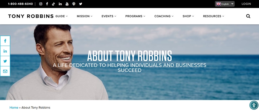
The page might look a bit plain with the dark colors, but the animations do help quite a bit. As you scroll down, a list of solutions drops in from private coaching to upcoming events. Scroll a bit more and a video screenshot drops in along with a link to Tony’s full bio.
What We Would Do Different
While we love the strong, basic color palette, we would add a few shades via the images utilized on the page. Tony often wears black or gray and it means the photos are also in those hues. It makes the page a bit dark and drab. If not for the animations, it might be more noticeable.
Since the topic of the page is about positivity and empowering your life, a photo of Tony wearing a bright shirt or with a background on a beautiful day might add just the right amount of interest to the overall design.
Embrace black and white designs but look for ways to grab interest with pops of color in your images and CTAs. Tony Robbins’ site manages to hit most of the high notes. With some photo updates, it would really stand out from the crowd.

Leave a Comment