Stark Bro’s Nurseries & Orchards Co.
From United States

You might wonder why we’d want to look at nursery websites heading into winter. After all, many areas of the country are experiencing cold temperatures. However, it is also the best time to think about what you’d like to plant in the spring and do some thorough research. Choosing Star Bro’s Nurseries and Orchards Co. seemed like a no-brainer.
We haven’t looked at nurseries yet as one of our categories in selecting a website design award. Designerly Staff was pleasantly surprised at the plethora of options in finding a winner. There are national stores that ship all over the country as well as mom-and-pop local nurseries catering to a specific region.
IBISWorld estimates there are around 18,069 nursery and garden stores in the United States. Collectively, they bring in $48.7 billion in revenue per year and employ around 144,000 workers. Although it is a niche business, other types of companies can learn.
If you sell a product combined with a service, you may be able to learn a lot from Stark Bro’s and Orchards Co.’s design.
Winner: Stark Bro’s Nurseries & Orchards Co.
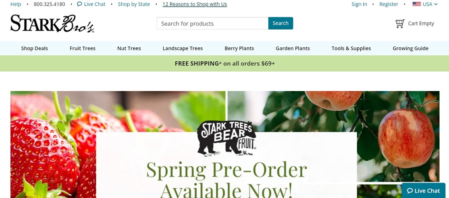
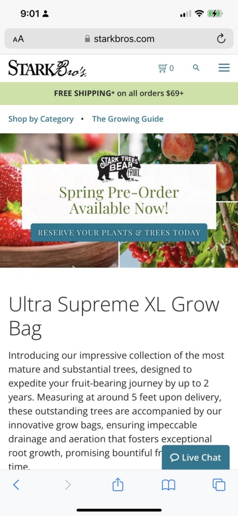
Stark Bro’s Nurseries & Orchard Co. is affectionately known as Stark Bro’s by its long-term customers. Note the clean, grid-layout of the design and the bright vivid colors that engage the user from the minute they land on the page.
You’ll find they’ve narrowed their navigation to their most popular categories and added some details to encourage the user to go through the sales funnel. Free shipping on orders over $69 is an offer that entices people to spend a bit more than they otherwise would.
What Is the History of Stark Bro’s?
Stark Bro’s was founded in 1816, making it a company that’s been around more than 200 years. They are the company that brought Red Delicious and Golden Delicious apples to the public.
The team works to bring trees and innovative growth methods to their customers from their base in Louisiana, Missouri. Some famous names who grew Stark Bro’s trees included Laura Ingalls.
The company provides a one-year guarantee or they’ll send a replacement item. They also have some unique varieties you won’t easily find elsewhere.
Why We Chose Stark Bro’s As Our Site of the Month
We love taking a closer look at a family heirloom type company. Stark Bro’s is a slice of early Americana as people migrated west and set up homes in various areas in the Midwest and beyond.
James Hart Stark carried apple tree scions from Bourbon County, Kentucky to the western banks of the Mississippi and settled in the same valley where they grow the trees to this day. His legacy of apples and 17 children carries on and can be seen in the customer service model the company provides.
Here is a closer look at the design of this age-old company and what we appreciate about it most.
Large Logo
The logo on the homepage is larger than many you see. Relying on a wordmark, they use two distinctive fonts to create a look of modern elegance and traditional calligraphy. Both fonts are highly readable and making the logo slightly larger puts the emphasis on their name and the reputation they’ve spent decades building.
Navigation Hierarchy
The navigational hierarchy on the site works particularly well with the number of products offered and the insightful tips about growing plants and trees in various zones.
Note the primary menu is in an expected place. It’s located just under the logo and broken into eight categories. However, there is a smaller menu at the very top of the page featuring some links to help pages, shopping by state, live chat, a toll-free number and “12 Reasons to Shop With Us.” To the right is a spot to register, sign in or shop by country.
Studies show 94% of people want navigation to be easy, so sticking to what you know works can keep them coming back to your site repeatedly.
Message Stripe
Under the navigation bar is a stripe with a message about saving money by spending $69 or more. A band of color with a note to users can draw them in and let them know about specials or breaking news.
Hero Image
The hero image used on this site is particularly effective because it’s a grid of some of their plants they offer with an overlay letting customers know they can order now for spring planting and be ready to go when the weather breaks.
Since many customers are likely starting to think about what they want to plant when winter is over, or even if they aren’t, this is a gentle reminder to get their pre-orders in now.
Relevant Sidebar
One thing we really like about this design and that put them at the top of our choices was the sidebar listing popular categories, including:
- Stark Picks
- New Products
- Exclusives
Within the sidebar menu, they include an image of the product, a heading and a short description. If the item is on sale, it gets a bright red banner to indicate the lower price.
Interactive Tools
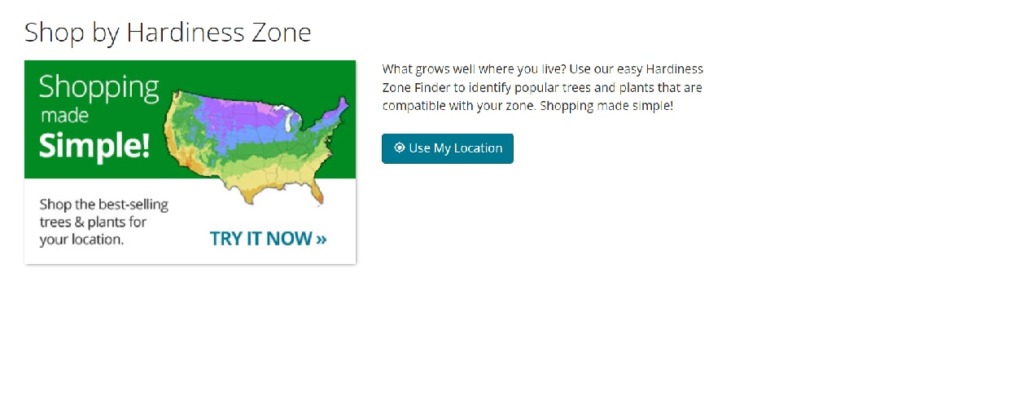
We like the location tool offered on the landing page. The user can shop by zone or click the “Use My Location” feature to find the best plants for their area. Since the company ships all over the place, it makes sense to include an interactive map to help people decide what will grow best in their area.
Mobile Responsiveness
The Stark Bro’s website got a lot higher marks than we might normally give. Why? It is their amazing mobile responsive design. Instead of presenting tiny little letters, they narrow down the categories and menu to keep things simple and readable. Images are slightly smaller but also stack on top of each other to keep them pleasant to the eye.
The main features are all there but the design is intuitive for smaller screens.
Color Palette
The massive amounts of white space give the design a fresh, crisp look. It seems perfectly suited to apple orchards, doesn’t it? The green is reminiscent of Granny Smith apples and the splashes of vivid blue draw attention.
The entire color scheme is outdoorsy but minimalistic and pulls users in and makes them want to read on.
What We Would Do Different
We would move the blog up a bit more and give it more focus. The amazing tips on their site include topics such as how to harvest and store onions and garlic, where to plant fruit trees and soil preparation for different seasons.
The website design is stellar and we gave them perfect or near perfect scores in every category. However, every site can use a tweak or two. Putting the blog front and center shows their decades of experience and sets them apart from competitors.