Each month, we at Designerly seek out the best of the best for web design inspiration. Our monthly award considers aspects of excellent user experience (UX) design. We also consider functionality and overall aesthetics in our final decision. Ensage encompasses many of the elements we appreciate most.
We have looked at many categories for our award, including retail, travel and a look at the Royal Family’s website from the UK. This month’s award goes to a design boutique known for its creativity and uniqueness.
Winner: Ensage
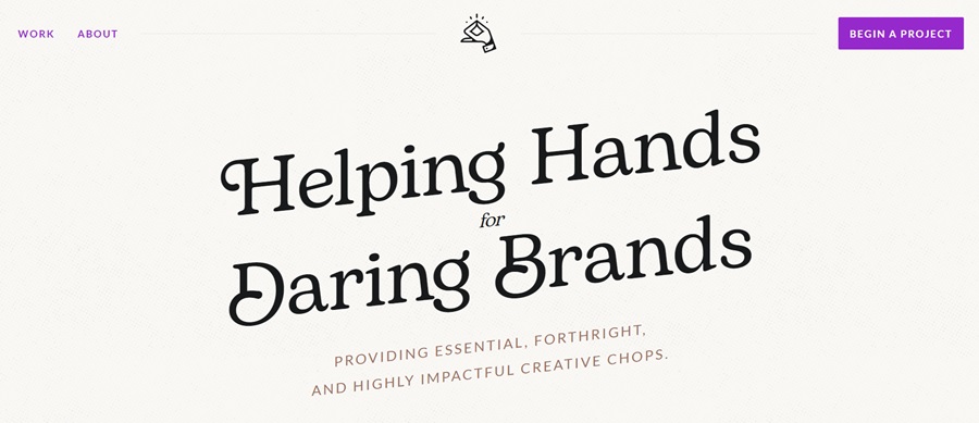
Ensage offers a simple design that embraces everything minimalistic. Although some of the design examples embrace a more complex look, keeping things simple on their website allows the user to see they are capable of any type of style.
IBISWorld estimates there are 450,279 graphic designers globally. Expected growth is 2.6% through 2024. Narrowing down the choices is challenging. We found many worthy designers with excellent websites.
The sheer focus of Engage is what made us keep coming back to this particular brand. The limited number of items on the landing page points the user to the call to action (CTA) button. The CTA is purple, which pops against the neutral background. We didn’t have access to conversion rates for this site, but suspect it has a high success in converting visitors to leads with that CTA button.

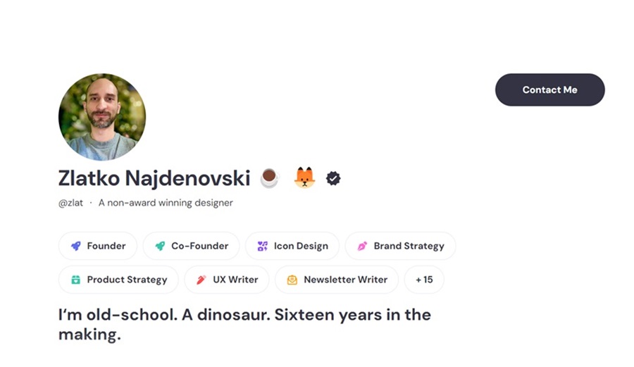
Mr. Najdenovski promotes himself as a non-award winning designer on his Polywork profile. We found this amusing as we loved his minimalistic design and chose it for our monthly award. Mr. Nakdenovski, now you can say you did win an award for design–probably one long overdue.
His years of experience and example designs speak for themselves on his About page. He enjoys “simplicity in creativity.”
Why We Chose Ensage as Our Site of the Month
Featuring a designer’s site as our site of the month is risky. Every other designer who reads this column will find something they would have done differently. We ask you to remove your critic hat for a moment and journey with us to the Ensage site and see what we saw. We can all learn from one another, and there are numerous things to appreciate from this particular design.
Minimalism
One of the top reasons we chose this site was how simple the design is. There is a singular goal to get the user to click on the CTA button. There aren’t many additional images, features or fancy bells and whistles.
Site Speed
There are no videos or images to drag down load times. The site pulls up at lightning speed on mobile and desktop. Google prefers fast sites. Most users aren’t patient enough to wait for something fancy to load.
Fun Tone
The tone of the site is relaxed and casual. The founder, Zlatko Najdenovski, mentions he walked away from corporate stress and focused on what he loves. It shows in his bio and the easy personality the site imbues.

Mobile Responsiveness
It is rare that we say we like a mobile site better than the desktop version, but here we are. We absolutely love the mobile version of Ensage.co. The site loads faster than you can blink. However, the layout looks even more intriguing on a smaller screen, telling us this site was likely designed for mobile first.
Note how you can see the examples on the landing page and the CTA button is top center to highlight the goal of the page once again.
Color Palette
The colors for Ensage are striking. A cream background is easy on the eyes. The black text pops against the pale shade. The only bursts of color come from the images and the CTA button. Notice how the bright purple hue grabs attention? The user’s eye is instantly drawn to it.
Interesting Fonts
The site headline is in a beautiful serif font that has some interesting ornamental features to grab attention. The heading is still highly readable on big and small screens. Keeping the rest of the design minimal puts the focus on the typography.
Navigation
Here at Designerly, we love simple and straightforward navigation. Even the nav bar in this design is as easy as possible. Limiting the options keeps the focus on the site’s goal. Note how the navigation has two options. You can look at the designer’s work or learn about him. The only other things on the nav bar line include a link back to the homepage via the logo and the CTA “Begin a Project” option.
Social Media Proof
People need a reason to trust someone they’ve never met before but are considering doing business with. Ensage adds some social proof to drive engagement and allow those interested to learn more about its design work.
The site links to Dribbble, LinkedIn and Polywork. Each site offers different insight into the designer.
Gallery of Projects
The thing that put this particular designer’s website ahead of the pack was the gallery of projects. His About page states he’s been in the business over 16 years. Yet, he has clearly hand-selected only the best work to share with users. By limiting the number of projects in the gallery, it’s much easier for people to see his best work and if his style matches their needs.
Short and Sweet
Everything on the site is short and sweet. It’s easily skimmable in a few minutes. We loved the focus of this website and how it respects the user’s time. People looking for a web designer are likely business owners. They may not have hours to poke around and read a ton of content and view examples. With Ensage, they can gather the details they need quickly to make an informed decision.
What We Would Do Different
While we love the simplicity of the site, we worry it might grow stale over time. Content bolsters a page and gives you fresh details to share on social media. They’ve done a good thing by making the gallery blog posts with additional insight. However, a few well-timed pieces might give them a bit more to post on social media and drive more traffic to their brand.
