Taylor Swift Orange: How Pop Culture Now Picks Color of the Year
Posted on August 22, 2025 | Updated on August 22, 2025
Marketing decisions involve a mix of factors. Experts must know what’s best for the brand, which steps align with the company’s standards and what the public will respond to. Fan-led marketing is changing that. Some of the biggest companies are publishing content in “The Life of a Showgirl” colors after Taylor Swift’s recent album announcement. Diving into how pop culture changes color-focused marketing could reveal new ways to reach bigger audiences.
What Is TS12 Orange? Taylor Swift’s Album Color Explained
Taylor Swift appeared on the “New Heights” podcast on August 12 to announce her new album, “The Life of a Showgirl,” and the internet turned upside down. Swifities collectively started a new Easter egg hunt, but most of their theories began with the color scheme. Swift’s upcoming album — affectionately called TS12 — features sparkly orange text on a mint green tub of water.
That pairing might not strike non-Swifties as anything special, but it rocked her fanbase. Orange has long been the supposed color of her unconfirmed lost album. Fans theorize that Swift was supposed to publish an album potentially called “Karma” after “1989,” but a particular over-the-phone circumstance in 2016 led to “reputation” instead.
Marketing teams don’t have to know years of Swiftie lore to learn from the singer’s current color choices. The lore gives the palette built-in significance to a widespread audience. Experts can redesign their creative playbook by incorporating pop color trends into their design guidelines. Numerous companies are already demonstrating how.
TS12 Orange Hex Code for Brands
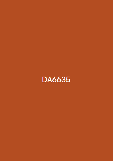
Taylor Swift doesn’t announce the color shades for her albums, so marketing teams must start by collecting an unofficial hex code sampling. Companies can use #da6635 as their TS12 orange, based on a sampling from the album cover. Once teams have their hex code ready, they can learn how best to use it from leading brands already implementing it into trend-based content.
How Brands Are Using TS12 Orange on Social
Research shows that 76% of consumers continue doing business with brands they feel connected to, which develops in numerous ways — and for companies with an audience that overlaps with Taylor Swift’s typical listener demographic, connection may just look like temporarily branding yourself with TS12 orange. Here’s how some of today’s top brands have done so.
McLaren
McLaren is a well-known luxury car manufacturer, so it doesn’t need to gain brand recognition. However, the company can make people feel more connected with its products by jumping onto color trends.
The brand already had an orange logo when the “The Life of a Showgirl” announcement countdown began. McLaren marketing team members used the countdown style for social media content ideas. They recreated the sparkly orange background to advertise that their summer shutdown was almost over, drawing the attention and joy of Swifites who love racing.
Empire State Building
Marketing gurus shouldn’t forget about the Empire State Building when reading about TS12 orange examples from brands. The iconic building partnered with her team previously for “1989” content. When her countdown started, the building lit up orange and posted about starting a new era. The simple photo and caption generated plenty of brand recognition and admiration through the Swifitie corner of the internet.
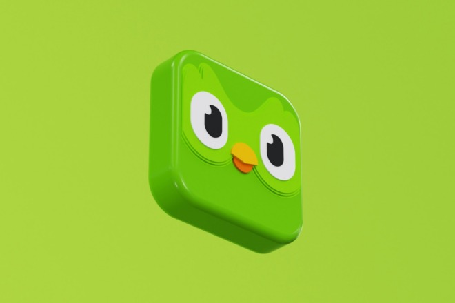
Duolingo
Brands can also lean into meme culture like Duolingo. The company’s marketing pros waited until Swift revealed her track list to put the Duo owl front and center. They spun the song titles into pictures from recent Duolingo history to make fans laugh and gain digital traction on the traffic generated by the album announcement excitement.
Scrub Daddy
People follow the Scrub Daddy Instagram account for funny videos and product updates. When the company posted a sparkly orange Scrub Daddy sponge locked behind the blurred-out TS12 album, it fit their brand standards. There’s no better proof that marketing teams can use culture as currency than a smiling sponge getting almost 100,000 likes.
Dunkin’
Dunkin’ was one of those brands with an orange logo before August 12, so its marketing team converted it to sparkly lettering. Making the logo change in a singular post helped the company join the TS12 countdown excitement. Fans who already like Dunkin’s coffee and doughnuts might enjoy their brand preference more because the company likes Taylor Swift like they do.
Buffalo Wild Wings
Buffalo Wild Wings had a similar idea to Scrub Daddy. The brand put an orange chicken wing behind the blurred-out album with a sparkly orange version of the company’s buffalo icon. Some of the most effective marketing design trends don’t have to be unique. The image still got plenty of comments and aligned the brand with Taylor Swift’s popularity.
United
While people might not think an airline can use a pop culture trend, the brand proved everyone wrong. The company posted a picture of a United plane taking off in a sparkly orange sky. The marketing plan was simple, but made a loud statement about United’s shared excitement with Swifties.
Olipop
Although trendjacking — known as reactive marketing — can sometimes get a bad name, Olipop demonstrated how to do it right. Swifties saw the company feed update with a sparkly orange-flavored can of Olipop against a green background. The added text referencing the “New Heights” episode drop gave the post an edge against other companies that only used the color scheme.
How to Use Taylor Swift Orange in a Brand Palette
Any company can use the unofficial Taylor Swift orange hex code without redefining established brand color palette standards. Implement a sparkly version of #da6635 into logos, icons, mascots and other imagery that already fit the company marketing plans. Any other references, like the album debut date, lean into the era more. The right blend depends on how much the marketing team wants their company identified as a Swifitie.
Experts also must think about design accessibility for orange and turquoise. A contrast checker will ensure that the color combination meets Web Content Accessibility Guidelines (WCAG). WCAG compliance ensures that marketing materials are accessible for people with disabilities in multiple ways.
Scaling A to AAA ratings guide WCAG metrics. While A is a minimum compliance requirement, a WCAG AA score means the materials have strong accessibility features. Those include contrasts with a minimum of 4.5 to 1 between text and colors. Otherwise, the images might be hard to read and exclude parts of the intended audience.
Best Practices for Reactive Marketing Around Pop Culture Moments
Using the new Taylor Swift album color palette will make a splash right now, but marketing experts should strategize how to maintain brand congruence while matching future trends. Simple steps like a logo swap or colorwashing could backfire without strategies in mind, like:
- Don’t overuse the color: Pop culture color trends might help companies gain recognition online, but overusing the color in continual posts could turn fans away by coming across as desperate.
- Avoid trends that don’t make sense for the brand: Posting sourdough bread memes wouldn’t work for a keto food company and make the brand’s post look amateurish.
- Monitor fan reactions: Give newer trends a moment to gain public reactions. Unless they’re something uncontroversial like Taylor Swift orange posts, marketing teams don’t want to look like they’re supporting something that gets the equivalent reaction of Pepsi’s 2017 social justice protest ad.
- Don’t derail planned campaigns: Companies that make viral trends their entire personality with multi-week posting look unprofessional because they’re ultimately distracting followers from their products or services.
Maintaining brand safety while participating in marketing design trends shouldn’t feel impossible. Strategies that define timelines, trend usefulness and compliance guidelines for things like accessibility contrast can make trendy posts work.
From Barbie Pink to TS12 Orange: Pop Culture’s Color of the Year
When Taylor Swift’s “The Life of a Showgirl” debuts and becomes an everyday occurrence for fans, other viral color trends will develop. The public saw it happen with Barbie pink in 2023 and Brat green in 2024. Charli XCX selected the shade because it looked uncool, but the anti-design approach won people over.
Designers used to look strictly at Pantone for the color of the year. While the company chose Peach Fuzz for 2024’s color, the general public might argue that Brat green made a bigger cultural impact. The shade went so viral that it shifted the short-term marketing of an entire presidential campaign.
They could also note that Barbie pink, Brat green and TS12 orange are vivid hues. Neon colors might be more popular year-to-year, which Pantone typically doesn’t select. Learning to wield both in marketing campaigns can strengthen a brand’s approach to building audience connections.
Follow Viral Color Trends and Repurpose Them
Discovering how to ride viral color trends without diluting a brand makes marketing teams stronger. Pay attention to what’s trending, watch the general public’s reaction to things and make minor content changes for fleeting fads. Marketing gurus can continue their planned campaigns and join pop culture phenomena without missing a beat.
About The Author
Eleanor Hecks is the Editor-in-Chief of Designerly Magazine, an online publication dedicated to providing in-depth content from the design and marketing industries. When she's not designing or writing code, you can find her exploring the outdoors with her husband and dog in their RV, burning calories at a local Zumba class, or curled up with a good book with her cats Gem and Cali.
You can find more of Eleanor's work at www.eleanorhecks.com.