The landing page is your first chance to make an impression on new visitors. Each page on your site has a very special purpose and function, but a landing page is quite specific to your buyer personas. You know it needs to be spectacular, but you might wonder what to include on a landing page.
If you look across all industries, you’ll find a 7.9% average conversion rate. Your business type might be higher or lower, so don’t stress about hitting a specific goal. Just be aware of the numbers and strive for something above average.
Fortunately, there are some rules of thumb about what to include on a landing page to make it stellar. Here are some easy tips for what will make yours shine.
1. Know The Location
Landing pages are in the middle of the sales funnel. Their general purpose is to nurture a lead and turn that person into a customer. However, there are also form pages meant to collect information. Anyone signing up via a form page will be pre-qualified.
Knowing the landing page position allows you to understand better why they need to be specific to a particular objective. The person likely already knows about your company or industry. They want detailed information on a product or service. Knowing what to include on a landing page helps you get better results.
2. Set an Objective
What is the goal for your landing page? Do you want to sell something? Perhaps you want contact information so your sales team can follow up? Each landing page should have a single purpose. What to include on a landing page depends on the objective of that page.
Everything on your page must point to the purpose you’ve set. The concept goes deeper than just adding words that tie into your goal. You must also add visual elements pointing the user to the action you’d like them to take.
An arrow can guide site visitors to scroll down the page, pay attention to a call to action (CTA), or click on the submit button for a form.

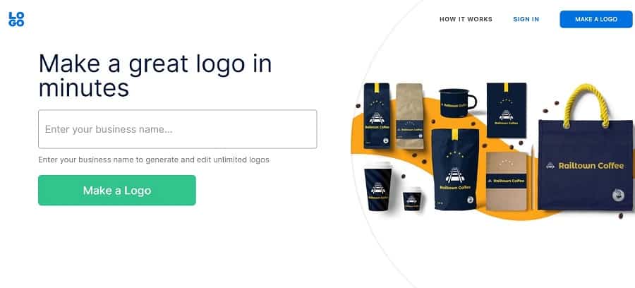
Logo does an excellent job of honing in on the pain point of needing to make a logo. They add a CTA in two spots calling the user to get started. The page’s goal is clearly to offer an incentive and get the user to sign up and use their tool.
3. Define Your UVP
What is your brand’s unique value proposition (UVP)? Your UVP is the thing that makes you stand out from all the other businesses like yours. Take time to study your competitors and see what their UVPs are.
You must choose something you can excel at that is different from theirs. UVPs tend to develop over time. If you aren’t sure what yours is, survey your customers and determine why they choose you over other brands. On the list of what to include on a landing page, your UVP should be near the top.
4. Address Buyers’ Fears
Create buyer personas so you fully understand the emotions and concerns driving your audience to your page. By tapping into emotions, you make a connection with the user. Addressing fears on a landing page increases conversions by as much as 80%, helping buyers choose to give your product a chance.
Don’t try to frighten your prospects. Just understand the fear is already there and explain what you can do to help alleviate it. Emotions are what to include on a landing page when you want to connect with your audience.

Christian Matches uses a photo of a happy couple to show people they could find a loving companion. Every detail in the photograph taps into the pain points of someone who’s lonely. The couple is clearly happy, the woman has her arms around the man, and he is turned slightly toward her.
5. Write Excellent CTAs
A great CTA wraps everything up tidily. The person made an effort to search or view your ad. They clicked and came to your site. They read the entire landing page. Now, they’re ready to take action.
How to create effective CTAs would take an entire article of its own. However, there are a few things you can keep in mind to improve yours.
Use first or second-person wording. Use a bright color button that contrasts with the background. Add arrows and other elements pointing the way to your CTA. Try different placement, hues, syntax and sizing until you find what works best with your audience.
6. Add Relevant Photos
There is an adage that a picture is worth 1,000 words. When you add photographs to your landing page, they must be highly relevant to the topic at hand. If you’re selling a product, add an image of the item in use.
You also don’t want to clutter your page with too many visuals. A few photographs or an informational video work nicely. A crowded mess of images just drives people away. Add only what is necessary to move the customer on through the sales funnel.
7. Rework Your Headline
Your landing page’s headline is likely what drew visitors to your page in the first place. If the page came up in a search engine results page (SERP), the headline grabbed attention. Add keywords and phrases your audience would most likely use when searching for a solution to the problem you’re solving.
Think about natural language patterns (NLP) and how you can tap into the words users turn to when searching online. Keep in mind that many people use voice search via smart speakers and cell phones today. NLP becomes a vital consideration when you realize your typical customer may use those methods to hunt for you.
Once you have the wording perfect, try it with some A/B tests to see how well it performs. Adjust the elements a bit to better suit the SERPs. With a little effort, your headline can draw in even more traffic than expected.
Once someone lands on your page, you want the headline front and center. The text should be bigger and bolder. Put some beautiful typography to grab attention and make sure the person understands the landing page’s content.

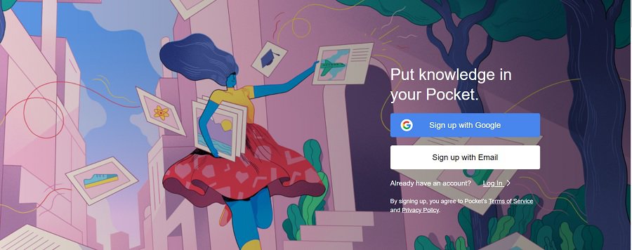
Pocket does an excellent job of keeping its landing page simple. The company uses the headline “Put knowledge in your pocket” to perfectly summarize what their software does.
The headline’s length is short enough to be memorable and uses action words alongside concrete ones that paint a picture. If you’re going down the list of what to include on a landing page, don’t forget the first element people see.
8. Offer an Incentive
Why should people share their personal data with you? After all, salespeople can be highly annoying, calling your cell phone at all hours or filling your email inbox with spam. Make sure you give them a compelling reason to submit the form.
A free e-book detailing how you can solve their pain point is a good start. Some landing pages offer webinars, free estimates, and other desirable things. You can even try different offers on separate pages and see which one performs best.
9. Sprinkle In Trust Elements
Most of the people coming to your website have never heard of your business before. How can you show them you’re authentic and they can trust you with their information or hard-earned dollars?
Adding in trust factors such as testimonials, reviews and logos to organizations you’ve joined are a good start. Make sure contact information is easy to find. If they can’t get in touch with you now, what will they do if they have an issue with the product?
Think about what you’d need to trust a company. Offer those reassurances to your leads as part of what to include on a landing page.
10. Remove Extra Elements
Many experts recommend removing extra navigation and elements not related to the objective of the landing page. Additional navigation risks the person clicking away from the action you’d like them to take.
Adding elements at the bottom of the page can create confusion. The person may not know if it is a landing page or a part of your website’s hierarchy. You might also distract them from the CTA, and they won’t click on it.
Create the Perfect Landing Page
There is no “perfect” landing page. When asked what to include on a landing page, your response will vary depending on each one. The best pages improve over time to meet the needs of your clients. Run tests frequently, make small changes, retest and get as close to exemplary as you can.
Landing pages all have a few things in common, but you also need to embrace what makes your company unique. Don’t be afraid to try something new if you know it might work for your audience. Today’s top trends in design result from someone getting a crazy idea and going for it. Who knows what you might accomplish with a little creativity.
About The Author
Eleanor Hecks is the Editor-in-Chief of Designerly Magazine, an online publication dedicated to providing in-depth content from the design and marketing industries. When she's not designing or writing code, you can find her exploring the outdoors with her husband and dog in their RV, burning calories at a local Zumba class, or curled up with a good book with her cats Gem and Cali.
You can find more of Eleanor's work at www.eleanorhecks.com.


