Charli XCX and the Rise of Anti-Design
Posted on July 24, 2024 | Updated on April 24, 2025
In pop music, few artists manage to challenge the norms and spark conversation. But Charli XCX has managed to do just that. Embracing the raw energy force of anti-design, her “Brat” album cover has sparked conversation and debate. While some are fans of the artwork, others have criticized it for being too minimalist or just plain ugly.
Yet, Charli’s album cover is making a statement in contemporary pop culture. The use of unconventional typography and disruptive imagery overall defies traditional design principles. This original art form steps away from the visuals typically seen in the music industry and creates an impact that challenges peoples’ perceptions of art and design.
Charli XCX’s Album Cover and Brat Girl Summer
Charli’s Brat album cover is a bold, quirky design containing a blurred title against a vibrant lime-green background. The artwork’s unfiltered look clearly avoids a clean visual. Instead, the cover’s design is reminiscent of the 2000s and looks like something created in PowerPoint.

The choice of its cover and typography stems from the direction she wanted to achieve. Charli felt the neon green was “gross,” but she picked it because it sparked a conversation about the desire for attraction. Charli also purposely chose this design since it was “uncool.”
While the Brat album cover’s design is imperfect and unexpected, it aligns perfectly with the music and the artist herself. Charli XCX is all about rejecting the status quo. When she felt her album cover was loud enough, she knew her design would invite listeners to look beyond the surface and encourage them to engage with the music on a deeper, more conceptual level.
And engage they have. Fans have quickly adopted the color “brat green” — also known as hex code #89CC04 — as the color of the summer. You’ve also now more than likely heard of “brat girl summer” or “brat summer,” the latter of which has been hashtagged in more than 40,000 TikTok videos. Even presidential candidate Kamala Harris turned her campaign brat green in honor of the meme of the summer, which Charli acknowledged with the tweet “kamala IS brat.”
The same type of visually unexpected “anti-design” look goes for the deluxe edition of Brat. “Brat and it’s the same, but there’s three more songs so it’s not.” The font and minimalistic cover rebel against the core principles of design.
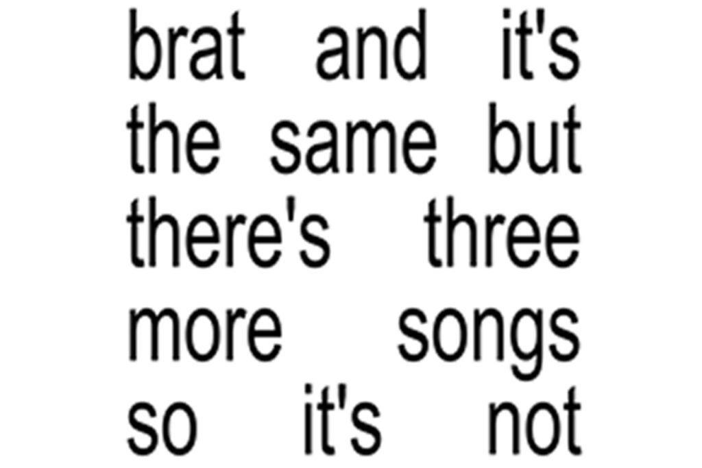
Yet, it does what Charli XCX set out to achieve — capture her audience’s attention with an accurate title in a plain black-and-white design.
What Is Anti-Design?
Anti-design is an artistic movement that deliberately ignores best design practices, favoring a more provocative approach. It prioritizes imperfection, challenging the controlled visuals used to make content engaging.
In practice, anti-design looks off-balance, flashy and crowded — it goes against every rule a graphic designer learns in school. However, anti-design is methodical and still follows a few core principles that push the boundaries of art, including:
- Dismisses conventional rules of composition, typography and color theory, opting for a more freeform approach.
- Celebrates the beauty of imperfection, often using hand-drawn elements, mismatched fonts and clashing colors.
- Incorporates ironic or satirical elements, critiquing societal norms, consumerism and the art world itself.
- Develops a unique visual language that stands out, often making bold statements through creativity and individuality.
While some think anti-design is aggressive and negative, it is more about expanding upon what design could be. It also inspires audiences to reconsider perceptions of beauty, order and creativity.
Anti-Design and Its Resurrection
Anti-design originated in the 1960s as a reaction to the effects of mass consumerism on design standards. As consumer culture grew, design became increasingly formulaic and focused on marketability.
Anti-design arose as a counter-movement, challenging the commercialization of art and design. It was a rebellious move against the sleek, uniform aesthetics that consumerism drove.
Throughout its lifetime, anti-design positioned itself as a critique of mainstream design trends. In the 1980s, it found expression in the punk movement and the grunge culture of the 1990s.
Today, it continues to serve as a counterpoint to the minimalistic corporate aesthetics prevalent in the digital age. Artists and designers are increasingly embracing the authenticity of anti-design and creating more original visual experiences.
Noteworthy Examples of Minimal Album Covers
Charli XCX is one of many musical artists to hop on the anti-design bandwagon. Throughout the last few decades, artists have exemplified similar minimal art covers.

System of a Down’s “Steal This Album!”
System of a Down’s early 2000s album “Steal This Album!” is a definitive example of anti-design. The album cover features a plain background with the album title hand-scrawled in black marker.
This design mimics the look of a burned CD, which was common in the early 2000s. People often copied music onto a blank disc and labeled it themselves. However, this album came at a time when technology was advancing, and the music industry was grappling with the rise of illegal digital downloads and file sharing.
Platforms like Napster and LimeWire facilitated digital piracy and illicit consumer behavior. When System of a Down’s album was released, the alt-rock band ironically named it “Steal This Album.”

Kanye West’s “Yeezus”
Kanye West’s “Yeezus” album features an entirely minimalist approach. The album cover is devoid of his previous album artwork, displaying only a transparent CD case with a single piece of red tape. This design starkly contrasts his usual style, where he often incorporated elaborate designs.
However, Kanye decided to strip away all typical design elements, as it was a strategic move to present the soundtrack itself. The minimalist cover mirrors the unfiltered production style of the music, which aligns with its themes of disruption and innovation.
The absence of artwork on the Yeezus cover can also be seen as a commentary on the industry’s focus on appearance over substance. By presenting a bare, almost industrial-looking package, Kanye West rejects the notion that visual appeal is important in the album’s reception.
Implementing Anti-Design in Artwork
While some musical artists seem to step outside the norms of elaborate album artwork, anti-design embodies more than minimalism. Instead, it embraces creative experimentation and pushes designers to explore a new approach to design. Yet, if a brand decides to go with complex layouts and reject simplicity, is it right for them?
The use of anti-design depends on several factors, such as the audience, the project, and the overall message. Anti-design is ideal for projects that appeal to a younger demographic and when brands want to inspire audiences to engage and capture their attention.
For instance, some designers may use anti-design on a website to present unconventional navigation, such as parallax animations. Elements like these invite users to interact with the website and stay to explore.
It is also all about how a brand wants to communicate with its audience and the message it wants to send. Typically, a company will use anti-design on social media to reinforce its message and stand out among the typical graphics artists use on these platforms.
When implementing anti-design, consider a few tips:
- Embrace imperfection: Use hand-drawing, mismatched fonts and uneven spacing to create a spontaneous layout.
- Challenge conventions: Break away from traditional compositions. Experiment with asymmetry, overlapping components and daring color schemes.
- Opt for raw images: Convey a sense of realism by using candid, unedited photographs or illustrations.
The Chaos of Anti-Design
Anti-design may challenge traditional aesthetics, but it encourages designers to explore new realms of creativity. From imperfection to bold statements, this movement becomes a powerful tool for connecting with audiences on a deeper level. However, implementing anti-design requires a deep understanding of its principles. Once a designer is ready to color outside the lines, they can create works of art that resonate with today’s culturally savvy consumers.


About The Author
Eleanor Hecks is the Editor-in-Chief of Designerly Magazine, an online publication dedicated to providing in-depth content from the design and marketing industries. When she's not designing or writing code, you can find her exploring the outdoors with her husband and dog in their RV, burning calories at a local Zumba class, or curled up with a good book with her cats Gem and Cali.
You can find more of Eleanor's work at www.eleanorhecks.com.