15 of the Most Iconic, Recognizable TV Show Logos of All Time
Posted on March 27, 2025 | Updated on March 27, 2025
One of the world’s favorite pastimes is watching TV shows. I asked five people in my immediate circle what their favorite shows were growing up and now. Each had an instant answer and remembered the most iconic TV logos as well as the theme song from the series. Designers can learn skills by studying the ones they remember and seeing how the creator tapped into a mood or period of time.
Methodology
The Internet Movie Database lists over 150 titles for 2025 alone, including American and British made-for-television shows. Multiply the number by all the shows throughout history and it’s an impressive collection of iconic TV logos to study.
Narrowing down the selection to the best TV show logos throughout broadcasting history required a list of six criteria.
| Crisp, clear designs with a simple point | Sets the same mood as the television show |
| Unique enough to be memorable | Speaks to the target audience |
| Color and aesthetics | Meets industry standards |
15 Iconic TV Show Logos Through the Ages
The entertainment industry is filled with talented designers and creative concepts. Narrowing the list of excellent TV show logos down to a small list is complex. Older shows were more limited in the software and design concepts they employed, yet they still deserve a spot for their timeless designs. After careful consideration, here are the top 15 logos that meet excellent design criteria and stand out from others within their decade.
1. Saved by the Bell
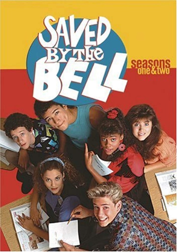
Sam Bobrick created Saved by the Bell for NBC. The teen-based sitcom first aired in 1989. The show was on for four seasons, through 1993 but spawned two spin-off series that ran through the year 2000. Most millennials and their parents are familiar with the show and enjoyed visiting Bayside High School and the friends who gathered there.
The logo changed slightly throughout the series, taking on different background colors and starting with a minimalist look and moving into a retro cartoon style later in the show’s airing. The show was light, funny and entertaining and the logo reflects the comedic aspects of Saved by the Bell. It sets a tone of friends enjoying high school and one another’s company and the bright colors stand out from other shows during the same time period.
2. Breaking Bad

When Breaking Bad first came out, I was obsessed with seeing what mess Walter would get himself into next. With around 29% of Americans reporting their debt feels unmanageable, most people can relate to his need for cash and then a difficult situation spiralling out of control.
The logo works because it ties into the main character’s propensity for chemistry by using boxes that look like they are straight from the periodic table. Some of the letters in the title appear inside the boxes like elements. Green isn’t a color you see often in television logos, so it stands out from other series logos. The grid-like pattern echoes the themes of the show.
3. Scooby-Doo

Scooby-Doo is a well-known franchise with several television shows, movies and merchandise galore. The mystery-loving friend group made up of Velma, Daphne, Fred, Shaggy and his dog Scooby first appeared in 1969 with “Scooby-Doo, Where Are You!” The logo changes slightly from show to show and over the decades, but remains in a spooky-toned script of outlined letters.
The shaky edges on the letters “S” and “Y” remind viewers what the series is about. The colors of purple and orange look a bit retro to remind people the series has been around for decades. Also, Scooby is an orange great dane, so the color reminds one of the main character of the cartoon. The logo is a simple wordmark but serves multiple purposes to draw viewers in while giving them a sense of nostalgia.
4. Beyond the Gates
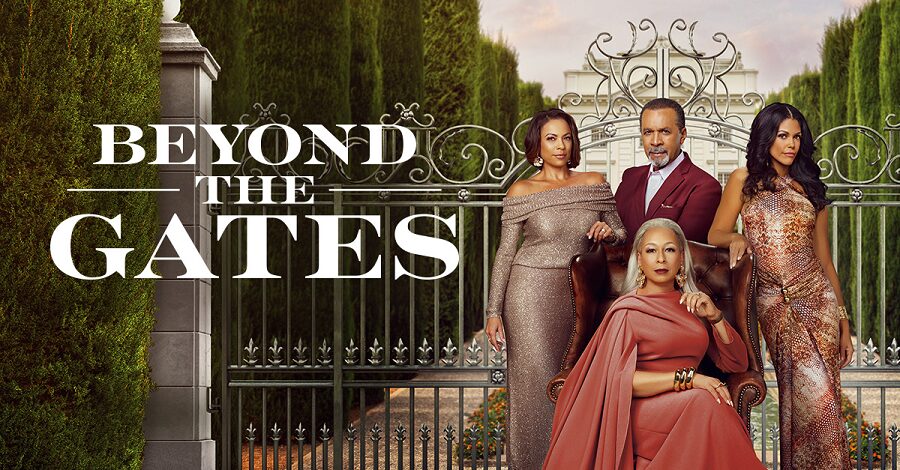
Those looking for something a bit more modern will appreciate the typography in the title of Beyond the Gates, a series based on a family living in a gated community. The show is a drama filled with secrets and storylines that pull people in.
Note the serif nature of the font. The letters “G,” “T” and “S” have sharp serifs and varying widths for the letter strokes. The tone of the font is elegant, which coincides with the show’s theme of a posh family living in a nice area. The ornate gate behind the letters adds to the overall mood.
5. Buffy the Vampire Slayer
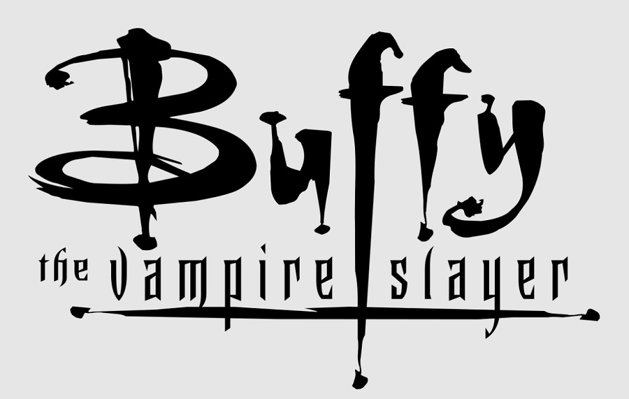
The series about a vampire hunter ran for seven consecutive seasons starting in 1997 on The WB and ending in 2003. Sarah Michelle Gellar plays a young Buffy, who battles vampires and also falls in love with one. I was obsessed with Angel and Buffy, weren’t you?
The series logo looks like a serial killer dipped their finger in someone’s blood and scratched the name across the surface of something. The long lines on the letters look like dripping blood. The logo sets an immediate sinister tone and pairs perfectly with the mood of the series. “The Vampire Slayer” has a medieval typeface appearance that hints at the immortality of vampires.
6. Stranger Things

The Netflix original series “Stranger Things” is one of the most compelling series of all time. I binge watch a season and anxiously wait for the next one to drop. Netflix released the first season in 2016, two more in 2017 and 2019. Season four dropped in 2022. The fifth season, which Netflix has stated is the final one, is scheduled for 2025 sometime. The show is set in the 1980s and follows odd happenings in a small town.
The logo looks like a neon sign thinking about blowing a few bulbs. The design gives a nod to design trends in the 1980s. The serif script is outlined in red with black interior on a black background. The look is stark and sets a sinister mood.
7. I Love Lucy

Everything about Lucille Ball is iconic, including her television series “I Love Lucy.” At the time, the show broke barriers never before breached, such as Ball appearing on the set while pregnant with her first baby. Although the logo dates back to 1941, it proves that a minimalistic design with the right font can stand the test of time.
The heart outline appeared every time the show aired, helping create brand recognition that saw the series go into syndication and remain on the air for decades. Note the font is a romantic script that ties into the theme of a husband and wife in love and surmounting all societal barriers thrown before them. The swoop of the uppercase letters gives the logo a slightly modern edge while still remaining readable. The asymmetrical layout of the words hints at a slightly off-kilter show that adds humor into the mix.
8. The Wire
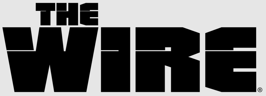
Another American crime drama series makes the list for a unique typeface that showcases the heavy topics covered by the show. Premiering in 2002, The Wire is on HBO and features a team made up of a former homicide detective and a woman who is a teacher. The series goes into urban themes.
The heavy logo is made up of geometric shapes. Since many of the show’s themes center around wiretaps and police surveilling suspects. The title of the show comes from the idea of wires and technology to track people and uncover their secrets. The letters look like a wire is running through them, hinting at the underlying structure of the series. By choosing black block letters, the designer also creates a heavy, bold look. There’s no doubt the series will have drama when one looks at the logo.
9. Charlie’s Angels
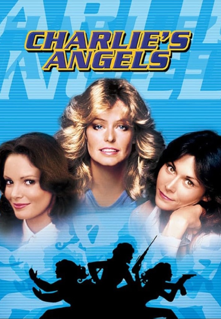
The year was 1976 and a new crime-fighting detective team emerged on the television scene. Charlie’s Angels featured three women played by Kate Jackson Jaclyn Smith and Farrah Fawcett with an unseen Charlie talking to them over a speaker and giving them assignments. The series called for a logo that was as bold and feisty as they were.
The wordmark for the show featured thick, bold lines with some variation where the letters were thinner. The letter “E” was not completely uniform, with more space between the top line of the letter than between the bottom two. Later, the font would morph into a block look reminiscent of stencils as seen above. In addition to the wordmark, a profile image in all black showed the three women, side-by-side, protecting one another from an unseen attack.
10. Alf
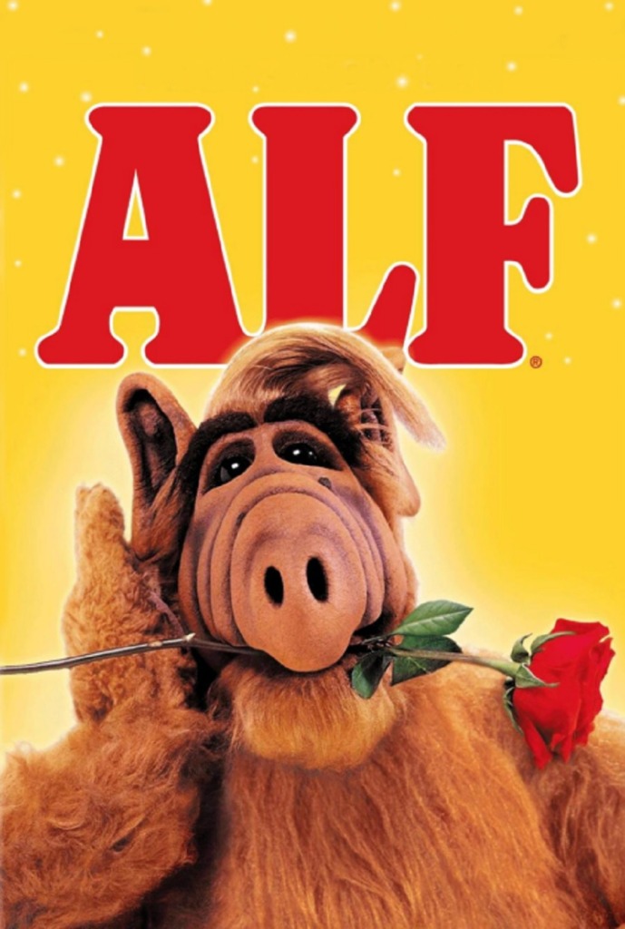
I loved the TV show “Alf.” All about a goofy, lovable, fuzzy and somewhat grouchy alien, the show ran from 1986 to 1990 as a television sitcom. The creature lived with a family in the suburbs in America. Alf thought cats were tasty, which made for running jokes about where the family cat was.
The logo, like many other iconic TV show logos, was a word mark. The thick letters appeared in red with a white outline around them. The chunky serifs added to the effect of the font, setting a mood of cartoonish fun without the cartoon portion. It stood out from other logos because it was a short word and in a large point.
11. Arrested Development
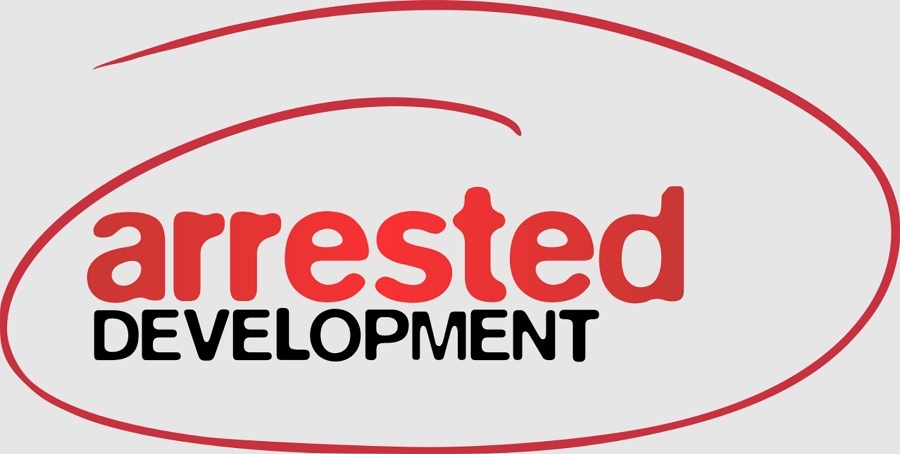
The dry comedy of the Netflix series “Arrested Development” is a love it or hate it style. Jason Bateman stars alongside great comedians like Michael Cera, Portia de Rossi, Tony Hale, Will Arnett, David Cross and Jeffry Tambor. The show was unique in the way it was filmed on location and in HD video using several cameras, giving it a documentary look in the spirit of shows like “The Office.”
The logo is reminiscent of a report, giving a nod to the business behind the storyline. The word “arrested” is in lowercase, while “development” is in uppercase. The use of capitalization shows the viewer that the arrest starts things rolling but more is to develop. The entire wordmark is circled as though with a red pen to draw attention to the title.
12. Younger

Younger was one of the first shows to address the subtle problem of ageism in hiring practices. The main character pretends to be much younger than she actually is to land a job after a divorce. The comedy-drama is centered around her trying to keep her age a secret and pretend to be a peer to younger coworkers.
The wordmark logo uses a youthful script that has a graffiti look to it. It looks like it’s been drawn with paint, chalk or a thick marker. The colors of the logo vary, depending on where it’s used. The swoops and swirls of the letters pull the viewer in. The logo stands out from others that have a more block appearance.
13. Running Pointe
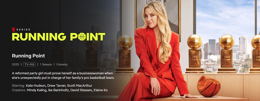
Running Point stars Kate Hudson in a made-for-Netflix comedy series. The show has a unique premise of a young woman suddenly in charge of a professional basketball team and the challenges she faces.
The logo uses a wordmark but takes the “O” in the word “point” and turns it into a basketball. By using yellow against a dark background, the title pops. The sans serif font is modern and puts the focus more on the mood of basketball than the words themselves.
14. The Twilight Zone
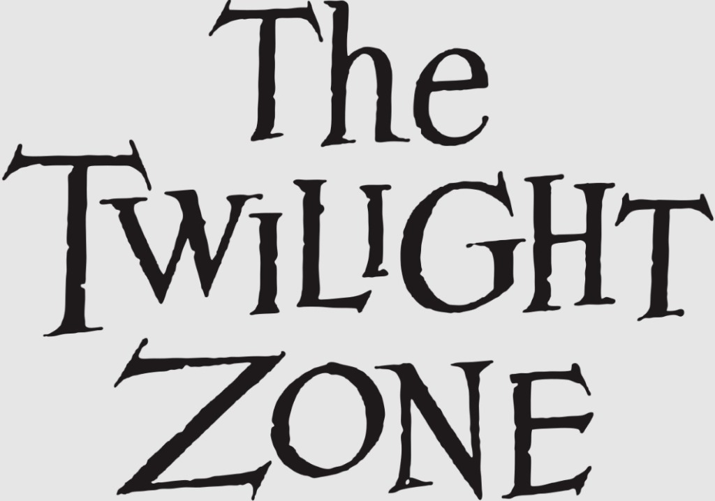
The Rod Serling series “The Twilight Zone” ran from 1959 to 1964, showcasing short episodes of fantasy and science fiction stories. The show was in black and white and often starred names viewers will recognize today like William Shatner, Charles Bronson and Art Carney. The series spurred other shows, inspired books, a movie produced by Stephen Spielberg and is given a nod on the Tower of Terror ride at Disney’s Hollywood Studios.
The asymmetrical layout of the font shows that things are off kilter in the show. Some of the letters have small notches out of them, as though things are a bit glitchy. Since the show was in black and white, the original logo is as well. However, the genius of the simple design with a unique typeface is that it carries into today. Producers can do a remake and grab the same design for their show.
15. Mister Roger’s Neighborhood
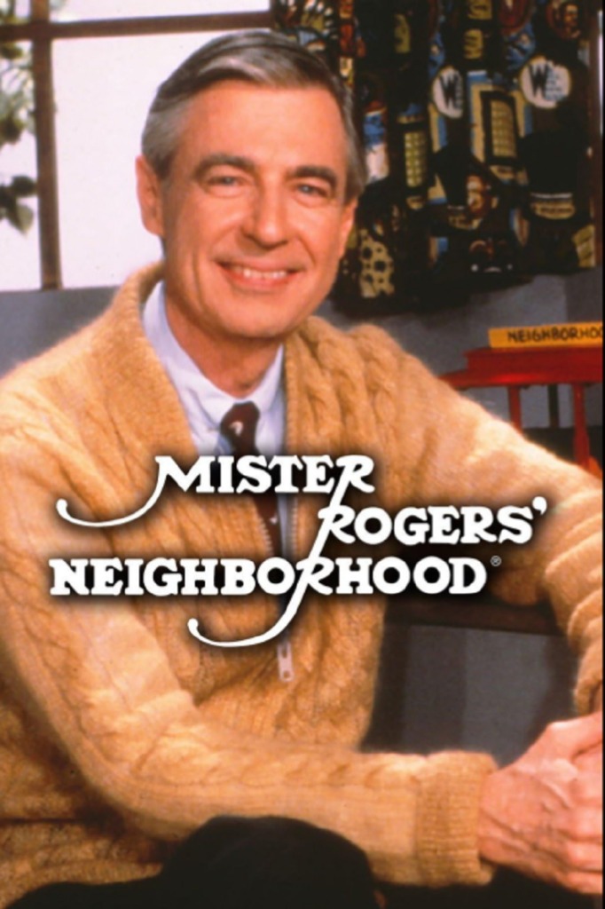
To know Fred Rogers was to love him. The kindhearted, soft-spoken man hosted a children’s television show on the Public Broadcasting Station from 1968 to 2001. Rogers originally appeared in a Canadian show years earlier before the spinoff to American television. Although the show is aimed at preschoolers, it is beloved by children and adults alike.
adds accents on some of the letters to show a connectivity that Mr. Rogers embraced for his “neighborhood.” The vertical line in the letter “R” in the word “mister” trails down through all the R’s.
Learn From Favorites
Looking at logos from the most memorable television shows helps designers figure out how to set a mood with just a font or specific colors. Every part of a logo must work to send a message. Understanding this simple but powerful format adds to a designer’s repertoire of skills for future projects.


About The Author
Eleanor Hecks is the Editor-in-Chief of Designerly Magazine, an online publication dedicated to providing in-depth content from the design and marketing industries. When she's not designing or writing code, you can find her exploring the outdoors with her husband and dog in their RV, burning calories at a local Zumba class, or curled up with a good book with her cats Gem and Cali.
You can find more of Eleanor's work at www.eleanorhecks.com.