
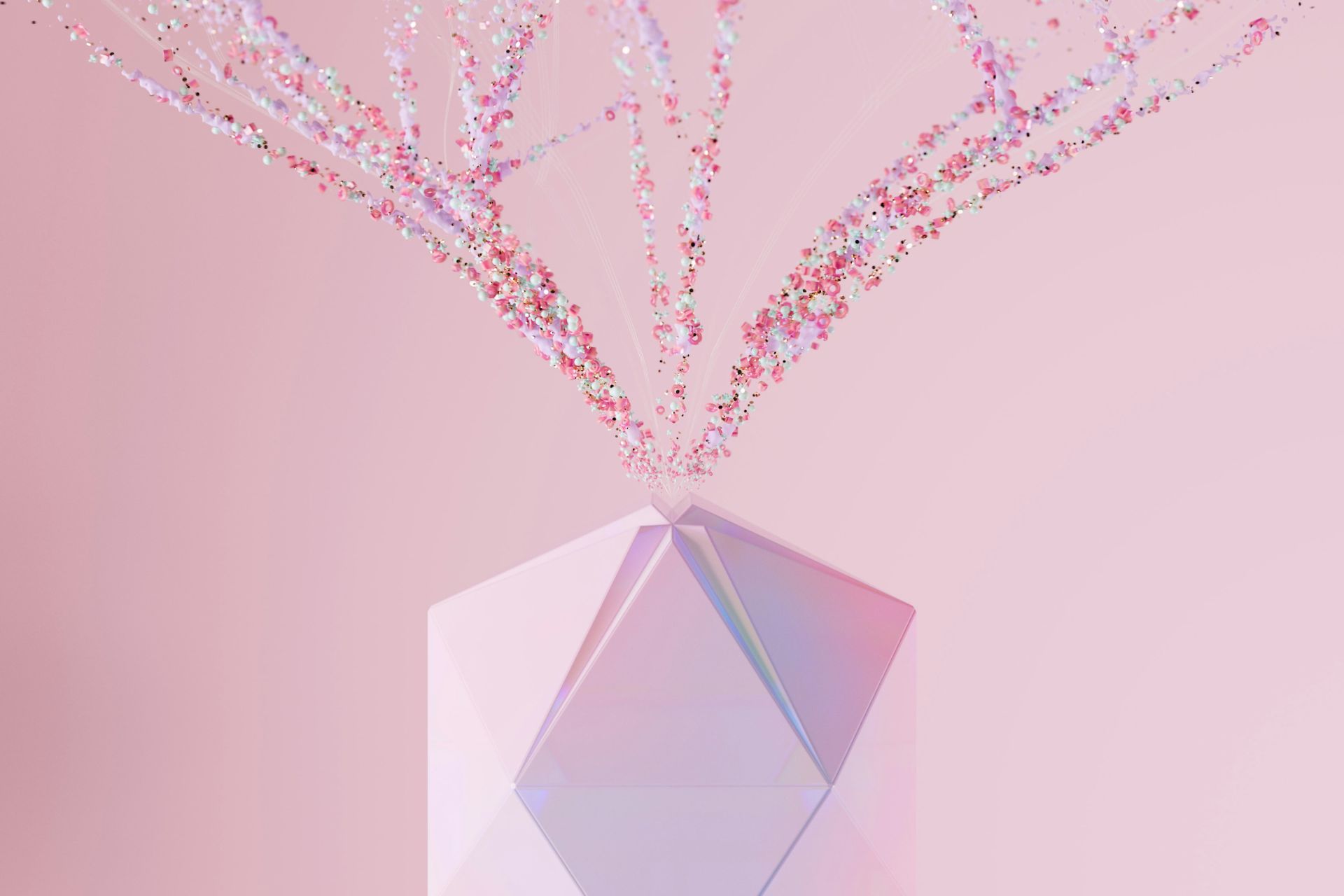
Balance is usually the key to all things graphic design. It makes everything feel even, well laid out, and the eye knows what it’s looking at and where to go. Not only that, but some people may also feel it makes a project look more professional. So why is asymmetrical balance still a favorite of some graphic designers? If it feels so off-putting and potentially chaotic, how can someone make good use of it to diversify their art? Even though it might feel odd, asymmetrical balance is valuable.
Sometimes, a designer might feel like a project they’re working on needs something more. However, it’s often hard to tell what that “something” is. Does a color feel off? Is the font a little dull and perhaps needs some revamping? Maybe what the design actually needs is some asymmetrical balance.
What Is Asymmetrical Balance?
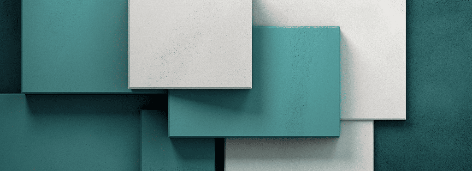
Asymmetrical balance is when a piece of art consists of different visual elements but still feels balanced. They could be similar but different components — like various boulders — or be entirely unmatching — like varying shapes. However, those rocks and shapes must find balance while still being opposing elements of the final project.
For example, imagine a white square with a black line dividing it in half. On either side of the line are an orange triangle and a purple circle. Those components don’t match, but putting them in certain places can balance them. They could sit on the left and right sides but in the same place — they still don’t match, but the equal placement balances them. Additionally, the triangle could be at the top middle left and the circle at the bottom middle right.
That kind of dynamic arrangement is very fitting for such differing elements. It breaks them up so things don’t look too chaotic while also mixing a design up more than usual. The key is taking two components that don’t necessarily go together or using white space to balance out what doesn’t match. Doing so creates an intriguing look in the composition — suddenly, things that don’t go together seemingly make up something very cohesive.
Why it Catches the Eye
The human brain loves to seek patterns, whether the user of the brain is aware of it or not. It comes from an old evolutionary habit that eventually became crucial for survival. When early humans were hunting for prey, they needed to be able to identify how many other predators they had to fight to survive. They then became good at picking out groups of four or less very well.
Additionally, pattern detection helped out when herds needed to navigate. They had to identify the way back if they were traveling down a path to gather food. Those who were good at recognizing the patterns around them so they could return to the group were the ones who survived. Repetitions in facial features, plants and sounds all helped people survive before they had protective shelters and clothing.
Thus, the human brain feels much more comfortable when it can see patterns — it formed that way. Mammal brains have a special feature called the neocortex, which is the outside layer. It takes up 80% of the brain’s weight because of all the folds it has. When humans were evolving, those with less-muscly jaws were the ones who lived because they had more room in their skulls for the neocortex, which helps recognize patterns. It actually formed around pattern-recognizing neurons that hover around 300 million in number.
So why is asymmetrical balance so appealing? It creates discomfort. The brain will look at it and try to find the pattern, keeping a person’s eyes on the design for longer. It can tell there’s some kind of balance, but something feels off. What makes what it’s looking at feel safe but also like it needs to find something? Asymmetry in all art forms makes people stop and stare because they want to locate the pattern.
The Other Kinds of Balance
Of course, asymmetrical balance isn’t the only kind of composition out there. These other forms are helpful to know, whether they can work alongside the asymmetry or in another project.
1. Symmetrical Balance
This composition style is fairly self-explanatory. If asymmetrical balance consists of creating balance out of oppositional elements, symmetrical balance means making a mirror image of equal components. For example, imagine the same divided white square. To have symmetrical balance, both features on either side of the middle axis will be the same and in the same place.
Symmetrical balance requires perfectly matching visual weight, while asymmetrical balance creates equal visual weight with unmatching elements. Because the brain likes symmetry, these kinds of designs feel more acceptable and sometimes formal. However, it can also get boring, as symmetry is predictable.
2. Mosaic Balance
Mosaic balance creates evenness between a bunch of varying elements. Imagine the white square filled with tiny stars, moons and suns. There is chaos, but everything still feels balanced because they’re the same size and usually in complementary colors. It differs from asymmetrical balance in that asymmetry will have one component taking up most of the visual weight, but mosaic balance has various elements with equal visual weight.
3. Radial Balance
This kind of composition makes the focal point the exact middle of the project. Everything will radiate out from the visual element in the center, drawing the eye toward whatever is in that middle. Radial balance is somewhat like asymmetrical balance in that there will be one significant focal point and the smaller elements will even it out — like a sun and its rays.
Famous Examples of Asymmetrical Balance
Looking to popular artists can help graphic designers visualize how asymmetry works and how they can replicate it. Here are two famous examples of asymmetrical balance in paintings to give a more concrete idea of how to use it.
Under the Wave off Kanagawa by Katsushika Hokusai
This woodblock print from 1831 is a fantastic example of how white space can make a composition dynamic but even. The massive wave on the left clearly draws the eye’s attention, but the negative area to the right of it — with a small Mount Fuji peeking out from the bottom — creates a striking visual effect. It still feels balanced despite clearly having one dominant element.
The Starry Night by Vincent van Gogh
The component with most of the visual weight in this painting is the dark cypress tree that takes up most of the left. However, rather than keep the right side blank, van Gogh made the moon very bright and large to give the piece balance. Despite having two distinct visual elements, the colors and placements of the moon and the large tree create asymmetrical balance.
Making Asymmetrical Balance Work in Graphic Design
Perfecting asymmetrical balance can take a bit of work to get right. The designer risks their work looking chaotic and messy if they don’t get the equity right. But when a graphic design has the proper mix of visual weights, it can create something dynamic and eye-catching that’s sure to please clients. Learn from various successful examples and play around in a graphics editor to learn how to master the style of asymmetrical balance.


Leave a Comment