One type of business we’ve not yet looked at for our monthly Designly Award is handcrafted soaps. We searched the globe, looking at different sites and finally settled on the small Bend in the Barrow company located in Ireland.
As you can imagine, filtering through all the possible companies was quite a task, filled with big companies to smaller brands. We love to feature small businesses and startups in our examples, so we narrowed the list down to only companies with a more local presence rather than some of the big players with chain stores around the globe.
The handmade soap market is worth $7.9 billion, with 40% of the market in North America. Experts predict it will grow by 3.4% through 2030. You’ll find hundreds of thousands of soap makers in the United States alone, so figuring out how to stand out from the crowd is crucial.
We looked at many different small businesses offering soaps and other personal grooming soap products. After narrowing down the websites, we came to the conclusion that Bend in the Barrow’s site spoke to us and met the clean, fresh style we were looking for.
Winner: Bend in the Barrow

We chose Bend in the Barrow for a variety of reasons, but one of the top ones was how bright and light the design felt to us. A minimalistic design for an e-commerce store puts the focus directly on the product and showcases the images nicely.
We love the family feel of this company. The posters often showcase the soapmakers on the Instagram and Facebook accounts. All soaps are handmade in Ireland in small batches and include natural ingredients. Examples they give include:
- Natural vegetable oils
- Essential oils
- Butters
- Fragrance oils
- Botanicals
They use a lot of olive and coconut oils with a mix of avocado, shea butter, apricot kernel, cocoa butter and castor oil.
The company focuses on sustainability by carefully selecting oils and ingredients from plants that regrow quickly and avoiding palm oils. The makers attend markets in Kildare or Newbridge Ireland and sell online.
Why We Chose Bend in the Barrow as Our Winner
The simple ingredients are reflected in the minimalistic website design. The website is powered by Shopify, giving the company some options they might not otherwise have, such as the ability to accept multiple payments from different carriers. Some of the things that drew us to the Bend in the Barrow design include:
Hero Images
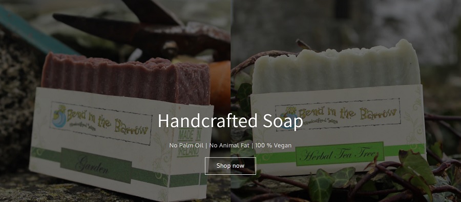
We adore the split hero image at the top of the page. Both photos have similar backgrounds but highlight different products. By combining the two, it shows distinct options for different customers and their preferences. Brand owners can also swap out current selections to showcase something new or seasonal.
Headings
A website headline can drive users to move forward or leave your site. The landing page headline and subheadings engage the user and focus on the things people most care about who might be shopping for handmade soaps.
The headline reads, “Handcrafted Soap.” The products on the site come into sharp focus with such straightforward language. Under the heading is a subheading explaining they use zero palm oil or animal fat and that the soaps are vegan.
The language pulls the user in and makes them want to learn more about the soaps. If you scroll down the page, you’ll notice other headings focus on the unique value proposition that benefits the user, such as “Order 5 Bars – The Fifth Bar Is Free.”
Product Photos
The images of Bend in the Barrow’s handmade soaps pop. They’ve used excellent composition and created a style that carries through in all the images. The plain, pale gray background shows the soap to its best advantage.
Navigation
The navigation is intuitive with only four options when you land on the page. You can select from “Home,” “Shop,” “About” and “Contact.” The buyer funnel immediately narrows to one choice unless you need to get in touch or learn more about the brand. Rather than scrolling through lengthy intros, they move site visitors directly to the shopping pages.
Mobile Responsiveness
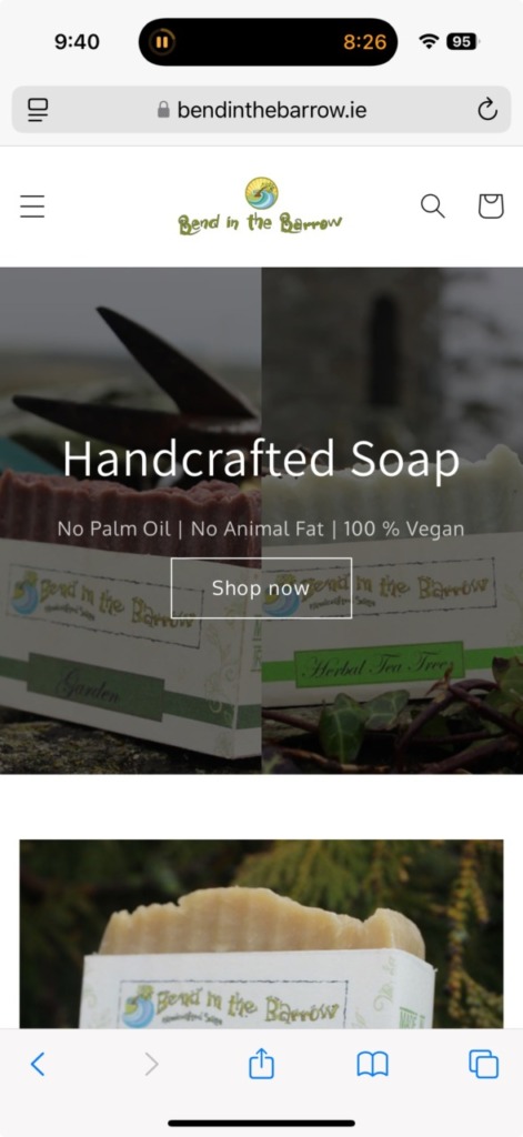
The site looks the same on mobile as it does on a desktop. The shopping pages are easy to navigate and add items to a cart. Checkout is a breeze. More than half of website visitors come via mobile devices, so ensuring your site translates to all screen sizes is crucial to retaining users and converting them into customers.
Inventory Filters
The shopping pages include a filter where you can hunt for soaps based on what’s in stock. Knowing the inventory is particularly useful if you’re ordering gifts for a wedding party or the holidays. You can ensure the delivery comes quickly when you don’t have to wait on production.
Loading Speed
One smart thing about using a third-party platform such as Shopify is that the servers load web pages at lightning speed. The site pops up almost instantly on mobile and desktop with miniscule lag time.
Since you can lose site visitors if they have to wait for your site to load, the faster speeds are a welcome addition for any website.
Logo

We love the simple logo and the placement on the page. Bend in the Barrow owners chose to place the logo smack in the center at the top of the page. The emblem also links to the home page, adding to the navigational hierarchy. The combination of the graphic with the wordmark works well to grab user attention and set a brand style.
What We Would Do Different
We love the look and feel of the Bend in the Barrow site. We might change the font used for the wordmark a bit. It could be difficult to read at certain sizes as it is quite decorative. They could get the same tone of old world soap making with a modern twist by using something a bit more readable, such as Cinzel Decorative or Arima.
If you’re looking for some inspiration for your artisan website design, you can learn a lot by studying Bend in the Barrow’s work.

