

In This Article
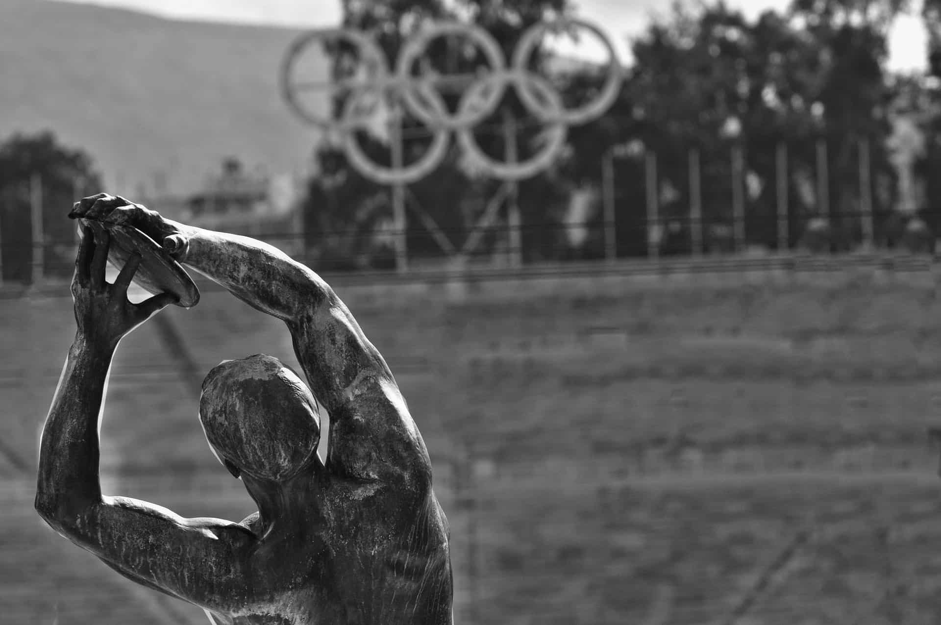
The Olympics trace back to Ancient Greece, where they took the form of athletic festivals. Most of the games were athletic, but there were also combat games and chariot races. The iconic Olympic rings aren’t quite as old, dating back to 1913 when they first showed up.
The symbol used by the Olympics is five interconnecting rings of equal proportions. There are rules about what colors to use and in what order from left to right. The Olympic Charter makes it clear what standards the logos have to meet. The logo shows the movement of the athletes and the union of five continents.
Each time the Olympics roll around, there is a logo to represent the location and theme of that year’s games. There are also different logos for summer and winter games. Some of the images are more interesting than others, and all manage to be surprisingly different even with so many rules in place. You can learn a lot by studying top logos from the Olympics.
All of the logo images below come from the official Olympic Games website.
Jump to Best Summer Olympic Logos: London – 1948 | Rome – 1960 | Tokyo – 1964 | Seoul – 1988 | Barcelona – 1992 | Sydney 2000 | London – 2012 | Rio – 2016 | Paris – 2024 | Los Angeles – 2028
Jump to Best Winter Olympic Logos: Lake Placid – 1932 | Cortina d’Ampezzo – 1956 | Squaw Valley – 1960 | Sarajevo – 1984 | Albertville – 1992 | Salt Lake City – 2002 | Turin – 2006 | Vancouver – 2010 | Beijing – 2022 | Milano Cortina – 2026
Best 10 Summer Olympic Logos
1. London – 1948

London’s summer games showed up in 1948 with this unusual-looking logo. The use of Big Ben in the background makes the logo taller than some of the others that fit in the parameters of a traditional circle. There are good elements in the design, but a different iconic background might have scaled better.
2. Rome – 1960

When the Summer Olympics were in Rome, the logo featured the symbol of Rome itself. The rings appeared just under the symbol. The overall result screams strength and tradition. The colors in the emblem and rings also reflect in the letters, indicating which Olympics this was. Shadow and light effects give the logo a three-dimensional look.
3. Tokyo – 1964

Tokyo’s Summer Olympics logo from 1964 is simple but says a lot without much fanfare. Note the gradient look of the red circle, which appears again in the gold rings. The red sun is a Japanese symbol. Even the block letters have a simple look that matches the weight of the rings above. This logo received high marks from designer Milton Glaser.
4. Seoul – 1988

The games in Seoul occurred in 1988 and the logo is fairly iconic of the period. The swirls start with a broad broken line and segue into a solid swirl reminiscent of the ’70s. The text is in a sans-serif font.
5. Barcelona – 1992

Barcelona’s logo uses primary colors and an abstract athlete in mid-jump. The interconnected rings emerge as regulated by the Olympic rules. The use of primary colors draws the eye up and toward the top of the logo, creating a strong sense of balance.
6. Sydney – 2000

Sydney, Australia, is the perfect warm location for summer games. When they hosted the Olympics in 2000, they came up with the above logo. The symbol features an athlete in motion, letters also in motion and the traditional circles in the required colors underneath.
7. London – 2012

The logo for the London 2012 games is one that designers either love or hate. The image features unique angles and a monochromatic look. The circles appear within one of the geometric shapes and the words within another. Take a step back from the design and you can see the shapes are abstract for the year 2012.
8. Rio – 2016

The logo for the Summer Olympics in Rio is impressive. Note the joined hands of the athletes at the top of the logo, representing unity. The font is modern-looking and then the rings are set up with a traditional layout and colors.
9. Paris – 2024

The summer games head to Paris in 2024. The 2024 summer logo highlights the famous Olympic flame that never goes out, the rings in a very traditional configuration and required colors and a font that is reminiscent of Comic Sans. Some hate this style of typography, but it works well with the simplicity of the design.
10. Los Angeles – 2028

In the year 2028, the Olympics come back to Los Angeles. Note the beautiful logo here. It is likely one of the most unique logos of any of the summer games. Note the image of the sun peeking through the beautiful athlete outline. The circular geometrical elements reflect in the font and the rings.
Best 10 Winter Olympic Logos
1. Lake Placid – 1932

The Lake Placid, USA, logo highlights the strength of winter Olympians while still staying true to the overall ring design. Note the four interlaced rings under one larger ring. Inside the big ring is a silhouette of a skier and abstract geography. The design is simple but riveting. Check out the negative space within the large ring that draws the eye to the high-contrast black icon.
2. Cortina d’Ampezzo – 1956

The winter games in Cortina d’Ampezzo, Italy, featured a snowflake-looking circular logo and the rings placed inside the circle. The result looks much like a stamp. The design is pretty simple at first glance. The complexity lies in the edges of the ring and the outline of a mountain range in the background.
3. Squaw Valley – 1960

Squaw Valley, California, hosted the Winter Olympics in 1960. This is probably one of the more unique logos. The star with different-length points grabs interest. The circular typography meshes with the rings inside the blue triangle.
4. Sarajevo – 1984

Sarajevo was the location for the 1984 Winter Olympics. The logo was quite attractive, using only a single color of vibrant orange throughout. In this particular rendering, the rings appear above the symbol. The symbol is a circle with paths opening out in four directions. When looked at from a different perspective, it looks like a snowflake or a person.
5. Albertville – 1992

Albertville, France, was the perfect location for the 1992 Winter Olympics. The logo features a cross in a red flame, two lines of motion underneath and the text and rings under that. The typography has a modern look that is reflected in the two lines under the flame.
6. Salt Lake City – 2002

The Winter Games in 2002 headed to Salt Lake City, Utah, in the United States. The logo for that year featured blues and oranges in a pattern reminiscent of Native American symbols. The abstract design blends colors representing a coming together of different countries. The font is simple and looks to be Arial or something similar.
7. Turin – 2006

Located in Northern Italy, Turin hosted the Olympics in 2006. Their symbol features a repeating pattern of white circles on a blue background that creates a “magic eye” sort of look. The text appears in all lower case and the circles appear underneath.
8. Vancouver – 2010

Vancouver hosted the 2010 games during the winter. The logo for the 2010 winter games features blocks of color stacked on top of one another to look a bit like an Easter Island-style man. The rest of the design is fairly traditional and a nod to designs of years past.
9. Beijing – 2022

Beijing is the location of the 2022 Winter Olympics. Their gorgeous logo represents a “joyful rendezvous upon pure ice and snow.” The font has long swooshes that give it a fluid edge like the snow itself. The text matches the swirls at the top perfectly and makes one think of paths skis make down a mountain.
10. Milano Cortina – 2026

The Milano Cortina logo is breathtaking. Elements of it are quite simple, with sans-serif text and simple logos interconnected. The spheres rising above the words represent the beautiful churches and architecture of the region as well as the snowy mountain ranges.
Learn From the Past
Studying the Olympic logos from past events is a good way to figure out what works well and what needs improvement. Which logos spoke to you as a designer and which ones would you redesign if you could? It isn’t easy to come up with something unique when there are so many regulations on what elements you can use, which colors you’re allowed and how to arrange it all.
However, the logos above prove that you can still find creativity even within narrow parameters.


Leave a Comment