Must-Try Block Serif Fonts for Modern Websites

Posted on May 5, 2024 | Updated on May 5, 2024
A block serif font, a subset of serif fonts with thick, block-like serifs, are gaining popularity in modern web design. These fonts blend traditional elegance with a bold, contemporary feel, making them ideal for headlines and statements that demand attention.
Their distinct style, which stands out on smaller screens, contributes to their growing use in various web design contexts, from professional websites to creative platforms. Their versatility and visual impact make them a trending choice among designers looking to add a mix of classic and modern flair to their projects.
Understanding Block Serif Fonts
Block serif fonts are distinct for their substantial, block-like serifs — the trim lines or extensions at the end of strokes in letters. These serifs are typically bold and square-shaped, making them highly legible, even on smaller or low-resolution screens.
The visual impact of these fonts on website readability and user experience is notable. Changing to a typeface that best suits a reader increases reading speed by 35 percent.
Traditional serif fonts, known for their readability and classic look, often convey a sense of formality and credibility. With their clean and minimalistic style, Sans-serif fonts are famous for their modern and uncluttered appearance.
Block serif fonts blend these qualities, offering the readability and authority of serifs with a bolder, more contemporary edge. It makes them versatile for various web design applications, appealing to multiple aesthetics while maintaining functionality.
Top 10 Block Serif Fonts for Modern Websites
These typefaces bring a modern and impactful aesthetic to your website design.
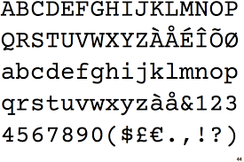
Roboto Slab
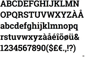
Roboto Slab is a versatile font that seamlessly bridges the gap between modern and traditional. Its geometric structure and natural curves give it a warm, approachable feel. Ideal for tech and business websites, it pairs beautifully with its sans-serif sibling, Roboto, to offer a cohesive and user-friendly experience.
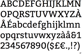
Rockwell
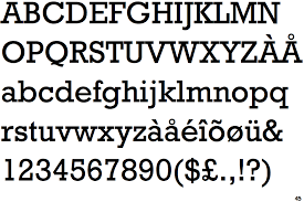
Characterized by its strong presence and timeless appeal, Rockwell imparts a sense of reliability and strength. Its bold nature makes it perfect for headlines and branding. It stands out on educational or news websites when combined with a simple sans-serif — like Helvetica — ensuring content clarity and engagement.
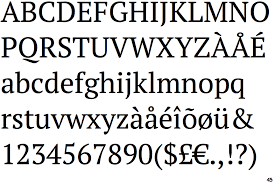
Clarendon
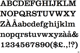
Clarendon’s balanced design offers a perfect mix of classic and contemporary. Its clear, strong serifs enhance readability, especially in print-like web layouts. It works exceptionally well on magazine or editorial sites and you can pair them with a lighter sans-serif — like Lato — for a visually pleasing contrast.
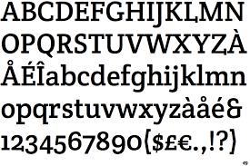
Chaparral
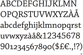
Chaparral stands out for its personal and inviting character, making it suitable for blogs or e-commerce platforms. Its readability and unique style make it a favorite, and it harmonizes well with clean sans-serif fonts, balancing personality with functionality.
Slabo

Designed with digital screens in mind, Slabo — specifically 27px and 13px — is tailored for specific sizes, offering crisp legibility. This feature makes it ideal for responsive web design. Pair it with a minimalist sans-serif for a modern, user-friendly interface.
Arvo

Arvo’s geometric structure and contemporary feel make it a go-to choice for headers and display text. It exudes a modern flair, suitable for websites with a fresh, cutting-edge vibe. Pairing it with a sans-serif can enhance its modern appeal while maintaining legibility.
Courier Prime
A refined version of the classic Courier, this font offers a clean, monospaced look reminiscent of a typewriter. Courier Prime is perfect for blogging sites or online portfolios, giving a nod to classic style. Paired with a straightforward sans-serif — like Open Sans — it creates a professional and engaging layout.
Bitter
Bitter’s warmth and legibility make it excellent for long-form content like articles or blogs. Its Latin-inspired design adds character, enhancing the user’s reading experience. Combine it with a light sans-serif — like Roboto or Helvetica — for a comfortable and easy reading experience.
PT Serif
PT Serif’s adaptability to screen and print makes it a versatile choice for corporate or business websites. A friendly appeal balances its professional touch. Complement it with PT Sans to maintain consistency and readability across various web elements.
Crete Round
Crete Round is unique for its soft, rounded serifs, lending a casual yet stylish feel. It’s particularly well-suited for creative or lifestyle websites, where its friendly appearance can shine. Pair it with a simple sans-serif — like Arial or Futura — for a clean and modern look.
Integrating Block Serif Fonts in Web Design
Block serif fonts in web layouts can enhance a website’s visual appeal and readability. It’s essential to employ them strategically for creating visual hierarchy and contrast, making them ideal for headlines and titles while opting for more subdued fonts for body text.
Attention to spacing and sizing is imperative, as their bold nature necessitates adequate line height and letter spacing for readability. Additionally, ensuring these fonts render well on various devices is crucial for maintaining legibility and aesthetic appeal in responsive design.
Complement these fonts with simpler sans-serif typefaces for body text to create a visually engaging layout and easy to read, like pairing a bold block serif for headings with a lighter sans-serif such as Helvetica or Arial.
In addition, effectively utilizing color contrast is crucial when working with block serif fonts, ensuring that text stands out against light and dark backgrounds for optimal readability. Maintaining a consistent color theme throughout your site — whether monochromatic or vibrant — can enhance the overall impact and coherence of the design when using these fonts.
Accessibility and Performance Considerations
Accessibility is crucial in font selection for web design. Choosing fonts that are visually appealing and easy to read ensures that all users, including those with visual impairments or reading disabilities, can access and comprehend the content. Legibility and readability — fonts should be clear and distinguishable at various sizes and on different devices.
Performance aspects — like loading times and responsiveness — are equally consequential in web typography. Heavy fonts can slow down a website’s loading time, negatively impacting user experience and potentially affecting search engine rankings.
Optimize font loading using web-safe fonts or loading only the necessary styles and weights. Responsiveness, the ability of the font to adjust gracefully across different screen sizes and resolutions, is another vital consideration.
A font that looks good on a desktop might render poorly on a mobile device, so testing across various platforms is essential. Balancing aesthetic appeal with accessibility and performance is critical to effective web typography.
How to Choose the Right Block Serif Font
Here are essential tips on choosing a font that resonates with your brand’s identity and ensures readability and functionality across various platforms. Whether revamping an existing site or building a new one from scratch, the right block serif font can make all the difference in elevating your digital footprint.
- Brand alignment: Ensure the font aligns with your brand’s personality. For a more traditional and authoritative feel, choose a classic block serif — for a modern and bold look, go for a contemporary design.
- Readability: For websites with heavy text content, prioritize readability. Look for fonts with clear letterforms and adequate spacing.
- Versatility: Consider the font’s versatility across different platforms and devices. It should be legible and maintain its character in various sizes and resolutions.
- Pairing possibilities: Think about how the block serif font will pair with other typefaces, particularly for body text. It should complement, not clash with, the different fonts on your site.
- Licensing and usage: Always check the font’s licensing, especially for commercial use. Some free fonts have restrictions.
Using these resources and keeping these tips in mind, you can find a high-quality block serif font that enhances your website’s design and effectively conveys your brand’s message.
Mastering the Art of Block Serif Font Selection
Experimenting with these fonts offers an exciting opportunity to elevate your designs, bringing a unique blend of tradition and modernity to your digital presence. Whether crafting an elegant corporate site or a vibrant creative portfolio, the right block serif font can add depth, character and a professional touch.
So, explore the possibilities — the perfect typeface awaits you to bring your vision to life and leave a lasting impression on your audience.
About The Author

Eleanor Hecks is the Editor-in-Chief of Designerly Magazine, an online publication dedicated to providing in-depth content from the design and marketing industries. When she's not designing or writing code, you can find her exploring the outdoors with her husband and dog in their RV, burning calories at a local Zumba class, or curled up with a good book with her cats Gem and Cali.
You can find more of Eleanor's work at www.eleanorhecks.com.


