Your website is your small business portal on the internet. You can use it to attract new customers, keep current ones engaged and show why your company is the best choice in your industry. Over recent years, we’ve collected some of the best small business website design tips out there. Now, we’re ready to share them all with you so they’re at your fingertips.
Whether your small business is online or a brick-and-mortar building, you’ll benefit from a strong online presence. Stand out from the competition and show what your unique value proposition (UVP) is to your target audience.
Online marketing almost requires some type of website to point people back to what you have to offer. You’ll find when you put effort into your website, you set a firm foundation for all the promotions and sales you’ll offer. Here are the top small business website design tips to try today:
1. Know Your Purpose
What is your brand mission statement? Figure out why you do what you do so you can stand out from competitors. Your purpose should tie into what you offer to your customers. A mission should be more than raising revenue. It should showcase how you make people’s lives better, improve the world around you or give you a deeper purpose.

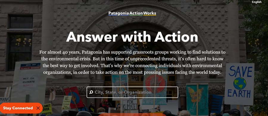
Patagonia is a great example of knowing your purpose. Their brand purpose statement is “to save our home planet.” Their Action Works page showcases some of the issues they’re tackling in regards to protecting the environment. The home page even features a ticker at the top stating their only shareholder is now the earth.
2. Find a Niche
You may have 100 different competitors online. Figure out what makes you stand out from the rest. What is your UVP? It could be your brand personality is more interesting than any others. Wendy’s is an excellent example of a company finding a way to stand out from dozens of other burger chains in their stratosphere.
Wendy’s takes on a youthful and somewhat snarky attitude. They will even comment when people post about other burger chains and make a sarcastic comment indicating their food is better.
Figure out what your brand personality is and whether people respond to it. You can always make adjustments if your attempts fall flat.
3. Survey Your Audience
Take the time to get to know your audience and know them well. Send out surveys to customers finding out what topics they’re interested in hearing about. Ask them what they love and hate about your site. Find out their favorite websites and study what makes those sites stellar.
The more you know, the better you can personalize the experience to suit your customers’ needs.

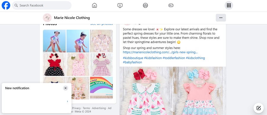
An example of a site that often collects data from customers can be seen in the Marie Nicole children’s clothing boutique. They engage on social media, posting images of their new arrivals, talk about what specials are coming up and have a VIP group for those who are devoted followers.
4. Personalize the Experience
Approximately 62% of consumers want a personalized experience before giving their loyalty to a brand. Think of ways to personalize their experience on your website. Start by creating a buyer persona to represent the average visitor to your blog. Dig into biographical and psychological data and create a profile based on what you know.
Refer back to the survey you sent out and discover any inside information competitors lack. Once you have an idea of what the average user cares most about, look at the topics trending and compare them to what the person is likely to want to read or view.
Greet registered users by name, use past browsing information to make new suggestions. Follow in Amazon’s footsteps. When someone lands on their homepage, they see what Amazon recommends based on past browsing and buying history.
5. Create Clear Calls to Action (CTAs)
Your CTAs can make or break your conversion rates. Get readers to sign up for your mailing list so you can let them know when new blog posts appear or you have a special offer you’re sponsoring. A CTA should fall above the fold but it’s okay to have more than a single one on your page.
Excellent calls to action often use first or second person to make the wording more personal. They include action verbs and are short and to the point. Strong CTAs tend to pop against the rest of the background, drawing user attention.

GiftRocket places their CTA in the middle of the landing page and above the fold. Although the color does match the rest of the theme, the CTA button has plenty of white space surrounding it to set it apart. There is no doubt what a user should do next on this site.
6. Study Your Competitors
Good design covers some basic premises, such as:
- Clear navigational hierarchy
- Strong visuals
- Beautiful color palette
- CTA buttons that pop
- Ample negative space
However, the best designed site in the world won’t stand a chance against your competitors unless you know what they do great and what needs work. Spend time browsing their site, pretending to be a potential customer. What do you love and hate?
Armed with knowledge about what they do best and how you can improve on it, you can take the information to your design and take things up another notch or two.
Tweak Your Small Business Website Design Constantly
Never stop improving your site. The best small business website design tips only work in some settings and with certain audiences. Your customers and company are as unique as they come and may respond differently to a red CTA button than the majority of users. Take the time to conduct your own split testing, pay attention to the competition, poll your buyers and make adjustments on the fly. Keep adding, taking away and trying new things until you reach the audience interaction you desire.


Leave a Comment