

In This Article
Keeping on top of the latest web design trends isn’t always an easy task. You want to create a site that stands the test of time. You also want something that doesn’t look dated two seconds after it goes live. Finding creative web designs offers just the inspiration you need to take your online presence to the next level.
There are about 1.8 billion websites but the number changes constantly and not all are live at any given moment. Tens of thousands of professional and amateuer designers constantly try new techniques to see what resonates with consumers.
With so many from which to choose, it’s hard to know what you should study and when. We’ve taken some of the guesswork out of your task by selecting our favorite creative web designs, each showing a different design principle.
Criteria for Finding Creative Web Designs
We looked through dozens of sites to find the best of the best and showcase some elements we think will make or break sites in the near future. Our criteria included:
- Choosing sites from different industries
- Selecting options showing different features
- Aesthetically pleasing design
- Everything functioning correctly (clickable buttons completing an action, etc.)
- No spam or ads on the site
Any site not meeting the basic criteria above was thrown out of the running for our top 11 list of creative web designs.
1. MounTeam

MounTeam uses a video background to pull site visitors in and show them what they can enjoy on a team building outing through their company. The images flip through lush forests, beautiful mountain views, people hiking and sitting around a campfire.
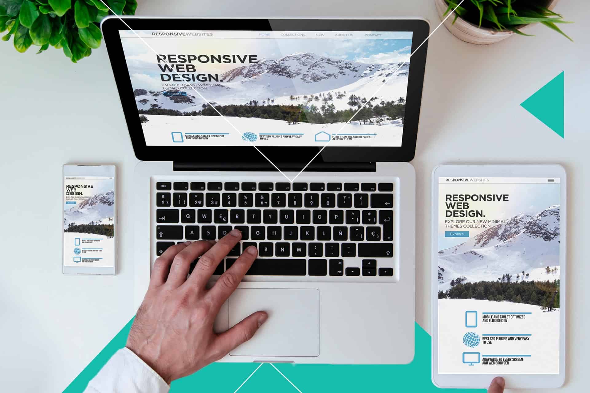
You’ll find many current creative web designs featuring video hero headers. People’s screens have a higher resolution than ever before and connectivity speeds continue improving. People can now stream videos without the hiccups of years past and designers are using the new accessibility to share rich images with potential customers.
2. Dimora Palanca Hotel
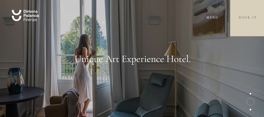
Dimora Palanca Hotel offers an art experience for users. They choose a full-width website, which gives them the opportunity to showcase different areas of their hotel and guests involved in various activities. The call to action (CTA) button looks like a piece of art blending into the wall on most images.
Expect creative web designs to use relevant images and let the picture tell the story. The simplicity of the site creates an excellent user experience (UX). Site visitors can easily find what they’re looking for.
3. Shaleen Cheah
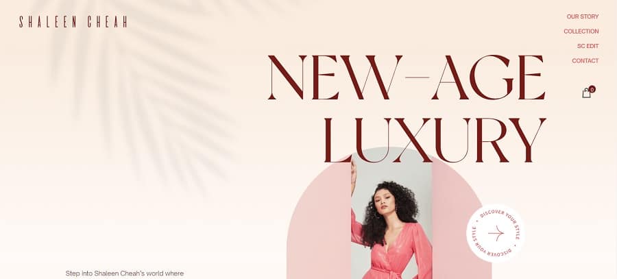
Shaleen Cheah uses animation to grab attention. The overall design appears minimalistic at first. But, as you stare at the screen, a palm leaf waves ever so slightly in the breeze, setting the tone for the cutting edge design of the site.
Other animated elements keep the user moving through the site. When one mouses over the “discover your style” circle, it spins around. The animation continues on shopping pages as headlines drop in.
4. de Bijenkorf

de Bijenkorf’s website has a bee and honeycomb theme. The use of geometric shapes to highlight different products makes the e-commerce site unique. If you’re looking for inspiration, find a theme that works for your brand image and run with it.
When users arrive on the landing page, there is an animated bee flitting around in a forest filled with sparkling fireflies. Scroll down and the honeycomb shaped boxes appear. Each product is set on a forested background to keep the theme tied together.
5. Texas State Technical College

Texas State Technical College takes creative web designs to the next level with a grid collage showcasing videos and photos of their students in action. They move the navigation to the left side to allow room for their logo on a white background without distracting from the visual elements.
The school colors complete the look and give the site personality and brand recognition.
6. Neri Oxman

Neri Oxman takes beautiful typography to the next level. When a user lands on the page, the screen fills with the name mark. The first part, “Neri,” slants to the right and sits perfectly positioned on top of the second part, “Oxman.” The rest of the page is kept simple to avoid distracting from the title.
As one moves through the front page, content scrolls both down and to the side to create a unique look while placing content as the central focus.
7. Gaslighter
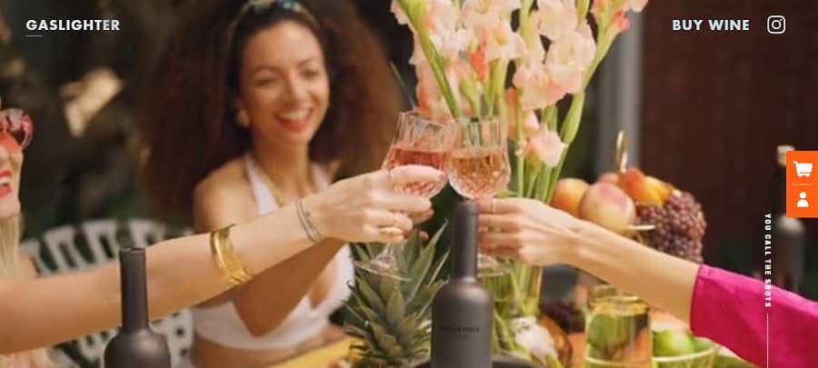
The Gaslighter website uses several intuitive and creative elements we adore. You can learn a lot from this site.
First, note the transparency on the logo and the navigation heading of “buy wine.” You’ll see the video show through here and there, making the type look as though it’s alive.
Second, we love how easy it is to add something to your cart and the way the cart icon follows the user from the front page to the last. The enhanced ease improves the UX of the site.
8. Savic Motorcycles
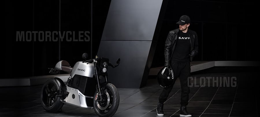
We adore the way Savic Motorcycles uses their product for their logo. Expect to see this trend on many sites in the future. Instead of an in-your-face logo in the upper left corner, it might appear in the background, on the product or incorporated into other elements.
When looking at creative web designs for inspiration, it’s crucial to pay attention to what’s different from traditional sites. Savic Motorcycles also reduces navigation to two categories and places them within the image. As one mouses over them, they grow bold, showing these are clickable elements.
9. Cosmetocritico

Cosmetocritico has a retro look that users respond to. However, it uses a more modern split screen with the product on the left and the CTA button on the right. They also add a scrolling bar along the bottom to grab attention. The site is a bit busy but it also is quite different from competitors’ soft flowery cosmetic sites.
10. Burnap’s Farm Market & Garden Cafe

Burnap’s Farm Market & Garden Cafe embraces the new trend of turning photos into illustrations. Note the painted look of the outside of the farmer’s market. It gives the site a timeless quality users are drawn to.
Pay attention to your competitors. What do they have on their sites? How can you meet industry standards while also doing something a bit unique with your own design?
11. Gumroad

Gumroad offers a really unique look that stands out from other sites. The bold colors grab attention from the minute the user lands on the page. Since the site is about trying out new ideas to make money online, a modern theme makes sense.
The bright yellow and bold pink speak of youth, new ideas and fresh starts. The site proves you shouldn’t be afraid to try new things in your designs.
Creative Web Designs for the Win
Try new things. If something doesn’t work, you can always revamp it and redesign your site or set it back to how you had it before. There are millions of sites competing for consumer attention. If you want to gain their interest, you must try something unique.


Leave a Comment