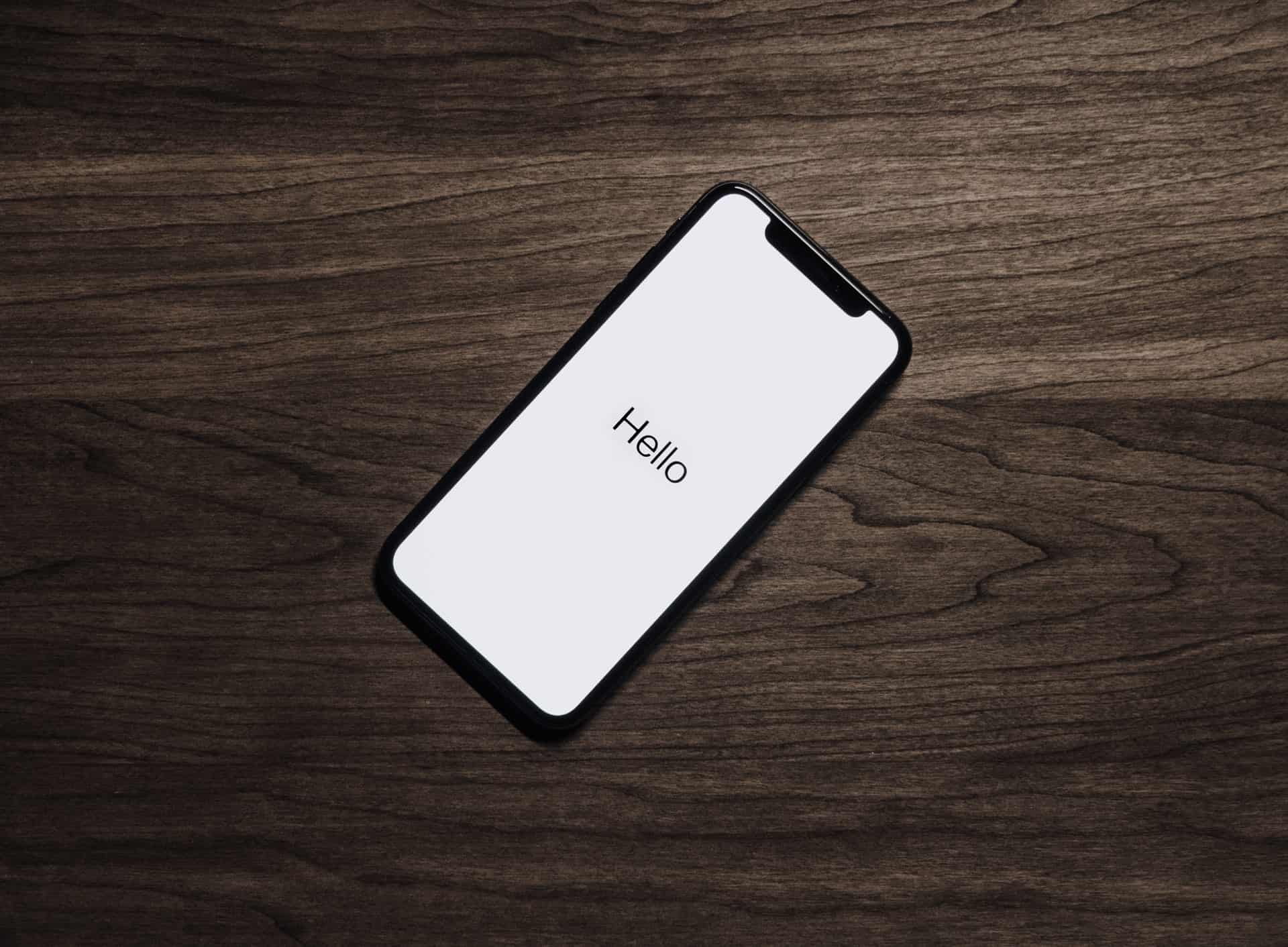


Splash screens, also called welcome screens, boot screens or boot skins, have multiple purposes. They can serve to give information to a game player, as a countdown to the start of a program or to let the user know the program is loading. This can keep the user engaged while a lengthy loading process occurs, for example. Google even recommends you use a splash screen while users are waiting for an app or website to load, which is a pretty good indicator that it’s smart UX design.
However, in the past, Google has also advocated against splash screens that are just there to waste the user’s time. Make sure your splash screen has a well-defined purpose. The user doesn’t want to feel that you’re wasting their time, so make it clear why you’re using the splash screen, even if with a simple “loading” text icon. There are some other elements you’ll want to keep in mind as well when designing your splash screen if you want it to work as well as possible.
1. Introduce the App
One of the main purposes of a splash screen is to introduce the application to the user. What exactly is your app about and what is the user waiting on to load? While you want the overall design to be simple, so the splash screen loads instantly, you also want it to be informative enough to entice the user to wait for the app itself to load. There are a variety of ways you can do this, including with text or with graphics.

One example of an app that uses a splash screen for this purpose is Postmates. The app is a meal delivery service, where the user can order food from any number of restaurants in major cities and have it delivered for a fee. When the app launches, the splash screen is a very simple graphic of a delivery boy on a bicycle. The stars that create a semi-circle to the left are animated and within seconds the actual app for your area loads.
It is necessary for Postmates to have a slight delay while they figure out your location and thus which restaurants in your area are available to order from that day. Using the graphic is a smart way to show what they do with an image. The animated stars also show the users that the app is loading so that they wait for the app to finish its work. The delay is very slight, with options popping up within mere seconds.
2. Choose the Right Screen Size
Another crucial element in creating a quality splash screen is the size of screen you choose. Depending on whether you are designing for Android or iOS devices, there are various dimensions and DPIs you’ll want to pay attention to. For example, if you’re creating a splash screen for a rectangular landscape, you’ll want to design 800 by 400 with 240 DPI. If designing for the iPhone 6 Plus landscape, you’ll want to use 2208 by 1242 at 72 DPI.
Think about how you will take up space on the screen. Do you want a graphic background or something more simple and to the point? Do you want the focus to be on the logo or another element on the splash screen? If so, then a plain background works well. If, on the other hand, you want to entertain the user, you might choose a video background or animated graphics.

For example, if you look at Regal Cinema’s app, you’ll note that the splash screen takes up the whole width of the phone. While the overall design is straightforward, it still fills every inch and puts the focus on the logo. It is simple but effective.
3. Create a Countdown
A countdown timer is a fun, interactive way to engage the user. As they watch the clock count down, they know exactly how long they have to wait. Perhaps the countdown is loading time, or maybe it’s the time left until a live event or game begins. The countdown clock is a technique that designers have used for many years for various purposes.

For example, HQ Trivia uses a graphic background that’s animated with simple geometric designs as you wait for the next game. It also provides information as mentioned in point number one, where it displays the next game time, how much the prize jackpot will be and also provides some info on your balance of funds, your weekly rank and whether you have any extra lives.
What you can’t see in the screenshot is that as the game nears, there’s a two-minute countdown clock running. Using a countdown clock keeps the user engaged as they wait to play the game or participate in an activity.
4. Avoid Ads
While it might be tempting to use load times to display ads, users may see this as spam rather than something they are interested in seeing. They may also wonder if the only purpose of the splash screen is to show them ads and the app didn’t need to load at all, and this could make them particularly resistant to watching the ad.
Instead of pushing an ad, you could use the time to offer tips on playing the game, feature winners or do anything other than show an advertisement. While people are willing to watch ads to earn free game time, etc., they dislike not having a choice in the matter.
By paying careful attention to these elements when creating your splash screen, you can create designs that pull users in and makes them want to hang around. The goal is to get the user to wait for loading or start time. Even seemingly insignificant aspects, such as keeping the design simple, play a crucial role in making a splash screen engaging.


Leave a Comment