The graphic design and marketing industries change and grow as technology advances. The pandemic sent a lot of workers home, which expanded remote work in the industry and put teams in the cloud instead of on-location servers.
Designerly Awards hadn’t yet looked at the design industry for a monthly award. Since we are all about helping designers and building up the next generation of artists and small business entrepreneurs, it made sense to take a look at websites in this category and see what those who build the other amazing sites out there are doing.
Narrowing down the options wasn’t easy in this category. Design agencies often have cutting edge sites with many of the current trends. They understand SEO, user experience (UX) and how to create a usable interface.
In many categories, we can start narrowing our choices fairly quickly because things such as mobile versions just don’t measure up. This wasn’t the case with design agency websites. Most of them had excellent UX, perfect mobile responsiveness and streamlined designers. We were finally able to settle on the Heights Agency thanks to some truly innovative features that drew us in and kept us there.
Winner: Heights

It’s hard to narrow down exactly what a design agency should entail. You can include various professions, such as graphic designers, web designers, app designers and developers. You could also add in marketing agencies, as they tend to do a lot of the tasks listed in the previous sentence. For the purposes of this contest, we included any agency that offered various marketing and graphic design services. This widened the scope of the contest a bit, but ultimately led us to the best examples in the industry.
Ibis World estimates the global graphic design market is worth $43.4 billion, with an expected growth of 3.7% per year. Initially, the candidates we looked at for this category were both agencies and freelance designers.
However, after some consideration, we’ve decided to revisit the individual design freelancers at a later stage. Because of the nature of running a small one-person operation, it wasn’t fair to compare the websites of individuals to those of agencies, with multiple employees working on the site.
After narrowing down the choices to agencies, we started picking each candidate apart. It wasn’t easy, because we had many excellent options from which to choose. However, Heights started to stand out as an agency with the most engaging website. Heights is based in the beautiful Cayman Islands. If you’re never been, be sure to check out the sea turtle rescue center when you visit and enjoy the beautiful lush landscape and bright blue water.
Traditionally, one might expect a sort of gallery of projects from an agency site, and a layout of the services offered. However, Heights also shares a video that shows how they help with strategic growth. They give the history of the company, tell about their designers and share a few projects.
What Is Heights?
They’ve dubbed their agency a “creative growth” one with a focus on branding. By not limiting what they can do, they can offer clients anything from logo design to websites to video reels. They can work on marketing campaigns. By utilizing different people on their team, Heights can cover nearly any branding need for small to mid-sized businesses.
They list the services they offer as:
- Strategy & Planning
- Brand Identity
- Advertising and Creative Content
They offer a set of values but talk about the diversity of their team. Their values include striving for integrity and caring about relationships. They also seek to be agile and change as the company and their clients’ needs shift. They’ve worked with names such as Foster’s, Car City, Avis and Hunts at Home.
If you visit their People page, you’ll learn more about the agency. Julian Fost is listed as a co-founder and the current head of Heights. Heights teams up with other agencies and artists to bring campaigns to life.
When we looked at various websites side-by-side, there were some big players in the mix. Slick websites from huge agencies that were quite impressive. However, this small agency’s site still stood out from the others. The detail and thought that went into the design is something every website designer should strive for.
Why We Chose Heights as a Top Design in Design Agency Sites
Why did we turn to a design agency based in the Cayman Islands? We often don’t know where a business is located until we dig into the top designs. We browse through dozens upon dozens of categories and then narrow it down to one. We then look at as many of the top results from those pages, because we also feel SEO plays a role in great design. Finally, we choose the one with as many high-functioning design elements as possible.
Sometimes we dig deep and look at nominees on other award websites and whether they should have gotten more attention than they did. At other times, we simply scour through the top results. For this particular award, we spent hours looking at different options because of the broadness of the category.
In this particular category, narrowing down the choices wasn’t easy. There were dozens of excellent designs. What put Heights over the top was their beautiful animated parallax scrolling features. The site kept us engaged from the minute we landed on it until we’d searched through each and every nook and cranny. It is beautifully designed and an excellent example of where creativity and good UX design can take you.
Unfortunately, parallax effects can slow load times with some servers. We noticed this wasn’t an issue with the Heights website. It loads in a millisecond without any lag. Here are the things we loved about the site and why it became a hands-down winner:
Simplicity
The site doesn’t have a lot of clutter. Even though it is a unique and trendy design, it is also minimalistic. It contains only the information someone needs to decide they might like to hire the agency.
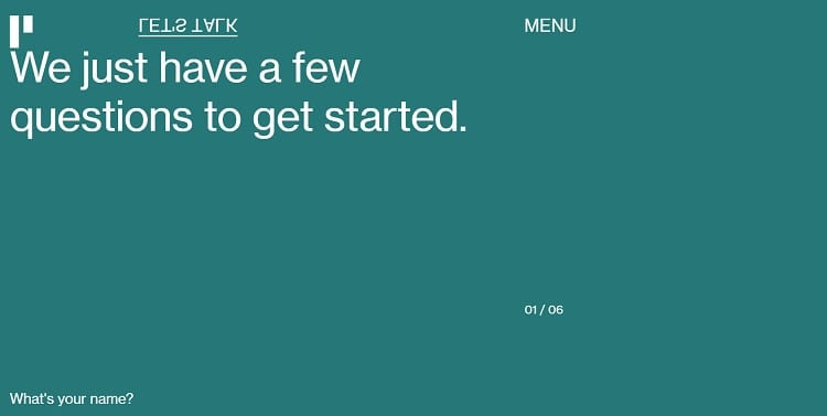
Even the form they include for prospective clients is super simple. They ask questions and you go through a series of clicks and choose options to share your information and start chatting with the team about your needs as a brand.
Mobile Responsiveness
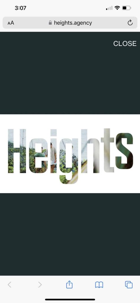
Wow! We often say the thing we’d change about an award winner’s site is the mobile version, but that’s not the case with this one. The mobile version works exactly like the desktop version. Everything transitions seamlessly. Even animated portions of the site and the video reel work exactly as they do on a desktop PC.
The form is also quite easy to use. It is just as simple on the mobile version and utilizes predictive text to make filling out the form as easy as possible. We rate this particular site an A+ on their mobile design work.
Parallax Effect
Parallax isn’t anything new. We’ve been chatting about it for a while here at Designerly and about how it keeps users engaged and scrolling down the page. Heights does parallax particularly well. The speed at which the elements move is perfect, drawing focus to the next task and keeping users moving through the buyer’s journey at a steady pace.
Brand Recognition
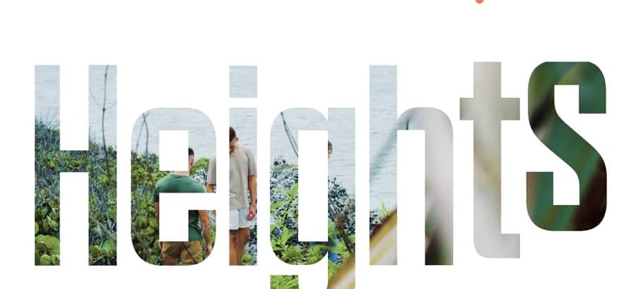
Another thing we really love about this site is the way they use cutouts in the video reel and on some of the pages to reinforce the brand name. Every page on the site is familiar and has the same navigation elements and other features. All images have a certain look and size to them that makes everything come together with a unique style.
Video Features
We love the video reel that introduces people to the agency. The music is upbeat and grabs attention. The images show what the agency is capable of and the cutting edge work of the various people who partner with Heights.
Big, Bold Typography
Beautiful typography never really goes out of style. In recent years, we’ve seen trends toward bigger, bolder typefaces and styles. One thing we love about Heights’ design is the use of their brand name in huge letters.
As you hover over the header, the name of the agency morphs and changes shape with a call to action button to “enter” moving along with the letters. It engages the reader and keeps them entertained while they decide their next move in the buyer’s journey.
Strong Social Media Support
Another thing we noticed about the brand is that they have a strong social media presence. The look of their social sites at LinkedIn and Julian Foster’s personal accounts on Instabram and Facebook all have the same general personality and tone.
In addition, you’ll find beautiful shots of the Cayman Islands which gives the brand some additional interest and personality.
What We Would Do Different
Studies show around 60% of people worry about how companies use their data and if their personal information is safe. The site doesn’t have an easy-to-locate privacy policy anywhere that we could find.
Even though we tested the form and filled it out, we were not reassured that the address would only be used for the purpose it was given. While that is likely the case, brands shouldn’t assume that their users will believe this. It’s best to add in details and make sure they know how you use their info, how long you store it and what safeguards you take to protect them. Some countries even require you to have such statements on your site.
Adding a privacy policy or short statement is a super easy fix. Overall, we adored almost everything about this site. We think it’s one of the better ones to study if you want to learn how to create beautiful websites of your own. Good job, Heights Agency! Congrats on winning this month’s award.


Leave a Comment