We thought November would be an excellent time to look at food-based websites. Thanksgiving is in the air in America, and around the rest of the world, people are gearing up for holiday celebrations of one sort or another. Food is on our mind so we started digging into food-based websites for this month’s Designerly award.
We started by looking at grocery stores, restaurants, coffee shops and fine dining. We also looked at a few product-based sites but quickly decided we wanted to focus more on the service industry for this particular award.
Even after narrowing the options down to restaurants, we realized that was a huge category, so we sought a restaurant subcategory. We finally decided to go with a casual café option.
Searching for “casual dining cafes in the United States” brings up over 126 million options. We like to expand our searches around the globe. You can imagine how difficult it was to choose the best.
The best action was taking the top results and narrowing down our choices. There may be other casual dining cafes with amazing websites we were unable to consider at this time. However, the one we finally chose represents a solid design to help our readers and fellow designers learn.
Winner: District Café & Bakery
What makes a casual dining café website spectacular? Why do some restaurant websites hit all the right points and others fall flat? Part of the equation lies in what people expect from such a site. What design elements are most important from a user experience (UX) standpoint?
According to Statista, the food market revenue is around $8.66 trillion and will grow an estimated 6.72% through 2027. As soon as we select one café website to take note of, you can probably find 10 new ones. Making a list of the best elements of any website is one of the best ways to figure out how to create a stellar one of your own.
Our choice was District Café & Bakery in Edmonton, Alberta, Canada. Our favorite thing about this site is how they hone in on only the information most customers need to decide if they want to dine there.
What Is District Café & Bakery

District Café & Bakery is located in Edmonton. They serve breakfast and lunch. You can get coffee anytime, pastries and a few breakfast items. The atmosphere appears to have a casual vibe where friends might chat over a few muffins and cinnamon rolls. Food is available for dine-in or carry-out. They call themselves the “pit stop to and from the office.”
However, they also are known for using locally-sourced, unique dishes comparative to some of the top chefs in the area. They work directly with Alberta’s farmers for their farm-to-table menu.
We found many things to adore about this minimalist website design, including:
- Plenty of white space so the focus goes to the important elements.
- An easy-to-access menu
- Separate drinks list
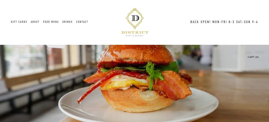
- Hours listed right at the top for quick reference
We even felt the logo shared the simplistic, fresh approach with a simple letter outlined in pretty gold geometric elements.
Why We Chose District Café & Bakery as a Top Restaurant Site Design
A local restaurateur, Nate Box, owns District along with several other bistros, such as Elm Café, Riverdale’s Little Brick Café and Burron in the Central LRT station. The University of Alberta shares how Box found inspiration for the café. He first worked in the restaurant industry while studying for his science degree. His mentor inspired him to enter the industry and the rest is history.
His youthful approach to an age-old industry shines through in the foods he offers and how he incorporates local ingredients into his dishes. As we browsed through the website, we felt the site answered all the critical questions. Here are our favorite things about the site:
Minimalist Design
The way the design matches the idea of the food is perfection. District is all about using farm-to-table with limited, fresh and nutritious ingredients. The website limits the color palette as well as only focusing on relevant images.
The extra white space puts the focus on things such as the menu and headlines.
Short Headlines
Rather than just throwing a bunch of words up, District’s design uses a very limited word count. For example, the first headline on the landing page reads, “Coffee, Breakfast & Lunch. Dine-in & Take-out!”
You don’t have to say a lot to say everything. A customer wondering if they’re open for dinner knows when they see “breakfast and lunch” that they are not. Someone wanting to know if they can grab carry-out sees clearly they have that option.
Beautiful Logo Matching the Personality of Brand
We adore the simplistic but gorgeous logo design for District Café & Bakery. The letter “D” has a gold geometric design surrounding it. The logo makes us think of a car logo design with its timeless quality.
There is nothing to distract from the rest of the page. The logo matches the brand personality with natural colors and a minimalistic tone.
Mobile Responsiveness
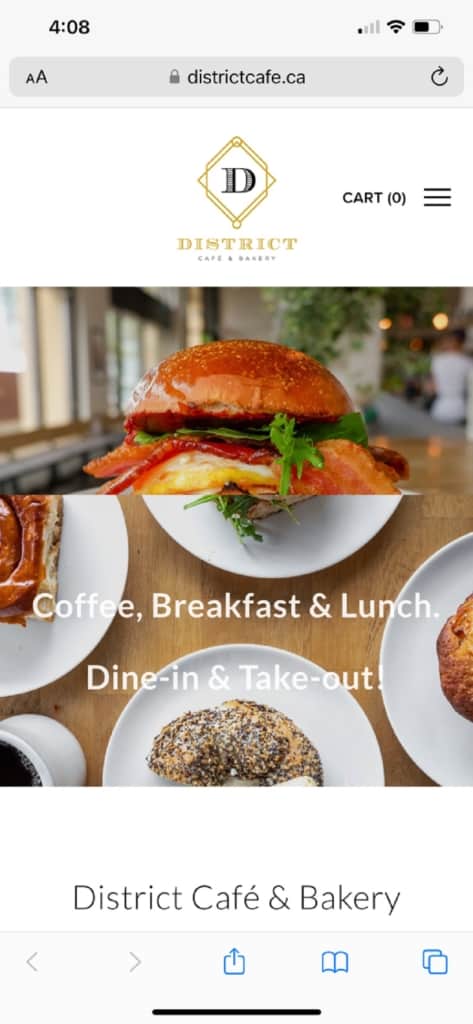
The District Café and Bakery website works well with a smartphone but we aren’t in love with how the hero image looks on a smaller screen–more on that in what we’d change. However, for someone looking up the menu or just wanting to see restaurant hours, the site functions very well.
Social Media Incorporation
Approximately 4.74 billion people use social media around the globe. If you don’t incorporate some social media marketing into your site, you may miss out on an essential promotional opportunity.
District adds some shots from their Instagram account and easy ways to connect with them on both Insta and Twitter.
Clear Directions
The site offers easy-to-understand directions to their location and a list of open hours. People can see at a glance when they should go. One of the things we like best about the design is the hours listed right at the top right of the landing page.
On some sites, we had to hunt hard to find out what hours the business was open. District told us within milliseconds of landing there.
We also like how they broke down their menu into Breakfast and Lunch. It’s easy to see what is available and when. They also included prices and product descriptions.
What We Would Do Different
Although we love the example of District Café & Bakery, and the images make us want to take a trip there soon, we’d tweak two things to make this site even better.
First, we aren’t in love with the look of the mobile design. The two images stacked on top of each other look great on the site’s desktop version. However, they don’t look as good on mobile, where they respond to the smaller screen size and look clunky and unmerged.
We recommend losing one of the images anyway. It takes a long time to scroll down to the body text on the desktop version and it looks less than ideal on the mobile version. The second image could be better utilized another time. They could also go with a rotating image, using a hero shot that rotates through several shots of the interior of their café or some of their top dishes.
We would also add an ordering system to the website. For new or smaller restaurants, a point of sale (POS) system that integrates with the website encourages more ordering online. An automated ordering POS system saves your servers or hosts time. They don’t have to take carry-out orders over the phone. The tickets go right back to the kitchen for preparation.
Overall, we adore the District Café and Bakery website. The changes we would like to see can be incorporated over time as a business grows. However, they’re an excellent example of how to show off your brand personality through your online presence.
