How do you structure an e-commerce website? An e-commerce website wireframe will show you. As long as you know what you’re doing and follow the best practices, you can make an effective, user-friendly final draft in no time.
Why You Need a Wireframe for Your Ecommerce Website
Even though all e-commerce websites share similar features — like shopping carts, search bars, and category lists — each has unique qualities. If you visit multiple of the most popular e-commerce websites, you’ll notice navigation and user flow differ significantly for each.
That being said, wireframes are about more than surface-level appearance and navigation. Using an e-commerce website wireframe streamlines web development and accelerates your release time. This way, you can work out bugs in advance, get stakeholders on the same page, and have a clear plan to implement your vision.
Making an e-commerce website wireframe before proceeding with web development ensures you balance familiarity with brand differentiation. While you want consumers to intuitively know how to navigate, you also want to stand out from the billions of other websites on the internet.
Examples of E-Commerce Websites for Design Inspiration
If you’re having trouble creating an e-commerce website wireframe from scratch, look up some examples for inspiration. While mockups can encourage creativity, we recommend looking at real e-commerce brands’ landing pages to get an idea of what works in practice.

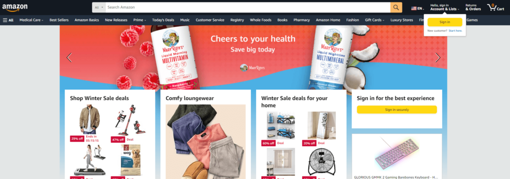
Amazon is the biggest name in e-commerce, so it’s a great place to start when looking for inspiration. As you can tell, it displays its latest sales and deals right at the top next to account, orders, and cart. It even has a pop-up directing users to sign in.

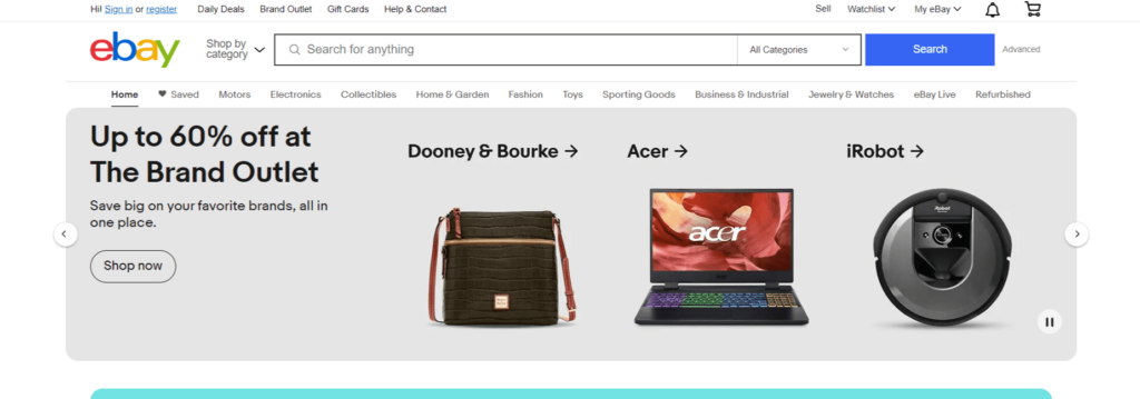
eBay’s layout is similar to Amazon’s. It prominently features the cart, search bar, categories, and sales. At first glance, the 60% off deal seems most vital because it takes up the most space. Consider this when crafting your layout around user intent if you run sales frequently.

Bite — a smaller, more niche e-commerce website — displays a small product description for unfamiliar users. It also prominently features “about” and “impact” pages to generate reputation. Despite these differences, it still has cart and account icons.

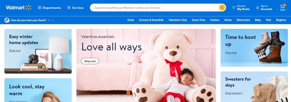
Walmart has numerous departments and services, so it has separate pages for those. It has a unique take on product categories — while it features a search bar and text categories, the “shop now” boxes are more prominent — you can tell what it wants users to focus on.

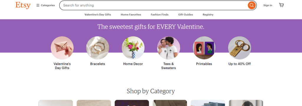
Etsy’s landing page is another similar story to the other e-commerce websites. It has account and cart icons at the top and displays priority categories below. In between, it prominently features a relevant time-sensitive section.
If you were to visit any of these websites, you’d notice they have one thing in common — wherever you navigate, the cart, category, and search functions remain on the page. Crafting your e-commerce website wireframe in a similar way to start may be a good idea.
Best Practices for E-Commerce Website Wireframes
E-commerce website wireframe creation is pretty flexible — there are very few rules in the creative stages. Still, following best practices can help you achieve success in the long term.
- Outline User Flow
When building an e-commerce website, your goal is to drive sales. To do that, you must direct consumers toward their wishlists, product pages, and checkout. Map out how users will navigate your website from the landing to order confirmation page.
- Craft Multiple Wireframes
Another best practice for creating an e-commerce website wireframe is crafting separate wireframes for mobile and desktop. Most people — around 63% of people, to be precise— use phones to go online. Ignoring them to accelerate time to market will only hurt your bottom line.
- Prioritize User Intent
User intent should be your priority when creating a wireframe. Almost every person visiting an e-commerce website shares the same goal — to make a purchase in a convenient setting. Get inside consumers’ heads to determine what they want most from their experience with you.
- Consider Content Hierarchy
Consider the hierarchy of e-commerce content on your website. Wishlists, sale banners, product listings, search bars, categories, and shopping carts are essential. Most users already look for these icons — it’s up to you to determine placement and sizing to maximize engagement.
- Collaborate With Others
Most things are better shared — and that includes e-commerce website wireframes. While it’s possible to design one on your own, your final product will be better when multiple people can voice their opinions. Involve developers, designers, and marketers in your process.
- Keep It Simple
Don’t add product images, colors, or listing details — unnecessary frills complicate things. For instance, since 90% of a first impression is determined by color, using any skews perceptions. You don’t want people commenting on color palettes instead of user flow or content hierarchy.
Considerations for Designing a Wireframe
Consider using programs to create a realistic wireframe — many exist. For example, Adobe XD lets you animate artboard links to better visualize user flow. While sketching your ideas out works well, specialized software can give you a better final draft earlier on.
Feedback implementation is another consideration. When you receive criticism on certain aspects of your wireframe, will you redesign it to fit it in? What about when you have a critical passing thought of your own work? Consider writing everything down so you have a record of what isn’t working and what to fix.
How to Create an Effective E-Commerce Website Wireframe
An e-commerce website wireframe guides web development and helps you clarify your vision early on. Whether you use artwork programs or sketch something out on the nearest piece of paper, making one is simple. That being said, making it effective requires more effort.
Your first step should be to use the websites of top e-commerce players and your direct competitors. Do you catch yourself wishing there was an easier way to navigate? Is there a feature that stands out to you? Write down your thoughts to improve the creative process.

How do you create a wireframe for your e-commerce website? Keep the best practices in mind, think back to the examples you saw, and then put yourself in your users’ place. How would you prefer to navigate? Development limitations and potential technical issues come second. For now, your only goal is to design something user-friendly — you can handle the finer details later.
Which elements of a website should you consider when designing a wireframe? Functionality and simplicity are essential, so you should only consider layout, navigation, search, product pages, and sharing. Placement, size, and shape are the three key factors to consider. While deciding where to put body text, images, and videos, use placeholders instead of actual content.
Wireframing takes time, even if you scribble on paper. It is a purposefully repetitive process, so don’t be afraid to trash your original ideas. Even if you really like your first attempts, make more anyway — having more than you need is good for your development process.
It’s Time to Test out Your E-Commerce Website Wireframe
Once you’re out of the design phase, it’s time to move on to testing. Whether you develop a skeletal website, use special programs, or simply have more people provide feedback, it helps to see if your concept really works.
The testing stage is crucial to the rest of the web development process because it irons out the kinks and design flaws. If you’re unsure what iteration to pick, then test multiple. This way, you can ensure your final draft is ready for users and looks excellent.


