Designerly looked at the travel industry this month to narrow down the choices and hand out an award for design to El Palace Barcelona. Anything travel related tends to have sweeping views and tons of features, so we narrowed the options for our design award down a bit more and looked only at hotels.
As you can imagine, there are big players in the hotel industry, including brands such as Hilton, Sheraton and Marriott International. We couldn’t possibly study every hotel out there, so we narrowed the options a bit more by what hotels popped up in searches of major cities. We haven’t focused on websites in Spain yet, so Hotel Barcelona stood out for us.
From video elements to a user-friendly design, this site had everything we look for in an example of excellent layout, appearance and functionality.
Winner: El Palace Barcelona
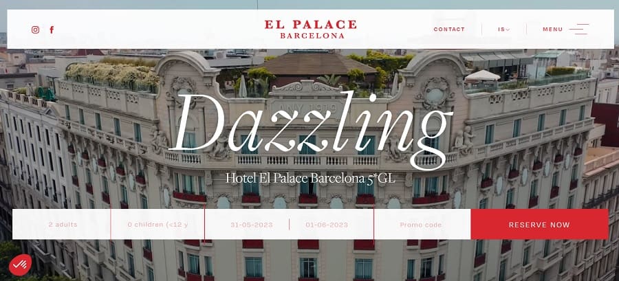
El Palace Barcelona–Hotel Barcelona in English–has a stunning site design. Although the industry stuttered during the global COVID-19 pandemic, experts predict it will rebound to an annual growth rate of 8.1% and hit $1.27 trillion by 2031.
With steady growth, more hotels will enter the playing field in the next decade. We chose El Palace Barcelona because it is easy to use and beautiful. The aerial shots of the hotel draw the viewer in and showcase the unique architecture of the building. The text overlay doesn’t distract from the aesthetics of the design but adds to it.
What Is El Palace Barcelona Like?
El Palace Barcelona is located at Gran Via de les Corts Catalanes, 668, Barcelona 08010
Spain. The hotel was designed by Antoni Falcon and offers fountains, pergolas, a swimming pool, tons of glass and light and over fifty different species of plants. It’s a little oasis in the middle of Barcelona, Spain.
You’ll find 120 rooms and suites, each decked out in luxurious bedding and furniture. You’ll find a beautiful rooftop garden on the seventh floor and a gorgeous swimming pool. Visitors feel as though they’ve stepped back into the 1920s when they see the solarium. The hotel features live music in the evenings in the cocktail bar.
The hotel is close to the beach and the wine region. The architecture screams Baroque period and the hotel was once a Ritz, which isn’t surprising when you see the grandeur of the place. Open since 1919, it is still a thriving business with plans for the future as the hotel group revamps the interior with new fixtures.

The gallery of images shows the interior also giving a nod to Baroque. From a Mayan luxury spa to a grand hall for meetings and events, you’ll find luxury in every corner of Hotel Barcelona. You’ll find images of the 1920s and the front when it was Hotel Ritz. Movie stars, musicians and royalty have stayed at the hotel through the decades.
Why We Chose El Palace Barcelona As Our Site of the Month
The main attraction was the video showcasing a front-facing aerial view that sweeps up into an overhead look at the rooftop garden. Numerous travel sites feature videos and even aerial shots, so we looked a bit deeper at other elements, such as the simplicity of the design and how well the calls to action (CTAs) function.
User Intent
Does the site meet the user intent for those looking for a hotel in Barcelona? Someone looking to book a hotel in this city can see what the location offers and what rooms are available on which dates. Information is easy to locate.
Aesthetic Appeal
We like the simplicity of the design. Because the video is the major portion of the page above the fold, the designer limited other elements to just a handful. The serif fonts on the heading and subheading give the site a formal personality that matches the elegance of the hotel. The limited colors put the focus on the video. White and red add details without distracting from the overall look.
CTAs
A call to action is arguably one of the most crucial components of a successful design. If the goal of a website is to turn visitors into leads or customers, then paying particular attention to placement, color and wording can make an impact on conversion rates. The pop of red for the “Book Now” CTA button grabs attention the minute you land on the page.
Navigation
Before we give out a website design award, we spend time in the navigational structure of a site. A design can be beautiful but nonfunctional. Since people use navigation to move throughout a site on various pages, it is one of the top functions we consider.
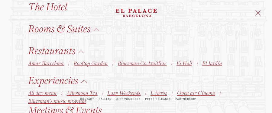
The El Palace Barcelona navigational hierarchy is spot on. We like the way it is a hamburger menu even on desktop, as it does not distract from the video or CTA. However, it then expands into a gorgeous mega menu offering large links to various areas of the hotel or to meet the needs of a wide array of site visitors.
Speed
While site loading time isn’t the only thing Google considers when ranking a site, a slow page can knock you out of the top position and even cause visitors to bounce away. We tested El Palace Barcelona on both desktop and mobile and found it loaded at lightning speed.
Around 67% of internet users get online via mobile at least some of the time. A slow-loading page can kill your conversion rates. On the mobile version of the site, the image turns into a static one for faster loading, but parallax scrolling keeps the user engaged and moving steadily through the site on the buyer’s journey.
Trust Factors
If people haven’t done business with you before, they have no reason to trust you to do what you say or give them value for their money. One thing Hotel Barcelona does that works particularly well is to have a page where they list mentions of their hotel.
Well respected magazines featured the El Palace Barcelona, including Conde Nast and local newspapers.
Images
We love their image gallery, featuring the hotel today and from different decades. It was one of the reasons we chose them for an award. Sharing your brand’s history with people gives them a glimpse of the ups and downs of building your business. It engages users and helps spark their imaginations.
What We Would Do Different
We don’t love the white with the red. It’s pretty harsh on the eyes and not in keeping with the rest of the design. We’d choose a soft cream color instead to soften the glare and not distract as much from the video. Another option would be to make the white bar slightly transparent so the text still shows but the video plays peekaboo in the background.
The site has many features that other designers can learn from, including the functionality of the booking system and the wording on the CTA. From the bright red that grabs attention to the well-thought-out font choices, the site is an excellent example of strong design with a nod to where technology might take the hotel industry in the near future.
