

Vintage typography is fonts that have a retro look to them. They are more traditional in nature and may use colors that give them a sepia-toned look similar to what you’d see in old photographs.
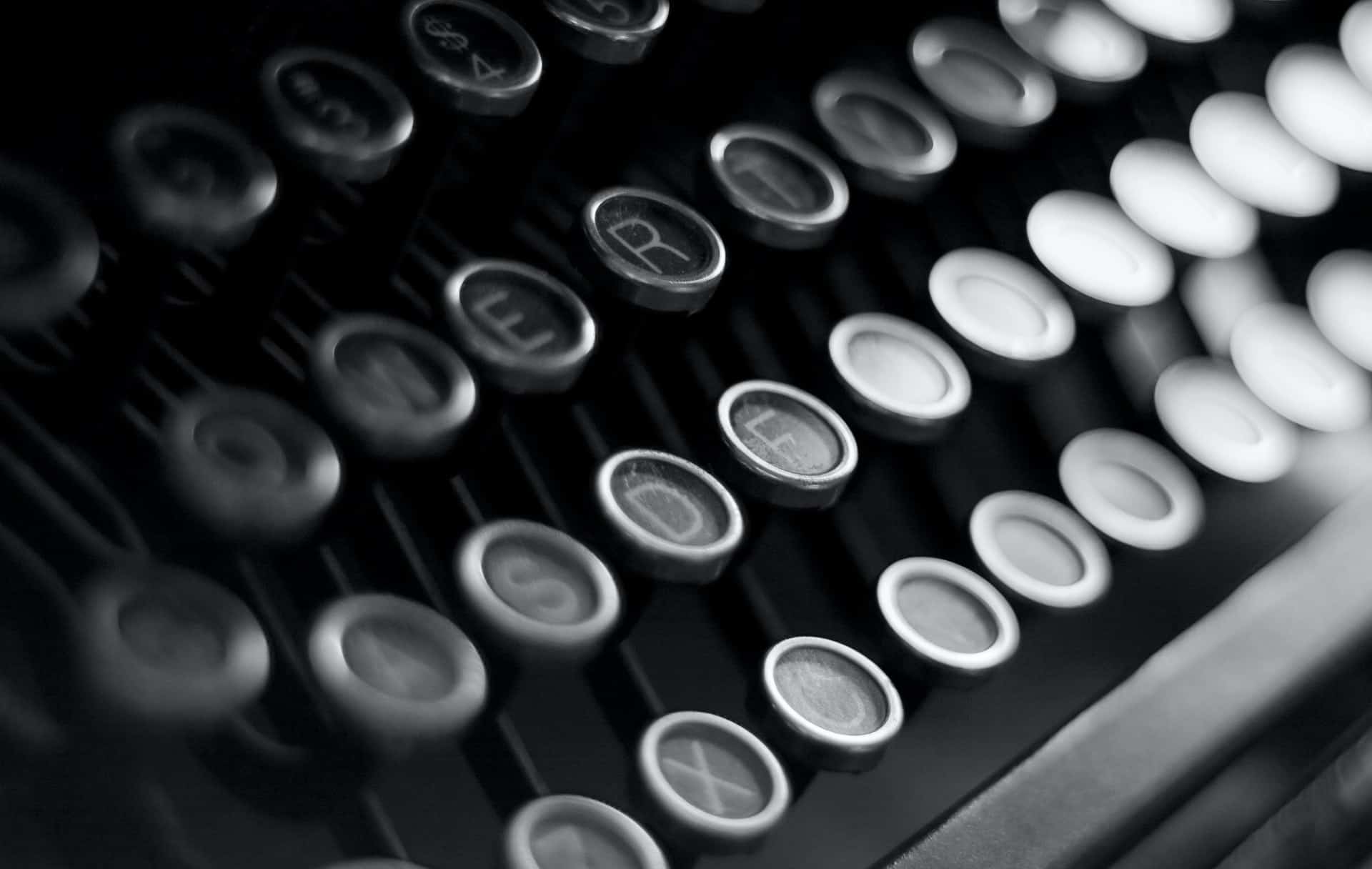
Printing and modern typeface design dates back to medieval times when Gutenberg began experiments in the 1400s. Typography allowed for a uniform text that was readable and visually appealing. It’s a combination of point sizes, line spacing, line length, kerning and tracking. The typefaces of yesteryear were often quite intricate and artistic.
When people say they want vintage typography, it can mean any number of things. They might want a look from the 1970s, or they may want something from the 1500s. Old typefaces inspired most modern fonts, so it will be easy to find a design out there to match your needs.
The best way to figure out what type of vintage typography you might desire for your own designs is by studying how others use it in theirs. Here are nine examples that rock the looks of the past.
1. Modern Retro
One way to get the look of vintage typography without making your product seem outdated is to update a retro type slightly. You can modernize it by straightening out some of the curves or changing it slightly. Lose a few of the serifs and embellishments. An update of an older look can make an age-old company seem timeless. Some vintage fonts that give your designs this type of look include Devant Horgen, Riverside, Northead and The Salvador.

Jack Daniel’s Whiskey has a retro look that shows they’ve been in business for many years. Over time, they’ve slowly upgraded their font on their whiskey bottles to reflect that they’re keeping up with current times. However, the face is still recognizable from their earliest products and to those who are fans of the brand.
2. 1980s Gamer
The 1980s were known for a lot of interesting styles and designs. There were parachute pants, big hair and neon colors. Video games became highly popular thanks to the introduction of home video game systems. The look is quite distinctive, and so are typefaces utilizing it. Get the 1980s gamer typefaces by using fonts such as Gamer, Game Robot and Video Game.

Blast Galaxy is in the Netherlands, and their logo works perfectly for an arcade. It offers a nod to retro systems and games such as Space Invaders. Note the neon colors in the logo, which also reflect what you’d see on the screen of a computer game.
3. Jazz
Jazz music has a style all its own, so it isn’t surprising that establishments where you listen to it often have a specific vintage typography look for their signs and logos. The fonts are sans serif with tall, thin letters. You’ll often see them combined with shadows to give a three-dimensional look. Some other jazz-looking fonts include Let’s Jazz, Kip & Val and Ecustic.

Jazz singer Kenny Colman has a really unique website where he uses typography like you’d see on the outside of a club. The look goes perfectly with his music genre.
4. Grunge
Grunge typefaces can take on a vintage look when used in the right place or way. You can add smoky elements, neutral colors and images to give the design a gothic feel. Some of the fonts that give you a Grunge look include Nomos, Marquee and Stampbor.

Grim London uses a grunge concept to make things seem dark and mysterious. The site features haunted historical places, so the font they use makes you think of Jack the Ripper or other mysterious goings-on.
5. Vintage Barbershop
Think about the barbershops that used to dot Main Street in towns across the United States. Their signs simply read “Barber” and included a candy cane, rotating cylinder to let people know if the shop was open or not. The word “Barber” often used a specific typeface. To get this type of Main Street USA look, go with fonts such as Fortunate, Parlour Sans and Barbaro.

Botot uses a font that looks very similar to Barbara but has lines under some letters to offer additional highlighting. Since they sell bath products, the barber theme using vintage typography works really well for their logo.
6. Embellished Serifs
If you want the look of an old-time elixir you might see at a street fair, try a font such as Foglihten or Prida. You can also use a plain serif font and add in embellishments around the name of the company with additional lines and accents.

Look at this gorgeous logo designed for Bib & Tucker Whiskey. The serif font has swirls and additions that give it that vintage typography feel you might want.
7. Hand-Drawn Fonts
Sometimes you can’t quite find the look you want in any of the available fonts. In those cases, you might want to create a hand-drawn logo or design that is truly unique to that business.

This idea for the Darkink Tattoo Studio logo is on Behance and designed by Tobias Saul. It’s a hand-drawn logo that gives the brand name the appearance of experience and stability. Note the embellishments inside the swirls of the letter D and then ending in a repeat type swirl on the letter K.
8. Script and Sans Serif
Meshing a script font with a sans serif can give your design a unique, retro look. For example, you might make the first letter in the title sans serif and the rest of the title cursive. Try combining Abril Fatface with Josefin Sans, Lobster with Arimo and Patua One with Oswald.

Even though the company is Danner, you can see the use of the vintage typography in the words “Vintage Boots” on their website. Note how the font is a mix of both serif and script. The V has the look of sans serif but then adds the look of cursive to the outer top left of the letter. The rest of the letters flow in a script, and the letter B repeats a similar look.
9. Vintage Garage
Back in the 1950s and ’60s, little gas stations with garages dotted each corner in every town. The fonts they used to indicate the name of their company had a distinctive look typically inside round logos. The fonts were a loose script with serifs, and the names underlined. For this look, try a font such as Gasoline, The Roxers and Number Five Rough.

Tommy offers that vintage typography garage-themed look. Note how the font is inside what looks like a round sign. Even the colors add to the retro look.
Vintage Typography Choices
There are tons of choices when it comes to finding a vintage typography look. Think about what era you most want to impersonate, and you’ll be better able to choose a font with the right personality and style. Try different ones until you find one that works best for you.


Leave a Comment