


Looking for fonts like Lato? Lato is a sans-serif typeface designed to be elegant and clean while minimizing distraction. Originally launched in 2015, this font family was a corporate commission that was later released and accessible to the public. “Lato” means “summer” in Polish.
Along with the other fonts in the family, Lato 2.0 covers more than 3,000 glyphs and 18 styles. Designers love this font for its robust structure and elegant curves. The font is very popular, appearing in a variety of media products. There are many options if you’re looking for a font with Lato’s characteristics that isn’t as prevalent in other designs.
Lato Font’s History
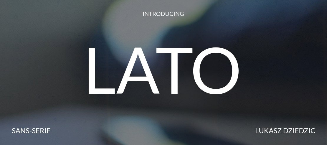
If you’ve ever studied Lato, you know it is a humanist sans-serif typeface. Lukasz Dziedzic, a Polish designer, created Lato for a banking company. The bank wanted a clean, modern font that wouldn’t distract from crucial information customers needed to do business with them.
The word Lato is of Polish origin and means “summer.” Created in 2010, other designers added additional glyphs in 2014, making Lato 2.0. The current font includes 3,000 glyphs, 18 different styles and weights and over 100 Latin languages plus Cyrillic, Greek and IPA. Lato is used by companies and organizations like Museum Week, Polish Jewish Magazine and Bank Pekao.
If you like to think outside the box and want to find something similar to Lato’s design but that a competitor might not use, there are numerous options. Here are our favorite fonts similar to Lato.
1. Syabil
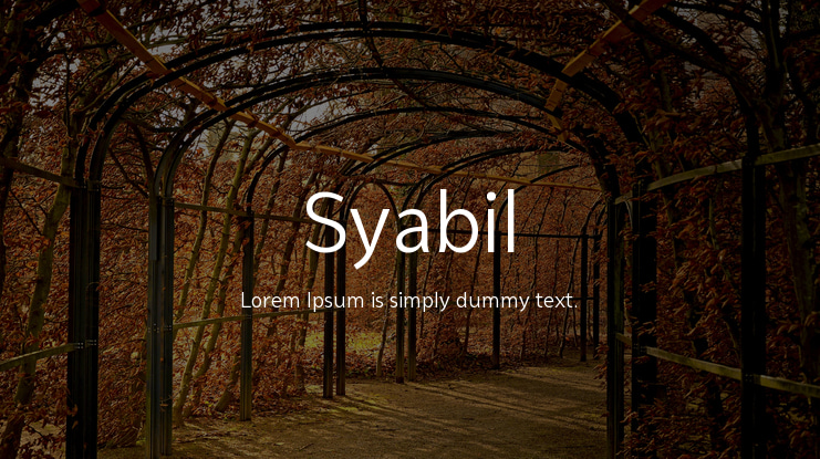
Clean and multipurpose, Syabil is a font family consisting of nine different weights.
It’s crafted to fit print media and video and works in various designs. Eko Bimantara designed the font, which is unique yet legible.
Whether designing a logo, label or infographic, Syabil is a solid choice thanks to its modern sans serif lines and clean look. It’s very easy to read in all sizes and weights.
2. Proda Sans
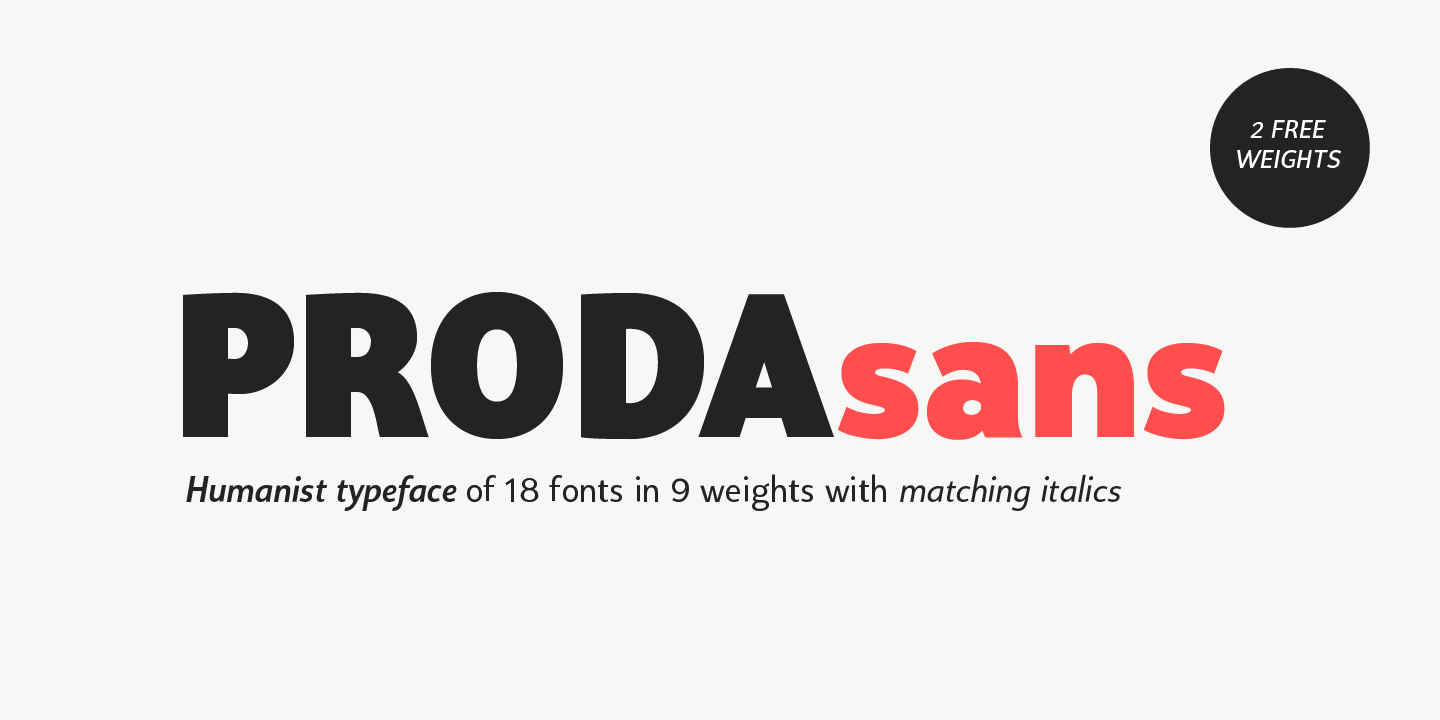
Proda Sans is similar to Lato, with both being humanist sans serif typefaces. It has nine different weights that allow it to adapt to various media.
It is legible while keeping the same gentleness that Lato’s known for. The font works well for both displays and body texts.
If you’re looking for a unique humanist font, Proda Sans is an excellent choice. Proda Sans works well for headings, logos and printed announcements.
3. Fibon Neue

Fibon Neue is a smooth font that works well with print and displayed materials.
The dynamic font has several different weights that appear similar to Lato Light, with its low contrast characters.
An improvement to the Fibon sans typeface, Fibon Neue is a nicely balanced font for a poster or screen. Included in the package for this font, you get Fibon Neue Regular with 8 weights plus obliques, Fibon Neue Round and Web Fonts Regular + Round with 32 options.
4. Halton
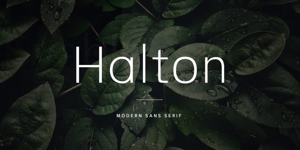
Halton is a font with many similarities to Lato Light. It’s a minimalist font that’s slightly condensed, making it an excellent option for headers and body text.
The typeface is a sans serif family and is easily legible with a bit of personality.
Halton is an excellent choice for posters, booklets or pamphlets.
5. Stark
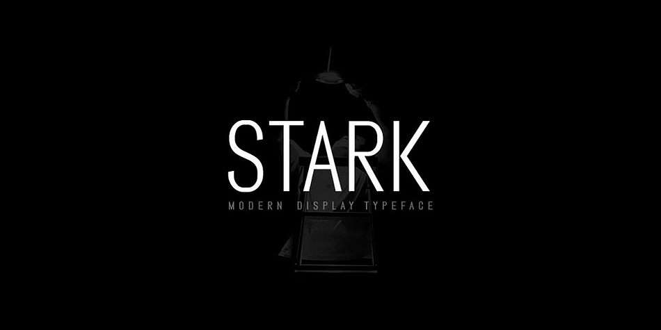
Stark is a modern sans serif font that’s designed similarly to Lato.
The font family works well in both header and body text and includes a variety of special characters.
The font is an excellent choice as a multi-purpose typeface for print or digital media.
6. Metrisch

Another humanist font, Metrisch has a clean and smooth look that mimics the Lato design.
The typeface’s weights range from light to extra bold, which makes it an excellent choice for logos and magazines.
If you’re looking to experiment with a font that works well on a flyer or a billboard, Metrisch works beautifully.
7. Sentral
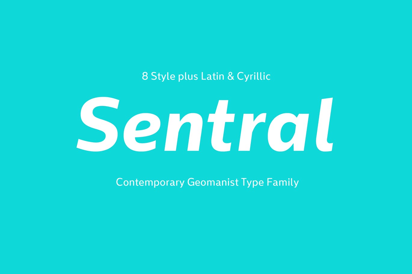
Sentral is a modern “geomanist” font popular for its energy.
The contemporary font comes in eight different styles giving you many options for your design. Warm while energizing, the font works well on posters and advertisements.
A fun font to experiment with, Sentral is an excellent choice for any attention-grabbing media piece.
8. Skrinia
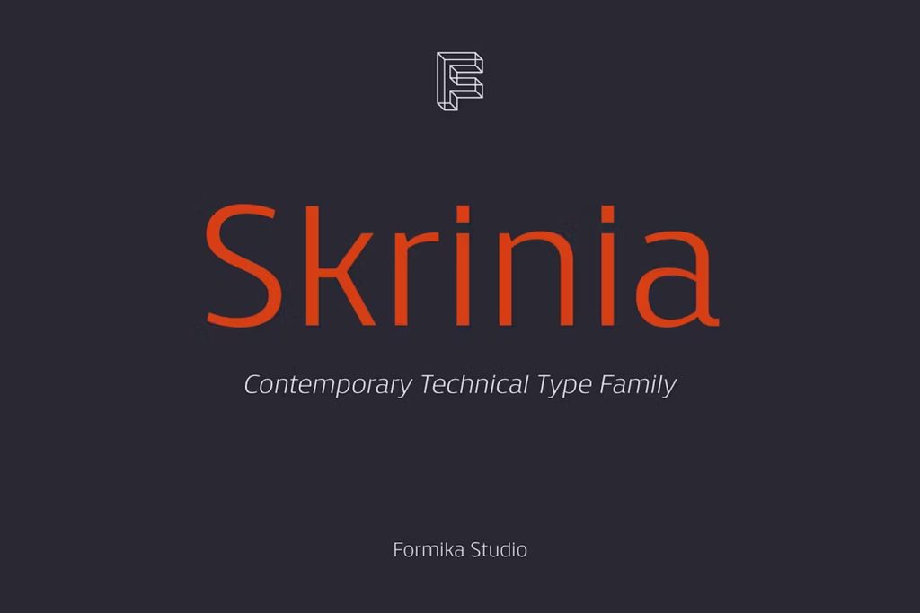
If you want something a bit bolder than Lato but with the similar clean lines, Skrinia is a tech type font in the sans serif category. It’s described as a versatile technical type family font with contemporary lines perfect for modern businesses or invitations to non-formal events.
The font boasts 16 styles from Extralight to Black and offers large language support.
The lack of serifs makes the font ideal for headings or body text. You can add more weight to give it a bolder look for headlines or swap out the color and have a monofont look that screams cutting edge.
9. Quadran
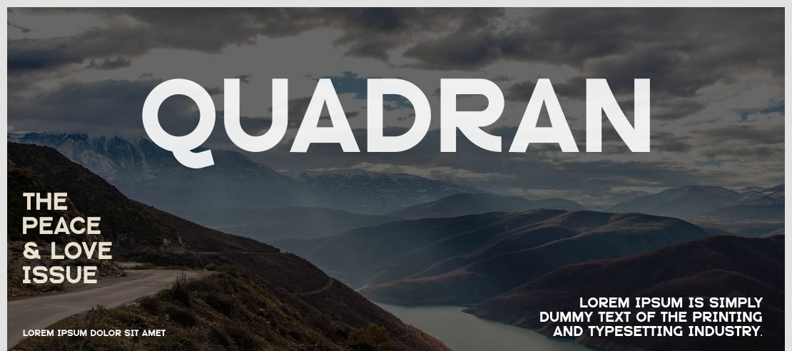
If you need a bolder look, Quadran has many of the same lines as Lato but offers some additional detailing on capital letters for a modern but more formal appearance. Rather than falling into the sans serif family, Formika Labs defines the font as “new geometric grotesque.” It still is fairly simple and offers a variety of weights including ExtraLight and Black.
The design features a double story “g.” The font is best suited for headings and logos.
10. Poppins
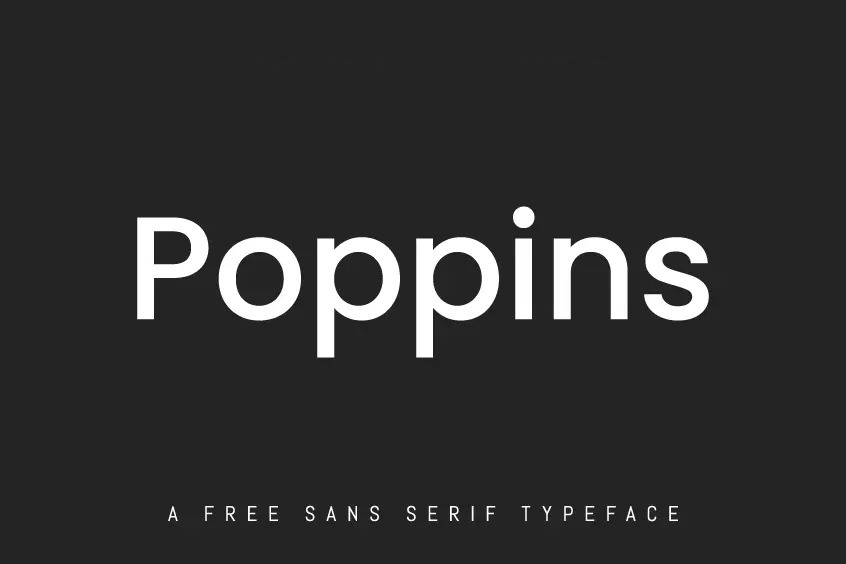
Poppins is a tall, slender sans serif font reminiscent of Lato. Many sans serifs have similar appearances, but the simplicity of the strokes match fairly closely. While there are a few variations with all of these fonts, Poppins is similar enough to be in the same class.
Poppins font is available for free through Google. It comes with 20 weights and glyphs such as Latin lowercase, Latin uppercase, numbers, punctuation and currency symbols. The font supports 469 different languages. While it is classified as a modern sans serif, the makers describe it as “having a touch of geometric” in the mix. The wide range of possible symbols should meet the needs of nearly any project.
The ability to utilize different weights and glyphs means the font is extremely versatile and can be used in digital and print formats in various sizes, while remaining legible.
The font comes from a foundry out of India and is well-suited for graphic design use. Poppins makes one think of styles such as Verdana and adds an elegant but warm touch to any project.
11. Monolith
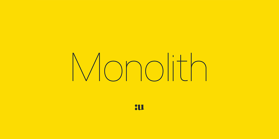
If you’re looking for a taller, more slender Lato-like type, the Monolith font fits the description. Monolith comes with two contrasting versions–Regular and Light. It also features true matching italics.
Monolith combines modern shapes and minimal grotesque. The entire typeface was designed to be as visually legible as possible. Special consideration went to how the eye skims over different letters.
12. Yellow Peas
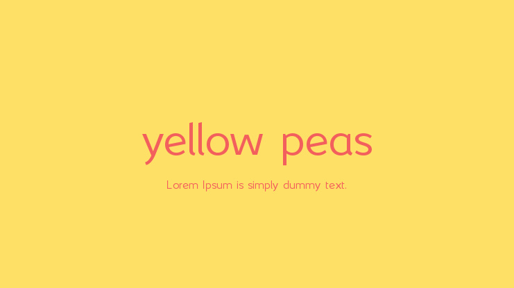
If you want to add a bit more interest to a heading and use a similar font alongside Lato for a nice pairing, try Yellow Peas. The font family comes in five different weights with a variety of licensing options.
Ultra Light is free but others require payment. The full, paid versions contain both Western and Eastern European languages, Thai, Vietnamese and Russian Cyrillic characters and symbols. You’ll also gain ligatures.
13. Botes
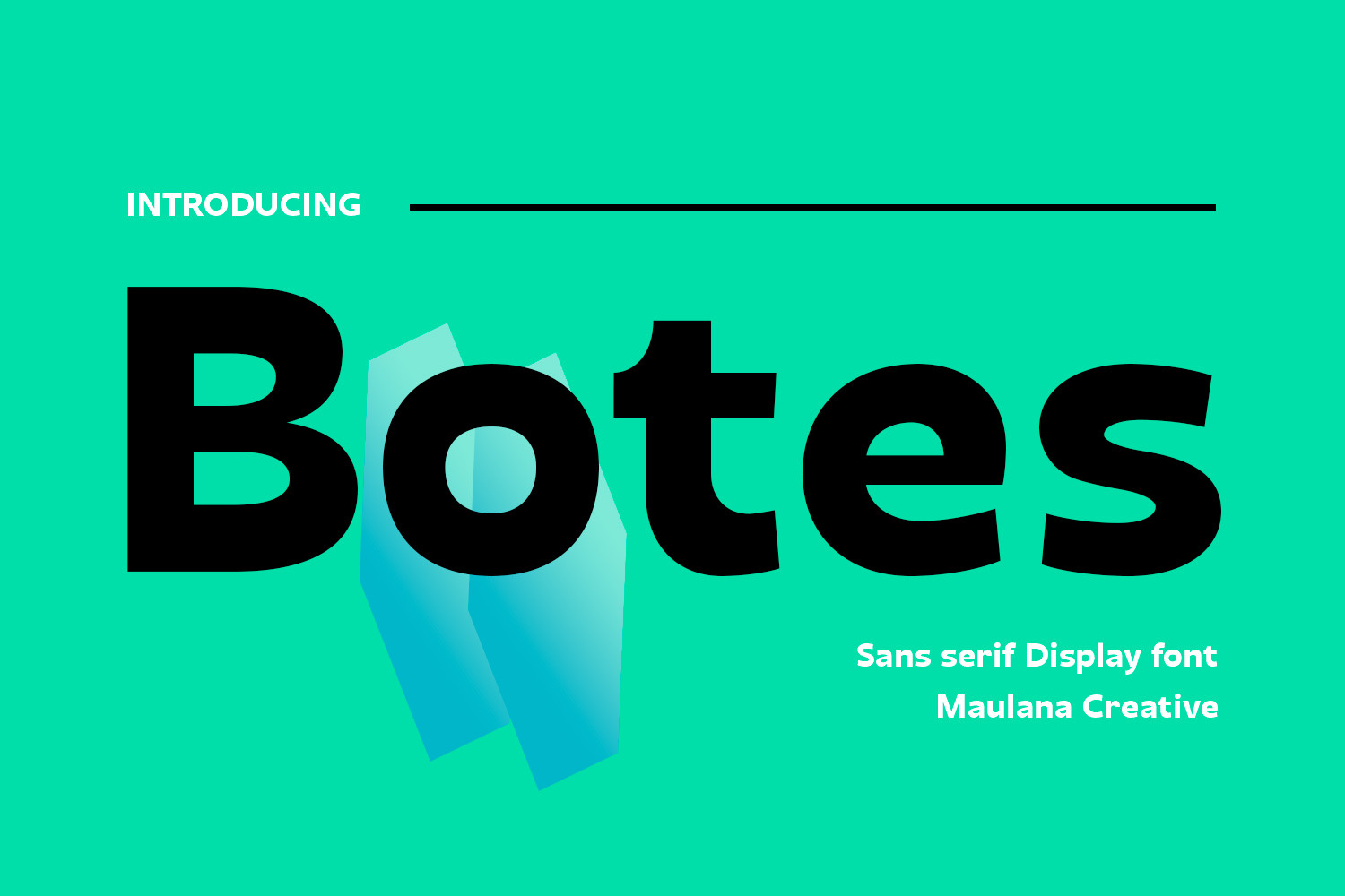
Botes is an interesting option brands might wish to consider. It’s a heavier stroke font classified as a modern semi-geometric humanist sans serif. Branch out with your creativity by adding character with ligatures and alternate characters.
The widest parts of each letter are fairly thick, making the circles and openings narrower.
One of the most useful parts of this font is its support of more than 100 different languages. No matter what audience you’re creating a design for, Botes can meet your needs. The heavier weight font is best suited for headlines.
14. Nunito
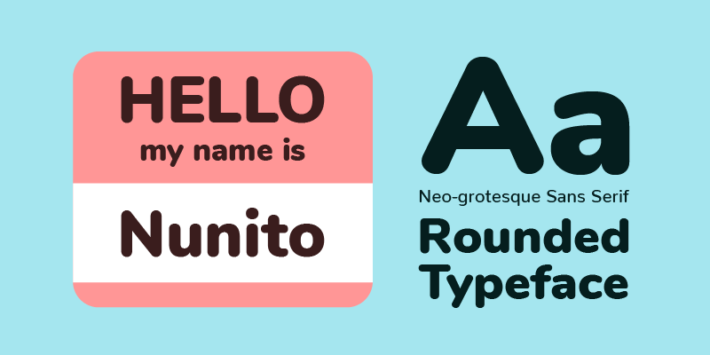
Nunito has a warm, simple appearance that makes it an excellent replacement for Lato. The superfamily of fonts offers two different versions. Vernon Adams created the first version of the font with rounded terminals best used for displays. Later, Jackques Le Bailly extended the font and added in a full set of weights and an option for non-rounded terminals.
Nunito offers weights such as ExtraLight 200, Light 300, Regular 400 and medium, semi-bold, bold, extra bold, black and 1000 weight. Each weight comes in italics, too. The wide range of weight options makes the font suitable for headings as well as body text. Nunito supports 616 languages and comes with a wide range of glyphs, including currency symbols and marks.
Find Your Own Lato Style Font
If none of the options above quite meet your needs, you can find your own Lato-like font by looking for options with the main characteristics of the original.
- Simple and consistent lines
- Readable at all sizes
- Slightly rounded characters
- Contemporary san-serif feel
Choosing the Right Font
The right font significantly affects how an audience perceives an advertisement, informational poster or screen display. Adding some personality to your designs while still staying in the same style family is crucial.
Lato is an excellent choice for all media types, but its popularity means it is now commonly seen in media. These fonts provide nice alternatives with enough similarities to Lato that you won’t miss it. Your look will still be a bit unique to show off your brand personality.


Leave a Comment