


A grayscale color palette can bring elegance to any design. You can still add pops of brighter colors if you’d like for your calls to action (CTA) and items you want to draw attention to. A neutral look gives you a ton of flexibility in the features you add to your pages. You can make your buttons pop and draw user attention or make everything on the screen different hues of gray.
Dreary days may make you think the color gray is boring and dull. Gray designs aren’t necessarily flat and lifeless. You can work in various hues of the color to create texture and add interest. You can also sprinkle in neutral colors, such as white or black to add dimension.
How to Implement a Grayscale Color Palette Into Your Design
Grayscale color palettes can be light, dark or medium shades, depending on the tone you want to set. Lighter colors are elegant and work as well for a wedding business website as a traditional business model.
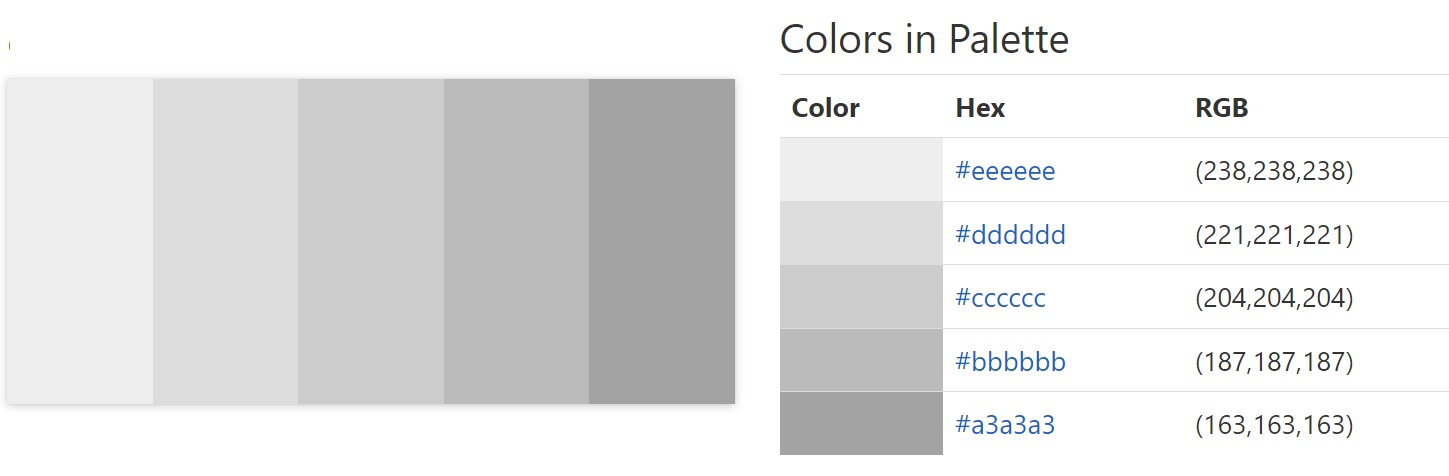
Source: https://www.color-hex.com/color-palette/9341
Darker colors create a more masculine, dramatic flare. They are well suited for financial institutions, sites selling products for men and blogs with a serious focus.
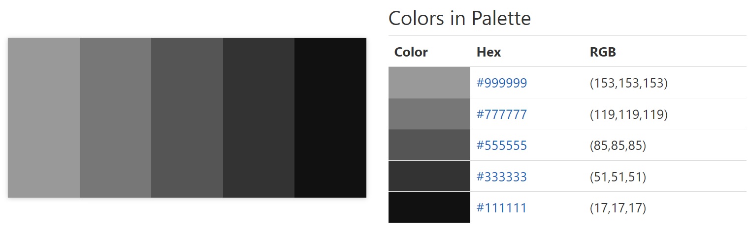
Source: https://www.color-hex.com/color-palette/184
Grayscale design means creating without the distraction of color. One benefit of using only hues on the gray spectrum is that people who are colorblind will be able to view your site easily. Here are some ideas for using a grayscale color palette in your design with examples of ones done well.
1. Embrace White Space
A good grayscale design can incorporate white and still look elegant and unique. If you’re going for a minimalistic look, a pure white background with some gray elements may give you the clean, uncluttered feel you’d like.

Source: https://www.angelamilosevic.com
Designer Angela Milosevic uses gray and black and white to create a stark and interesting site that pulls the user in. The negative space puts the focus on the graphic in the center of the page.
This technique would work well for any portfolio type website. It shows a sort of old world elegance potential clients respond to.
2. Use to Offset Product Images
Do you want to place the focus on your products rather than the background or other site elements? A grayscale color palette design almost fades away, putting attention on anything with a bit of color. If you sell products without bright pops of red or blue, surrounding the photos with gray gives them a chance to shine.
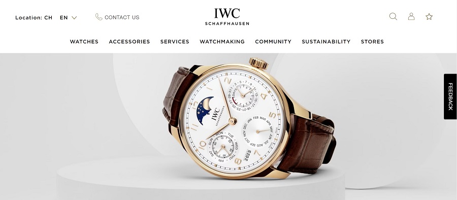
Source: https://www.iwc.com/en/home.html
IWC Schaffhausen sells elegant timepieces. The gray background throughout the photos and the site gives users a chance to focus on the earth-toned watches. We particularly like the white band where the menu and logo are located at the top. Utilizing black text goes with the rest of the colors on the page but allows enough contrast for the information to pop.
3. Create a Visual Hierarchy
It’s crucial when working with grayscale designs to select a base color and other shades for different areas, text and so on. By creating a hierarchy before you begin designing, you’ll ensure there’s enough contrast to keep text readable and prevent distracting combinations.
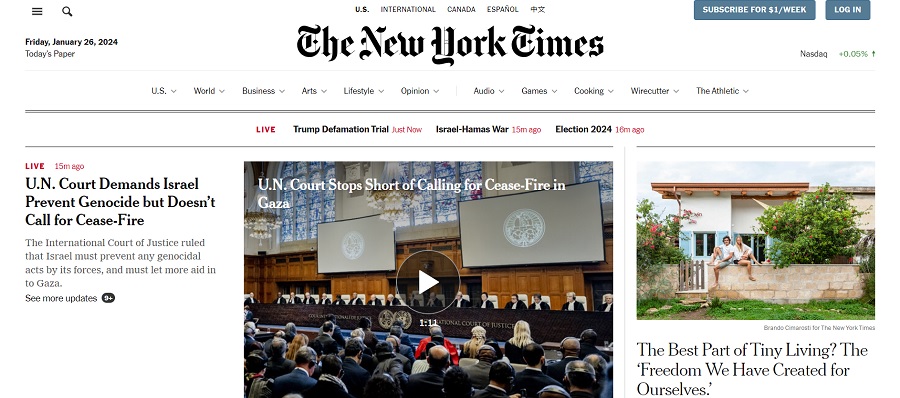
Source: https://www.nytimes.com
The New York Times uses a grayscale color scheme to create a traditional look people know they can rely on. Even the CTA buttons are in a gray hue with a touch of blue mixed in to offset them. Their visual hierarchy starts with a solid white background. Then, they use a bold heavy black font for the letterhead. Finally, a softer, charcoal gray makes up the menu and body text.
Finding the right shades for each element takes a bit of trial and error. Create a mockup to see how different hues look in your design. You can plug in Lorem Ipsum for the words where text will go. Use solid-colored boxes where images will appear to get an idea of the colors and how they contrast. Is everything viewable?
4. Choose the Right Typography
When working with darker grayscale in particular, you may need to turn to a bolder, chunkier typography to make things readable. Look for a font that has thicker lines. You can use serif, sans serif or display fonts, but ensure the typeface matches the overall tone you want for your brand.
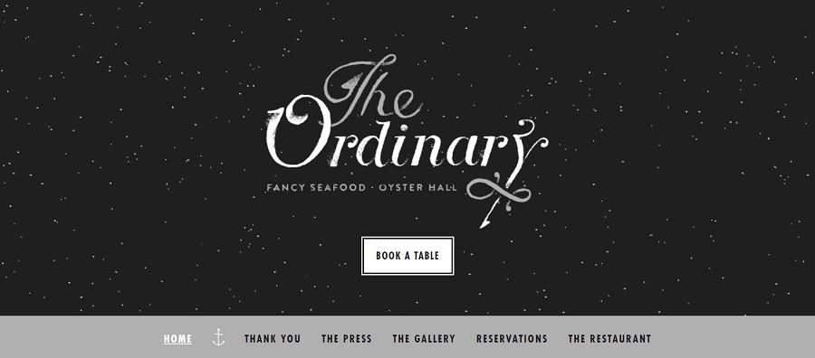
Source: https://eattheordinary.com
The Ordinary pulls on the theme of sea and pirates for a fun grayscale color palette theme. Note the typography choice pops against the black, star-filled background. The text incorporates both gray and white with some smudging at the edges to make it look antique.
We also like the soft gray band to highlight the menu items. The visual hierarchy and focus on a display font give the feel of elegance but comfort. The message is that it is a restaurant you’ll enjoy eating at, so book a table now.
5. Test for Usability
Whether you’ve chosen a grayscale color palette because you enjoy the look, are going for something a bit more traditional or want to cater to a potentially colorblind audience, testing your site for usability is a wise move.
Some of the colorblind checker tools you can utilize include:

Source: https://forloh.com
Forloh uses gray backgrounds and black and white to create a masculine look for their American-made outdoor gear. Even the chat icon is a grayish-green, muted shade. The only pop of color is an icon in the top left corner of the page.
How Can You Embrace a Grayscale Color Palette in Your Designs?
Grayscale color palettes can be 100% grays, whites and blacks or you can add in pops of color. The key is to figure out your reason for choosing the shades and how they impact your audience. With a bit of practice, you’ll have a highly accessible design that stands out from your competitors and reassures customers you know your business well.


Leave a Comment