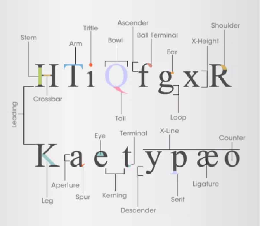
You might know about serifs, stems, and ascenders, but what is a tittle? Check out this infographic about the anatomy of typography and fonts. (Click to see full-size version.)

Here’s a quick breakdown of each term used in the infographic:
Typography Terms
- Aperture – the open negative space between the inside and outside of a letter
- Arm – part of a letter that extends upward by itself
- Ascender – upper part of a lowercase letter that’s above the mean line
- Ball Terminal – the circular end of a letter stroke
- Bowl – round letter stroke that creates a completely enclosed space
- Counter -negative space that’s completely or mostly enclosed in a letter
- Crossbar – a horizontal line that’s part of a letter
- Descender – lower part of a lowercase letter that goes below the font baseline
- Ear – small stroke that comes off a letter for decorative effect
- Eye – the closed space in a lowercase “e”
- Kerning – the space between letters and characters in a font
- Leading – the space between lines of letters in a font
- Leg – part of a letter that extends downward by itself
- Loop – rounded part of a lowercase “g” found below the baseline
- Ligature – two letters that are combined to create one new character
- Serif – a small line that finishes the end of another stroke
- Shoulder – a short round stroke that connects two straight strokes
- Spur – a small curve in a letter
- Stem – main vertical line in a letter
- Tail – curved descender in some capital letters
- Terminal – the end of a straight or curved line that doesn’t use a serif
- Tittle – a small dot in a font
- X-Height – the space between the baseline and the mean line of a font
- X-Line – the mean line of lowercase letters in a font
I spotted this gorgeous typography infographic by The Logo Company today and had to pass it on. Know of any other great typography resources for designers? Share them in the comments below!
About The Author
Eleanor Hecks is the Editor-in-Chief of Designerly Magazine, an online publication dedicated to providing in-depth content from the design and marketing industries. When she's not designing or writing code, you can find her exploring the outdoors with her husband and dog in their RV, burning calories at a local Zumba class, or curled up with a good book with her cats Gem and Cali.
You can find more of Eleanor's work at www.eleanorhecks.com.

