Jaguar’s new logo has caused a firestorm of reactions, with critics and supporters debating the luxury automaker’s bold rebranding move. The sleek, minimalist design starkly contrasts its classic jaguar emblem, and much of the public remains unimpressed with the redesign.
Some think it is bland and uninspired, while others believe the change works perfectly for targeting younger, more contemporary audiences. While Jaguar enthusiasts question whether the brand had strayed too far from its roots, was this the car brand’s intention?
Jaguar’s New Logo Rebrand

Jaguar’s new logo reveal is a hot topic across social media and design communities. The rebrand replaces the iconic leaping jaguar emblem with a minimalist wordmark featuring contemporary typography and soft pastel hues. While the company described the redesign as a breakthrough in its branding, public reception has been anything but unanimous.
On Reddit, reactions ranged from sharp critiques to grudging curiosity. One user compared the new logo to a “cheap shoe shop.” Another called it “a step backward,” noting that the minimalist style feels dated and lacks the premium aesthetic long associated with Jaguar.
Others were more charitable, interpreting it as an attempt to reposition the brand toward the electric vehicle (EV) market and appeal to younger generations. “They’re positioning to be more than just a relic car company into something higher end, tech-y and futuristic, and this fits.” However, even supportive voices questioned the decision to move away from the big cat imagery that has been a staple since the 1950s.
Brands like Specsavers and Aldi were quick to jump into the conversation. Specsavers mocked up its own parody logo, joking that Jaguar’s new design “looked like it had been created on Microsoft Paint.” Aldi chimed in, taking aim at Jaguar’s slogan, “Copy Nothing,” with the cheeky jab, “You sound like our legal team.”
Despite mixed reactions, Jaguar has stood by its rebrand. A spokesperson told the BBC that it wanted to break the rules and do something that would cut through the noise. Whether it cements Jaguar as a forward-thinking brand or alienates loyalists remains to be seen. However, the debate shows the struggles of rebranding and that you cannot cater to all.
What Jaguar Did Well and What Fell Short With Its New Logo
Rebranding a legacy brand like Jaguar is a heavy decision. The company’s redesign offers designers and brands a masterclass in bold marketing decisions and a cautionary tale for businesses establishing a new identity. Here’s a breakdown of what worked and where Jaguar fell short in its new logo.

The Wins in Jaguar’s Rebrand
Jaguar’s change to a minimal wordmark clarifies that the car brand is pivoting toward a modern, electric-first future. It aligns with the trend among automakers to shed legacy imagery in favor of sleeker, digital-friendly designs.
Jaguar also did well on starting conversations. If the goal was to get people talking, Jaguar succeeded brilliantly. The new logo sparked debates online, ensuring the brand remains a hot topic in a crowded market. Therefore, widespread coverage and consumer engagement can be valuable outcomes in today’s attention-seeking economy.
Additionally, Jaguar is committed to challenging expectations and “breaking the rules,” which is critical for brands looking to remain relevant in fast-changing markets.
The Missed Opportunities
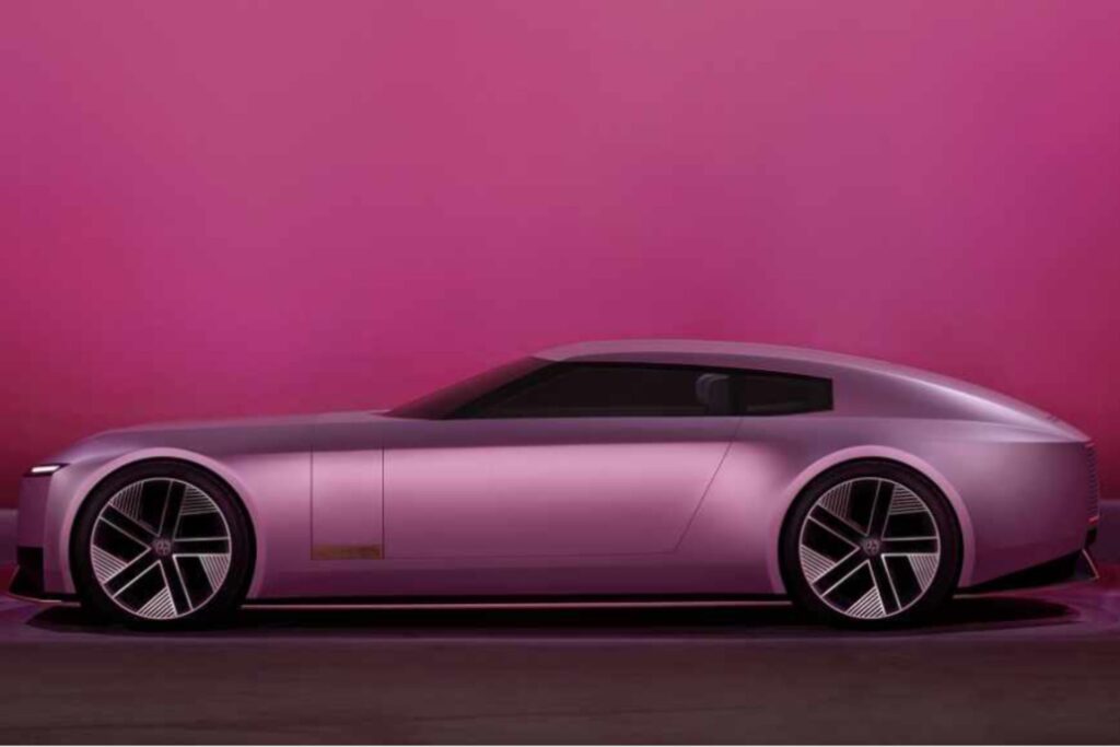
For a brand synonymous with British luxury and class, removing the leaping jaguar feels like a misstep. Many critics argue that the monogram looks like every other logo, stating that it is nothing unique, making it less memorable. Additionally, people say it looks like a shampoo brand, lacking the premium feel that the car company has long represented. That could be because the pastel pink in its promotional material and chosen typography give off a cosmetic product vibe.
I personally have to agree here. Growing up with a father who has favored and owned classic Jaguars over the years, the new logo does not remind me of a car brand. Instead, it makes me think of luxury fashion, which complicates the message. Possibly, that is the mark Jaguar was trying to hit.
Most people who drive luxury cars love high-end fashion. If Jaguar is gearing its brand toward a younger, tech-loving demographic, then it may have succeeded.
In this case, Jaguar may have lost its Baby Boomer and sports car-collecting audience. Critics note how loyal customers may feel alienated in the process. Balancing innovation with the expectations of longtime fans is crucial, as it risks creating a divide between attracting older and younger generations.
Furthermore, Jaguar’s redesign lacks a clear storyline, leaving many to question its purpose. It could have tied its heritage to its future goals, but it is missing a narrative that makes the change feel abrupt rather than evolutionary. Jaguar should have brought its customers along the journey by giving a backstory behind its transition.
Tips for Brands Considering a Rebrand
Rebranding is a high-stakes process for well-known brands, but not as much for smaller ones. Still, brands considering a redesign should ensure they get creative with their strategy following these tips.
1. Know Your Audiences and Their Expectations
A successful rebrand starts with a deep understanding of its target market. Conduct thorough research to learn how an audience perceives the brand today and what they hope to see in the future.
If a brand has established a long history with its customers and attempts to go modern, it should ensure longtime customers feel valued while attracting new demographics. Therefore, personalization matters — 62% of people will remain loyal to a company that offers a personalized experience. Keep this insight in mind to craft a rebranding strategy that feels tailored to the audience’s needs.
2. Tie Your Rebrand to a Bigger Story
Rebranding is an opportunity to tell a story about a brand’s change. Make the connection by tying the rebranding effort to the company’s goals.
For example, a brand may be adopting new technologies or expanding its offerings. Use those new aspects of a brand to approach its audience with a new story. Doing so will help customers better understand the reason behind the change. Ensure the marketing team spreads this message using every touch point, such as social media, press releases and campaigns.
3. Prioritize Clarity and Consistency
Confusion is the enemy of a strong rebrand. Ensure the new design is seamless and easily understood across digital and physical platforms. Keep the message consistent and ensure all marketing materials align with the new brand identity.
4. Incorporate Feedback — But Do Not Let It Derail You
While feedback is valuable, it’s important to stick to a vision. Social media and other channels are great for gauging customer sentiment and identifying trends. However, true constructive criticism is the most helpful for refining future messaging. The key takeaway is to avoid making reactive changes that dilute the identity.
Rebrand With Purpose in 2024
Jaguar’s new logo reminds designers and branding professionals that rebranding is an art and a science. While the company succeeded in igniting conversation and achieving a bold shift toward the future, the mixed reactions highlight how challenging it is to align with audience expectations. A rebrand is about redefining who a company is, where it is going, and how it will connect with those who matter most. Done thoughtfully, it can help businesses stand out and stay relevant for years to come.
About The Author
Eleanor Hecks is the Editor-in-Chief of Designerly Magazine, an online publication dedicated to providing in-depth content from the design and marketing industries. When she's not designing or writing code, you can find her exploring the outdoors with her husband and dog in their RV, burning calories at a local Zumba class, or curled up with a good book with her cats Gem and Cali.
You can find more of Eleanor's work at www.eleanorhecks.com.


