Ligatures impacted one of my recent design projects and not for the better. My client was insistent on using them, despite the fact they go against style guide standards. Let’s just say things didn’t turn out for the best.
You may or may not know this, but the term “ligature” means “connection,” originally called Ligari in Latin. Another form, Ligatus, refers to the concept of tying or binding things together.
Many people mistake the term ligature as a form of typography or design, when, in fact, it refers to the actual use of particular characters. A ligature is a series of two or more letters, which appear connected or linked. When you write text the old fashioned way with pen and paper, this happens all the time, not always intentionally. But with typed print, things are a little different.
Of course, if you work in design and you have experience with typography you know this already. You likely know the rare circumstances upon which you should use such elements too.
In the digital world, ligatures have evolved to be something new. Rather than call them individual letters — joined together — instead you refer to them as a glyph, or sometimes even symbol. Due to the nature of computers, they are often presented, displayed and written using a single glyph. They originate from the combination of two or more letters.
Some examples include fi and fl. In printed books, such as Encyclopædia Britannica, the word “encyclopaedia” often has a strange version of the letters “a” and “e.” This is another common ligature.
You’d be forgiven for wondering why they even exist in the first place. To understand that, we have to go back in time a little bit.
A Brief History on Ligatures
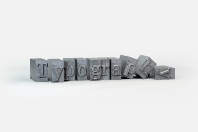
During the 15th century, a new form of type cropped up that relied on metal components or blocks. The printing system would be set up so metal blocks of letters were used to press text on paper or documents. Naturally, it’s time-consuming to lay out the metal blocks, and even more so to do extensive prints. Ligatures were adopted as a time and space saver. Rather than have blocks for individual letters, some would have multiple which made things a little easier during printing.
Much later — in the 1950s — we began using sans-serif fonts for typewriters, which have a slight overlap with the letters. This new form of print overshadowed the old ways, and ligatures fell by the wayside.
While ligatures are rarely used today, they still have their place. More often than not, when they are used it’s because a designer or author prefers the visual style of a ligature.
The Problem
To this day, I still have no idea why my client wanted them. In fact, they had even gone out of their way to include words and phrases that called for ligatures in their standard web copy. Go figure.
Since ligatures aren’t necessary today, they should only be used for stylistic purposes. Attractive typography, for instance, seems to put an emphasis on this archaic design process. But most style guides — Chicago Manual of Style included — advise against using them except in select circumstances.
If you need to remain true to Old English spelling — who in their right mind would use Old English — they’re acceptable. Some foreign word variations also use ligatures, which is really the only time they’re truly warranted.
My client insisted on using them in their design. Fair enough. Except it ruined my experience for one simple reason. In Safari, ligatures remain even with standard letter spacing. This ends up shifting text, cluttering a design and it looks downright stupid. Guess what platform most of my client’s users were browsing from? That’s right, iPhone. This left me stuck between a rock and a hard place.
To make a long story short, my client insisted on using them but was also persistent that the design on all browsers remains the same. This put a wrench in my plans, obviously. Many a time I was forced to move backward, trying to find a quick fix for an unappealing element. And to make matters worse, there was absolutely nothing keeping me from removing the ligatures altogether, except for my client.
The Workaround
If you want to be truthful, in this strange scenario there wasn’t really much I could do. I had to play around with modern design to get things exactly as the client wanted. The simple fix would have been not to use ligatures at all, but that wasn’t an option here.
I doubt you’ll run into anything similar — or maybe you will.
Needless to say, the experience ruined me and I will forever have disdain for this silly design concept. Why keep an outdated design technique that is no longer necessary, simply for visual appeal? It’s not as if ligatures contribute the same oozing style as minimal design elements or high-quality visuals. It’s nothing more than obsolete text. At least, with digital print, you can call upon a ligature with a single keystroke or shortcut because it’s printed as a single glyph. That’s surely a plus.
What do you think about ligatures? Do you feel they are necessary? Do you enjoy how they look?
About The Author
Eleanor Hecks is the Editor-in-Chief of Designerly Magazine, an online publication dedicated to providing in-depth content from the design and marketing industries. When she's not designing or writing code, you can find her exploring the outdoors with her husband and dog in their RV, burning calories at a local Zumba class, or curled up with a good book with her cats Gem and Cali.
You can find more of Eleanor's work at www.eleanorhecks.com.

