


Thoughtfully designed login pages can lengthen the time people spend on a website and increase the chances of them taking desirable actions, such as buying things. In contrast, login pages made with the user experience in mind can prevent visitors from getting so frustrated that they quickly leave. Studying existing login page examples makes it easier to understand which features are most beneficial for smooth interactions and why.
Kroger
Source: https://www.kroger.com/signin
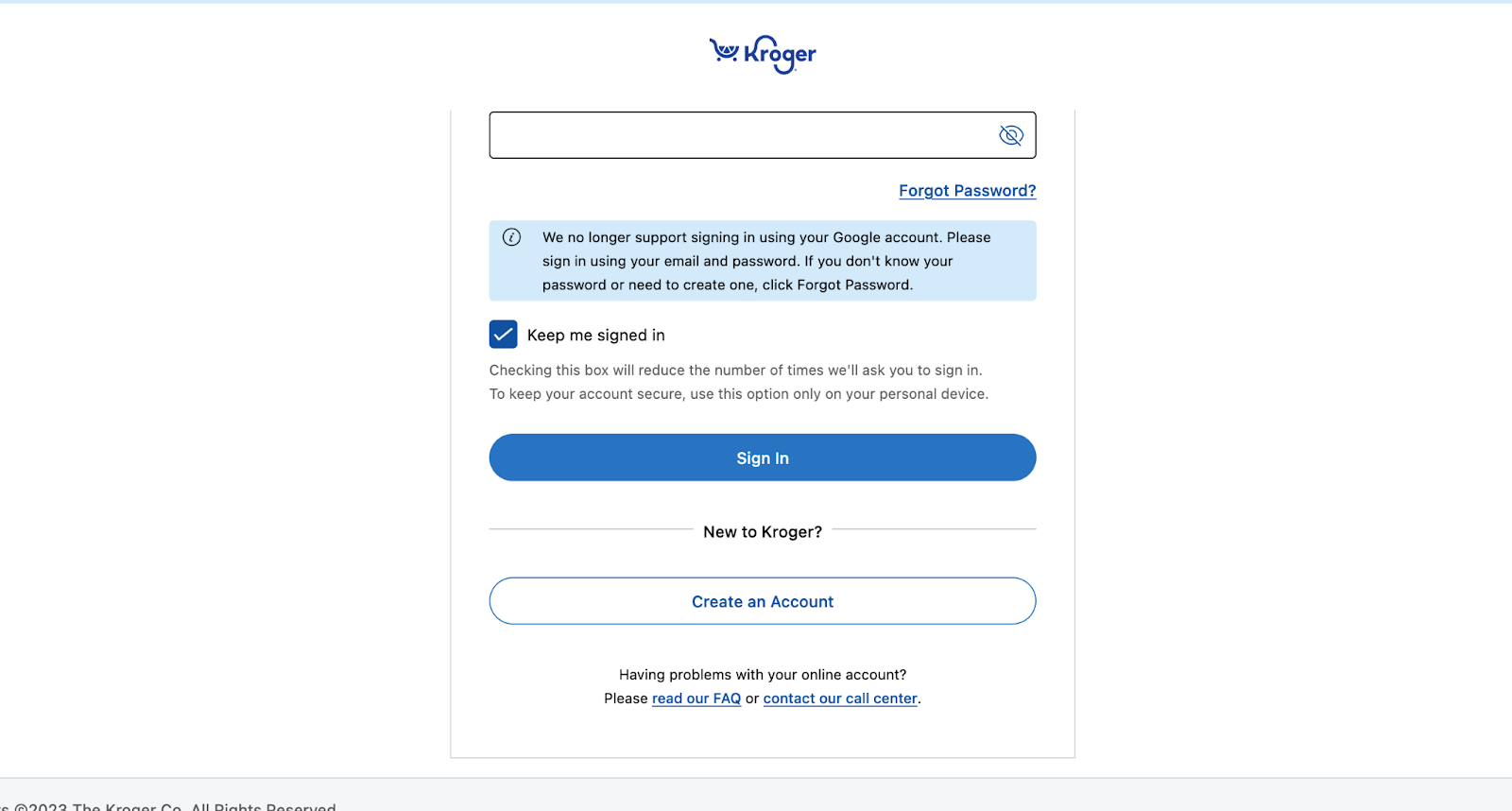
Kroger is an American grocery store chain with more than 2,700 retail locations. The company’s broad reach increases the probability that people of all levels of tech expertise will try to use the login page.
The parts of Kroger’s login page with fields to enter usernames and passwords are standard. However, the information below them is well worth mentioning. The login page includes two links that direct users to read a FAQ or contact customer support by phone. Offering those options can minimize people’s annoyance about login difficulties.
One study found 55% of customers have forgotten passwords while trying to purchase things. Additionally, 43% of respondents had to wait a long time to get the situation resolved. This
Providing immediate resources can keep people engaged with the site and give them the information needed to eventually make purchases. Another notable thing about this login page example is it addresses how people’s preferences for getting help vary. Some people like the self-service option of reading through a FAQ page. However, others appreciate the support provided by a kind, experienced person on the other end of a phone line.
The minimalist branding is another stand-out characteristic of this login page design. The company’s shade of blue ties everything together, and the small logo supports customer recognition and familiarity.
DoorDash

Although passwords are incredibly common in today’s society, some companies are phasing them out. Logging in with a password has several downsides. For example, passwords frequently get compromised in data breaches. Also, people often forget them. Many reduce the chance of that happening by reusing login credentials. However, that choice makes passwords much less effective by widening hackers’ reach once they steal the details.
Fortunately, a growing number of login page examples reveal what’s possible. DoorDash’s version appears to use text messages with codes to verify someone’s identity. The line of text below the company’s logo also encourages customers by mentioning two things people can do after signing into the site.
The sleek design of this login page makes it easy for someone to sign up instead. Although many sites have side-by-side fields to accommodate that, this alternative looks great. The contrast of the background and text color on each button also prevents people from getting confused.
OptinMonster
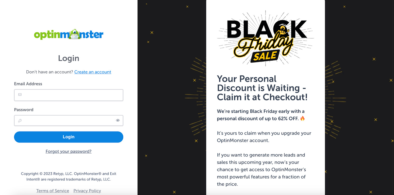
Source: https://app.optinmonster.com/login/
As people study many login page examples, many will notice they rarely see advertising. One of the primary reasons is that site designers don’t want to distract visitors. However, as this OptinMonster page shows, promotional characteristics can work if deployed strategically.
The black bars around the message create visual boundaries to emphasize separation from the login area. In this case, the goal is to promote a time-limited promotion. The last paragraph of the message highlights some benefits associated with the offered product, giving people something to ponder as they type in their details to access their accounts.
Something to keep in mind is that most people trying to log in at OptinMonster already have a relationship with the company and its services. People who decide to try adding advertising to their login pages should ensure it’s as relevant as possible to those who will see the messaging. The example here does that well by encouraging users to upgrade their accounts.
Alternatively, promotions on a sign-in screen might include a bulleted list that provides a rundown of customers’ favorite features. Since having login page advertising is a less common approach, marketing professionals and others must make it as helpful as possible to the audience. If people learn a current promotion could save them significant money or provide access to new features, they’re more likely to become interested in it.
eBay
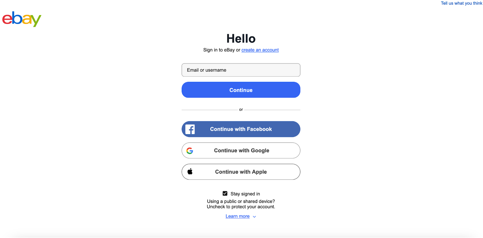
Source: https://signin.ebay.com/ws/eBayISAPI.dll
Some customers understandably prefer using an existing service to log in instead of using credentials associated with new accounts they create. eBay allows this, letting customers sign in through Facebook, Apple, or Google. This approach elevates overall convenience by reducing friction and saving time.
However, eBay stands out in another way. Most login page examples don’t have a way for people to immediately provide feedback. However, notice the link in the top right corner that lets users do just that. Clicking on it opens a form in a new window where people can report problems or offer suggestions. Making the link open in a new window was a wise choice because people don’t need to use their back buttons to get back to the login screen.
eBay also keeps people informed with the Learn More button at the bottom of the login area. Clicking on it makes a small box appear on the same screen, explaining the specifics of leaving the Stay Signed In check mark there rather than removing it. That’s a helpful addition for less tech-savvy users or those who don’t log into sites frequently.
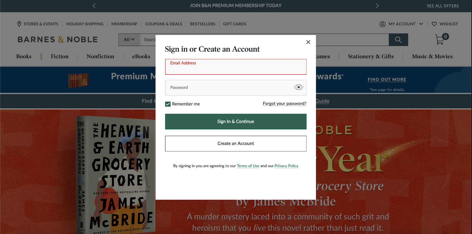
Barnes & Noble
Source: https://www.barnesandnoble.com/
Barnes & Noble takes a different approach than the other login page examples explored here. More specifically, the login area appears over the existing page once someone clicks the My Account button on the top right.
This method can work well because people are highly distractible. Imagine if someone immediately noticed something appealing on the website — such as the title advertised via the main banner. By not requiring people to navigate to a different page to provide their details, this site helps them stay focused.
However, once people get familiar with other design features on the Barnes & Noble site, it becomes less surprising that the team responsible for including them made the login section work that way.
For example, placing a mouse cursor over one of the categories across the top of the screen makes a huge assortment of subcategories appear in a menu. People who scroll past the large banner shown underneath the login area in the screenshot will find other books featured. Putting a cursor over any of them makes a quick-add feature appear. Such attention to detail shows how user convenience is a priority at this site.
People can take inspiration from this login page example by putting themselves in the position of a typical user. What functionality would they genuinely appreciate, and which decisions might be overkill?
Let Login Page Examples Expand the Possibilities
Most people encounter numerous login page examples throughout a typical week. However, they often use them without dissecting what works well and how designers could improve them. Use the sites highlighted here to learn what’s possible and what users would like best when interacting with the content.
Login pages might seem like relatively basic parts of a site. However, they’re important because logging in is often required for people who want to buy things or access perks only available to registered users. Plus, data associated with users once they log in can allow site managers to track trends and become more familiar with visitors’ activities.
Treat a login page as a critical part of the user experience. A well-designed one can encourage people to stay on the site and return frequently. However, design shortcomings may cause frustration that negatively affects brand image.


Leave a Comment