Designers often spend years figuring out the best placement for different elements, from everything from web design to print ads. There needs to be a set amount of white space and a certain alignment to various items, plus numerous other factors. It is difficult to stay up to date on all of these features that you have to factor in. One big thing you might wonder is about logo placement.
The answer isn’t cut and dry but can vary depending on what item you place the logo on and what its design elements are. However, there are some general rules you might find helpful as you move forward. Here are some tips that will help you with logo placement in your designs:
1. Website
Traditionally, a logo is placed in one of three places on a website — all three across the top. The decision is simply whether to place it to the left, middle or right of the page. One thing you’ll want to consider, however, is how your readers process the information on a page. Typically, an English speaker will start at the top left corner of your page and read across and down. This style is how they would read a book.
This left-to-right reading style could indicate that it is a smart idea to place your logo on the top left of the page. However, if you would rather guide the reader’s focus to something other than your logo, then you might choose a different placement. If your website is available in other languages that read right-to-left, you might want to switch up your design for those versions of your site.
2. Shirt
Giving out shirts with your logo on them is a great way to get the word out about your brand. Your customers appreciate the free gift, and you get multiple walking billboards to advertise your product for you. However, logo placement and even logo color versus background color is vital. It doesn’t do you much good to pass out shirts if no one will see the logo on them or hear about your brand.
First, you need to make sure there is a strong contrast between the colors of the logo and the shirt. You wouldn’t want to place a white logo on a yellow tee. Place white on black or black on a light color. As a rule of thumb, pair a dark color with a light hue, so the logo and shirt contrast with one another. There are, of course, different levels of contrast.
The best placement for a logo is on the front of the shirt from six to eight inches below where the shoulder seam and the neckline meet. Four inches to the left of the shirt’s center also works. Make sure the logo’s size is appropriate for both men and women and can be easily spotted from a distance. It should not be so large that it takes over the entire shirt or sits upon the woman’s chest in an unflattering way.
3. Bag
If you own a brick and mortar store, or you plan to create a tote with your logo, then you’re probably wondering what to place on the bag. The simplest design is usually the most effective. The logo alone is often enough for this type of design. However, if you have other elements within the design, you’ll want to make sure the logo has some space around it.
For example, you need to make sure your logo is placed within a boundary and separated from other elements. You can see an example in the “U” spacing on the University of Texas at San Antonio logo. It has a U equal in height and width to the logo U, so that nothing comes too close to the logo boundary.
Place the logo on a bag near the center both in height and width, so it is clear and easy to view. Essentially, you want a bit of negative space around your logo, so it stands out to the viewer.
4. Graphics on Transportation
Vehicle wraps are a lasting way to market your brand. Placement is vital. You must consider how your logo will look when the car doors are open or when the vehicle is in different settings.
One thing you want to be particularly cautious of when placing a logo on items is the logo’s alignment. For example, check out this example of the Starbucks van logo gone wrong. Think about every aspect of the logo. How will it look from different angles, for example? Or, in the case of the Starbucks van, what happens when the door is open or closed?
5. Ads on and in Public Transportation
What about advertising on public transportation? Many buses feature one or more ads from local businesses. You can also place your logo on a bus stop bench or inside the bus itself. Think about where people look when they ride on public transportation. What is at eye level? If you place your logo in the wrong location, it might be partially cut off by a tall rider or someone standing in the aisle. How does the logo appear if portions of it aren’t viewable?
6. Packaging
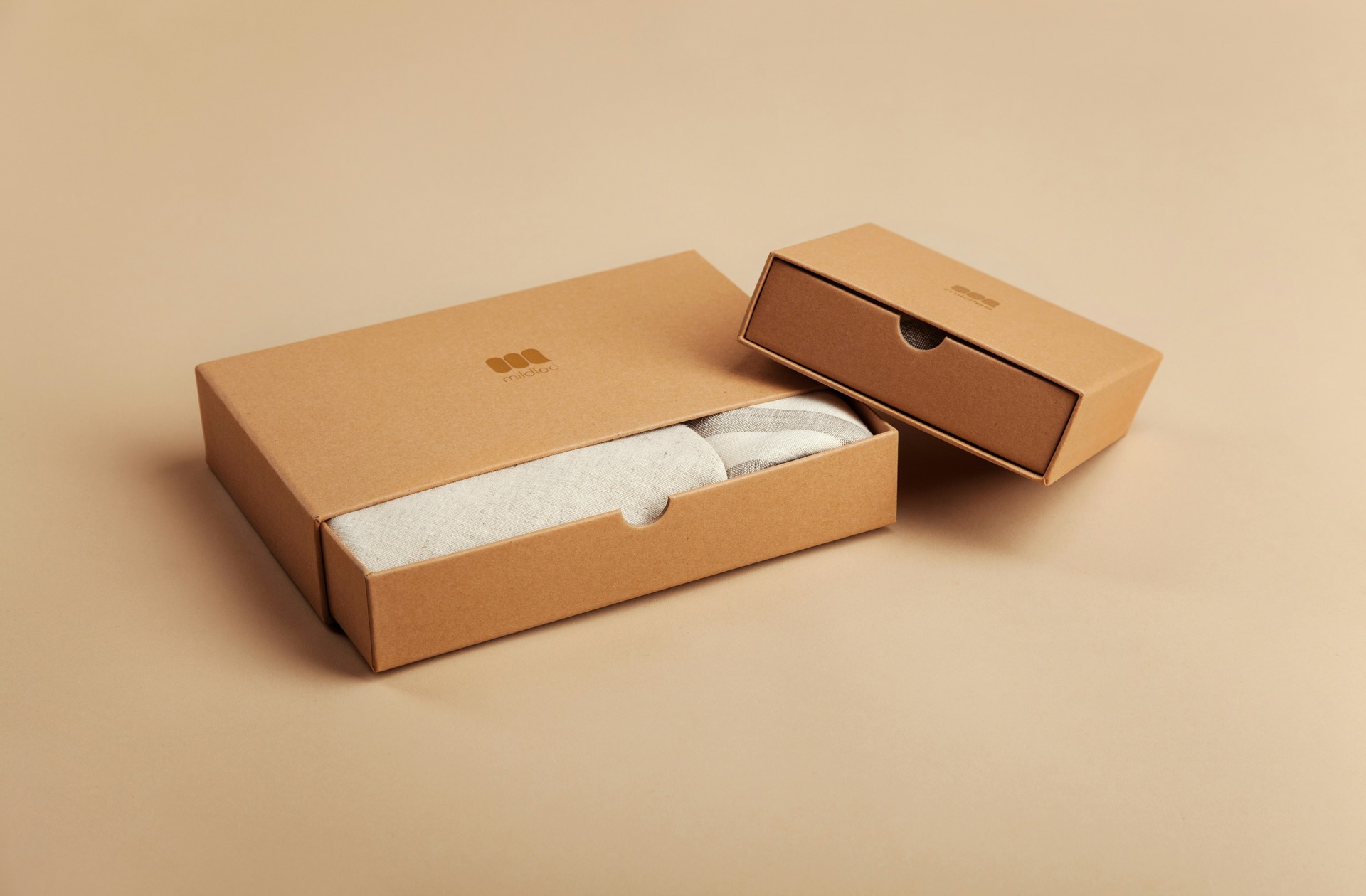
Consumers also have some expectations when it comes to logos on product packaging. Consumers have come to expect a well-known brand’s logo to appear near the top portion of any packaging. Even if the logo looks better in another location, it might be wiser to place it at the top where the user expects to see it. This ties into your brand marketing strategy.
You want the consumer who is loyal to your company to recognize the product as yours immediately. Simply placing your logo near the top can make the consumer see you as one of these big brands, even if you are not yet there.
7. Social Media
Social media platforms are an excellent way to connect with consumers and reach people you otherwise wouldn’t. About 49% of the global population is active on social media. Each platform has a different layout for profile pages.
When you’re adding your logo to a social media page, there are a few things to consider. If you include the logo in your banner, does the profile image or navigation buttons cut it off? You could just make your profile image the logo, but then it might not appear on some elements, such as a video.
You may also need to come up with unique placement and style guides for each platform. What works on Facebook may not look the same on LinkedIn or Twitter. Test each placement until you find the perfect alignment and add the details to your brand style guide.
8. Emails
One of the most effective ways of advertising to people is capturing their contact information and adding them to your mailing list. By segmenting the audience, you can send highly personalized marketing messages to each subscriber.
Even your emails should highlight who you are as a brand and showcase your logo. Place your logo high in the email within the header, so users immediately know who the news is from. Think about the logo text. Are alt tags in place for those who use e-readers or have visual impairments?
Many emails also have the logo at the bottom of the page in the footer. It might be a bit smaller when placed at the bottom of the email, but it’s still there. You can also make it a clickable feature so people can move straight to your website through the logo.
9. Mobile Apps and Ads
There are 3.5 billion smartphone users in the world. Mobile advertising is a must as the Internet of Things (IoT) expands and more people turn to mobile devices to access the internet. At some point, you’ll likely create a mobile app for your business. You may also target ads to mobile users.
Keep in mind the size of the average smartphone screen. Not everyone has a plus-size cellphone model. If you make your logo too big or place it in the corner, it could obscure other elements on the page you want users to see and interact with.
Your logo must scale up and down, so it appears crisp on small screens. You also want it to appear in a location that doesn’t interrupt the flow of the user experience. For mobile, it is best to place your logo in the upper left or upper center of the page. Don’t let it move with the user as a sticky feature. Once they’ve seen the logo, it’s time to move on to new elements on the page.
10. Zippered Clothing
If you plan to sell or give away branded clothing, consider any zippers the clothes might have. If you place the logo in the center of a jacket with a zipper, you risk the emblem being sliced in half and becoming unrecognizable. Always place the logo away from zippers.
For example, you might place the logo on the upper left side and make it a little smaller to avoid the zipper. You could also move the logo to the back of the clothing. Another option is to make hoodies without a zipper so you can place the logo anywhere you’d like.
Designing Logos for Optimal Placement
There are many factors to consider in logo placement. While there are rules of thumb in design, there are no hard and fast rules. What works for one brand may not work for another. It is best to seek expert advice and get feedback on your overall design and your logo placement within the design’s context.


Leave a Comment