What hues come to mind when you think of luxury colors? Gold is a given, but you’ll find an entire rainbow of choices that lend themselves to high-end looks. Think about some of the designer clothing and luxury car brands and the color palettes they use.
How does one pull the entire look together and come up with a color palette that signifies luxuriousness? Choosing the right background color is a crucial component in designing your website or ad. You can make it blend away and use it as negative space or add a design that makes your background a statement.
With so many different options, it can be difficult to choose ones for your next design. Your final choices may reflect back to your original color palette or be options that let you stand out from the competition. What colors are typically best for luxury brands?
1. Gold
Gold is a common choice to show off a bit of upscale attitude. You can add it in the accents on a website, place it on product packaging or use it for text. The key with utilizing gold is placing it on a dark background so it pops.
Once considered the height of luxury, people still desire gold. Adding a bit of the hue to your design shows you understand its value.
If you want to add a softer touch to a design, go for a rose-gold hue. You can add some sparkle while still maintaining the high-quality look gold brings.
Combine gold with black for a regal look. Use it on dark red for a pop of elegance. Gold is a color often associated with Rolex watches. It also works well in a color gradient.
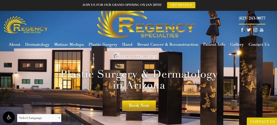
Regency Specialties uses a gold logo to draw attention to their brand image, performing upscale dermatology and plastic surgery procedures. They use gold for their primary call to action (CTA) button and a slightly lighter gold or gradient for their other CTAs. The video background works nicely with the luxury colors and gold detailing.
2. Purple
Purple is a color that lends a touch of elegance to any design. It works well as a background color or for your buttons. There are many different shades of the luxury color. You should probably stay away from lilac as it has more of a fresh, youthful feel.
However, a deep purple or even maroon screams upscale luxury. You might even combine it with a color such as blue for some nice contrast and bursts of brightness. You’ve likely noticed a lot of royal families use deep purple in logos, clothing and other designs. It has an old-world sophistication people respond to.
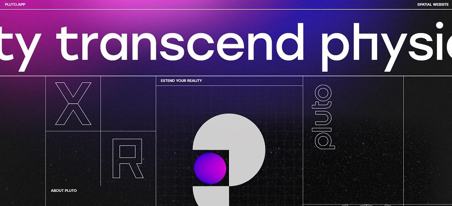
Pluto is an extended reality (XR) company. XR covers the multiverse and embraces virtual reality, augmented reality and any future concepts. Because such products are still considered luxury items by many, it makes sense Pluto would embrace rich colors to grab attention.
Note the purple gradient. Colors go from a vivid purple to a deep hue almost on the verge of blackness. By giving hints of purple but going with a dark, neutral hue in the same family, the company sets a tone for their brand.
3. Tiffany-Blue
Some brands are so iconic and so well established that the very colors they use become synonymous with luxury. Tiffany & Co. is known for their fine jewelry that comes in a specific shade of blue box. Seen by many as one of the top jewelers in the world, it isn’t surprising brands turn to hues similar to Tiffany-blue to send a message.
When you use a color similar to theirs in your designs, it lets people know you sell a quality product. The shade works well to advertise clothes and things in different genres. You might want to make a different selection if you sell jewelry, so people don’t grow confused. No one wants to think they’re buying a Tiffany bracelet and find they purchased an off-brand instead.

The almost aqua colored Tiffany-blue is featured on Tiffany & Co’s website. Note how they combine the shade with neutrals so as not to distract from the luxury colors. One thing we noticed immediately was how Tiffany uses a blue box filled with their signature shade as their favicon. This allows the user to find the tab with their website quite easily.
Note that Tiffany has rights to use their iconic blue so you can’t just grab the exact same shade and use it in your promotions. You can, however, get close to their shade without violating copyright.
4. Petal Yellow
Soft colors create a luxury look when used with other items and shades that send a rich message. You want to select a yellow that is almost cream colored to get this effect. A bright yellow might be pretty but it isn’t as elegant.
Consider the faded yellow of a lily as it edges toward the outer petals of a flower. On the color scale, it would be the shade edging into white. It has such a tiny hint of yellow that you barely know it’s that color. Think soft, softer, softest and you’ll hit on the right note.
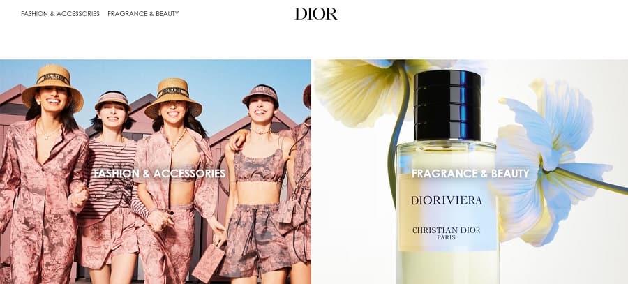
As new collections come out, luxury brands such as Dior change their look. As of June 2023, they have a soft yellow hue on one of their products and highlight it in their featured hero image on the right. Note the use of a flower to highlight the color and show how soft it is.
They place the bottle and flower graphics on top of a creamy white background to highlight the color is a few shades darker.
5. Black & White
A website using basic black and white can offer an elegant tuxedo effect. One of the biggest advantages of a black and white color scheme is the minimalism of it. There’s nothing to distract from the images of your product.
An overlooked bonus is that your site will be easy to read for those on low resolution screens or with colorblindness because of the sharp contrast between the two colors.
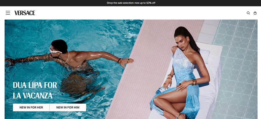
Versace goes with the luxury colors of black and white. They then put the focus on the photographs of their products, adding pops of color and taking shots that look almost as though they are in motion. If you scroll down, you see some of their vividly colored products under the fold. The simplicity of the design shows they let their quality products do the talking.
6. Orange
You might think of orange more as something to advertise juice or a kids’ store, but it actually can work quite well for luxury products when combined with a strong luxury colors palette. For example, an orange accent on top of a deep blue or black is just subtle enough to grab attention and gives a regal feel.
Orange is also a choice that comes in a variety of shades. You can choose from a soft southern peach to a deep and vibrant burnt-orange. Consider how the hue you choose complements the other colors in your design.
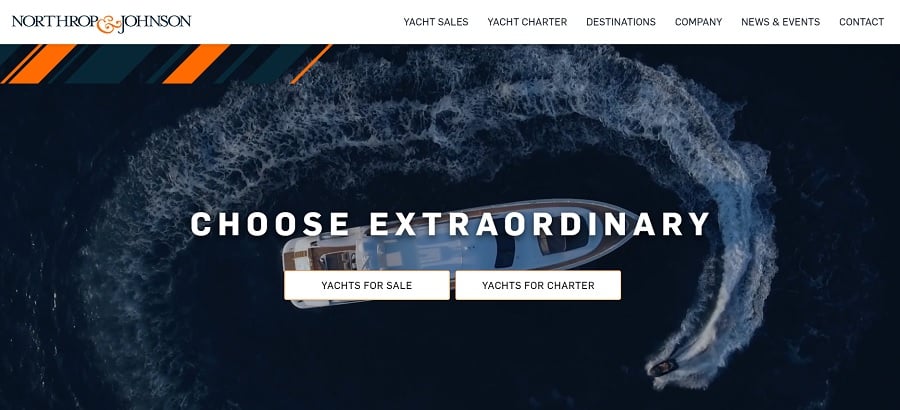
Northrop and Johnson sell luxury yachts. You might expect to see blues to represent water, and they do incorporate some very deep greenish blues into their design. However, the regal addition of orange stripes near the top of the page make one think of a regatta or other yachting event.
7. Red
A lot of people adore the color red. It makes a bold statement and can help a product or CTA pop on the page. The key is to use it here and there and not let it take over your entire design. Although it is considered one of the luxury colors, you can get too much red on a design and make it feel busy.
There are also many options when going with red. You can choose a cherry-red, a deep maroon or a brighter apple-red. Any shade of red can be seen as luxurious when you combine it with a minimalistic design.
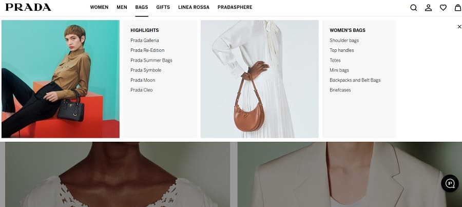
Note how Prada sticks with a basic black and white but adds splashes of red in the drop down menu and in some product images. A beautiful model in neutral hues leans against a bright pop of stairs. In one of the product shots, another model rests her elbows on a vivid orange-red prop. Everything else in the photo is neutral.
The site utilizes just enough bold color to grab user attention and make a statement. Because designers change their products often, they try to stick with a neutral, simple design and create a tone by swapping out photos. Today, they use red, but they may not in a few months. We can still learn a lot by studying how they incorporate the color in their design.
8. Deep Blue
A deep, almost navy blue adds a regal touch to any web design. Utilize in the header, as the background or even as an accent color. The majority of people like blue and will relate well to it. Pull the user in by varying your shade slightly from what competitors use.

Sotheby’s International Realty goes with a dark blue that holds a touch of green. The luxurious color highlights the beautiful properties around the globe. Whether you’re looking for a French villa in the countryside or a mansion in New York, you’ll find the photos enhance the overall effect of the theme’s design.
9. Maroon
A deep purplish-red makes one think of heavy velvet curtains you might see in a palatial setting. When combined with other luxury colors, such as gold, the effect is breathtaking and quite regal. Maroon is a heavy color meant to be seen as a bit somber.
If you run a company where serious tones rule the day, such as a funeral home, then this is an excellent choice for your color palette. On the other hand, if you try to keep things elegant but light, you may want to limit the hue to accents.
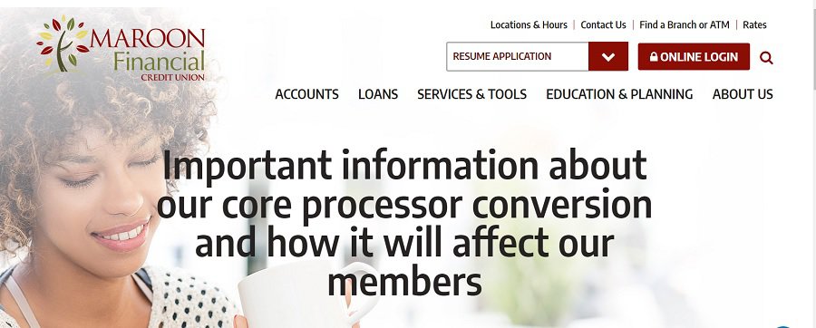
Maroon Financial Credit Union features maroon as an accent color. They want to gain trust and show they have an established reputation. At the same time, they don’t want to appear too stuffy or they might not attract younger members. The balance comes in using brighter hues and whites combined with a call to action and a logo with maroon. Some of the text picks up the color, as well.
10. Cream and Beige
When you want to create a light and airy look, go with lighter color palettes. When you stick to whites, creams and soft neutrals you show that you embrace a luxurious minimalism. You’ve likely noticed that a lot of upscale brands use a lot of white space and beige or cream backgrounds in their designs.
You aren’t just stuck with pale cream when building a site. There are so many different shades you can embrace that it’s impossible to list them all. Add some off-white, grab a bit of vintage cream lace and go with the lightest possible pinkish-tan hue.

Norm Architects embraces some soft beige and cream colors in their design. They showcase images of their elegant remodels and new builds, showcasing the luxury projects they’re capable of completing. As the slideshow goes through one image after another, each of them is perfectly matched to the overriding color scheme.
11. Earthy Browns
When coming up with a color scheme that screams luxury, earth tones might not be your first choice. However, when done correctly, they add a touch of elegance to any design.
Pair earthy browns with white or hints of gold for a back to basics look. Keeping in mind that sometimes less is more ensures you stick to the basics and create a beautiful minimalist look that only those with an eye for elegance can pull off.
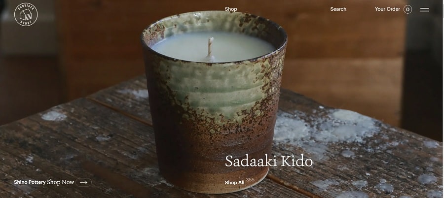
The Provider Store uses earth tones in their images and design. They stick to basic whites and neutral colors for the rest of the look. The animated accents on the page engage the users as they move the cursor from place to place. Even the color of the accents are an orange-brown to blend in with the rest of the monochromatic look.
12. Soft Pink
Pink is an interesting addition to some designs. A bare hint of the color, such as blush can add some soft elegance without overwhelming the user. It is a more feminine look, so works well for beauty brands, candles and services for women.
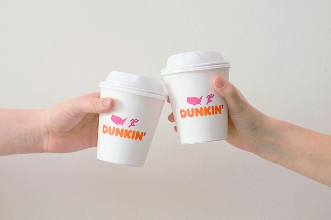
However, there are some brands that aren’t feminine that one thinks of when considering the color pink, such as Pepto-Bismol and Dunkin’. The key is the amount of pink used, the purpose behind it and the hue. If in doubt, conduct some surveys and research with your current customers and see how they respond.
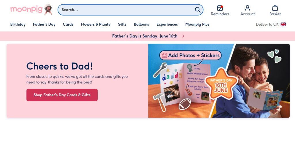
Moonpig sells cards and gifts to both men and women and for all genders. However, they use a soft pink for a background color on some of their slides and a pop of bright pink on CTA buttons. The pink works well when combined with images of the upcoming event and other colors, such as blue and yellow.
A soft pink can be quite versatile, tapping into emotions such as love and tenderness without overwhelming the user.
13. Deep Blue
The majority of men and women enjoy blue. It can signal reliability and trust. You probably have noticed many banks use blue in some form. They tend toward a royal blue or a navy blue. You can use the same technique to indicate trust to potential customers.
Consider the different places you’ve seen blue used and what the shade is. A tropical, aqua may indicate a business with a beach vibe or a youthful audience. A soft blue may indicate children or fun times.
The color must make sense for your brand so that people understand why you chose the shade and how it impacts them as customers.

DHE Material Handling Equipment uses mostly white for the background of the page. However, they pull in some navy blue for the logo and accents on the navigation menu. Headings and subheadings are in the same shade. The result is a crisp look that appears professional and lends itself to trust.
Why Choose Luxury Colors?
Perhaps you wonder why you shouldn’t choose more basic hues to better relate to your audience. However, you have to fully understand your target customers and what they’re looking for. When you sell an upscale brand, you must convey the quality and reputation of your business image.
Luxury colors work well to attract the customer base most likely to buy what you’re selling. However, you can also swap luxury colors out fairly easily if your split testing shows they aren’t working well for your buyers.

Thx for the information.
I ever saw by the time watching TV… There was the Luxurious Colours only 3 as follows;
1). Black
2). Red
3). Purple
That’s all.
With very best warm regards.
Moehammad Sarquin in South Tangerang, Banten Province, INDONESIA 🇮🇩🙏😊